Post by: DragonBlaze on September 04, 2006, 02:20:04 AM
This char is a silver dragon known as Tol'nysrak (name thanks to Sandwich). He's replacing the yellow Zersevick dragon from my old demo. The problem that I think I have is that with being silver (gray actually), and having black armour, its hard to tell one part of the body from another.
Heres the charset
Some feedback would be nice :)
Post by: DarkFlood2 on September 04, 2006, 02:28:20 AM
Post by: DragonBlaze on September 04, 2006, 02:49:28 AM
Post by: drenrin2120 on September 04, 2006, 02:54:09 AM
Post by: DragonBlaze on September 04, 2006, 02:56:45 AM
Quote
Originally posted by drenrin2120
hm.. idk, looks cool, but looks like a robot dragon more than anything. If that's the look you were going for, then hurray! If not, ... :blue-eye:
:(
*ponders how to make it look more organic*
Post by: drenrin2120 on September 04, 2006, 03:00:17 AM
Post by: DragonBlaze on September 14, 2006, 12:32:40 AM
Post by: Meiscool-2 on September 16, 2006, 04:03:15 PM
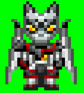
My eyes sorta suck. If it's not out of your way, could you post it with a different color background? A white dragon on a white background is kinda hard to see correctly.
Post by: DragonBlaze on September 16, 2006, 08:44:09 PM
I'll post the charset with a green background. I usually just use the white backgrounds on my charsets because I start working on them on a blank ms paint sheet. Usually changing the background color is an unessisary step for me, but I never took it into consideration that other people would be seeing this and the white background would make that harder :p
So anyway, sorry, heres the green background.
Post by: Linkizcool on September 16, 2006, 10:39:32 PM
UBER COOL!
Post by: Meiscool-2 on September 16, 2006, 11:06:42 PM
Post by: Linkizcool on September 16, 2006, 11:22:51 PM
I think the head looks a bit out of proportion, like the body is too skinny for the head. Other then that, it's UBER COOL.
Post by: DragonBlaze on September 16, 2006, 11:53:30 PM
I see what you mean about the head. The thing is, the height of the head and the length of the snout needs to be proportionate to eachother. In order to make the head smaller, I would have to make both parts smaller, and then it would have been too small. In most sprites, the head is 1/3 of the height of the body, even though in reality its 1/7, if it gets smaller than 1/3 in a sprite, it'll look wierd, especially if all the other sprites use that proportion. As for the body, If I made the front view larger, I would have to make it 2 pixals larger to be proportionate, and that would have been too wide for what I was going for. I maybe could have made it one pixal larger on the side views but... well actually, after some more thought, I might do that.
So yeah, I know what you mean, but I'm not talented enough to do too much about it :|
Post by: I Have a Sandwich on September 17, 2006, 12:04:45 AM
Post by: DragonBlaze on September 17, 2006, 12:11:39 AM
Quote
Originally posted by I Have a Sandwich
As far as the head, my only prob with it is the bottom jaw. It's too flat.
Hmm, how else could I make it though if not flat?
Post by: I Have a Sandwich on September 17, 2006, 12:16:09 AM
Post by: DragonBlaze on September 17, 2006, 12:22:21 AM
Post by: I Have a Sandwich on September 17, 2006, 12:25:21 AM
Post by: drenrin2120 on September 17, 2006, 01:24:38 AM