Post by: AsakuraHao2004 on June 29, 2005, 07:22:13 PM
This one was simple

Another simple one
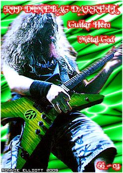
This is my favorite
I forgot how I made this, but it looks awesome. Its all fiber optic-y
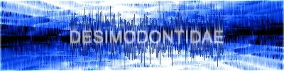
This one was harder than it should have been. I dont really like it.
More to come.
Post by: Snake Eater on June 29, 2005, 07:40:26 PM
Post by: GhostClown on June 29, 2005, 08:03:21 PM
Post by: Grandy on June 29, 2005, 08:05:51 PM
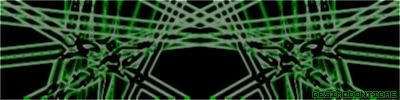
And the last one is the cooler
Post by: AsakuraHao2004 on June 29, 2005, 08:16:53 PM
Post by: shinotebasiiackh on June 30, 2005, 01:32:26 AM
SEIZURE!
Post by: VahnGrave on June 30, 2005, 03:19:14 AM
Post by: AsakuraHao2004 on August 15, 2005, 01:27:14 AM
Post by: AsakuraHao2004 on August 18, 2005, 06:06:06 AM
...
I mean... New sigs.

Post by: Moosetroop11 on August 18, 2005, 09:30:24 AM
I like your favourite one best. There's some other good ones as well, and some not so good ones.
Keep at it, man.
Post by: AsakuraHao2004 on September 05, 2005, 02:34:51 AM

I've been trying some new things.. mainly messing with renders, bruses and layers.. how is it?
Post by: ZeroKirbyX on September 05, 2005, 02:46:00 AM
Post by: charaman on September 05, 2005, 02:57:00 AM
Quote
Originally posted by ZeroKirbyX
I think that the rose stands out too much. Maybe blur or feather it.
try making the flower the same shed as the petals behand it, maybe? something about that flower is a bit much.