Post by: ZeroKirbyX on August 31, 2005, 11:51:21 PM
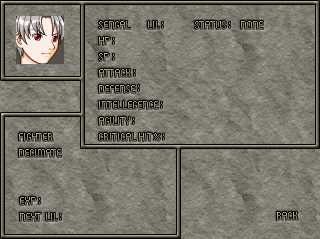
Or this look:

Would be better as a CMS, and I figured I'd ask the people who'll be playing the game the question. Little input pleaze.
Post by: FFL2and3rocks on August 31, 2005, 11:54:27 PM
Post by: charaman on August 31, 2005, 11:58:09 PM
Quote
Originally posted by FFL2and3rocks
I like the second one better. The first one looks a bit plain.
Post by: Pythis on September 01, 2005, 12:08:07 AM
Quote
Originally posted by charaman
quote: Originally posted by FFL2and3rocks
I like the second one better. The first one looks a bit plain.
Post by: Moosetroop11 on September 01, 2005, 01:57:18 PM
Post by: WarxePB on September 01, 2005, 02:04:39 PM
Post by: ZeroKirbyX on September 01, 2005, 08:09:13 PM
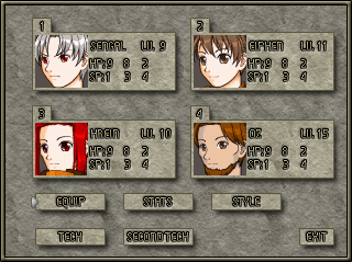
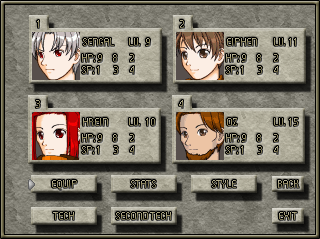
And Warxe, those are just the Party and Status menus. The main menu leads to the party menu which leads to Status.
Post by: coasterkrazy on September 01, 2005, 09:37:55 PM
EDIT: Oh, lol I didnt notice you already made a choice.
Post by: ZeroKirbyX on September 01, 2005, 09:44:08 PM
Quote
Originally posted by coasterkrazy
I think the second one looks nicer. Better shadow effects and that sort of thing.
EDIT: Oh, lol I didnt notice you already made a choice.
Hehe, you can stil lpost your opinions.
Post by: Meiscool-2 on September 04, 2005, 03:24:28 AM
I Like the top part of the first one, and the top part of the second one. The second one's bottom one is over shadowed/shaded if you ask me.
Post by: wildguy3922 on September 04, 2005, 03:40:15 AM
Post by: Dashman on September 05, 2005, 02:54:21 AM