Post by: Ace of Spades on September 11, 2005, 05:32:24 PM
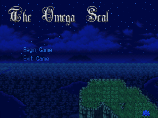
Here's a screen of the custom title. Nothing special really, but I like it. Especially the music in the background, but anyway, you'll notice that it's just an empty cliff, well that changes as the game progresses. For example, once the first intro is done and you play as Ace, Ace is added to the scene. In order to see this though, you have to use the newly added "Exit to Title" option in the Custom Menu. So, here's the screen.
Post by: Ian-TheResourceMaker on September 11, 2005, 06:01:47 PM
Post by: ZeroX5 on September 11, 2005, 06:29:33 PM
Post by: Meiscool-2 on September 11, 2005, 10:41:22 PM
Post by: PyroAlchemist on September 11, 2005, 11:04:56 PM
Post by: AsakuraHao2004 on September 11, 2005, 11:14:03 PM
Edit: I like the idea, but overall it dosent seem right. I mean, if the intro sceene is really important, you wouldn't put it at the game intro. Usually, I just skip over stuff like that, and the
professional" games you speak of dont do that. Sure they might have a little part before the title screen, but they always put the main important intro in the begining. Otherwise you have people that completly missed the concept and started the game with no idea what's going on.
Post by: wavedude101 on September 11, 2005, 11:55:29 PM
Post by: WarxePB on September 12, 2005, 12:38:35 AM
Wavedude: We can't give out specific RM2K/3 links, so go search it on Google.
Post by: ZeroKirbyX on September 12, 2005, 12:49:39 AM
Post by: Ace of Spades on September 12, 2005, 01:59:35 AM
Post by: coasterkrazy on September 12, 2005, 02:06:51 AM
Post by: Hell Angel on September 12, 2005, 02:31:49 AM
But, I'm sure the magician can't reveal his secrets. =P
I'm going to go read the original thread now, so I can comment the game as well.
Edit- No, nevermind. I can't seem to find it. Went all the way to page six or so... Has it been deleted?
Post by: Ace of Spades on September 12, 2005, 02:38:04 AM
Post by: Hell Angel on September 12, 2005, 02:40:42 AM
Post by: Hell Angel on September 12, 2005, 03:09:21 AM
Post by: Ace of Spades on September 12, 2005, 09:40:52 PM

Post by: Hell Angel on September 12, 2005, 09:44:45 PM
He looks much better. Along with the rest, I would not have guessed that the hair was generated.
Post by: ZeroKirbyX on September 12, 2005, 09:45:33 PM
Post by: Meiscool-2 on September 12, 2005, 09:48:14 PM
Post by: WarxePB on September 12, 2005, 10:22:55 PM
Quote
ZKX
I like how is colors are inverted from Ace (black coat, blue shirt instead of blue coat, black shirt). Proves that friend point.
Actually, Ace's shirt is white, but meh.
And thanks for the praise; I think of myself as a crappy spriter, so every bit of appreciation I get is good for my ego ;P
Post by: ZeroKirbyX on September 12, 2005, 10:31:34 PM
Quote
Originally posted by Warxe_PhoenixBlade
quote: ZKX
I like how is colors are inverted from Ace (black coat, blue shirt instead of blue coat, black shirt). Proves that friend point.
Actually, Ace's shirt is white, but meh.
And thanks for the praise; I think of myself as a crappy spriter, so every bit of appreciation I get is good for my ego ;P
Heh, thinkin of his hair.
Eh, I'd like to think I kinda learned from you. I studied your's for form and stuff.
Post by: Al~Len on September 12, 2005, 11:07:27 PM
I wasn't as fond of the original Travis chara. The new one is much more appealing, and still resembles the character well I believe.
Good work. ^_^
Post by: Tomi on September 13, 2005, 11:47:29 PM
Post by: AsakuraHao2004 on September 13, 2005, 11:53:42 PM
Post by: Meoix101 on September 14, 2005, 12:13:00 AM
Set the event on Hero Touch,
Custom Route
Not phasing
Here's what the route should like:
Move Toward Hero
Repeat Action.
Frequency 8
Next, for the event have a move event
It should look like this
Move event : Hero ,Begin Phasing Mode ,Wait ,End Phasing Mode
More or less depending on the version you have.
This way they'll follow you, but you can walk through them if you need to.
Also you have to set this for each follower. With this you can have as many as you want :)
... That Yuna event was funny as heck. You know if you walk through the wall and talk to the girl in the Jail lol. Nice one
Post by: Ace of Spades on September 14, 2005, 01:42:38 AM
Edit: Oh yeah, and to those who thought Travis sucked, and didn't tell me... why didn't you say something? I want my game to be great, and certain things that are crap and could be better I want to be mentioned, constructive criticism helps the game become better. So tell me these things from now on.
Post by: WarxePB on September 14, 2005, 01:46:20 AM
Post by: Meoix101 on September 14, 2005, 01:46:38 AM
Post by: AsakuraHao2004 on September 14, 2005, 02:01:48 AM
Post by: Tomi on September 14, 2005, 02:05:13 AM
Post by: Ace of Spades on September 14, 2005, 02:35:54 AM
Quote
Originally posted by Tomi
Sorry Ace, for not telling you. By the way, do you need the new Travis to have new poses?
Heh, no problem. But yes, I do need new poses for him.
Edit: They shouldn't be too hard though, because he'll mainly have what he had before. (Not as hard because you have a reference, I guess. *shrugs*)
Post by: xJericho on September 14, 2005, 04:50:58 AM
Quote
Originally posted by Ace of Spades
quote: Originally posted by Tomi
Sorry Ace, for not telling you. By the way, do you need the new Travis to have new poses?
Heh, no problem. But yes, I do need new poses for him.
Edit: They shouldn't be too hard though, because he'll mainly have what he had before. (Not as hard because you have a reference, I guess. *shrugs*)
All my pretty poses will be trashed? :yell:
Post by: Ace of Spades on September 14, 2005, 10:22:29 AM
Quote
Originally posted by xJericho
quote: Originally posted by Ace of Spades
quote: Originally posted by Tomi
Sorry Ace, for not telling you. By the way, do you need the new Travis to have new poses?
Heh, no problem. But yes, I do need new poses for him.
Edit: They shouldn't be too hard though, because he'll mainly have what he had before. (Not as hard because you have a reference, I guess. *shrugs*)
All my pretty poses will be trashed? :yell:
<_< ...This was one of the downsides, I felt bad that I made this decision after things were made for him. I'm sorry man, but it was something that needed to be done, even Robotam stated it in his review that Travis was too bland.
Post by: xJericho on September 14, 2005, 03:11:52 PM
I lately took a look a my own charsets,... and some remakes make sence,...
wish you luck with new travis
Post by: Tomi on September 15, 2005, 01:19:47 AM
Post by: WarxePB on September 15, 2005, 01:38:28 AM
Travis wasn't the only charset redesigned. There's a few more, but I won't say who, and I doubt Ace will either, so you'll just have to wait for the next trailer/demo/screenshots.
Post by: dragon11137 on September 17, 2005, 11:23:45 PM
Post by: WarxePB on September 28, 2005, 07:46:09 PM
Screens:
 - The new main menu. Those status things took me 3 days...
 - The partially-completed Equip screen.
The Inventory is going to be similar to Tales of Eternia/Symphonia, with seperate subsecions for each type of item. I don't have a screen of that yet, but I will soon.
Post by: ZeroKirbyX on September 28, 2005, 08:11:08 PM
Post by: WarxePB on September 28, 2005, 08:15:18 PM
EDIT: Or, even better, post it in your own game thread.
Post by: Meiscool-2 on September 28, 2005, 08:21:02 PM
Post by: WarxePB on September 28, 2005, 08:27:08 PM
Post by: Meiscool-2 on September 28, 2005, 08:30:26 PM
Cool. I can't believe I never thought of making pages for my menu. God I feel dumb. I went and scripted a whole damn thing for just having 50 items, and I could've used pages. Meh....
Right. Question for Omega. I don't know if you've answered this before, but do you have like a blacksmith event or salvage expert in your game to make custom items out of?
Post by: Ace of Spades on September 28, 2005, 08:35:30 PM
Post by: wavedude101 on September 28, 2005, 08:39:00 PM
Post by: Meiscool-2 on September 29, 2005, 12:40:23 AM
It involves:
A CBS- only for running into enemies, not for battles and etc.
2 Smiths- One to make items and one to salvage them.
10-20 items
2-7 enemies
Basically, you make groups of enemies that are 'human'. Then, make a script ( I will go over this script if you need me to) that will regulate the ammount of steps you take, then randomly make the human monsters you have appear in any map. (you can turn it off for villages and etc) Then, you'll make another script to have each enemies states increased by 13% for every lvl that your main hero has. That way, you don't have to make needless enemies. Everytime you kill one, make it randomly drop something like a broken shield, dented armor, punctured plates, duled blade, etc. You can then take these usless items to a salvager or blacksmith, and pay him to melt them back down. Then, you can make it randomly give you steel, iron, copper, whatever. Lastly you will make the script for a blacksmith that requires X ammount of Iron, X ammount of Steel, and what have ya to make an Item.
Post by: Ace of Spades on October 01, 2005, 01:32:44 AM
- Flow of Storyline (certain things happened too quickly
- Dialogue (there wasn't much conversation between the heros)
- Character Development (as stated above)
These are the main things that will be worked on. So, that's the major update. The game will be different, maybe not entirely different, but a lot of things will have changed.
Post by: ZeroKirbyX on October 01, 2005, 05:20:52 AM
Post by: Ace of Spades on October 01, 2005, 01:25:13 PM
Post by: WarxePB on October 03, 2005, 02:01:59 PM
And we're also going to be needing a dedicated poser to animate the monsters. But I'll let Ace take care of that.
Post by: Ace of Spades on October 06, 2005, 12:20:48 AM
The Omega Seal Trailer 3.0 (http://savefile.com/files/2479312) This trailer may contain spoilers if you haven't played the game yet. Watch at your own "risk."
Post by: Dragonchick93 on October 06, 2005, 12:34:53 AM
Post by: Linkforce on October 06, 2005, 01:48:56 AM
Post by: SC3K on October 06, 2005, 04:22:32 PM
*Writes Spring 2006 on calender.*
As a newbie to RM2K, I'm speechless.
Post by: Ace of Spades on October 07, 2005, 01:15:25 AM
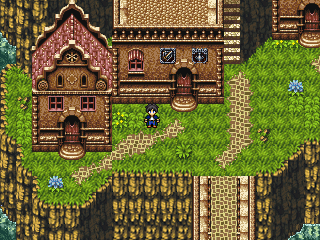
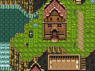
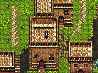
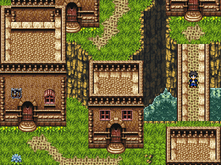
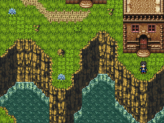
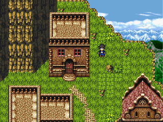
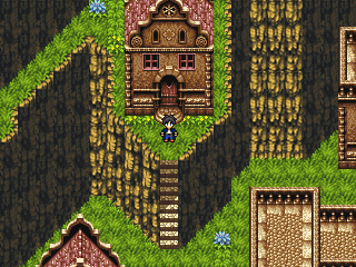
Post by: ZeroKirbyX on October 07, 2005, 01:20:42 AM
Post by: Linkforce on October 07, 2005, 01:51:24 AM
Post by: Ace of Spades on October 08, 2005, 11:43:12 PM
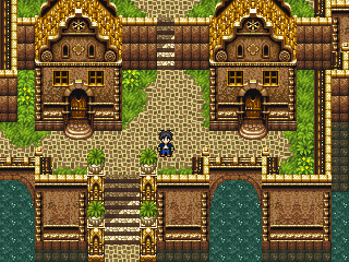
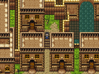
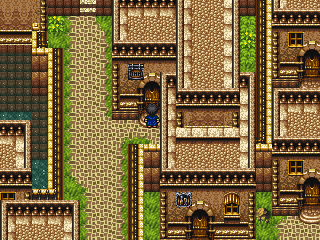
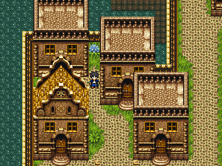
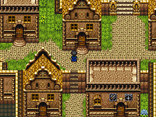
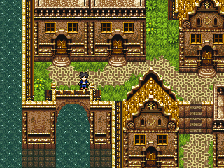
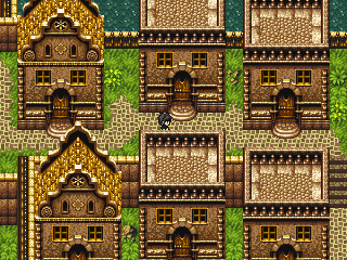
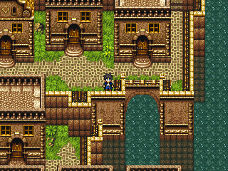
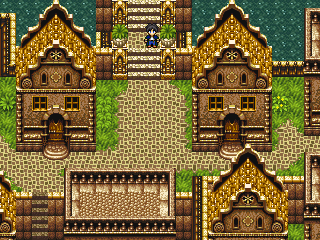
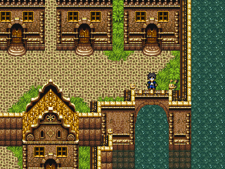
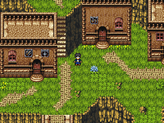
If you want to see a full view of it, just ask.
Post by: ZeroKirbyX on October 08, 2005, 11:52:29 PM
Post by: Ace of Spades on October 08, 2005, 11:56:13 PM

Post by: ipoopedontheroof on October 09, 2005, 12:01:38 AM
Post by: Meiscool-2 on October 09, 2005, 02:28:18 AM
Town 2- quite nice looking. So long as you don't add a whole lot of people to over crowd the town, everything will be good.
Would you mind posting the chipset to the second town? I know I could just search for it, but this way it's easier. I like to edit the Rutra towns, and characters that I will agree with and say they are over used.
Post by: ZeroKirbyX on October 09, 2005, 05:32:37 AM
Post by: Ace of Spades on October 09, 2005, 05:35:23 AM
Quote
Originally posted by Meiscool
Would you mind posting the chipset to the second town? I know I could just search for it, but this way it's easier. I like to edit the Rutra towns, and characters that I will agree with and say they are over used.
Sorry, but no. I'm not going to post the chipset because:
Other people might see the towns, like them, and then want to use the chipset to make their own for the sole purpose of "that looks cool." Which will make it overused, and this is what I'm avoiding. So if they do want to, they can rip it themselves.
Edit: Btw, you can't search for it. You can search for something similar, but it doesn't have half of what I ripped. The chipset I used was things ripped by me, so you won't find it on the net.
Post by: Meiscool-2 on October 09, 2005, 04:28:07 PM
In that case, could you PM it to me, or would you still say that that would be over distrabuction (sp?) ? Anyways, also watched your trailer. Didn't really show a whole lot in my opinion. Half of it was just words popping up. I did however like the little joke in the begining about a Ace and Waraxe game.... made by Ace and Waraxe.
Post by: ZeroKirbyX on October 09, 2005, 04:53:40 PM
Post by: Ace of Spades on October 09, 2005, 05:36:06 PM
Quote
Originally posted by Meiscool
Alrighty then, I guess I can understand that. But, bear in mind that, if you've ever gone on to my thread, those graphics don't go with my game, and I tend to edit them so that they do. When I was done with it, it would basically be a completly new chipset.
In that case, could you PM it to me, or would you still say that that would be over distrabuction (sp?) ? Anyways, also watched your trailer. Didn't really show a whole lot in my opinion. Half of it was just words popping up. I did however like the little joke in the begining about a Ace and Waraxe game.... made by Ace and Waraxe.
Just rip it yourself. And um.. that's not a joke, Warxe is another member of charas who is my partner in making the game.
Post by: Meiscool-2 on October 09, 2005, 11:51:49 PM
Quote
Originally posted by ZeroKirbyX
If it'll be completely new why do you want his?
Because I'm a complete and total newb when it comes to using the internet and computer to do things, thus I don't know how to rip.
And I know that waraxe is part of the team, I just ment it was kinda funny how you repeated yourself. But meh, nevermind.
Post by: ZeroKirbyX on October 09, 2005, 11:55:36 PM
Quote
Originally posted by Meiscool
Because I'm a complete and total newb when it comes to using the internet and computer to do things, thus I don't know how to rip.
I can't tell if that was sarcasm or not...
Post by: Meiscool-2 on October 10, 2005, 12:03:51 AM
Post by: wavedude101 on October 10, 2005, 12:54:16 AM
Post by: Meiscool-2 on October 10, 2005, 01:05:55 AM
Quote
Originally posted by wavedude101
you should send ur game to nintendo!! that would be cool!
XD
Post by: Ace of Spades on October 10, 2005, 03:24:43 AM
Quote
Originally posted by wavedude101
you should send ur game to nintendo!! that would be cool!
XD!!! Nah, they'd just steal the game and say they made it. :p
Post by: SaiKar on October 10, 2005, 10:45:06 AM
Post by: Meiscool-2 on October 10, 2005, 07:27:10 PM
Quote
Originally posted by Ace of Spades
Meiscool, ripping is easy. You don't need special programs or anything. You just download the game, open it up, hit Print Scrn SysRq, paste the screen in MSpaint, and go from there.
Ok, thanks. I'll try that then.
Post by: Bluhman on October 10, 2005, 07:30:01 PM
Quote
Originally posted by SaiKar
I really love the "city on the water" thing you've gone with Calathia.
Me too. Reminds me strongly of a very dumbed down version of Vivec (http://www.rpgplanet.com/morrowind/mpg/images/rahuu/vivec.jpg)
Post by: Meiscool-2 on October 10, 2005, 07:39:02 PM
Quote
Originally posted by Bluhman
Me too. Reminds me strongly of a very dumbed down version of Vivec
Hmm, I would say it looks more like Balmora (sp? It's the seoncd biggest town in morrowind) then Vivec.- Title:
Post by: Bluhman on October 10, 2005, 07:40:45 PM
quote: Originally posted by Bluhman
Me too. Reminds me strongly of a very dumbed down version of Vivec
Hmm, I would say it looks more like Balmora (sp? It's the seoncd biggest town in morrowind) then Vivec.
Well I know it definetley remids me of one of those cities. Balmoras built around a river, not on a big body of water, but ok.- Title:
Post by: Meiscool-2 on October 10, 2005, 07:47:08 PM- Yeah, but Vivec is the one with the big domes that is entirely on water. Balmora is the one with all the square buildings that has the big river flowing under it. I just think it looks more like Balmora because of the buildings and streets. Vivec's buildings were like towers with small rooms inside that represented the various buildings and such.
But meh, here I am off topic again.... um.... great looking game so far.- Title:
Post by: Moosetroop11 on October 10, 2005, 08:28:47 PM- The towns look reeeal purdy. Melikey :)
- Title:
Post by: Ace of Spades on October 10, 2005, 09:26:41 PM- Heh, thanks for the compliments. I don't know what either of those places are, but don't worry it's not off topic. You're talking about the town, which is a part of my game. :)
- Title: Updatez0rs
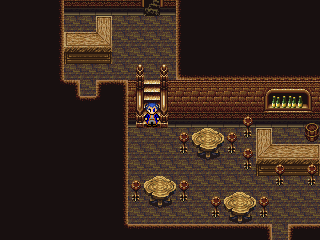
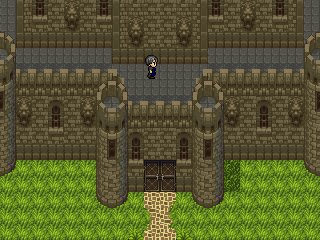
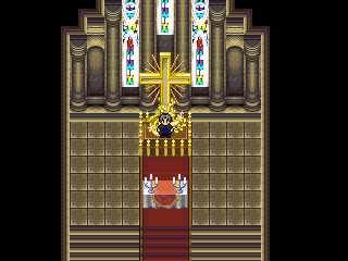
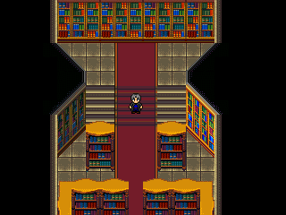
Post by: Ace of Spades on October 20, 2005, 07:42:18 PM- T3H MAP REMAKING IS DONE!11!!!!1! ...<_<
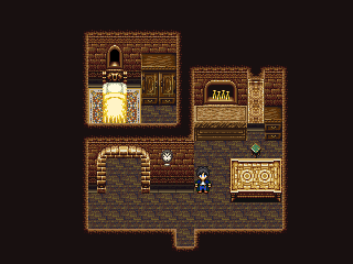
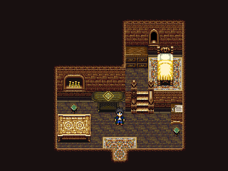
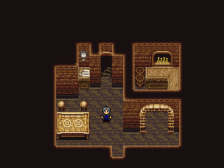
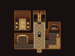
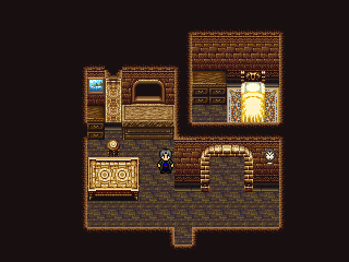
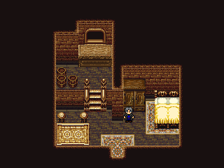
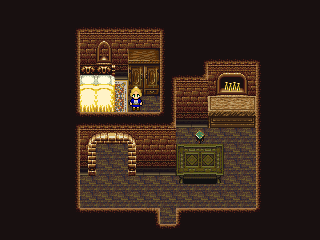
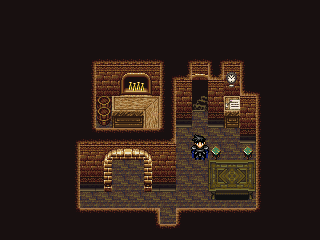
Well, actually, I was done like, 4 days ago. But anyway, yep, I'm done with the map remaking. Didn't take as long as I thought it would, but there's no longer Mack and Blue in the game. So, nothing much else to say, so here's some screens of the new remade maps. Tell me what ya think! ^^
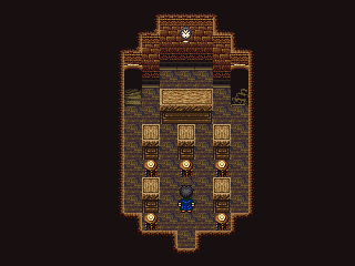
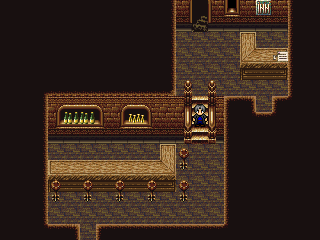
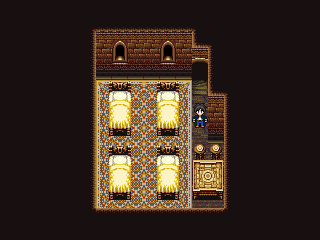
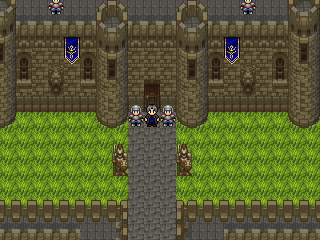
- Shurmer - Ace's House
- Shurmer - Travis' House
- Shurmer - Annie and Mark's House
- Shurmer - Joe and Marian's House
- Shurmer - School (There is no longer a church in Shurmer, religion is taught through
school.)
- Shurmer Inn/Pub
- Shurmer Inn - Room
- Trazunia Castle (I ripped the clean nature version because the polluted environment one doesn't look as nice (I'm talking about Treasure of the Rudras if you don't know))
- Inside of a Calathian Residence
- Another Calathian Residence
- Another Calathian Residence
- Last Calathian Residence
- Calathian Inn/Pub
- Calathia Castle (similar to Trazunia Castle in this view, but enlarged there's a difference, so don't worry)
- Calathia Cathedral Chaple
- Calathia Cathedral Library (With a book puzzle included ;))- Title:
Post by: SC3K on October 20, 2005, 09:46:50 PM- Wow! You really have excellent ripping skills!
Well, it looks really good so far. I like how all of the maps have a certain...Glow, to them.
It's looking great!- Title:
Post by: maxine on October 22, 2005, 09:36:59 AM- ive always admired your game mate.. Wish you all luck with it :D
- Title:
Post by: Moosetroop11 on October 22, 2005, 12:55:13 PM- Looks better than ever. One of the few games I will be bothered to download.
- Title:
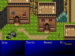
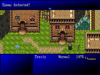
Post by: Ace of Spades on October 28, 2005, 10:05:46 PM- Just a couple screenshots of Travis' new battle char in battle. Thanks to InsaneJP for the battle charset!!!
- Attacking
- Victory Pose: Crossing arms with head down and eyes closed. (I love it! ^^)
Oh, and right now I'm currently typing out my game. Basically, I'm typing everything that happens in the game except for dialogue. I'm still at the beginning, almost middle and there's already 11 pages typed out. The new demo will be a lot different than the others. A LOT different. ;)- Title:
Post by: Ian-TheResourceMaker on October 28, 2005, 10:24:22 PM- Pretty good.
- Title:
Post by: Linkforce on October 28, 2005, 10:32:34 PM- Cool screens. ^_^ Btw, how do you get it so your Battle Backround looks just like the actual place you're fighting?
- Title:
Post by: SaiKar on October 28, 2005, 10:41:19 PM
Cool screens. ^_^ Btw, how do you get it so your Battle Backround looks just like the actual place you're fighting?
You have to be sneaky. You take a specially made screenshot of the playing the game without the hero or any people in it, then crop it to be the right size and put it as the battle background.
Anyway, very promising updates. Good that you're writing out the script. I still like the old Travis better, but I guess I'll get used to it.- Title:
Post by: Leon_1990 on October 28, 2005, 10:42:39 PM- Damn!, just when I thought I was the only one with a decent Rudra town chipset! lol
@Linkforce: he takes a screenshot of the map, and omports it as a battle BG- Title:
Post by: Ace of Spades on October 29, 2005, 02:15:15 PM- Just a note to those who do want to just use the real place that you're fighting in as a background. In rm2k3, you can't switch the position of where your heroes are in the battle layout. So in every background, you'll have to make sure the heroes/monster isn't standing on a building/cliff/tree/big rock/water/water fall, you get the picture. However, since Warxe is putting a CBS in the game, I can switch where they are for each one so that there's no background interference with the character's positions.
Thanks for the comments though. ^^
Leon: XP- Title:
Post by: InsaneJP on October 29, 2005, 06:50:52 PM- ok ok i had to mak an appearance soo here i amm.....i like how its going Ace and i hope when i come back that me and you can work together some more to help me with my own game....games looks promising keep it up!
- Title:
Post by: xJericho on October 30, 2005, 07:13:01 AM- <----- me, too
- Title:
Post by: Ace of Spades on October 30, 2005, 04:17:41 PM- Heh, thanks guys, I do as well. ^^
- Title: t3h g4m3 is not d34dz0rs
Post by: Ace of Spades on November 14, 2005, 09:08:30 PM- Been a couple of weeks, eh? Well, there's no update, I haven't been working on the game in a while because I'm typing out the game still. It's been about 2 weeks, filled with great ideas, constant typing as well as the dreadful writer's bl0cks. Yes... I've had many of those. x_x Anyway, I'm just replying so that you guys know the game isn't dead. The story is 22 pages now, without dialogue that is. With dialogue I wouldn't be surprised if it were almost 100. I think I'm about in the middle of the middle of the story. I have a couple people reading it as I go, and they really like the new story. They say it's a vast improvement on the previous version, and that they're hooked into it and want more. One of them is a senior member, as well as a moderator of GamingW, and if you've been there, you'd know that they're hard to please when it comes to game making, and story making in general. Which means that's a good sign! :) So hopefully I won't have as many writer's blocks, and I can finish the story soon so I can get back to work on the actual game making. And for those who don't know, if you played the 1rst and 2nd demos I released, just scrap pretty much everything you remember from them, because most of it has changed. This means that the next demo I release will be the first demo. That's all for now. ^^
- Title:
Post by: Leon_1990 on November 14, 2005, 09:38:17 PM- Thats great to hear Ace ^_^
- Title:
Post by: Meiscool-2 on November 14, 2005, 09:42:19 PM- 22 pages en? I've got a book myself, and know it takes a lot of time. Keep at it!
So.... gonna give us any excerpts of the book, like your favorite chapter or something?- Title:
Post by: Ace of Spades on November 14, 2005, 09:47:09 PM- Heh, well I'm not really typing it out like a book, seeing as there's no dialogue. Basically, I'm typing out what happens in the game, mainly as a guidline for me when I'm making the game, so that I don't forget things, and also so I don't have to come up with main ideas as I go. Anyone is free to read it, but obviously it'll spoil the game for them if they read the whole thing.
- Title:
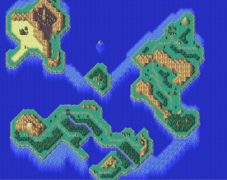
Post by: Ace of Spades on November 26, 2005, 11:29:37 PM- Well everyone, I'm done with the story. I dusted the rpg maker off and have gotten back to work. The first thing I did was make a world map. It's ok, nothing too good. I suck at making world maps, but anyway here it is.
Like I said, nothing special. Hopefully I can still get a demo out by my planned release date, which is Spring 06. With my whole story typed out, I have a guideline as to what I'll be doing so hopefully writer's blocks won't be an issue. Anyway, that's all for now. I'll be sure to keep you guys updated with new screens and such, so check back every now and then. ^^- Title:
Post by: InsaneJP on November 26, 2005, 11:37:35 PM- Ace that chipset you used is great! ....the map is really really good i like how the water works the most....keep us updatedd
- Title:
Post by: coasterkrazy on November 26, 2005, 11:46:29 PM- I have my eye on that sunken pyramid in the north... Looks great!
- Title:
Post by: Bluhman on November 27, 2005, 12:00:41 AM- Looks a little awkward in the mountains, but other than that, it looks awesome.
- Title:
Post by: kelpie on November 27, 2005, 12:06:42 AM- cool map ace, i like how it looks :) the lighter part of the water means its shallow..right?
- Title:
Post by: Ace of Spades on November 27, 2005, 12:12:46 AM- Heh, wow. I didn't think it was that good. But yeah, the mountains are kind of weird. That happens with like every world map chipset I get my hands on. :( But those lighter areas are actually like, underwater "mountains" and such. There was no light water and then dark water on this chipset which kind of stinks, but oh well. Thanks for the compliments. ^^
- Title:
Post by: Rune_of_Punishment on November 27, 2005, 02:49:41 AM- The rocky stuff can pose as the shallower water. It works. Pretty map.
- Title:
Post by: InsaneJP on November 27, 2005, 07:57:44 AM- Heres your phoenix down!!! i kno you like this drawing i just did! lol
- Title:
Post by: Ace of Spades on November 27, 2005, 08:00:29 AM- XD What's this, more fanart I see? Nice job, it's sw337 dude. I shall add this to my fanart page too! ^^
- Title:
Post by: Leon_1990 on November 27, 2005, 09:36:05 AM- Ah, sweet world map ^^
too bad the mountain set it sctrewed up for it (Trust me, Ian made me use it for his world map :x ).
It's great to see some progress after all this time ^^ lol- Title:
Post by: ZeroKirbyX on November 30, 2005, 11:47:12 PM- Small world map....
- Title:
Post by: Ace of Spades on December 01, 2005, 12:23:45 AM- 1, 2, ready, GO! *starts singing It's A Small World Afterall*
- Title:
Post by: Shady Ultima on December 01, 2005, 12:31:06 AM- *Shoots Ace of Spades*
Never sing that song!
Anyways, I've been keeping an eye on your game, and played the old demo and thought it was pretty well done. So I'm definately looking forward to the next demo- Title:
Post by: Meiscool-2 on December 01, 2005, 02:16:45 AM- Map:
Cons-
Small
The mountains both above land and below need to be fixed badly
The world map looks like a link from town to town and nothing other. I mean, that's what they are for, but yours looks so small that it would rarely be used.
Pros-
It's good looking
Looks natural
Just a question, but have you considered a picture map, something like in Illusion of Gaia?- Title:
Post by: Ace of Spades on December 01, 2005, 08:33:14 PM
Map:
Cons-
Small
The mountains both above land and below need to be fixed badly
The world map looks like a link from town to town and nothing other. I mean, that's what they are for, but yours looks so small that it would rarely be used.
Pros-
It's good looking
Looks natural
Just a question, but have you considered a picture map, something like in Illusion of Gaia?
I can't do anything about the mountains, and I know it's small. The path things make it look better, it's too empty without them. And I never considered the picture map, because certain things happen on the world map that couldn't really be shown well on a picture map. I considered doing a FF6/Tales of Phantasia type world map, but that's way too complicated.- Title:
Post by: Meiscool-2 on December 01, 2005, 08:36:28 PM- Hmmm, yes. You yourself said you're not very good at coding. But, an FF6 map is very possible, if you need to know how to code it I'm sure waraxe could help you, or I can do it for you.
As to the chipset, can't you edit it or try ripping the same set from that game?- Title:
Post by: Ace of Spades on December 01, 2005, 08:53:43 PM
Hmmm, yes. You yourself said you're not very good at coding. But, an FF6 map is very possible, if you need to know how to code it I'm sure waraxe could help you, or I can do it for you.
As to the chipset, can't you edit it or try ripping the same set from that game?
Well, every chipset I've found that contains the mountains from that game has the same problem. I'm guessing that the way they were made in the actual game itself were put together differently. So there's really nothing I can do about it. And about the FF6 map, yeah he and I both discussed it, but it's not really coding that's the problem, it's the fact that you have to make the whole map graphic yourself, from scratch. So we figured it wasn't really worth the time.- Title:
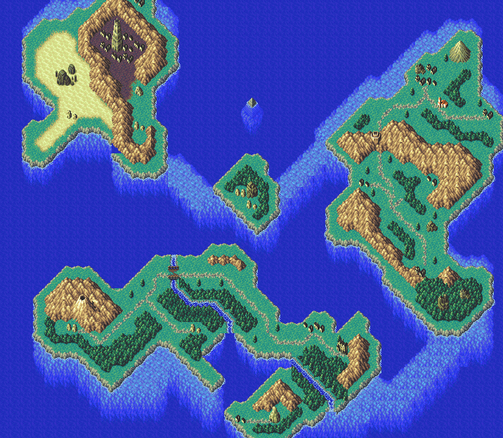
Post by: Ace of Spades on December 02, 2005, 01:54:25 AM- Well, I redid the mountains the best I could. It looks better to me, but what do you guys think?
- Title:
Post by: Shady Ultima on December 02, 2005, 04:01:48 AM- Looks sweet (I want that chipset!)
- Title:
Post by: ZeroKirbyX on December 02, 2005, 05:04:26 AM- MUCH better.
- Title:
Post by: Leon_1990 on December 02, 2005, 04:50:28 PM- Nice, but I see a flaw in the north-west continent.
theres a blue chip on it 0_o- Title:
Post by: Red Fox on December 02, 2005, 05:10:51 PM- Hardc0re! Nice world map it's great.
- Title:
Post by: Meiscool-2 on December 02, 2005, 08:19:16 PM- Much better. And yeah... what Leon said.
- Title:
Post by: Ace of Spades on December 02, 2005, 08:45:25 PM
Much better. And yeah... what Leon said.
Yeah, I knew it was there just forgot to mention it. I was just showing the mountain, but since the continent border and mountain are both second layer chips, I couldn't do both. In the game, the mountain will be an event. Thanks though, I'm glad it's better. ^^- Title:
Post by: Ace of Spades on December 06, 2005, 08:36:15 PM- I've incorporated a custom message box into the game. Thanks goes to gamerman for making it and then DragonBlaze for doing some editing. Also, ZeroKirbyX for the faces that will be attached to the boxes. So, what do you guys think?

- Title:
Post by: coasterkrazy on December 06, 2005, 08:46:35 PM- I like the look of the new message system!
- Title:
Post by: Moosetroop11 on December 06, 2005, 09:13:28 PM- Coolness. And nice world map, though there won't be much 'exploration' going on there...
- Title:
Post by: Meiscool-2 on December 06, 2005, 09:49:00 PM- HAHA! cool, I've only seen one other game done with rpgmaker that had a custom message system, so that's a pretty good idea to do. My only complaint is that his face doesn't make him look as young as your character is supposed to be, and that you have a small line in the upper left of the box that shows the sceen behind it. Doesn't look to good to me in my opinion when it's only showing one line.
- Title:
Post by: DragonBlaze on December 06, 2005, 10:16:28 PM
My game has a custom message system :D, but it doesn't look as good as this one. :p
Anyway, it looks really cool ace, I like your idea of making the background transparent but the border still solid :)- Title:
Post by: ZeroKirbyX on December 07, 2005, 12:09:16 AM- Do you use like a transparent blue bg for the text and have the separate borders as pictures?
- Title:
Post by: DragonBlaze on December 07, 2005, 12:36:34 AM- I can answer this one :)
He uses two images, one is the border, and one is the blue background. The blue background is desplayed transparent, while the border picture isn't.- Title:
Post by: drenrin2120 on December 07, 2005, 12:43:43 AM- THe whole thing kicks *** man. Like, i love the screenshtos you put up, they're so.... god! idk, just awesomely done.
- Title:
Post by: InsaneJP on December 09, 2005, 06:04:04 PM- hey man that text box looks great!!! im loving how ya games comin along....keep up the good work!
- Title:
Post by: Linkforce on December 09, 2005, 06:43:53 PM- Looks great. I like where your game is going. ^^' But I have to agree with Meiscool. The face makes him look much older than he is supposed to be.
- Title:
Post by: Ace of Spades on December 09, 2005, 08:05:09 PM- Hmm, alright since I've gotten a few remarks that Ace looks older than what he is, I'm upping him 1 year, so now he's 17 not 16. That better?
- Title:
Post by: Meiscool-2 on December 09, 2005, 09:18:38 PM
Hmm, alright since I've gotten a few remarks that Ace looks older than what he is, I'm upping him 1 year, so now he's 17 not 16. That better?
LOL, whatever you want man. But, with the abundence of FE faces out there, I think you can find a younger one. Try this site: http://feplanet.net Look in the 'sprites' section.- Title:
Post by: Ace of Spades on December 09, 2005, 10:42:55 PM
quote: Originally posted by Ace of Spades
Hmm, alright since I've gotten a few remarks that Ace looks older than what he is, I'm upping him 1 year, so now he's 17 not 16. That better?
LOL, whatever you want man. But, with the abundence of FE faces out there, I think you can find a younger one. Try this site: http://feplanet.net Look in the 'sprites' section.
Thanks, but ZeroKirbyX did my facesets and I don't want to not use it. So I'll just either make him 17 or just say he looks old for his age. ^_^- Title:
Post by: Meiscool-2 on December 09, 2005, 10:50:17 PM- Lol, you don't have to worry about ZeroKirby getting mad, he's the one that gave me that site to give to other people looking for FE stuff.
- Title: New Site
Post by: Ace of Spades on January 15, 2006, 12:20:30 AM- Been a while since I posted in here, eh? Anyway, I made a new site with an html editor called Dreamweaver. Right now there's nothing really updated yet, but I like it a lot better than my old crappy freewebz site. Freewebz is still my host for this one except I didn't use the freewebz site builder to do this, so it's more custom. Special thanks to DragonBlaze and Shino for helping out on this, I probably couldn't have done it without you guys. So, that's about all I have to say. Check it out and tell me what ya think! ^_^
The Omega Seal New Website (http://www.freewebs.com/omegasoft/index.html)- Title:
Post by: Tomi on January 15, 2006, 01:16:43 AM- Whoa, awesome site, dude.
- Title:
Post by: drenrin2120 on January 15, 2006, 01:56:18 AM- very nice site dude.
- Title:
Post by: coasterkrazy on January 15, 2006, 02:09:34 AM- Fantastic site dude. Seriously, it is cool.
- Title:
Post by: DragonBlaze on January 15, 2006, 03:30:58 AM- That site looks a bit familuar, :p, anyway, its a sweet site :)
- Title:
Post by: coasterkrazy on January 15, 2006, 03:56:48 AM- I knew I saw that layout before!
- Title:
Post by: Linkforce on January 15, 2006, 04:49:39 AM- Sweet site. I like how things are coming out. Keep it up! ^^
- Title: The New OS Battle System
Post by: WarxePB on January 15, 2006, 05:31:34 AM- As Ace said, a completely new CBS is currently being developed for OS. Our idea for this is somewhat unique, and will probably be disliked by some people, but both me and Ace have agreed that the story should take precedence over battles.
The basic premise:
In most battle systems, you directly control the hero/es, making them attack, use skills, and the like. Well, in the OBBS (Order-Based Battle System), there's none of that. Instead, a global command is issued to the party, and they act based on what you told them.
There are three types of commands - Attack commands, Defense commands, and Other commands. Attack commands have options such as Attack Strongest, Attack Same, and the like. As well, you can choose to use regular attacks, the most powerful techs the party possesses, or the most effective attacks.
Defense commands include defensive maneuvers like Defend, Heal with Items, Escape, etc. Other commands are battle-specific, so revealing any of the planned ones would be spoilers.
After the heroes have acted, the enemies act. After both sides have acted, total damage from both sides is calculated. If the heroes have doen more damage than the enemies, the battle is "won", and they gain experience, money and items. If the enemies have done more cumulative damage than the heroes, another command is issued to the heroes, followed by another enemy turn, until the damage dealt by the heroes is more than the enemies. Boss battles don't end until either side is defeated.
That's the gist of it, anyways. Comments? Suggestions? "Th15 B4TT13 S7ST3M SUXX00RZ!!!!!11!!111"?- Title:
Post by: blaze_shinigami on January 15, 2006, 05:35:09 AM- something like ogre battle?
- Title:
Post by: WarxePB on January 15, 2006, 05:38:39 AM
something like ogre battle?
Hmm, I didn't think of that. Yeah, it is kinda similar to the Ogre Battle games. Although, if I remember correctly, the parties attack based on their rows, and not by commands.- Title:
Post by: DragonBlaze on January 15, 2006, 05:57:28 AM- I'll be honest, I don't think I'll like how that battle system works. A big thing I like about rpg battle systems is the ability to command each character and form a stratagy of your own. Sometimes if I'm stuck with a 'bad' character, I'll set them back and defend with them, and then I'll also use them to heal characters that are injured, meanwhile I'll have another character attack, and yet another character may be doing something else. If you have one general command for the whole party, you can't really indevidualize moves and stratagies.
Also, I'm not to fond of the idea that you'll win if you deal more damage than the monsters in one turn. Sometimes there needs to be monsters that you just have to wack at again and again and again to defeat. Dealing more damage in one turn shouldn't be enough for the party to win.
I guess I really won't know how the battle system will be until I actually try it out though.
QuoteOur idea for this is somewhat unique, and will probably be disliked by some people, but both me and Ace have agreed that the story should take precedence over battles.
Although the story is more important than the battles, the battles are very important, and add a LOT to the gameplay. EVERY aspect of a game needs to be great in order to have a great game, its what seperates most good games from great games.- Title:
Post by: Celius_401 on January 15, 2006, 03:54:59 PM- Good site.
- Title:
Post by: WarxePB on January 15, 2006, 06:45:48 PM
Yes, but what about those random battles in dungeon Y wher you just keep hitting Attack to defeat the group, with no real strategy needed? That's what this system is developed for.QuoteAlso, I'm not to fond of the idea that you'll win if you deal more damage than the monsters in one turn. Sometimes there needs to be monsters that you just have to wack at again and again and again to defeat. Dealing more damage in one turn shouldn't be enough for the party to win.
Again, the random battle example. A lot of time is wasted in RPGs by fighting random monsters who just won't die (ie. keep respawning every 5 seconds). With this system, if you get stuck in a tough encounter, you can just attack the weakest enemy and get it over with, even if you don't get the exp and money you would get otherwise. And there are planned features that will differentiate bosses and major enemies from regular battles.QuoteAlthough the story is more important than the battles, the battles are very important, and add a LOT to the gameplay. EVERY aspect of a game needs to be great in order to have a great game, its what seperates most good games from great games.
You have a good point. But as you said,QuoteI guess I really won't know how the battle system will be until I actually try it out though.- Title:
Post by: Meiscool-2 on January 15, 2006, 06:56:28 PM- Well, ace told me about the battle system over MSN, and I think meh of it. It sounds like he's trying to shorten battles because he doesn't like them, but he has to remember that games don't have just plot, they need a strong source of gameplay to go with.
- Title:
Post by: Ace of Spades on January 15, 2006, 07:10:38 PM
Well, ace told me about the battle system over MSN, and I think meh of it. It sounds like he's trying to shorten battles because he doesn't like them, but he has to remember that games don't have just plot, they need a strong source of gameplay to go with.
Actually, I was originally going to have no battles at all. Gameplay isn't just battles though.- Title:
Post by: Meiscool-2 on January 15, 2006, 07:12:57 PM
quote: Originally posted by Meiscool
Well, ace told me about the battle system over MSN, and I think meh of it. It sounds like he's trying to shorten battles because he doesn't like them, but he has to remember that games don't have just plot, they need a strong source of gameplay to go with.
Actually, I was originally going to have no battles at all. Gameplay isn't just battles though.
Ok, what is your gameplay then, watching it like it's a movie?- Title:
Post by: Ace of Spades on January 15, 2006, 07:25:10 PM
quote: Originally posted by Ace of Spades
quote: Originally posted by Meiscool
Well, ace told me about the battle system over MSN, and I think meh of it. It sounds like he's trying to shorten battles because he doesn't like them, but he has to remember that games don't have just plot, they need a strong source of gameplay to go with.
Actually, I was originally going to have no battles at all. Gameplay isn't just battles though.
Ok, what is your gameplay then, watching it like it's a movie?
Um, no. The actual game. Dungeons, puzzles, that kind of stuff. Games don't need battles to make it good. There's a game called Sunset over Imdahl that didn't have battles and it was a great game. But, it's not like there aren't any battles in this. Basically, non-boss battles are pointless. I mean, seriously, since when does a rabbit, bird or other animal attack you when you're just walking around in a forest? Maybe things like ghosts, wolves and bears, but most encounters are stupid. That's why we're going to focus on boss battles, because they're the only important ones.- Title:
Post by: drenrin2120 on January 15, 2006, 07:27:53 PM
quote: Originally posted by Meiscool
quote: Originally posted by Ace of Spades
quote: Originally posted by Meiscool
Well, ace told me about the battle system over MSN, and I think meh of it. It sounds like he's trying to shorten battles because he doesn't like them, but he has to remember that games don't have just plot, they need a strong source of gameplay to go with.
Actually, I was originally going to have no battles at all. Gameplay isn't just battles though.
Ok, what is your gameplay then, watching it like it's a movie?
Um, no. The actual game. Dungeons, puzzles, that kind of stuff. Games don't need battles to make it good. There's a game called Sunset over Imdahl that didn't have battles and it was a great game. But, it's not like there aren't any battles in this. Basically, non-boss battles are pointless. I mean, seriously, since when does a rabbit, bird or other animal attack you when you're just walking around in a forest? Maybe things like ghosts, wolves and bears, but most encounters are stupid. That's why we're going to focus on boss battles, because they're the only important ones.
You got a point, I think you should for the ogre battle system. I played that once, it wasn't as bad as you think. It was different and fun. In this day and age of gaming, you need more than just fun, you need different.- Title:
Post by: DragonBlaze on January 15, 2006, 07:49:34 PM
Hmm, well the thing about sunset over imdahl, is that the plot itself didn't have any fighting in it, so there was no need for a battle system, until the very end that is. I'm guessing you're plot will have quite a bit of fighting, so you'll need a good battle system to show that aspect of the game.
The only part in a game where you get attacked by rabits and other animals like that is in the way begining so you're not fighting demons or something right off the bat. And a lot of times you're the one hunting/attacking the animals.
QuoteAgain, the random battle example. A lot of time is wasted in RPGs by fighting random monsters who just won't die (ie. keep respawning every 5 seconds). With this system, if you get stuck in a tough encounter, you can just attack the weakest enemy and get it over with, even if you don't get the exp and money you would get otherwise. And there are planned features that will differentiate bosses and major enemies from regular battles.
I think the differant stratagies and what not for differant enemy groups is a really good idea :) It takes away from the 'press the spacebar and win' battles that are seen too frequently in a lot of games.
If you're worried about battles taking up too much time, or battles being too frequent, that can happen with any battle system. The only way it can be solved is if you set up the enemy encounter rate and the monster stats well. And if there is a battle where you just need to get away from, attacking the weakest one doesn't make too much sence. Even if you would kill the weakest enemy, there are still one or two harder ones there fighting you. If there would be a battle that you just had to get away from, just run.
Well I stated my opinions, I'm not going to try and push them anymore :p, at least not until I see it in action. Its nice to see an original battle system and all, I'm just worried that it could take away from a great game.
Anyway, good luck, I'll be interested on how this battle system turns out.- Title:
Post by: Ace of Spades on January 15, 2006, 08:00:27 PM
Well, if this happens then by all means we'll most likely change it. But we won't know this until we try, so there's no sense in arguing about it now.- Title: this game
Post by: dark-virus on January 15, 2006, 09:30:14 PM- i am really looking farword to this game.
- Title:
Post by: DragonBlaze on January 15, 2006, 10:48:26 PM
quote: Its nice to see an original battle system and all, I'm just worried that it could take away from a great game.
Well, if this happens then by all means we'll most likely change it. But we won't know this until we try, so there's no sense in arguing about it now.
Lol, I never thought about that :p. If thats the case, go for it and see how it turns out :)
Question, have you started programming the battle system at all yet? Or is it still in the planning stages?- Title:
Post by: WarxePB on January 16, 2006, 12:17:10 AM- I'm about 70% done the core system (monster AI, algorithms, techniques, etc). I still need to code in all the monsters and their AI, most of the commands, and a couple of other things. I can't get any screens yet, because I'm not on the right computer, but I'll post some as soon as I can.
- Title:
Post by: Ace of Spades on February 11, 2006, 04:12:42 AM- Ok, for like the past week and a half I've been mapping a very large forest. I've finally finished the forest, so now I want you guys to see it. These are just map screens, the actual game screens will come later in a less amount. By this I mean, animals, fog effects, overlays, etc. are not in it, it's just the actual forest map. Since there are 30 screens (I could've taken plenty more, but I figured this was enough), I'm not going to post all of them, instead I zipped them up. So, if you wanna take a gander at the new Variun Forest, here's the link. Variun: The Immortal 152 X 80 Forest (http://www.savefile.com/files/1206959)
I put a lot of time and hard work into this, and I'm pretty happy with the final result. I hope you guys like it as well. Tell me what ya think. ^_^- Title:
Post by: Linkforce on February 11, 2006, 04:22:44 AM- Nice forrest. You can tell that alot time was put into it. >_> XD
It looks real good. Looking forward to see it with all the events and such. ^^- Title:
Post by: coasterkrazy on February 11, 2006, 04:30:23 AM- Looks great, man. Looking forward to the demo still!
- Title:
Post by: DragonBlaze on February 11, 2006, 05:07:09 AM- Over 2 mbs :o I'll take your word for it that its immortal, I don't feel like taking 15 minutes just to look at your screen, damn dial up.
Anyway.. Nice map, good job, keep it up :p- Title: First post in a long time.
Post by: Nandez on February 11, 2006, 06:36:38 AM- I gotta say your a very beatiful map designer they look great.
- Title:
Post by: drenrin2120 on February 11, 2006, 03:22:10 PM- Wow, very nice ace. It's massive.
- Title:
Post by: Desimodontidae on February 11, 2006, 03:55:56 PM- Man, I so just downloaded them. Awesome screens right there
- Title:
Post by: Meiscool-2 on February 11, 2006, 03:59:05 PM- You already know my opinion, but I'll say it here anyways.
Very nice. I enjoy the maze-like mapping you've got going on there.- Title:
Post by: Ace of Spades on February 14, 2006, 01:31:10 AM- Thanks for all the comments guys! I'm glad you like the new Variun. ^^
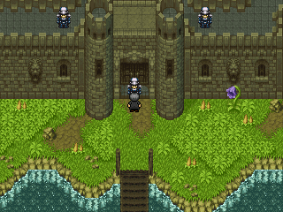
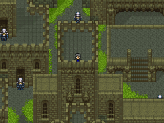
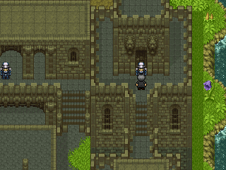
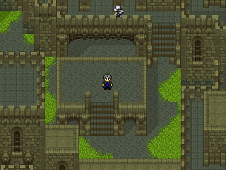
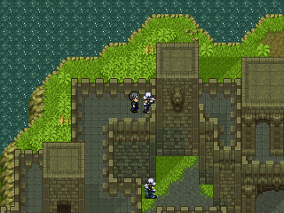
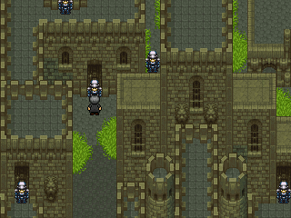
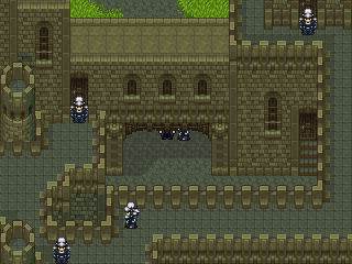
Anyway, I have some more screens to show. After remaking Variun Forest, I needed to make Trazunia Castle have a forest setting, not a mountain one like the previous. So I did a lot of editing to chipsets and then remade the whole thing because the old one sucked. Now, I know there's probably similarities between the two, but rest assured this one is different, and better as well. (Well at least I think so.) My goal for this one was to make it more connected, have less gaps within it and of course, have it in a forest setting so it actually does look like you access it through Variun Forest. It may not look too foresty because, well, there are no trees. <_< This was unavoidable though, because the chipset was already too full for me to put trees in, and there was nothing "not needed" in the chipset that I could remove to accommodate them. I might make some trees out of charsets, but I'll do that later if I do. :p Anyway, enough babble, here's the screens. ^^
As always, comments and criticism are welcome. ^_^- Title:
Post by: Tomi on February 14, 2006, 01:42:32 AM- Very cool. Great job!
- Title:
Post by: Meiscool-2 on February 14, 2006, 02:04:03 AM- Ya know, I don't think I've ever seen a fortress/castle look quite that good before.
- Title:
Post by: Fortet on February 16, 2006, 09:10:30 PM- Reminds of that one town in "The Way." Pretty good!
- Title:
Post by: Rune_of_Punishment on February 16, 2006, 10:20:57 PM- If you mean Estrana, nope. Estrana is MUCH larger than that. It reminds me of that one fort in Episode 2.
- Title:
Post by: Nandez on February 16, 2006, 11:00:41 PM
If you mean Estrana, nope. Estrana is MUCH larger than that. It reminds me of that one fort in Episode 2.
Yeh thats nothing like Estrana Estrana is HUUUUUUUUUGE.
Long Live The Way!- Title:
Post by: Fortet on February 17, 2006, 02:24:23 AM- I kept getting lost in Estrana. XD Keep it up, Ace! :D
- Title:
Post by: xJericho on February 17, 2006, 07:30:07 AM- I'm still loving it
- Title:
Post by: Ace of Spades on February 26, 2006, 02:37:38 AM- Thanks for all the responses guys! I'm glad you like the new Trazunia Castle as much as I do. :) On another note, I made a song! ^^ Yeah, I know, since when did Ace make music? Well, I never did really. My dad got a midi controller the other day though, and has programs (not like Noteworthy Composer type thing, more professional) so I figured I'd give it a shot. This is the first song I've ever made, I decided to make a battle theme for the game. So, that's about it really. Once again, this is my first try at making a song, so I know it's not perfect. I'm rather pleased with the results though. Hope you guys like it! ^_^
OS- Battle (http://www.savefile.com/files/2359032)- Title:
Post by: Meiscool-2 on February 26, 2006, 03:09:58 AM- it's rehash. Majority rehash. I contantly expected it to go in a different direction, but it just kept repeating. It's decent, but I'm not pleased with it.
- Title:
Post by: DragonBlaze on February 26, 2006, 03:11:26 AM- That was your FIRST song? Ok, you have to tell me the name of the products you used to make that. Needless to say, thats pretty sweet.
The maps are awesome too, though I am curious on how on the second screen your character got on top of that tower.. I don't see any stairs... :o- Title:
Post by: Meiscool-2 on February 26, 2006, 03:15:25 AM
The maps are awesome too, though I am curious on how on the second screen your character got on top of that tower.. I don't see any stairs... :o
Ctrl button :p- Title:
Post by: Ace of Spades on March 01, 2006, 06:13:50 PM- 2nd custom theme for the game. I like this one a lot better than my first attempt. This song is more of an escape-like theme (Well, it is seeing as that's what I made it for). I might add more to it, but as for now I'm keeping it as is. Tell me what ya think. ^^
OS- Crisis (http://www.savefile.com/files/5005028)
- Title:
Post by: Meiscool-2 on March 01, 2006, 07:41:25 PM- Better then you first one.
- Title:
Post by: Bart_Fatima on March 10, 2006, 08:50:09 PM- I didn't like the Way at all, the generated face sets bothered me and it wasn't that cool looking....
Your maps are looking awesome and its seems that you have been putting alot of effort into this am I right? It looks even cooler than it did looooong ago when you first told Charas about it- Title: *BOOT*
Post by: WarxePB on May 06, 2006, 02:14:15 PM- Yes, OS is still being worked upon. Ace just updated his site, so there's new info there. Other than that, work is slow but happening, and hopefully we can get a demo out sometime in the near future.
EDIT: Yes, I'm allowed to do that.- Title:
Post by: Ace of Spades on May 06, 2006, 02:41:34 PM- Yeah, the updates are on the site. There'll be a new screenshot concept I have updated there soon as well, so check out the site later on to see if it's there, if you want. There'll also be a few new screenshots with it, but they'll be of ones that are already up there. In other words, I did some editing and tried to make them look better, and there'll also most likely be events with them as well. Also, stick around because I plan on doing something special for my 2000th post. ;)
- Title:
Post by: Meiscool-2 on May 07, 2006, 01:14:22 PM- Then hurry up and post 5 more times!
- Title:
Post by: Ace of Spades on May 07, 2006, 10:37:04 PM
Then hurry up and post 5 more times!
XD only 3 more now. :O It's still in the process of being done though, so I'm gonna have to stop posting... <_< Anyway, I've incorporated the new way of showing screenies at my site, so check it out if you want. When you get to it, in order to see a screenshot, click on the black dots, which are place markers. Only a few of them work right now, but there's still a few to look at. ^_^- Title:
Post by: ZeroKirbyX on May 07, 2006, 10:42:19 PM- Glad to see that map worked. Whatever you did, it looks kick ***. Its a cool cystem, but its really hard t use in sych a small window.
- Title:
Post by: Meiscool-2 on May 07, 2006, 11:55:28 PM- I like your castle mabobber. The one that was under screen 3 I think.
- Title:
Post by: DragonBlaze on May 08, 2006, 05:52:29 PM
quote: Originally posted by Meiscool
Then hurry up and post 5 more times!
XD only 3 more now. :O It's still in the process of being done though, so I'm gonna have to stop posting... <_< Anyway, I've incorporated the new way of showing screenies at my site, so check it out if you want. When you get to it, in order to see a screenshot, click on the black dots, which are place markers. Only a few of them work right now, but there's still a few to look at. ^_^
Lol, it looks like you have 38 more posts go to for me, did some topic where you have 30 posts in get deleted :p
And yeah, the screenies section on your site is very cool :)- Title:
Post by: Ace of Spades on May 08, 2006, 06:08:32 PM- Wow, either that or multiple threads. o_O Ah well, guess the surprise will have to wait, then.
- Title:
Post by: DragonBlaze on May 08, 2006, 06:15:49 PM
Wow, either that or multiple threads. o_O Ah well, guess the surprise will have to wait, then.
Noooooo!!!
Wait, I got the perfect idea... SPAM, mwahaha!- Title:
Post by: Ace of Spades on May 08, 2006, 06:23:12 PM- Well that wouldn't be too fitting for my position, now would it? :p
And I actually have some news pertaining to the game I forgot to say. A new layout is being made for the site, which means... well, there'll be a new layout for the site. XD It's made for the game though, so it won't be something that was just found of the net, like the one there now. And when this is all re apllied, then I'll fix it so you can view screenshots via the map of Senyaltia in a full window. :D Thanks for the comments on it by the way, glad you guys like it. ^_^- Title:
Post by: Solstacefaerie on May 09, 2006, 08:51:12 PM- Wow your game looks awesome... :bend:
Is there a preview I can watch or something?- Title:
Post by: Meiscool-2 on May 09, 2006, 08:53:27 PM- Dude... this is bull... not only do I have to wait... but I lost like 70 some posts :p
- Title:
Post by: ZeroKirbyX on May 09, 2006, 09:14:34 PM- My posts seem intact.
- Title:
Post by: Ace of Spades on May 10, 2006, 06:17:21 PM
Wow your game looks awesome... :bend:
Is there a preview I can watch or something?
Nope, sorry there isn't. : But the demo should be out within the next month or so, so just be patient. ^^- Title:
Post by: Robotam on May 10, 2006, 06:20:26 PM- Dude, this is just childish... Nobody cares if you'd post this update on your 1970th post rather than your 2000th. Now submit that sursprise for us! :p
- Title:
Post by: Ace of Spades on May 13, 2006, 10:36:16 PM- Alrighty everyone, as promised, here is the surprise. This is to show off the story part of the game, not features, and plus there aren't any battles created for the game as of yet, so I couldn't put any in anyway.
The Omega Seal Trailer (http://www.savefile.com/files/4901748)- Title:
Post by: drenrin2120 on May 13, 2006, 11:53:32 PM- damn. That was awesome, you're game is looking top of the line my friend. I can't wait for the demo and even the full game.
- Title:
Post by: Meiscool-2 on May 14, 2006, 12:07:04 AM- Damn. Rars don't work for me :(
- Title:
Post by: Ace of Spades on May 14, 2006, 12:54:57 AM
Damn. Rars don't work for me :(
Not a problem. The Omega Seal Trailer (Zip) (http://www.savefile.com/files/1758968)
Thanks btw, drenrin. ^^- Title:
Post by: ZeroKirbyX on May 14, 2006, 01:25:58 AM- Hehe, schweet.
- Title:
Post by: Zerlina on May 14, 2006, 01:46:49 AM- Wow, I love it Ace! Your game looks so amazing ;). If it wouldn't kill my cruddy computer, I'd download the demo.
Your trailer looks so awesome, but... ^^' I just noticed a few grammer/spelling errors.
Hm...when Ace is in the prison he says something, but the word "then" is in the wrong place (I think). It should "Then that means we were arrested" or something like that. I think what you wrote might also be technically correct, but this order makes more sense (at least to my Canadian mind- maybe I'm wrong).
There's some point where the words "him though" are written (those are the only words I wrote down so I'm not sure where). There should be a comma after him.
And lastly, you've capitalized the "D" in "Do" when it's in the middle of a sentence.
Also, I'm not sure but I think that the ! traditionally comes before the ? in !?. But again I'm not sure.
Otherwise it looks great!- Title:
Post by: ZeroKirbyX on May 14, 2006, 01:48:34 AM- ...You wrote down grammatical errors? Weird.
But I don't think the "!?""?!" makes any difference.- Title:
Post by: Ace of Spades on May 14, 2006, 01:55:37 AM
Wow, I love it Ace! Your game looks so amazing ;). If it wouldn't kill my cruddy computer, I'd download the demo.
Your trailer looks so awesome, but... ^^' I just noticed a few grammer/spelling errors.
Hm...when Ace is in the prison he says something, but the word "then" is in the wrong place (I think). It should "Then that means we were arrested" or something like that. I think what you wrote might also be technically correct, but this order makes more sense (at least to my Canadian mind- maybe I'm wrong).
There's some point where the words "him though" are written (those are the only words I wrote down so I'm not sure where). There should be a comma after him.
And lastly, you've capitalized the "D" in "Do" when it's in the middle of a sentence.
Also, I'm not sure but I think that the ! traditionally comes before the ? in !?. But again I'm not sure.
Otherwise it looks great!
Thanks for the advice, but some of those are intentional. Especially Ace's, he's the more "I don't like school" character, so what he says is a lot of times grammatically incorrect. It adds to his personality, he also swears a lot more. Travis is the polar opposite, as stated on my site, so he speaks with fluid grammar and uses bigger words. Thanks though guys, glad you like it. ^^- Title:
Post by: Meiscool-2 on May 14, 2006, 03:55:58 PM- The begining of it turned me off, but after minute 3 it started getting really good!
- Title:
Post by: Linkizcool on May 19, 2006, 12:16:35 AM- How could a game possibly turn you on?
BTW, that was easily the best RM2k/3 game trailer I'ver ever seen. What program did you use to make it?- Title:
Post by: Ace of Spades on May 19, 2006, 12:23:04 AM
How could a game possibly turn you on?
BTW, that was easily the best RM2k/3 game trailer I'ver ever seen. What program did you use to make it?
RM2K3. ;) I did everything in rpgmaker and then recorded it, imported the created clips into windows movie maker and then compiled it together. Thanks btw, glad you liked it. ^^- Title:
Post by: drenrin2120 on May 19, 2006, 01:13:43 AM- You made that all in rm2k3? Impressive dude. That means the graphics are even better than I thought. BTW, I loved the music you chose
- Title:
Post by: chocobomaster09 on May 19, 2006, 04:32:02 AM- Looks really nice man, looking forward to playing it..
- Title:
Post by: RPG LORD on May 19, 2006, 04:07:25 PM- Meh, I'm interested now.
- Title:
Post by: Ace of Spades on May 20, 2006, 08:39:13 PM- The Omega Seal has a new site! Special thanks to Zerlina for making the layout. ^^ Check it out if ya want to.
The Omega Seal Website (http://www.freewebs.com/omegasoft/index.html)
And thanks for the comments on the trailer btw. Glad you liked it. :)- Title:
Post by: PyroAlchemist on May 20, 2006, 09:12:13 PM- I was first to sign guest book =D
- Title:
Post by: Linkizcool on May 20, 2006, 10:25:06 PM
quote: Originally posted by Linkizcool
How could a game possibly turn you on?
BTW, that was easily the best RM2k/3 game trailer I'ver ever seen. What program did you use to make it?
RM2K3. ;) I did everything in rpgmaker and then recorded it, imported the created clips into windows movie maker and then compiled it together. Thanks btw, glad you liked it. ^^
No ya got me wrong. I meant what did you use to record the video clips and put them in WMM.- Title:
Post by: Kijuki_Magazaki on May 21, 2006, 01:50:26 AM- There's something wrong with the website...
Or is it my browser?
words overlap the menu and the menu is not clickable.- Title:
Post by: Ace of Spades on May 21, 2006, 01:54:50 AM
There's something wrong with the website...
Or is it my browser?
words overlap the menu and the menu is not clickable.
: yeah, it's something that isn't fixed yet. For one, it's messy in IE. For two, you have to view it at 1024 X 768 or + pixels. I'm not too sure how to fix this though, so there's nothing I can do at the moment.- Title:
Post by: ZeroKirbyX on May 21, 2006, 05:12:32 AM- Ace released an unfinished site? For shame....
- Title:
Post by: Zerlina on May 21, 2006, 05:56:44 PM
Re-align the layer while in 800x600.
Make an index.htm file with an option to open in either 800x600 resolution or 1024x768 resolution.
For 800x600 make an ordinary link. For 1024x768 make a popup with the size 800x600.
To make it viewable in IExplorer, change the textarea code to a simple textarea allowing html. Set the background as nothing.
I think I tried to say this before but I can't remember ^^'.- Title:
Post by: Linkizcool on May 21, 2006, 06:12:31 PM- Or put that picture with the firefox fox eating the Internet explorer E and give a link to download firefox.
- Title:
Post by: Meiscool-2 on May 21, 2006, 11:00:46 PM- Totally Rad!!!
- Title: Progress Report (And posting my 2000th post in my favorite thread)
Post by: Ace of Spades on June 01, 2006, 08:09:07 PM- Ok, how about a progress report? (Yes, as the title suggests, the main reason I'm posting this is because I don't want to waste my 2000th post in some other crappy thread :p) So, what's the deal with the game? Nothing, that's what! <_< I decided to ride out these last two weeks of school by just taking a breather from all work, which includes the game. I've just been relaxing, or doing other things not work related. But fear not! Final exams start tomorrow and my last day is next Wednesday, which starts my summer vacation (WOO!!!), therefore OS progress will take a big step up. So yeah, on hault for about a week, but then things will be done at a much higher rate.
Ok, now for the real reason I posted this.
Happy 2000th post to me!!!!!!!!- Title:
Post by: Tomi on June 02, 2006, 07:54:53 PM- Happy 2000th post to you.
This all is great stuff. Keep it up.
And Happy 1134th post to me :p- Title:
Post by: Meiscool-2 on June 03, 2006, 12:08:30 AM- I never had a happy 2000th post :(
- Title:
Post by: ZeroKirbyX on June 03, 2006, 04:29:13 AM- Because you suck buddy.
- Title:
Post by: Rikushinblade on June 03, 2006, 10:24:45 AM- This is a cool game and the site is cool as well i wish i can do that :/
