Post by: neb87 on February 01, 2006, 11:31:50 PM
Post by: oooog on February 02, 2006, 12:20:16 AM
Post by: Seth Mitchell on February 02, 2006, 01:29:51 AM
Post by: Grandy on February 02, 2006, 01:39:27 AM
Post by: SaiKar on February 02, 2006, 05:05:23 AM
Post by: ZeroKirbyX on February 02, 2006, 05:37:04 AM
Quote
Originally posted by SaiKar
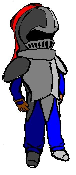
The legs are very short. He has the proportions of like a 5 year old with short arms. Unless you're trying to start a style of artwork where people have shortened legs (come to think of it, that might be pretty darn cool) you might want to just lengthen them out next time.
Hey! That's how I draw! Look at my versions of Ace and Sire!
Post by: neb87 on February 04, 2006, 01:27:45 AM
Post by: drenrin2120 on February 04, 2006, 04:25:50 PM
The colorings not bad. The shading seems pretty decent. I'm not exactly an artist, but when I first look at, it's not bad.
Post by: neb87 on March 03, 2006, 02:17:37 AM