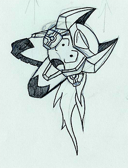
Post by: ZeroKirbyX on February 15, 2006, 04:30:17 AM

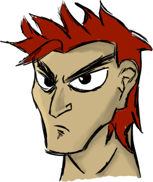
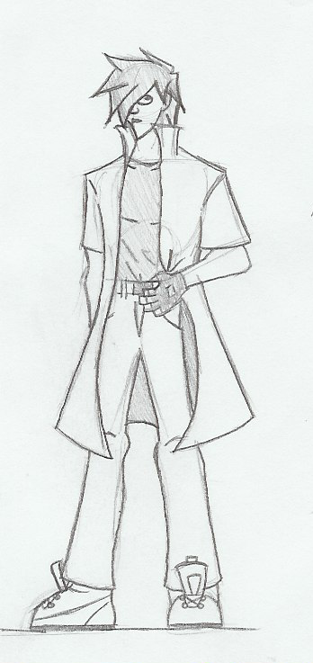
Random character for a webcomic idea I have. If I find the other two I'll post em.
Random KH sig I made a friend. (Yeah, I'm puttin ps schtuff here)

Animated version of said sig. I think that is one of my better renders though
And yes, the animated isn't the greatest, but I cant find the original animated sig.

My rendition of Mr. Kite from the song "Being for the Benefit of Mr. Kiye" from the Beatles Srgt. Pepper album
Post by: VulcanRaven336 on February 15, 2006, 06:27:22 AM
Post by: Moosetroop11 on February 15, 2006, 09:55:01 PM
Post by: Grandy on February 15, 2006, 09:58:26 PM
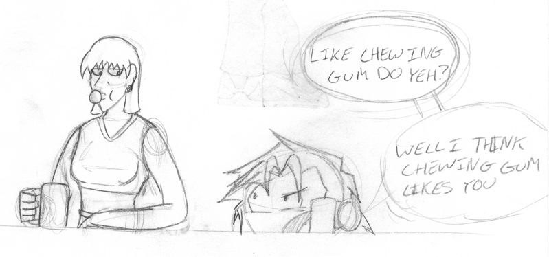
Post by: Meiscool-2 on February 15, 2006, 09:59:41 PM
Quote
Originally posted by Grandy
Mr. Kite made me laught
I would've, but I hate the beatles. Its still good though.
Post by: ZeroKirbyX on February 16, 2006, 04:01:57 AM

I was so damn happy I finally purchased my own copy of Hellboy 1: Seeds of Destruction I decided to draw the cover of everyone's favorite hellspawn.
Post by: ZeroKirbyX on February 19, 2006, 12:10:15 AM

Post by: Archem on February 19, 2006, 01:01:38 AM
And I recall that wallpaper. It was pretty cool. I just wish I had seen the whole series.
Post by: Meiscool-2 on February 19, 2006, 02:19:17 AM
It is good.
Post by: ZeroKirbyX on February 19, 2006, 06:39:06 PM

Got bored and decided to make a wallapaper featuring Jayne Cobb from Firefly. I was gonna have a big "serenity" logo in the top right where Serenity is (the ship), but I didn't have any episodes on my comp with a clean shot. I miss all the eps I have lost...
I used scenes from three different eps to make that BG XD One from Serenity (1) Trash (11) and Out of Gas (9?)
Post by: ZeroKirbyX on February 20, 2006, 07:03:18 AM

A DA ID I made awhile back. Just figured I'd show somethin colored.
Post by: Moosetroop11 on February 20, 2006, 11:19:58 AM
Post by: Grandy on February 20, 2006, 02:40:18 PM
Post by: Osmose on February 20, 2006, 03:28:20 PM
Post by: ZeroKirbyX on February 20, 2006, 07:32:13 PM
Post by: ZeroKirbyX on February 21, 2006, 06:23:51 AM

Admiral DeLoco

Admiral Vigoro (Hate the text)

Admiral Gregorio
All 3 from Skies of Arcadia
Post by: ZeroKirbyX on February 22, 2006, 03:54:45 AM

Admiral Galcian
I think this may be my fav of the four. Either that or Gregorio.
Post by: Meiscool-2 on March 07, 2006, 11:58:52 PM
Post by: ZeroKirbyX on March 09, 2006, 12:51:00 AM

Newest sig. Als waiter fromm reboot. WHAT!?
Post by: Linkforce on March 09, 2006, 01:39:51 AM
:p
Post by: ZeroKirbyX on March 09, 2006, 01:42:14 AM
Quote
Originally posted by Linkforce
Stop doing sigs...........>.<
:p
And why is that?
Post by: Linkforce on March 09, 2006, 01:46:41 AM
Post by: ZeroKirbyX on March 09, 2006, 01:50:54 AM
Quote
Originally posted by Linkforce
I dunno...you can do other things besides sigs...that I know. We know you can make sweet sigs. What else though?
My scanner doesn't work though.....
Post by: ZeroKirbyX on March 09, 2006, 04:35:30 AM

Luigi and........ believe it or not.... Jigglypuff XD

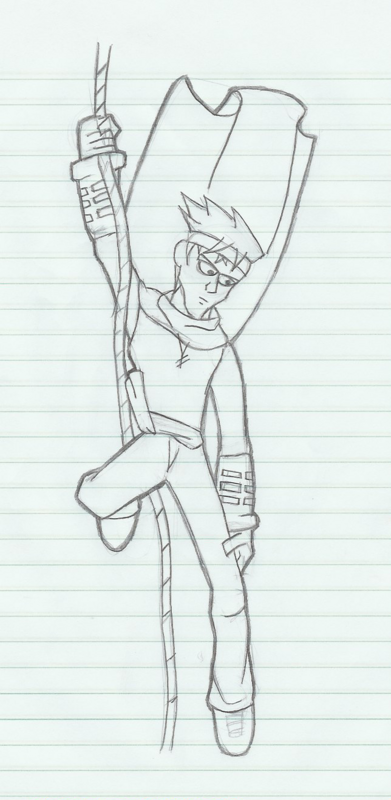
Random dude drawn on the back of my notes. It really bugs me that I went almost full anime.....
Post by: Linkforce on March 09, 2006, 04:36:36 AM
Post by: Prpl_Mage on March 09, 2006, 06:41:54 AM
And the Luigi looks really good too, like the shape of his body, really state the point that he is a badass now.
That last guy is very good drawn, no flaws, ok the hand holding the knife looks a little strange.
Great work as always.
Post by: Bluhman on March 09, 2006, 07:50:22 PM
Post by: ZeroKirbyX on March 09, 2006, 10:56:15 PM

Melvin, my black mage

Another dude from the back of todays math notes
Post by: MSlash67 on March 10, 2006, 12:44:29 AM
Post by: Ace of Spades on March 11, 2006, 04:18:18 AM
Post by: Snake Eater on March 11, 2006, 06:42:37 AM
Post by: DarkFlood2 on March 12, 2006, 12:39:36 PM
Post by: ZeroKirbyX on March 12, 2006, 07:33:43 PM

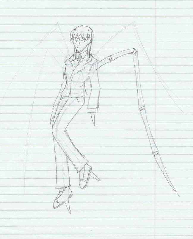
Random chick I drew. My friend made one based on the Yin-Yang, I made one off of the Iron Cross.

Just a quick concept for Reihan, the main char of that other game Idea I was piddlin with.
Post by: Moosetroop11 on March 12, 2006, 09:20:33 PM
Post by: ZeroKirbyX on March 12, 2006, 10:34:09 PM
Quote
Originally posted by Moosetroop11
Great as always. And about the sig text you didn't like... You're allowed to pick the text you want, you made it _sweat_
XD I meant the way the blending came out.
Post by: ZeroKirbyX on March 15, 2006, 11:41:26 PM

Post by: ZeroKirbyX on March 18, 2006, 01:24:59 AM

I colored the first page. Took about 6+ hours. Thoughts? Opinions? Tap dancing leprachauns.
Post by: Meiscool-2 on March 18, 2006, 02:10:04 AM
Post by: ZeroKirbyX on March 18, 2006, 02:14:11 AM
Quote
Originally posted by Meiscool
The randomness of it isn't exactly funnkee, it was meh overall. I must add, better then Shadus could hope to become.
Well, its going to be continuous. As in, not every page has to have some ROFLMAO end joke.
Post by: shadus on March 18, 2006, 02:39:35 AM
Quote
Originally posted by Meiscool
better then Shadus could hope to become.
I'll Get better.I just don't want to work on that stuff right now.
Post by: blaze_shinigami on March 19, 2006, 01:16:33 PM
Post by: Kasumi_Sakura on March 19, 2006, 03:19:27 PM
Post by: Leon_1990 on March 19, 2006, 03:27:06 PM
any chance of making a Rami sig with cool quote for me to steal? ;P
Post by: ZeroKirbyX on March 20, 2006, 03:55:17 AM
Quote
Originally posted by Leon_1990
haha Nice ^_^
any chance of making a Rami sig with cool quote for me to steal? ;P
...Rami?
Post by: Leon_1990 on March 20, 2006, 03:20:21 PM
Post by: Razor on March 20, 2006, 06:57:35 PM
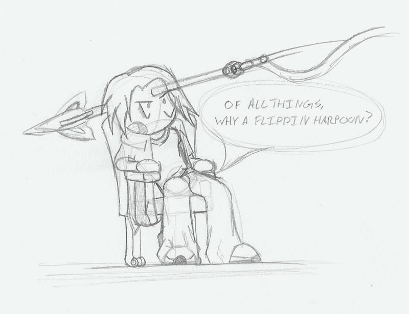
You see in square two, Prink is standing on a bin, but in square 5, he is not on a bin. WTFIUWT?
Post by: ZeroKirbyX on March 21, 2006, 11:02:01 PM
Quote
Originally posted by Razor
LOL CRITICAL ERROR
You see in square two, Prink is standing on a bin, but in square 5, he is not on a bin. WTFIUWT?
Lookit frame 5. He jumped off it.
Post by: ZeroKirbyX on March 22, 2006, 03:08:41 AM

I finally finished one of Ramirez to go with my other 4 XD Here ya go Leon
Post by: ZeroKirbyX on March 25, 2006, 04:49:38 AM

Quick sketch of Grandy I did as a request on MSlash's forum.
Post by: rush_fan on March 25, 2006, 04:52:00 AM
Post by: Robotam on March 25, 2006, 05:33:01 PM
Post by: Leon_1990 on March 25, 2006, 05:36:09 PM
Quote
Originally posted by ZeroKirbyX
I finally finished one of Ramirez to go with my other 4 XD Here ya go Leon
XD woot! Thanks mate ^_^
Post by: ZeroKirbyX on May 08, 2006, 04:04:05 AM

Random thing I just did from Draces bye thread. I just wanted to keep this topic up.
ZEROSCHWARZEWHATEVERX!
Post by: PyroAlchemist on May 08, 2006, 04:14:45 AM
Post by: Razor on May 08, 2006, 08:37:09 AM
Quote
Originally posted by ZeroKirbyX
quote: Originally posted by Razor
LOL CRITICAL ERROR
You see in square two, Prink is standing on a bin, but in square 5, he is not on a bin. WTFIUWT?
Lookit frame 5. He jumped off it.
Mayhaps, but regardless it is not in Frame 4 at all.
Post by: Bluhman on May 08, 2006, 06:27:43 PM
Quote
Originally posted by Razor
quote: Originally posted by ZeroKirbyX
quote: Originally posted by Razor
LOL CRITICAL ERROR
You see in square two, Prink is standing on a bin, but in square 5, he is not on a bin. WTFIUWT?
Lookit frame 5. He jumped off it.
Mayhaps, but regardless it is not in Frame 4 at all.
'Tis behind him.
Post by: ZeroKirbyX on May 08, 2006, 10:15:45 PM
Quote
Originally posted by Bluhman
quote: Originally posted by Razor
quote: Originally posted by ZeroKirbyX
quote: Originally posted by Razor
LOL CRITICAL ERROR
You see in square two, Prink is standing on a bin, but in square 5, he is not on a bin. WTFIUWT?
Lookit frame 5. He jumped off it.
Mayhaps, but regardless it is not in Frame 4 at all.
'Tis behind him.
Yeah, Razor is wrong!!!!! MUAHAHAHA!
Post by: Spike21 on May 08, 2006, 10:42:15 PM
Quote
Originally posted by ZeroKirbyX
quote: Originally posted by Bluhman
quote: Originally posted by Razor
quote: Originally posted by ZeroKirbyX
quote: Originally posted by Razor
LOL CRITICAL ERROR
You see in square two, Prink is standing on a bin, but in square 5, he is not on a bin. WTFIUWT?
Lookit frame 5. He jumped off it.
Mayhaps, but regardless it is not in Frame 4 at all.
'Tis behind him.
Yeah, Razor is wrong!!!!! MUAHAHAHA!
but in the rough sketch he is still on it (i think)
Post by: coreystranick on May 08, 2006, 10:52:24 PM
Post by: ZeroKirbyX on May 08, 2006, 10:55:51 PM
Quote
Originally posted by coreystranick
I love the art you have. The Hellboy i think is you best. But I love the character you made up also. Question, do you do more cartoonish/anime stuff, or can you do portraits and other more realistic stuff?
I am trying to learn realism for anatomy purposes, but I really dont like it. I prefer cartoon.
Post by: ZeroKirbyX on June 11, 2006, 02:42:02 AM

Post by: I Have a Sandwich on August 14, 2006, 04:37:06 PM

Meant as a sig, but I thought itd be too big for our small res friends.
Post by: coreystranick on August 14, 2006, 04:43:04 PM
Quote
Originally posted by ZeroKirbyX
quote: Originally posted by coreystranick
I love the art you have. The Hellboy i think is you best. But I love the character you made up also. Question, do you do more cartoonish/anime stuff, or can you do portraits and other more realistic stuff?
I am trying to learn realism for anatomy purposes, but I really dont like it. I prefer cartoon.
I can do more of realism, but I want to try cartoon. But for some reason I just can't get hold of it. I geuss I should jsut keep trying. Ohh And your last picture is quite funny haha.
Post by: Desimodontidae on August 14, 2006, 04:43:40 PM
Post by: Kijuki_Magazaki on August 14, 2006, 04:46:18 PM
Quote
Originally posted by I Have a Sandwich
Meant as a sig, but I thought itd be too big for our small res friends.
haha lol owned!
love it xD!
Post by: Ace of Spades on August 14, 2006, 04:54:11 PM
Post by: Kijuki_Magazaki on August 14, 2006, 04:59:37 PM
Quote
Originally posted by Ace of Spades
YES! I friggin hate that ninja ******. I hate Naruto period, actually. Awesome pic, dude! :D
hey, me too! =D
great minds think alike *nods*
Post by: Revolution911 on August 14, 2006, 05:57:30 PM
Post by: Meiscool-2 on August 15, 2006, 01:49:54 AM
Yes, various people have ruined the show for me too.
Post by: Tomi on August 15, 2006, 10:58:45 AM
Various people*coughslkdjflkilkjsdJEKldjlskjldkcough*
Post by: EXO Muffin on August 15, 2006, 11:20:46 AM
Post by: EXO Muffin on August 15, 2006, 11:38:21 AM
Post by: I Have a Sandwich on August 15, 2006, 04:27:39 PM
Post by: coreystranick on August 15, 2006, 04:42:11 PM
Post by: EXO Muffin on August 16, 2006, 11:11:29 AM
Also; reason it's dark yellow and brown and blue is because MS Paint doesn't convert colors well. To edit it, I had to make just one shade of white. If Photoshop wasn't giving me this,"ERROR:There is not enough space on the main disk drive. It is reccomended that you have at least 200 MB for optimized performance. Free up more space and try again," thing, I could have just set it to 32 tolerance so it counts the 32 colors around the hexadecimal value of the color. So I had to make it a 256-Color Bitmap. And MS Paint substitutes greys with dark browns, yellows, teals, and what-not.
Post by: Moosetroop11 on August 16, 2006, 12:14:41 PM
Quote
Originally posted by Desimodontidae
Pure awesomeness.
Nothing more to say really.
Post by: I Have a Sandwich on August 21, 2006, 04:37:09 AM

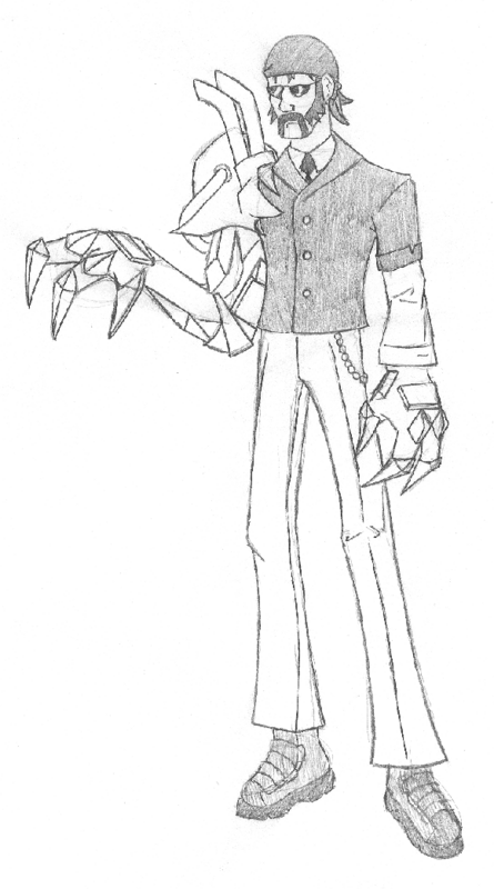
It's Ruprect Kroenen from Hellboy.
Post by: I Have a Sandwich on August 28, 2006, 10:33:58 PM
Post by: Meiscool-2 on August 28, 2006, 10:41:19 PM
Post by: emiiru on August 28, 2006, 10:43:53 PM
Post by: I Have a Sandwich on August 28, 2006, 10:45:15 PM
Post by: emiiru on August 28, 2006, 11:01:51 PM
Also, now that you have a tablet, you don't have to worry about smudging that much. With photoshop you set opacity levels with pressure sensitivity. Make a special brush,and you're set.
Post by: I Have a Sandwich on August 28, 2006, 11:04:54 PM
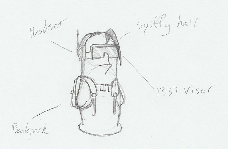
Screen in 5 x 3 3/4
Post by: EXO Muffin on August 29, 2006, 01:21:52 AM
I sure do hope you mean 5 x 3 3/4 INCHES.
Post by: I Have a Sandwich on August 29, 2006, 01:29:54 AM
Post by: emiiru on August 29, 2006, 02:03:50 AM
Quote
Originally posted by EXO Muffin
My mom's planning on getting an Intuos3 Wacom for my birthday.
< bought one a while back. Very nice.
I want a Cintiq though.
Quote
Originally posted by EXO Muffin
I sure do hope you mean 5 x 3 3/4 INCHES.
Obiviously.
Post by: I Have a Sandwich on September 12, 2006, 03:27:26 AM
Post by: Prpl_Mage on September 12, 2006, 03:41:47 AM
But the guy on the far rights smile creeps me out.
Post by: I Have a Sandwich on September 12, 2006, 03:46:00 AM
Quote
Originally posted by Prpl_Mage
But the guy on the far rights smile creeps me out.
That would be Roy, the very first of my original multi-purpose chars I made. He's on the same team as ZKX. If he didn't creep you out, I failed in drawing him XD
Post by: Grandy on September 12, 2006, 10:05:30 AM
Post by: I Have a Sandwich on September 12, 2006, 11:58:54 AM
Post by: Grandy on September 12, 2006, 02:16:34 PM
Post by: I Have a Sandwich on September 12, 2006, 08:00:42 PM
Post by: I Have a Sandwich on October 05, 2006, 02:37:25 AM

Half assed color, and I totally forgot how I used to do the pencil lead-esqe text.
Because text sucks:
1.I'm a bunny, aren't I super cute!?
3.Oh wow, that neck just won't stop bleeding
4.Best be gettin the ol' skinnin knife, we're havin rabbit stew tonight!
Post by: Linkforce on October 05, 2006, 02:50:27 AM
"Eric says: LMFAO!!!!!!"
Post by: CrematedPumpkin on October 07, 2006, 01:08:17 AM
Is.
Disturbing.
Very well done, though. Funny, if a little morbid (humourously so, though).
Post by: I Have a Sandwich on October 07, 2006, 04:09:07 AM
Quote
Originally posted by CrematedPumpkin
That.
Is.
Disturbing.
Very well done, though. Funny, if a little morbid (humourously so, though).
Too much JtHM I guees :/
Post by: Archem on October 07, 2006, 04:25:02 AM
Three is not enough, people!
Post by: CrematedPumpkin on October 07, 2006, 02:30:12 PM
Quote
Originally posted by I Have a Sandwich
quote: Originally posted by CrematedPumpkin
That.
Is.
Disturbing.
Very well done, though. Funny, if a little morbid (humourously so, though).
Too much JtHM I guees :/
Hahaha! JtHM is quite possibly the greatest comic ever created.
Don't currently have any, but a friend has...all of them I think. I'm too poor for comics right no, lol. WoW does that...
Post by: Moosetroop11 on October 07, 2006, 04:13:09 PM
Post by: I Have a Sandwich on October 16, 2006, 09:11:06 PM
Quote
Originally posted by Moosetroop11
Above all else I love the character design.
That mean it wasn't funny? I'm hurt. Anyways, new drawings.
New drawing of Grandy, this time not sucking. That old one makes me cry... BUT ITS A POSE DOODLE!
Quick drawing of a character for my game trying to get his proportions right. Face is totally f***ed up, but I think I got his size and such right.
Post by: Grandy on October 16, 2006, 09:27:31 PM
Post by: Ace of Spades on October 16, 2006, 11:18:55 PM
Oh and the bunny thing was hilarious. XD
Post by: Noobpwner on October 19, 2006, 02:36:33 AM
Post by: I Have a Sandwich on October 19, 2006, 11:31:06 PM
Quote
Originally posted by Noobpwner
That's good I wish I could draw that good :D
Heh, thanks.
Colored and shaded with a new method of sorts. I think it looks loads better than cel for this, but could use some work.
And there's the flat colors just in case you wanna try imagine it with cel so I can deliver a hearty told you so.
Post by: Grandy on October 19, 2006, 11:59:39 PM
GRANDY HAS EYEBROWNS?!
I never portraited him like that... well, it was lacking some. I love it.
Post by: I Have a Sandwich on October 20, 2006, 12:30:09 AM
Quote
Originally posted by Grandy
OMG! ... his eyebrowns are green? ........
GRANDY HAS EYEBROWNS?!
I never portraited him like that... well, it was lacking some. I love it.
EyeBROWS buddy, BROWS. Glad you love it. It was really more practice than anything.
Post by: I Have a Sandwich on October 26, 2006, 09:55:46 PM
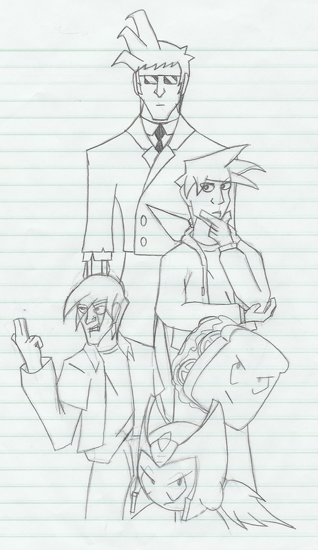
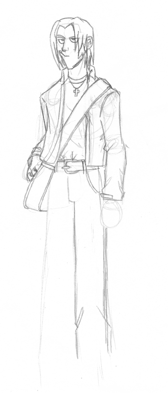
'Nother school drawing. Roy, Tane, Sammich, ZKX, and the closest thing they have to a known enemy, Agent Terrier. I messed up on Roy, particularly the face and hand (Drew him in the morn). EVeryone else is pretty damn close to how I want em.
Post by: Grandy on October 27, 2006, 12:48:23 AM
Post by: I Have a Sandwich on October 27, 2006, 12:53:01 AM
Post by: Grandy on October 27, 2006, 01:00:51 AM
Post by: Archem on October 27, 2006, 01:57:42 AM
Post by: ZeroKirbyX on November 08, 2006, 01:56:24 AM
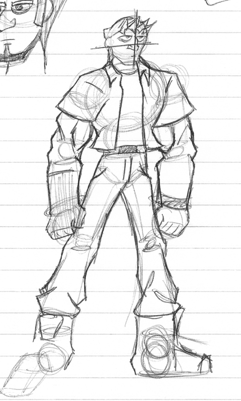
Not much to it, just the bounty hunter Kaiyro from what I've dubbed "Project K: The Game" for now. Mainly its a way for me to figure out how I wanted proportions in my games sprites.
Post by: Moosetroop11 on November 08, 2006, 07:47:54 PM
Post by: DarkFlood2 on November 08, 2006, 09:10:40 PM
Post by: Prpl_Mage on November 08, 2006, 10:36:09 PM
How comes the Suscrible option doesn´t work btw? Is it because it´s been no posts for a while?
Post by: ZeroKirbyX on November 09, 2006, 12:37:39 AM
Quote
Originally posted by DarkFlood2
Looks good, But I have to point out taht his neck is a tree stump and his head is too small.
Yar, hius legs are way long as well. Like I said it's for determining the sprites style, lemme show you.
And thanks Purple. I was actually thinking about making a one shot Project K comic.
Post by: Meiscool-2 on November 09, 2006, 12:43:16 AM
Pretty cool. I'd make his legs a few pixels shorter, but I dunno anything else wrong with it.
Post by: ZeroKirbyX on November 09, 2006, 12:57:22 AM
Post by: Meiscool-2 on November 09, 2006, 01:02:38 AM
What's the purpose though? Brothers or something? :p
Post by: ZeroKirbyX on November 09, 2006, 01:06:52 AM
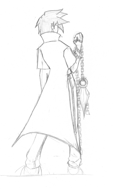
Post by: ZeroKirbyX on December 05, 2006, 02:20:09 AM
One in a series of three comics I'm doing few the contest. It's gonna all be one piece with an individual panel for Tane, Roy, and Kirb.
Yes, the arm is really bad. I already stabbed my foot for it.
Post by: ZeroKirbyX on February 02, 2007, 02:36:38 AM
Random bad guy for Project K. Agent Bullwhip, and contrary to his appearance, he can't actually ride a bike.
Dunno why I posted this, probably cuz I felt like having more than one pic. Rough I did for graphic design class to be carved into a stamp in a linoleum block. Black is the stamp, which is carved. I hope you can all guess who that is.
Post by: Ace of Spades on February 02, 2007, 02:55:14 AM
Post by: Meiscool-2 on February 02, 2007, 03:28:09 AM
It's Agumon.
Post by: Archem on February 02, 2007, 03:57:14 AM
Post by: Dominicy on February 02, 2007, 07:10:18 AM
Quote
Originally posted by Meiscool
No you dumbass.
It's Agumon.
no, that's gahz-rilla. wait, he has three heads, ok, yup, its agumon.
Post by: Grandy on February 02, 2007, 12:39:10 PM
Quote
Originally posted by Ace of Spades
lol Charmander
DAMNIT beat me to it.
Post by: ZeroKirbyX on March 22, 2007, 04:36:36 AM
Random drawing for a new dA ID. Need to color it but it's been awhile since an update so meh.
Meh doodle of a quick idea for Widget 2.0, the mascot for MSlash's site.
T3h original drawing.
|
V

Post by: Dominicy on March 22, 2007, 05:46:34 AM
Quote
Originally posted by ZeroKirbyX
Random drawing for a new dA ID. Need to color it but it's been awhile since an update so meh.
Meh doodle of a quick idea for Widget 2.0, the mascot for MSlash's site.
T3h original drawing.
|
V
that is one evil looking bean. O_O
Post by: Moosetroop11 on March 22, 2007, 06:29:00 PM
Also, awesome mission impossible widget! :p Cool.
Post by: Fortet on March 23, 2007, 02:44:35 AM
Quote
Originally posted by ZeroKirbyX
Meh doodle of a quick idea for Widget 2.0, the mascot for MSlash's site.
Speaking of which and whom, how's his site coming? I've not been there in a long time.
Post by: Archem on March 23, 2007, 03:11:25 AM
Post by: ZeroKirbyX on April 08, 2007, 09:05:37 PM
Quote
Originally posted by FortetQuoteOriginally posted by ZeroKirbyX
Meh doodle of a quick idea for Widget 2.0, the mascot for MSlash's site.
Speaking of which and whom, how's his site coming? I've not been there in a long time.[/B]
www.ms-invent.com is the newest incarnation. But alas, it's dead.
Anyways, new art bump. Garbage sketches basically, but that's all I seem to do lately.
Yet another character from Project K. One of their agents.
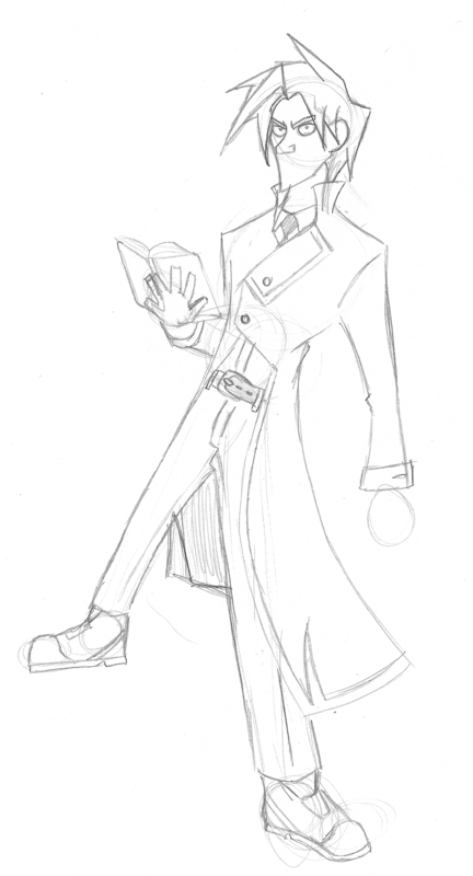
Unfinished Artemis Kleid. If any of you have rp'd with me, you may recognize the name. Just a quikc drawing I did of him.
Post by: Roland_Deschain on April 08, 2007, 09:22:38 PM
Post by: Moosetroop11 on April 08, 2007, 09:22:48 PM
Roland, you can post writing right here in creative arts. Go ahead.
Post by: ZeroKirbyX on April 08, 2007, 09:26:18 PM
And thanks Roland.
By the wya, Ijust went back and fixed some of the broken links.
Post by: Moosetroop11 on April 08, 2007, 09:31:28 PM
Post by: ZeroKirbyX on May 02, 2007, 04:07:56 AM
My gaia avatar. Thats right. I'm a gaiafag.
Kaiyro
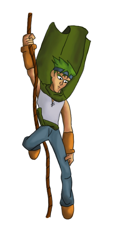
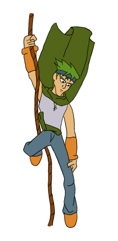
Random sketch of some YuGiOh, mage thing with gawky legs.
Post by: Moosetroop11 on May 03, 2007, 09:01:25 PM
Everything's great, especially the freedom of the initial sketch (It's also great that you leave most of the lines in), but just be careful to distinguish clearly between different characters.
(Obviously, since you draw pre-existing characters a lot, there's times when you can't help it if they look similar)
Post by: ZeroKirbyX on May 03, 2007, 10:08:13 PM
Post by: ZeroKirbyX on May 09, 2007, 03:43:59 AM
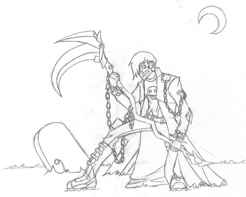
When the dead rise, he is the one to re-reap their recyled inbred souls. He really likes his job.
Post by: Dominicy on May 09, 2007, 06:06:07 AM
Post by: carmen on May 09, 2007, 12:12:46 PM
But like what was already said, I'd work on some still lifes or some figure drawing to get how the body moves.
Post by: Moosetroop11 on May 09, 2007, 05:13:30 PM
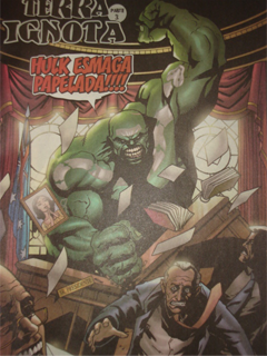
Post by: ZeroKirbyX on June 02, 2007, 05:10:10 AM
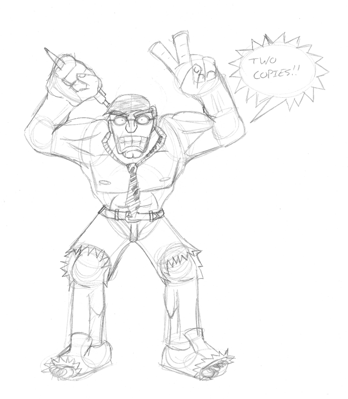
Office Hulk
Guile from memory. Except slightly less buffular
Post by: Moosetroop11 on June 03, 2007, 09:15:56 PM
Let's see. You did the hulk's torso really well although his face kinda lacks something (I know the style is goofy, so it's hard to tell with the faces)
Guile's feet are really well drawn. I haven't seen the real character but his neck looks a little too long and his arms are a bit odd- like an elastic man or something.
Good work, a little better than I draw, keep it up, blah blah :p
Post by: ZeroKirbyX on June 03, 2007, 09:29:31 PM

Guile. Not by me of course, but thats his original.
Post by: Archem on June 03, 2007, 09:51:59 PM
Post by: Grandy on June 05, 2007, 07:16:33 PM
Also, dude:
Part of Dinasty M (at least that's how I call it) when Hulk became the president of Australia. =D
In case you're wondering, he's saying "Hulk smash paperwork!"
Post by: ZeroKirbyX on June 13, 2007, 11:24:38 PM
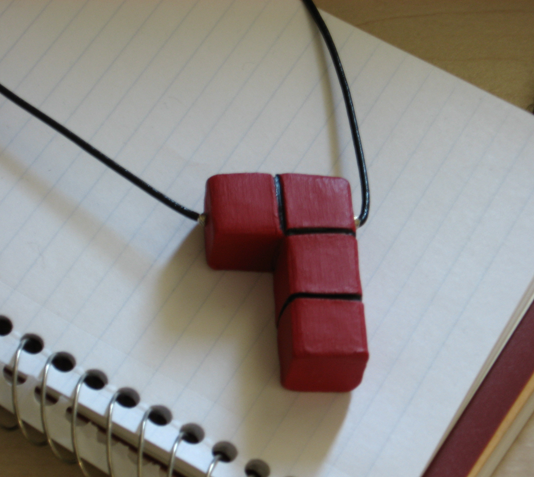
Necklace I made. Clay. Made a T-Block (yellow) and a Z-block (green) too, but gave away the T it was crap (first one) and sold the Z for $10 bucks.
U liek?
Post by: Archem on June 14, 2007, 12:12:54 AM
Also, that Hulk made me laugh. Thanks for the giggles, Grandy.
Post by: ZeroKirbyX on August 07, 2007, 10:42:19 PM

Post by: Prpl_Mage on August 08, 2007, 05:09:41 AM
So does this mean that we will see a topic about the Project K soon? Would be awsome.
Post by: ZeroKirbyX on August 08, 2007, 06:08:45 AM
Pics of Roy and Tane would go in the white boxes, respectively.
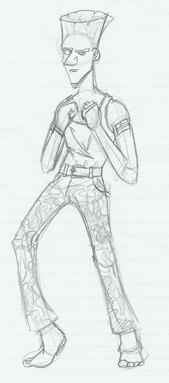
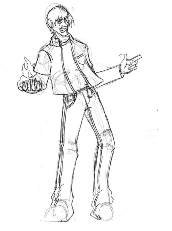
Post by: ZeroKirbyX on August 11, 2007, 05:56:31 AM
Simple Roy semi-redesign to go along with Kirb. More hair with different styled shirt and pants.
Pic of Roy to go into the window for that title up there, drawn before proposed redo.
Post by: Prpl_Mage on August 11, 2007, 06:23:45 AM
Post by: ZeroKirbyX on August 11, 2007, 06:28:02 AM
Post by: Prpl_Mage on August 11, 2007, 06:37:53 AM
You got any new of Tane by the way?
Post by: ZeroKirbyX on August 11, 2007, 03:59:00 PM
Post by: Grandy on August 11, 2007, 04:27:05 PM
Also, nice drawing
Post by: ZeroKirbyX on August 11, 2007, 04:35:23 PM
Quote
Originally posted by Grandy
Hey, ZKX, your PM box is full.
Also, nice drawing
CLeared it so resend whatever you needed to.
Post by: ZeroKirbyX on September 16, 2007, 06:17:25 PM
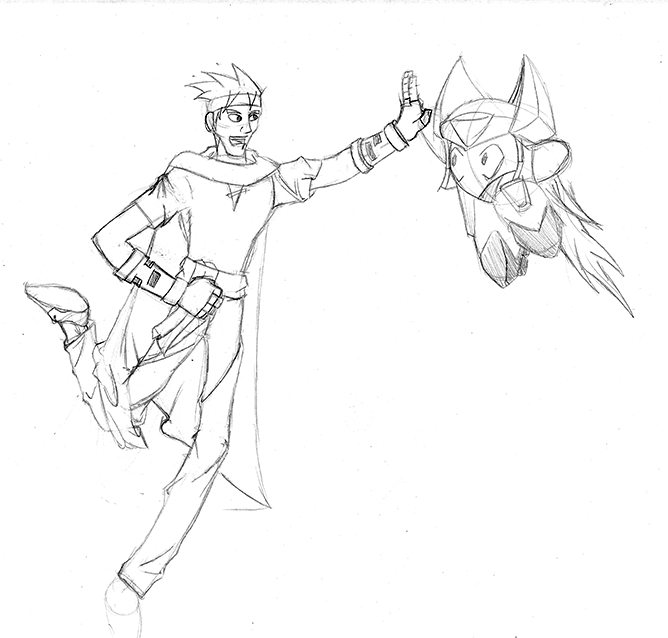
Wondertwin Powers, activate!
Pic I've been meaning to do of Kirb and Grandy. I thought of making it a fight scene, but it was just to nice to pass this up XD Going to go alongside a fight between Devon and Roy.
Kirb for a project in animation. It's for the bouncing critter project where they're on a tarp bouncing. I might just use the penguin in a snow coat though.
Post by: Moosetroop11 on September 16, 2007, 06:54:32 PM
Post by: ZeroKirbyX on September 16, 2007, 07:11:13 PM
Post by: Moosetroop11 on September 16, 2007, 08:03:06 PM
Post by: Grandy on September 16, 2007, 08:13:07 PM
Post by: ZeroKirbyX on September 16, 2007, 08:26:56 PM
Post by: Grandy on September 16, 2007, 08:32:42 PM
Post by: ZeroKirbyX on September 16, 2007, 08:38:42 PM
Post by: Grandy on September 16, 2007, 10:50:36 PM
Post by: ZeroKirbyX on September 17, 2007, 12:37:14 AM
Post by: Grandy on September 17, 2007, 10:12:14 PM
...but seriously that's what I said.
Post by: Archem on September 17, 2007, 11:17:00 PM
I too has a drawing. It's of me.
_ghost_ _ghost_ _ghost_ _ghost_ _ghost_ <-----[quickies of me]
There may be coloring errors here and there...
Post by: Grandy on September 17, 2007, 11:36:58 PM
Quote
Originally posted by Archem2
Seriously, you guys...
I too has a drawing. It's of me.
_ghost_ _ghost_ _ghost_ _ghost_ _ghost_ <-----[quickies of me]
There may be coloring errors here and there...
You got the color palletes wrong.
Post by: Archem on September 18, 2007, 03:36:11 AM
Quote
Originally posted by Archem2
There may be coloring errors here and there...
Grandy?
Post by: Grandy on September 18, 2007, 02:23:33 PM
Quote
Originally posted by Archem2QuoteOriginally posted by Archem2
There may be coloring errors here and there...
Grandy?[/B]
I was pointing what the coloring errors are.
Post by: Archem on September 18, 2007, 05:10:36 PM
Post by: ZeroKirbyX on September 18, 2007, 09:40:12 PM
Post by: Grandy on September 19, 2007, 06:11:44 PM
Quote
Originally posted by ZeroKirbyX
*serious face*
Her proportions are incorrect.
Post by: Bluhman on September 19, 2007, 06:47:38 PM
Heheheheheheh.... Hahahahahahahaaa!!
KUAHAHAHAHAHAHAHAHAHAAHAAAAAAAAAAAAARRR!!!
Er- Oh, sorry. Just thought of something amusing.
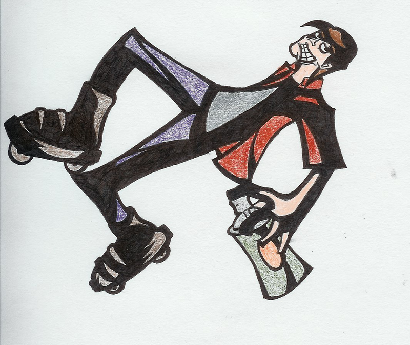
Post by: ZeroKirbyX on November 06, 2007, 10:56:58 PM
Jet Set Radio style Roy from memory. I failed.
Post by: Revolution911 on November 07, 2007, 02:23:55 AM
On this latest drawing, I really liked the whole shading, but when I looked at it I noticed that you have no definite lightsource. Pick a lightsource and stick with it. You have to have an eye for seeing where a shadow should be cast. Also, fore-shortening is a bit of a problem, and so are the skates, The arm should be a tad bit shorter, seeing as its pointed towards me slightly. The right(his right) skate is bigger than the left one. Its farther away, DATS WEIRD. I feel like I should be seeing the bottom of the left skate. I also feel like it should be alot bigger. The colored pencil and/or crayon leaves a bit to be desired. Its just awkward when you see the pitch black and the crayola coloring job, ya know? Its either gotta be all solid, or all crayola. Otherwise it'll look kinda weird.
Good stuff from you. A few suggestions would be learn how muscles/hair work a bit more. Never substitute "style" for anatomy. Another would be....well...work on faces. The just all look like that same dude with a different haircut :(
AFRAID OF DRAWING GIRLS ARE WE? LEARN FEMALE FORM TOO, YOU SILLY BILLY.
Your art shiiitttt might be one of the few reasons I still check up on charas. You and mid. Cause mid is cool. KEEP UP THE SOLID STUFF, MANG.
Post by: ZeroKirbyX on November 07, 2007, 02:34:14 AM
Thanks for the words man, really appreciate it. I understand what you mean about the light source, got too caught up in trying to do that JSR thing.
I completely agree about the faces thing :(
Post by: Revolution911 on November 07, 2007, 03:10:44 AM
Get a feel for how everything on a REAL human works. From wrinkles in clothes, to varying eye placement and lip size.
It helps.
Post by: ZeroKirbyX on November 07, 2007, 03:14:40 AM
Post by: Dragoon de Sol on November 07, 2007, 03:58:56 PM
Rev, no offense, but you sound like my dad. he's always saying how people should draw cartoons more realistic and they should all have a similar style. But that's why cartoons are appealing is their differences. I'm not saying he's drawing all cartoons, mind you, but you seem to focus mroe on the realism than the feel.
The anatomy on his skater is awkward, sure, but it fits as well. If he had a normal male anatomy, it'd look stupid to me.
But yeah, work on using color pencils more.
Post by: Grandy on November 07, 2007, 05:42:02 PM
By far.
Post by: Prpl_Mage on November 07, 2007, 07:00:08 PM
Really like it but one of the bang's shade looks a bit wierd. Great job.
Post by: Revolution911 on November 07, 2007, 07:23:41 PM
Did you even...ya know...read my crit? Like, at all? If you did you obviously didn't understand it. These arent anatomy flaws. These are foreshortening and depth problems. ANY drawing can have this. It has nothing to do with how you work your anatomy. And either way, despite style, you can always spot an anatomy problem. lol it has nothing to do with "normal male anatomy."
I focused on the feel and I critiqued it and he even AGREED WIF ME FOO. The lightsources were off. S'cool, it happens to the best of us.
Never substitute style for anatomy. Never. Its like writing a book when you cant read. Once you have a basic feel for anatomy, THEN you shape and mold it into your own style. I made that anatomy comment as a critique on all of the drawings in general.
BREAK YOSELF, FOO. TRYIN 2 TEST ME, YO?
And in the midst of all this, I mean no offense, but you sound like the guy who when someone shows him a flaw in his work, he screams "ITS NOT A FLAW, ITS MY STYLE."
Edit:
2ZKX: Do you use reference at all? Just wondering.
Post by: Archem on November 07, 2007, 07:59:18 PM
Post by: Dragoon de Sol on November 07, 2007, 08:14:19 PM
Post by: Revolution911 on November 07, 2007, 08:45:09 PM
Pikachu? Come now man, you make no sense. FIRST OFF, PIKACHU IS A ****ing ANIMAL LOL. Made up animals and fictional beasts call for no specific anatomy, so you're free to have fun and be creative. Once that anatomy is set, THEN you have to follow the rubric, but if its a MADE UP ANIMAL, WHAT ANATOMY RUBRIC IS THERE? This has NOTHING, and I mean 0 RELEVANCE TO THE TOPIC AT HAND.
But don't even get me started on the art in pokemon. I SWEAR THEY'RE ALL THE SAME ****ing CHARACTER WEARING A DIFFERENT WIG. Except that pimp brock.
Post by: Dragoon de Sol on November 07, 2007, 08:51:26 PM
Post by: Revolution911 on November 07, 2007, 09:13:49 PM
Anyway, all pokemon are based off of something. It doesn't HAVE a definite anatomy set for it. Are all dogs built the same? Are all creatures of the rodent family built the same? Are all fish built the same? No they're ALL DIFFERENT. Pikachu is no different. Pikachu is its own animal and therefore has his own form.
NOW, onto my shitty machamp from 10 years ago.
Post by: Dragoon de Sol on November 07, 2007, 09:22:05 PM
Post by: ZeroKirbyX on November 07, 2007, 09:53:14 PM
To Rev: I do when I can. I'm finding it funny how people are defending me when I agreed with you. I mean, I appreciate it guys, but Rev is 100% right. Cartoonism is the act of deforming something accurate, and if you don't know whats accurate, you can't deform it. I've got a ton of referenced stuff in the sketchbook, but it's a ****ing sketchbook. I'm not gonna post every page.
Post by: ZeroKirbyX on December 18, 2007, 03:43:35 AM
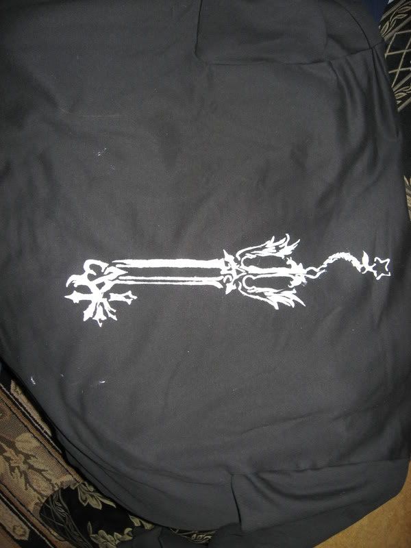
Shitty hoodie I made. Bros xmas present, looks like **** but he'll like it.
GOD I hate KH.
Post by: Archem on December 18, 2007, 03:52:57 AM
Post by: Grandy on December 18, 2007, 04:36:30 AM
Post by: Ben on December 18, 2007, 07:38:20 AM
Quote
Originally posted by Grandy
Cartoonish drawings >>> anatomy
dude, mostly all cartoons reference anatomy to some extent. that was an ill conceived statement
l dig lt zeek. ld like to see You try blending your style with a wider range of surface texture. l think that would help with the ligting inconstencIes rev mentioned as well. l always like logging in and finding this thread Updated. :Plight:
Post by: ZeroKirbyX on December 18, 2007, 12:44:00 PM
Post by: Grandy on December 18, 2007, 02:53:32 PM
Quote
Originally posted by geminiQuoteOriginally posted by Grandy
Cartoonish drawings >>> anatomy
dude, mostly all cartoons reference anatomy to some extent. that was an ill conceived statement
l dig lt zeek. ld like to see You try blending your style with a wider range of surface texture. l think that would help with the ligting inconstencIes rev mentioned as well. l always like logging in and finding this thread Updated. :Plight: [/B]
Most cartoons would snap and die due to their deformed bodies. Just look at Johnny Bravo.
Post by: Archem on December 18, 2007, 05:43:14 PM
Post by: Prpl_Mage on December 18, 2007, 06:29:27 PM
Looks gerat either way.
Post by: Ben on December 18, 2007, 07:05:18 PM
Quote
Originally posted by GrandyQuoteOriginally posted by geminiQuoteOriginally posted by Grandy
Cartoonish drawings >>> anatomy
dude, mostly all cartoons reference anatomy to some extent. that was an ill conceived statement
l dig lt zeek. ld like to see You try blending your style with a wider range of surface texture. l think that would help with the ligting inconstencIes rev mentioned as well. l always like logging in and finding this thread Updated. :Plight: [/B]
Most cartoons would snap and die due to their deformed bodies. Just look at Johnny Bravo.[/B]
Point taken, But im talking about the anotomical landmark and composition of it.
The Facial Landmarks still exist... Even on a 4 fingered hand, cartoons still have knuckle alignment...the span of the arms still equates to the height of the character...etc etc... You need to have an effective grasp of anatomy, to properly exagerate it to johnny-bravo-snap-leg-proportions.
Post by: Moosetroop11 on December 18, 2007, 08:55:38 PM
Post by: Ben on December 18, 2007, 09:29:33 PM
zkx... i draw all over my crap. I bought these sharpie poster paint markers...if you get a fabric paint marker for a base coat and then go to town with the opaque sharpies, you can get some sick blending. Just a tip
Post by: ZeroKirbyX on December 18, 2007, 09:34:34 PM
Post by: ZeroKirbyX on May 05, 2008, 01:02:57 AM
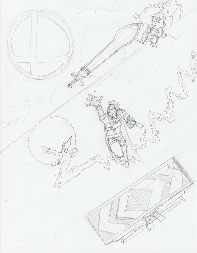
**** you Ness. **** you.
Post by: Fortet on May 05, 2008, 02:19:18 AM
Post by: Archem on May 05, 2008, 05:05:54 AM
Post by: ZeroKirbyX on July 15, 2008, 10:14:27 PM
Derp.
Post by: Archem on July 15, 2008, 10:50:58 PM
Post by: Grandy on July 15, 2008, 11:10:02 PM
Post by: ZeroKirbyX on August 03, 2008, 06:04:29 AM
Derp.
Post by: Meiscool-2 on August 03, 2008, 09:07:05 AM
Post by: Moosetroop11 on August 03, 2008, 10:42:58 AM
Awesome.
Post by: Archem on August 03, 2008, 07:33:36 PM
Post by: ZeroKirbyX on September 30, 2008, 02:28:39 PM
Raw raw etc. Shitty background though.
Post by: Dominicy on September 30, 2008, 03:07:00 PM
Post by: Grandy on September 30, 2008, 03:35:45 PM
Heh
Post by: Revolution911 on September 30, 2008, 11:09:46 PM
Work on that mouth though.
huge chin is huge
good **** yo
Post by: Hell Angel on October 01, 2008, 05:50:26 AM
huge chin is huge
Yeah, well -- have you SEEN Silas' chin? I'd say it's about right.
Post by: Archem on October 01, 2008, 05:57:42 PM
Post by: ZeroKirbyX on October 02, 2008, 02:37:52 AM
It's not good.
Post by: Archem on October 02, 2008, 03:58:22 AM