Post by: Zerlina on February 20, 2006, 10:07:53 PM
The eyes are borrowed just so you know.
Enjoy the design? Tagline ok?
Post by: MrMister on February 20, 2006, 11:09:23 PM
Other **** = random.
Post by: Kijuki_Magazaki on February 20, 2006, 11:41:45 PM
I actually liked the tagline however the position and horizontal spacing of it it's abit akward. To maybe fix this problem you might want to either: make the text expand a bit sideways so the spacing looks diminished.
Another flaw might be unbalance shown without a stable element to support it( i am talking about the top part). If you split this from the middle, you can see what I am talking about. .... ok maybe you might not so i'lll show a pic :D
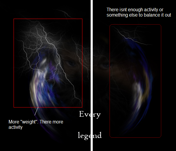
To correct this you might want to try balancing by either ( a bit of brightness on theright side, ro a bit more "activity" on the right side.
Also too much negative spacing BUT it may be something you want to portray an idea, but currently is being a bit unaffective, or not reaching. You may want to brighten up the eyes/face or even the whole picture you have there so there actually a contrast and the negative..ness feels "comfortable".
I REALLY like your text logo for the game :P i find quite cool XD
I hope you dont get an agressive feeling from me <.< If at all i am softing what mr mr implemented o.0 I'll check up on this. xP
Post by: Zerlina on February 21, 2006, 02:51:13 AM
Post by: Kijuki_Magazaki on February 21, 2006, 03:23:54 AM
ok i'll give u another suggestion. lighten up the eyes abit. so they stand out a bit/ not just enough so they stand out, that way you'll have a better focal point.