Post by: Meiscool-2 on July 19, 2006, 09:15:41 PM
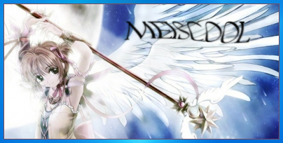

The last one is meh favorite. Took me a long time to get the face in the waterball.
Disclaimer: I did not actually draw any of the anime myself. Just compiled them, edited them, and added effects.
Post by: Gary on July 19, 2006, 09:57:21 PM
Post by: Linkforce on July 19, 2006, 10:03:15 PM
Post by: Dragoon de Sol on July 20, 2006, 12:19:29 AM
B. Where'd ya get the anime images?
C. Can ya make me one?
Post by: Meiscool-2 on July 20, 2006, 12:24:25 AM
I got my pics here: http://www.vietnhim.com/CuteGallery/displayimage.php?album=topn&cat=0&pos=26
http://animeangels4.tripod.com/cutegirls/index.album?i=23
Just search google for more. That's what I did.
And yes, but all the people so far that have asked me that have asked me to use pictures that are hard to work with :( So, make sure it's something like the ones above.
Post by: Desimodontidae on July 20, 2006, 12:57:47 AM
Post by: Meiscool-2 on July 20, 2006, 01:10:17 AM
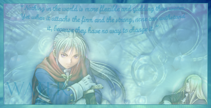
Like, on this one, I just couldn't find the right text :(
Post by: Tomi on July 20, 2006, 01:23:06 AM
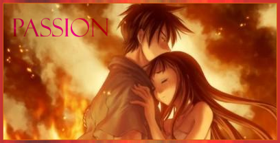
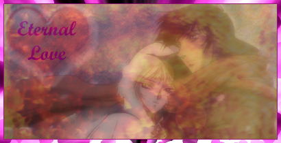
Post by: Dragoon de Sol on July 20, 2006, 01:25:28 AM
Thanks.
Use the two people with a red background/cloud similar to your second sig there.
With the words:
Eternal Love
Post by: Meiscool-2 on July 20, 2006, 01:59:27 AM
Anyways, if you don't like it, I'll try again. I don't like how it came out either, but thought I'd post it anyways. You might like it... afterall.
Post by: DragonBlaze on July 20, 2006, 02:30:33 AM
But seriously, those are pretty cool. I've had photoshop for a long long time and I can hardly do anything cool in it.
Post by: Meiscool-2 on July 20, 2006, 02:35:18 AM
Quote
Originally posted by DragonBlaze
Wow, that last one seemed a bit too girly, even for you :p
XD!!! Like I said, I don't like it how it came out.
Post by: Dragoon de Sol on July 20, 2006, 02:40:58 AM
And oh well if it seems girly.
I am a guy, but I kinda wear my emotions on ym sleaves...so to speak.
Post by: I Have a Sandwich on July 21, 2006, 01:32:40 AM
Post by: Tomi on July 21, 2006, 01:39:42 AM
The last one is quite girly, but it's not bad.
Post by: Dragoon de Sol on July 21, 2006, 02:26:18 AM
Post by: MrMister on July 21, 2006, 02:31:01 AM
Bringing you to photoshop level 4(adept).
I don't like the textin any of them, though. You should try out some more text effects and stuff.
All you nooby ***-suckers.. here's where you should start learning photoshop.
Post by: Kijuki_Magazaki on July 21, 2006, 02:39:52 AM
Tips!!! XD don't bend, warp, twist text for signatures. Most of those things are only done on wallpapers. And if you are becauseful on how it turns :P
The strokes, makes sure they arent too big and that the textures are right in everything specially opacity. If you want thick borders that look nice, make it roughly but distinctively the same color as the main color you are using.
Manage color balance and you should be better, but you are good for a new user.. if you are.
Practice makes better :D
Post by: I Have a Sandwich on July 21, 2006, 02:43:13 AM
Post by: Kijuki_Magazaki on July 21, 2006, 03:12:52 AM
And well what you said is right! There has to be conssistency.. or something, well what I man it all needs to flow.
Post by: I Have a Sandwich on July 21, 2006, 03:26:22 AM
Post by: Meiscool-2 on July 21, 2006, 03:31:38 AM
Post by: I Have a Sandwich on July 21, 2006, 03:42:44 AM
Post by: Archem on July 21, 2006, 04:29:30 AM
Post by: Kijuki_Magazaki on July 21, 2006, 04:36:44 AM
Quote
Originally posted by Archem2
These are so good, they almost inspired me to start using Photoshop in a similar manner!
Nuu,d o it your own way :P
Post by: Archem on July 21, 2006, 04:54:26 AM
Which I've yet to develop...
Post by: I Have a Sandwich on July 21, 2006, 05:00:35 AM
Post by: Kijuki_Magazaki on July 21, 2006, 05:19:23 AM
but yes grunge is awesome.
What is getting overrated right now tho is abstract so =P at least in my POV
Post by: I Have a Sandwich on July 21, 2006, 06:09:08 AM
Post by: Meiscool-2 on July 22, 2006, 08:37:44 PM
Post by: Tomi on July 22, 2006, 09:19:40 PM
Post by: I Have a Sandwich on July 23, 2006, 02:37:04 PM
Unless the border is actually a part of the sig and not a little outline then it can be thick. However if its just to separtate it from the page, it only needs to be 1-2px. Its not a good idea to have opacity changes to text on top of a render the same style. I would have rotated the render clockwise a bit and moved it so that the guys shoulder was hanging off the left side and resized the text to fit on the left middle. Ctrl+T should alow you to resize.
Post by: Meiscool-2 on August 03, 2006, 06:24:42 PM
I'm very pleased with this. If I could, I would go back and make Tifa's face a little more transparent, but it still looks good to me. I know it needs some texts, but I'm still figuring on what to put :D
EDIT: Small Boarder Added
Post by: Meiscool-2 on August 13, 2006, 11:32:23 PM
Anyways, this isn't complete, but I wanted to know which one you guys like more.
^ I don't like how I blended the red it in, but you can see more detail.
^ I don't like the brightness, but it looks better blended, and it makes the center the 'eyespot'. I'm learning to fade better... so I'll try and do that to make the outside less bright.
Post by: Tomi on August 13, 2006, 11:39:06 PM
Post by: I Have a Sandwich on August 15, 2006, 01:52:17 AM
Post by: EXO Muffin on August 15, 2006, 08:16:54 AM
New Layer
New Layer
New Text Layer(in 2nd new layer)
Type type type!
Merge Down(Text Layer+Blank Layer)
Layer--_>Blending Options
Good for easy contour/glow/whatever.
Teach meeeeeeee!
Post by: Meiscool-2 on August 15, 2006, 05:14:11 PM
Opinions?
Post by: Meiscool-2 on August 17, 2006, 03:19:45 AM
I know the text is off a lot. MEH.
Sasuke Sig:
Post by: I Have a Sandwich on August 17, 2006, 03:46:53 AM
Text is meh, yes. MEH.
EDIT: Is that... Disney font for his name?
Post by: Gary on August 17, 2006, 10:02:03 AM
Post by: Meiscool-2 on August 17, 2006, 02:02:07 PM
Quote
Originally posted by Gary
the text is grammatically incorrect. "I will, won't"? Haha you need to fix that man.
I quoted the exact script from the show 0_o. I didn't even think to proof read it.
Rectangle Manaquet (sp?) tool. Yeah... Rec MaN I guess.
Post by: I Have a Sandwich on August 17, 2006, 05:15:42 PM
You didnt answer the Disney font question.
Post by: Meiscool-2 on August 17, 2006, 06:08:12 PM
No, it's not disney.
Post by: I Have a Sandwich on August 17, 2006, 06:13:51 PM
Post by: Meiscool-2 on August 17, 2006, 10:31:41 PM
And, now that I actually take a good look at that sig, it sucks so much ***. Kinda wish I didn't post it....
Post by: Meiscool-2 on August 18, 2006, 04:30:04 AM
Post by: I Have a Sandwich on August 18, 2006, 05:17:25 PM
Post by: Meiscool-2 on August 18, 2006, 10:14:14 PM
Post by: I Have a Sandwich on August 18, 2006, 10:17:07 PM
Post by: Meiscool-2 on August 20, 2006, 04:04:45 AM
Yes, I know I've been doing a lot of sigs latly. One a day almost, though I only post the ones I feel like. I'm really trying to see new things on what Photoshop can do and testing it's capibilities.
Post by: Kijuki_Magazaki on August 21, 2006, 03:57:50 AM
aasflkamnlvn lwe nvlawe
away you fiend!
How many pictures did you mixed on the last post o.o
Post by: I Have a Sandwich on August 21, 2006, 04:21:15 AM
Post by: DragonBlaze on August 21, 2006, 04:26:27 AM
Post by: I Have a Sandwich on August 21, 2006, 04:33:33 AM
Post by: DragonBlaze on August 21, 2006, 04:36:52 AM
Quote
Originally posted by I Have a Sandwich
DB, a sig usually IS a premade image put on a doc with filters -_-
I know, and I said they look cool and all, its just that sigs like that don't really impress me all too much :|
Post by: I Have a Sandwich on August 21, 2006, 04:47:31 AM
Quote
Originally posted by DragonBlaze
quote: Originally posted by I Have a Sandwich
DB, a sig usually IS a premade image put on a doc with filters -_-
I know, and I said they look cool and all, its just that sigs like that don't really impress me all too much :|
Then what kind of sigs DO impress you?
To Mic: Try to do some brushing on your sigs. That last one looks like you may have, but it also looks like some overlay type of clouds.
Post by: DragonBlaze on August 21, 2006, 04:54:21 AM
Quote
Originally posted by I Have a Sandwich
quote: Originally posted by DragonBlaze
quote: Originally posted by I Have a Sandwich
DB, a sig usually IS a premade image put on a doc with filters -_-
I know, and I said they look cool and all, its just that sigs like that don't really impress me all too much :|
Then what kind of sigs DO impress you?
Original ones that are 'completely' made by the creator of the sig ;)
Post by: I Have a Sandwich on August 21, 2006, 04:55:39 AM
Post by: emiiru on August 21, 2006, 02:22:46 PM
Quote
Originally posted by DragonBlaze
quote: Originally posted by I Have a Sandwich
quote: Originally posted by DragonBlaze
quote: Originally posted by I Have a Sandwich
DB, a sig usually IS a premade image put on a doc with filters -_-
I know, and I said they look cool and all, its just that sigs like that don't really impress me all too much :|
Then what kind of sigs DO impress you?
Original ones that are 'completely' made by the creator of the sig ;)
like mine!! Emiiru FTW
Post by: DragonBlaze on August 21, 2006, 02:25:09 PM
Quote
Originally posted by I Have a Sandwich
So you don't like a sig unless the render, bg, font used for the text, etc were all by the creator?
What do you want? I said the sigs look good. Would you get off my case if I lied and said those sigs impressed the **** out of me?
Post by: Moosetroop11 on August 21, 2006, 03:32:25 PM
Quote
Originally posted by emiiru
quote: Originally posted by DragonBlaze
quote: Originally posted by I Have a Sandwich
quote: Originally posted by DragonBlaze
quote: Originally posted by I Have a Sandwich
DB, a sig usually IS a premade image put on a doc with filters -_-
I know, and I said they look cool and all, its just that sigs like that don't really impress me all too much :|
Then what kind of sigs DO impress you?
Original ones that are 'completely' made by the creator of the sig ;)
like mine!! Emiiru FTW
Tadaaa!
Post by: Meiscool-2 on August 21, 2006, 04:05:39 PM
Quote
Originally posted by I Have a Sandwich
To Mic: Try to do some brushing on your sigs. That last one looks like you may have, but it also looks like some overlay type of clouds.
It's both. Brushes and some dodge tool used to make the fluff of the clouds.
Post by: Meiscool-2 on August 24, 2006, 04:00:46 PM
Soul Caliber Siggies.
Nightmare

Damn image resizing....
http://img243.imageshack.us/img243/6975/xianghuasig1qv1.png
Xianghua
Post by: DragonBlaze on August 24, 2006, 08:40:51 PM
Post by: emiiru on August 24, 2006, 08:44:59 PM
Post by: EXO Muffin on August 24, 2006, 10:25:34 PM
Post by: I Have a Sandwich on August 24, 2006, 10:33:59 PM
Quote
Originally posted by EXO Muffin
The Nightmare one needs to have more saturation. I can see the outlines and stuff for them. And, yes, the text , must be a different color. And font. Like blurred, winded, flaming, Gremlins or other bloody/calligraphic font. This one looks to comic-y and swirly.
If he did what you said it'd come out worse.
Post by: Blue_Strife on August 25, 2006, 12:00:47 PM
Also, try to get rid of the outlines on the left Nightmare render, possibly blend him somewhat into the background as well (Eraser tool > soft brush basic > 30 opacity).
Post by: Meiscool-2 on September 01, 2006, 07:54:40 PM

Most recent. I like. You like?
Post by: emiiru on September 01, 2006, 09:42:04 PM
Post by: Meiscool-2 on September 02, 2006, 03:15:48 AM
Quote
Originally posted by emiiru
That's pretty cool, except the outer glow color. is it yellow?
Just white I think. You can change the color of the outer glow?
Post by: emiiru on September 02, 2006, 03:40:37 AM
Post by: Meiscool-2 on September 02, 2006, 03:42:52 AM
Post by: emiiru on September 02, 2006, 04:26:15 AM
Post by: EXO Muffin on September 02, 2006, 04:29:28 AM
Post by: Meiscool-2 on November 09, 2006, 12:58:57 AM
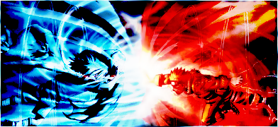
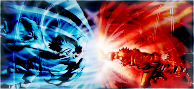
Let's see if I've gotten any better.

If it's not transparent in the blue parts, then I did something wrong.

I don't much like Naruto anymore, so odds are that's the last one I'll make. I made that before school started, so at least 2 months ago.
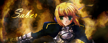
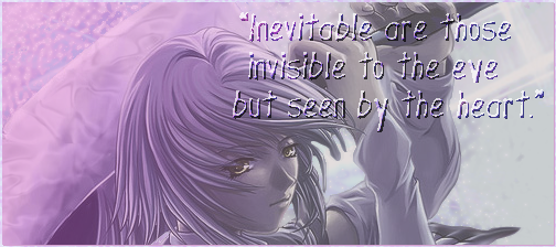
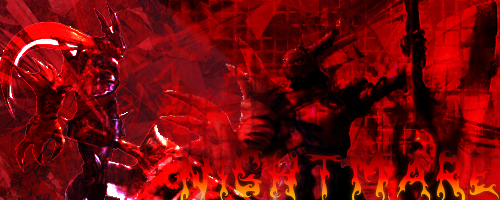
My personal favorite of my Saber sigs. I'm a fanboy for her at the moment, allong with several hundreds of others.
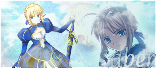
Edited a promotional wallpaper from the Fate game.
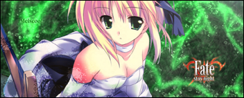
Wallpaper I made turned into a signature. The size of things are sorta shotty because I didn't bother to do much of anything to it other then resizing.

And lastly, my VERY FIRST wallpaper. This wallpaper took me some time to get things right, and it has a lot of stuff done to it. First off, the water, reflections, etc, all me. The tree shadows on the render are also me too. The logo was self rendered, but the character is a stock render from the Fate game. However, it was a jpeg image, so I went in and redid the hair, face, and sword. I hope it's a lot less noticible that it's a distorted image.
EDIT: Yeah, the wallpaper is 800X600 I think. It's actually ment to fit a whole 17 in screen, so yes, it's been resized to fit on here.
Post by: plightofthepureblood on November 09, 2006, 03:31:26 AM
But this stuff looks awesome man.
Good work.
It makes me want to pira-er...purchase a copy of photo shop tonight..
right after I finish the stupid big download Im working on.
Keep it up man. Very cool.