Post by: Noobpwner on October 27, 2006, 01:37:35 AM
Post by: Prpl_Mage on October 27, 2006, 04:26:58 AM
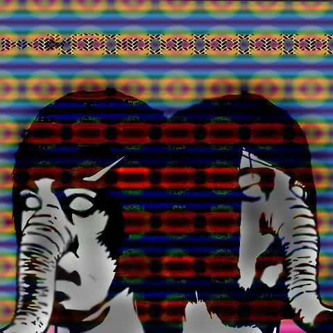
But try to add a backround to the picture and try to remove the white edges around the bird.
If you add a backround, it is more likely that the thing is seen as one picture insteed of two different ones(snake and bird).
And maybe making the snake transparent and like add it into the backround as well but alot larger?
The snake is drawn on a piece of paper and the bird is an actually picture, and putting those two together without altering one of them makes it look, weerd.
Sorry if you can´t take this kind of critism btw.
Post by: VulcanRaven336 on October 27, 2006, 05:42:02 AM
Post by: Noobpwner on October 28, 2006, 04:01:11 AM
Post by: drenrin2120 on October 28, 2006, 04:15:24 AM
Quote
Originally posted by VulcanRaven336
[strike]Get[/strike] Pirate Photoshop :D
Post by: Noobpwner on October 28, 2006, 04:32:52 AM
Post by: Archem on October 28, 2006, 04:46:49 AM
Post by: Moosetroop11 on October 28, 2006, 10:24:49 AM
Post by: DarkFlood2 on October 28, 2006, 12:07:07 PM
Post by: Noobpwner on October 28, 2006, 04:16:40 PM
Quote
Originally posted by Archem2
It's not a crime if you don't get caught! I mean, I haven't been to jail yet... I totally should, though.
Just remember DO NOT DROP THE SOAP!!!Lol
Hers one I did on Photoshop ,of death from above 1979.
I was just messin around with pic so it probably sucks.
edit: The writing from the pic isnt showing up :(
Post by: Meiscool-2 on October 28, 2006, 04:20:22 PM
Post by: Noobpwner on October 28, 2006, 05:06:18 PM
Heres the same picture but edited on Jasc paintshop pro 8..
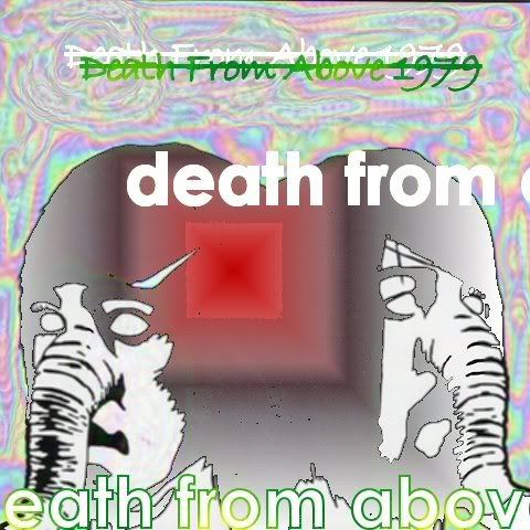
I think it looks better
Post by: Moosetroop11 on October 28, 2006, 05:42:15 PM
Post by: Noobpwner on October 28, 2006, 05:45:34 PM
Post by: Noobpwner on October 28, 2006, 06:33:37 PM
Tell me what you think of it??
Post by: Noobpwner on October 28, 2006, 08:39:45 PM
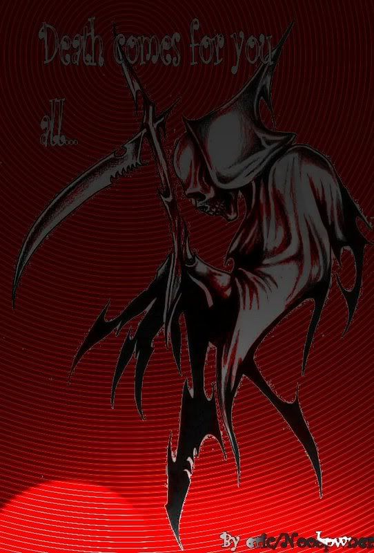
what do ya think??
go here to see full sized http://i110.photobucket.com/albums/n98/twistedjoke/Death.jpg
Post by: MrMister on October 28, 2006, 09:31:43 PM
Post by: Blue_Strife on October 29, 2006, 12:13:29 AM
Post by: MrMister on October 29, 2006, 12:15:22 AM
http://good-tutorials.com/
Post by: Meiscool-2 on October 29, 2006, 05:13:20 AM
Doesn't work to well that way. I'd suggest that you practise more before you post 'junk', because that's what this is. These are made in a few seconds time at most. I know you're just begining, but you don't have to show us everything you make from day one. Wait till day 10 or whatever when you're actually decent and you can do something that everyone else isn't able to do.
Post by: Noobpwner on October 30, 2006, 02:41:01 AM
and to answer the question the bottom one I think looks best...
EDIT::My death pic I spent more time on and now its almost done but I need a poem about death anyone out there have one??
Post by: Blue_Strife on October 30, 2006, 03:39:33 AM
O_o;
You're gonna kill it even more with text, imo.
Oh, btw MIC, I like the first one best. Nice amount of depth. :P
Post by: plightofthepureblood on October 30, 2006, 03:43:46 AM
Post by: Noobpwner on November 04, 2006, 05:12:30 AM
Quote
Originally posted by Blue_Strife
"I need a poem about death..."
O_o;
You're gonna kill it even more with text, imo.
Oh, btw MIC, I like the first one best. Nice amount of depth. :P
Hmm yeah that one looks good to but i like the last one it just looks cooler(the effects from the first one look cool)