Post by: forgetaboutit on April 22, 2007, 02:53:37 PM


Gifs:


Post by: Meiscool-2 on April 22, 2007, 03:42:26 PM
Post by: Moosetroop11 on April 23, 2007, 09:34:01 PM
The sigs could also be held together a lot better- most have a sort of quickly done 3D edge which could be replaced by experimenting with borders.
Keep it up :)
Post by: ZeroKirbyX on April 23, 2007, 09:38:48 PM
Post by: Meiscool-2 on April 23, 2007, 09:43:56 PM
Post by: ZeroKirbyX on April 23, 2007, 09:50:40 PM
)
Post by: Meiscool-2 on April 23, 2007, 09:52:14 PM
Might take awhile. Also, I'm not the best photoshopist around, and every artist has their own style, so you've got to remember that this will just be my opinion.
Post by: ZeroKirbyX on April 23, 2007, 10:39:39 PM
Post by: Meiscool-2 on April 23, 2007, 11:05:30 PM
Alright, let's see how this works for you:
To begin things, I always make the color of my background layer black, then make a new layer for the next thing I want to do. Lastly, I keep the color of the brush as white, and I will note any color changes in the guide. For the purpose of this guide, you should do that too.
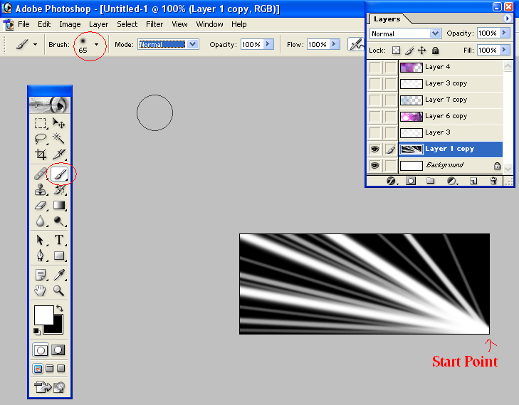
After making the first layer, start out with a circular brush. It's best if it has a gradual fade, so use one with a fade already in it or use the airbrush tool.
Next, select a spot on your signature. I chose to use a corner. After you chose the spot, left click to start the brush, then press "SHIFT". Let go of the mouse afterwards, then go to another side/corner of the signature and press the left click again. You should see a straight line from your first click to your second click. Try doing this a few times with different angels and brush sizes. It might look somewhat like the below:
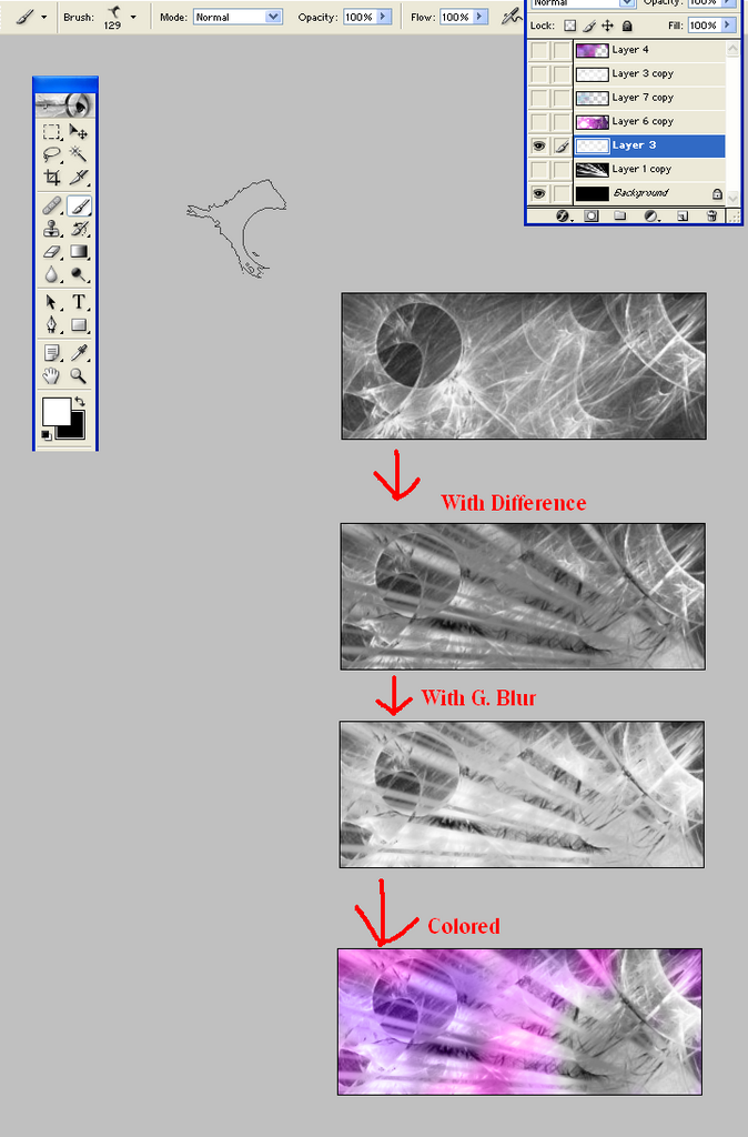
Next, click the box in the layer window that hides the layer you just made. You should now be staring at a black box. Make a new layer above the one you just hid. Put on any C4, fractal, crystal, whatever your favorite brush types are. Use your favorite brush here and there untill you get an outcome that covers most of the signature.
Set the blend of the layer you just made to Difference, and reclick the box that you used to hid the previous layer. You should now have what is begining to look like a decent background.
Next, press Crtl+J (Layer Copy) on the layer you just made, and go up to Filters. Use a Gras Blur, and set the Radius to around 3. This will give your signature a much brighter and less focused look. Experiment with the blend options. I chose to use "Overlay" here, but you might want to use something other.
Next, make a new, blank layer. Go to filter, Render, and hit clouds. You should have a filled layer that looks like it's black and white fog. Set your brush to the settings stated at the begining of this guide, and change the color of your brush to something other than white/grey/black. For the purpose of this guide, I chose Purple.
Go to your brush settings and set it from "Normal" to "Color". Shade in a few areas, and after you have around 25% of the signature covered with one color, change to a different color and color in another 25 or so percent. I chose pink as the second color, and then a darker shade of the original purple as the third color.
Visual below:
That is my quick tut on how to make a decent looking background. Several more things can and probally should be done to make it look better, but this is just the basics.
After a couple tweeks here and there, and the adding of some images, you can have a cool looking signature:

Next, add your text, and, if you think your work is good enough, add your name to the signature as well.

Any questions, thoughts, problems, or issues (as I might've forgotten to add a step as I was writing), feel free to ask.
Post by: ZeroKirbyX on April 23, 2007, 11:15:44 PM
Post by: Meiscool-2 on April 24, 2007, 12:14:44 AM
Personally, I don't like the colors, but like I've said before: Each artist is different.
To prove that your background can actually go somewhere, I fooled around with it a little bit. Sure, the outcome isn't as good as most my stuff, but as you can see, it doesn't take a whole lot of editing to make something effective.
Post by: Ben on April 24, 2007, 01:09:11 AM
(Rhetorical question. Dont answer)
Post by: Moosetroop11 on April 24, 2007, 12:03:23 PM
Quote
Originally posted by lucas_irineu
can you give me a download link to some brushes?
Presumably you've already tried
Quote
Originally posted by ZeroKirbyX
The only brush site you'll ever need. (http://www.deviantart.com/
)
?
Post by: ZeroKirbyX on April 24, 2007, 12:47:06 PM
Post by: Moosetroop11 on April 24, 2007, 01:50:40 PM
I quoted him and then said "presumably you've already tried ZKX's link"
Post by: ZeroKirbyX on April 24, 2007, 10:34:24 PM
Post by: Meiscool-2 on April 24, 2007, 11:17:16 PM
Personally, one thing I would change is making the render look... less slapped on. An easy way to do this would be to put another layer over the render or something simple.
Post by: Ben on April 24, 2007, 11:25:43 PM
You just have to Mute the green to more of an Oliive tone.
If you could Dull the saturation in the background and Add some say....Beige Highlights, youd have some good colour scheme (dull drab militant muddy colours would go best with that dude)
But Bright green and poop brown dont mix, no.
Post by: ZeroKirbyX on April 24, 2007, 11:30:34 PM
Post by: Daetyrnis on April 24, 2007, 11:51:09 PM
I've noticed that people put images into their sigs such as anime faces or dragons or whatnot. The thing is, whenever I do that, I generally have a white noise around the edge.
Sure, I could spend 5 minutes figuring out an awesome way how to get rid of it myself.
But why not get an awesome answer from the source?
Post by: ZeroKirbyX on April 25, 2007, 12:11:08 AM
Post by: Daetyrnis on April 25, 2007, 01:01:14 AM
And it didn't happen.
Problem solved?
Post by: Meiscool-2 on April 25, 2007, 01:13:11 AM
However... whenever I have a little white to get rid of, I either use the color brush, erase tool, or blur.
Post by: game_maniac on May 13, 2007, 05:07:35 PM
Post by: Meiscool-2 on May 13, 2007, 05:08:27 PM
However, the text on that just plain sucks.
Also, there is no need for a tutorial on blending... blending is just changing the options of layers. What colors do and don't show, the trans, ect.
Post by: game_maniac on May 13, 2007, 06:06:42 PM
Post by: ZeroKirbyX on June 02, 2007, 07:32:42 PM