Post by: Dominicy on November 24, 2007, 05:24:43 PM
Post by: Dominicy on November 24, 2007, 05:28:35 PM
Post by: Dominicy on November 24, 2007, 05:30:48 PM
Post by: A Forgotten Legend on November 24, 2007, 09:19:45 PM
Post by: Dominicy on December 03, 2007, 11:52:56 PM
Post by: MrMister on December 13, 2007, 03:48:26 AM
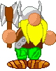
also look at the 'axe' on the tail, it doesnt look smooth. or like an axe
anti-alias it some.
Post by: Dominicy on December 13, 2007, 05:13:39 AM
EDIT:
You know, I can see what you mean by black outlines not being smart. Looking back at it again, it seems to make it look... wierd, almost pop out. But at the same time, what exactly should I use in substitution to a black outline? The only thing I can think of is a darker shade of the color closest to the outline, maybe I'm just dumb.
About the axe not looking completely like an axe, that's mostly the fault of I didn't want to oversize the tail's barb. The needle at the tip of the tail, right after the blades, should be removed, though.
Post by: Dominicy on December 13, 2007, 05:15:42 AM
Post by: Dominicy on December 13, 2007, 05:51:31 AM
Post by: MrMister on December 13, 2007, 06:00:44 AM
..you picked better colours this time, still needs to be anti-aliased.
And know that dithering is a complicated pixel technique, and you shouldn't use it until you fully understand it.
Post by: Dominicy on December 13, 2007, 03:32:06 PM
EDIT: I've actually never heard the term, what IS anti-aliasing?
Post by: Moosetroop11 on December 13, 2007, 08:34:19 PM
Overall they seem pretty good though, keep spriting :)
Post by: ZeroKirbyX on December 13, 2007, 09:08:29 PM
By the way, when it comes to doing edits, not just FE, do more than change the hair color. UNless you want it to look like [Insert character] overstylized, do it.
Post by: Ben on December 13, 2007, 09:28:10 PM
cloud strife with blue hair is still cloud strife....
just an example...mmyep
Post by: Dominicy on December 14, 2007, 01:03:24 AM
Post by: Dominicy on December 14, 2007, 01:06:20 AM
Post by: Dominicy on December 14, 2007, 01:09:58 AM
Post by: MASTA NOHORN on January 16, 2008, 04:06:34 AM
Post by: Dominicy on March 15, 2008, 05:37:46 PM
Post by: Dominicy on March 15, 2008, 06:11:16 PM
Post by: Moosetroop11 on March 15, 2008, 06:29:44 PM
Post by: Dominicy on April 26, 2008, 08:24:04 AM
Post by: Dominicy on April 26, 2008, 08:26:30 AM
Post by: Dominicy on April 26, 2008, 04:49:48 PM
Post by: Dominicy on April 27, 2008, 03:47:19 AM


Post by: ZeroKirbyX on April 27, 2008, 04:01:44 PM
Post by: Dominicy on April 27, 2008, 04:50:11 PM
Quote
Originally posted by ZeroKirbyX
I dunno, I think she looks rather feminine.
It's all in the eyes, earring and mild cleavage, maaaan @.@
By the way dude, here's the pictureI asked if yu could check last night. I'd say he looks pretty close to the original.

:O!!! One of his eyes is higher than the other!!
Post by: Dominicy on May 08, 2008, 04:55:21 AM
Post by: Dominicy on May 08, 2008, 04:56:43 AM
XD Forgot to ever change the song name
Post by: Noodman on June 07, 2008, 06:40:12 PM
Post by: Dominicy on June 14, 2008, 02:45:45 AM
Here's the intro song, 100% accurate and ready to be sent to the Complete Resources.
There's not much I can do about the volume change right in the middle. It's to give the characters in the introduction scene some 'room' to speak.
Post by: Dominicy on August 16, 2008, 05:45:41 PM
Post your thoughts here or there, either works.