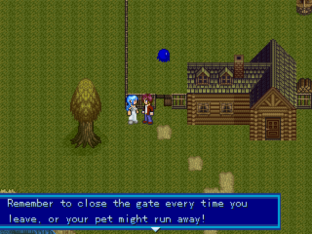
Post by: Ace of Spades on May 07, 2006, 07:33:59 PM
Now, obviously you're more likely to want to post a finished product in your game thread, so that's why in this one, you get a good start on the map, and then us members can tell you how you're doing. This way you can fix mistakes and such with the map before you're completely done with it.
All the rules of this board apply, and this thread is only for posting screenshots and then commenting on them. Post away! ^_^
Post by: CoolZidane on May 07, 2006, 08:53:49 PM


Post by: PyroAlchemist on May 07, 2006, 09:01:04 PM
Quote
Originally posted by CoolZidane
Here are mine.
Those look pretty good. Except the second one, the water and the trees look to squared. Try fixing that up a bit =)
Post by: CoolZidane on May 07, 2006, 09:24:16 PM
Post by: Meiscool-2 on May 07, 2006, 11:52:04 PM
Post by: Linkizcool on May 08, 2006, 12:42:15 AM
Post by: ZeroKirbyX on May 08, 2006, 12:44:28 AM
Quote
Originally posted by Linkizcool
Meis, asking if anything is wrong with your maps is like Rembrant asking if there was something wrong with his Night Watch.
Oh for the love of... They're good, yes. But they're not perfect. Personally, I don't like the top right corner of it. Somethin seems wrong with it.
Post by: Linkforce on May 08, 2006, 01:37:16 AM
Post by: PyroAlchemist on May 08, 2006, 01:42:34 AM
Quote
Originally posted by Linkforce
Meiscool, I think your map has too much going on, to know whats going on.
Agreed. Also I think it should be a little lighter.
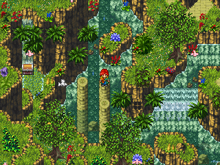
Post by: aboutasoandthis on May 09, 2006, 08:38:13 PM
Post by: Meiscool-2 on May 09, 2006, 08:51:07 PM
Post by: Archem on May 09, 2006, 09:16:41 PM
Quote
Originally posted by Meiscool
WHETHER or not you think my mapping is good isn't relevant. It's nice to hear that you like my maps, but I just wanted to know if the overlay is good or not.
I see no fault with the overlay. I do feel that your map is (and often are) too crowded. Strip it down to only what's important, and they're nothing more than strips. There, that's my two cents... continue with the overlay criticism.
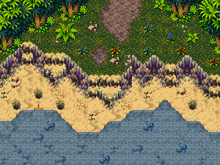
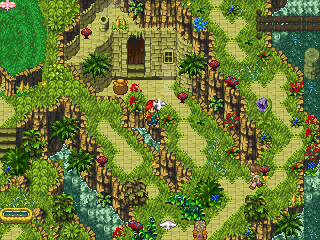
Post by: aboutasoandthis on May 09, 2006, 10:48:49 PM
It's a little dark here's a brighter version
Please post comment/things I need to add.
Also if you can, can you name any games that have chipsets that I can edit. For example some of the stuff up there uses Final Fantasy 5 Recolorings. If you know any other chipsets that can easily be recolored please tell me.
Post by: Meiscool-2 on May 10, 2006, 06:20:08 PM
Quote
Originally posted by Archem2
quote: Originally posted by Meiscool
WHETHER or not you think my mapping is good isn't relevant. It's nice to hear that you like my maps, but I just wanted to know if the overlay is good or not.
I see no fault with the overlay. I do feel that your map is (and often are) too crowded. Strip it down to only what's important, and they're nothing more than strips. There, that's my two cents... continue with the overlay criticism.
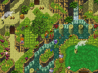
They are crowded because my maps are ABS maps. If I put to much space in it, you'll be able to walk by to many enemies, and get ganged up on to easily.
As to the forests, it looks fine. Sorta looks like it's lacking effort, and more just pre-made on the chipset, but if you make the entire forest look like that, it will look fine. It all depends on how you want your mapping, be it open like what you've got, insanly detailed like what Robotam does, or crowded and detailed like mine.
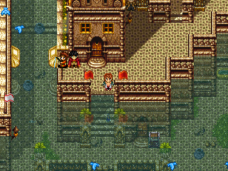
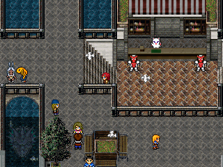
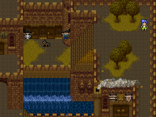
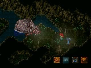
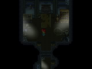
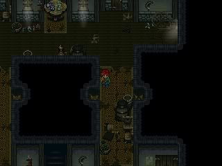
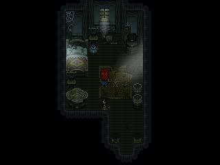
Post by: Robotam on May 10, 2006, 06:47:22 PM
Just a simple room in an underground hideout.
Edit: Try to avoid double posting please. Thank you. ^^
~Ace~
Post by: Archem on May 10, 2006, 08:14:01 PM
Quote
Originally posted by Meiscool
quote: Originally posted by Archem2
quote: Originally posted by Meiscool
WHETHER or not you think my mapping is good isn't relevant. It's nice to hear that you like my maps, but I just wanted to know if the overlay is good or not.
I see no fault with the overlay. I do feel that your map is (and often are) too crowded. Strip it down to only what's important, and they're nothing more than strips. There, that's my two cents... continue with the overlay criticism.
They are crowded because my maps are ABS maps. If I put to much space in it, you'll be able to walk by to many enemies, and get ganged up on to easily.
As to the forests, it looks fine. Sorta looks like it's lacking effort, and more just pre-made on the chipset, but if you make the entire forest look like that, it will look fine. It all depends on how you want your mapping, be it open like what you've got, insanly detailed like what Robotam does, or crowded and detailed like mine.
I always thought it would be good to give more breathing room in an ABS, since you can get group attacked more easily in a crowded, claustrophobic area. Mebe I'm not thinking on the same wavelengths as you on this, but it's not important. Your maps still look good nomatter what. Even if I don't like them, I can't lie about their awesomness.
Post by: jynce on May 12, 2006, 08:21:41 PM
Post by: Zerlina on May 12, 2006, 09:21:06 PM
Quote
Originally posted by Robotam
Just a simple room in an underground hideout.
I like it ^^. And on a side note, I also like your spriting style!
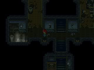
Post by: Meiscool-2 on May 12, 2006, 11:43:10 PM
Quote
Originally posted by jynce
robotam i see that's a very nice room not alot of space though
Where the hell are you gonna walk in a SMALL ROOM?
Post by: Robotam on May 13, 2006, 07:51:16 AM
Quote
Originally posted by Meiscool
quote: Originally posted by jynce
robotam i see that's a very nice room not alot of space though
Where the hell are you gonna walk in a SMALL ROOM?
Hahah, agreed. :P
Thank you, p'eeps.
Post by: drenrin2120 on May 20, 2006, 03:07:48 PM
Post by: Robotam on May 21, 2006, 04:49:01 PM
That house would look even better if it was one level higher. ^^'
Post by: darkrune on May 21, 2006, 06:21:38 PM
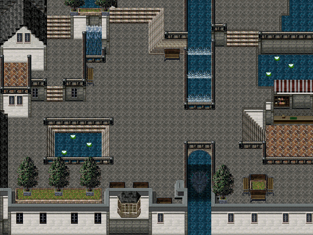
Post by: drenrin2120 on May 21, 2006, 07:14:23 PM
Here's another map, it's a mansion in a massive city. 100 x 100, with about 20 enterable houses.
Post by: ZeroKirbyX on May 21, 2006, 07:37:10 PM
Post by: drenrin2120 on May 21, 2006, 08:22:57 PM
Post by: Bluhman on May 21, 2006, 08:32:16 PM
Post by: drenrin2120 on May 21, 2006, 08:51:38 PM
Post by: Bluhman on May 21, 2006, 08:56:07 PM
Quote
Originally posted by drenrin2120
okay, checked. What about the wall itself?
Well, because I'm just so used to how the chipset is used by the Mac and Blue fellows, the top of the wall doesn't look quite right to me; It looks like one could just cross over to the ground below. Simply said, it looks like that the courtyard inside the walls is a big trench. Try using a different chip for the top of the walls, Ok?
Post by: drenrin2120 on May 21, 2006, 10:02:40 PM
Post by: Bluhman on May 21, 2006, 10:14:06 PM
Post by: ThaSprout on May 21, 2006, 10:17:45 PM
but You shouldn't have done it both sides, at the left wall. I'd say remove one side, Otherwise, it's not a wall, but just a slope, with a stright path on top ;)
And for the water, maybe you should lighten it a bit, it's not a little to dark for me, just to be water. Of course, it's a different story when the water is moving, but still ;)
But it's a good map m8 n__n
Post by: drenrin2120 on May 21, 2006, 10:31:55 PM
Quote
Originally posted by Bluhman
Not... Quite. Try giving the old walls some railing of sorts to make the two look like different elevations.
Well, they're not ment to be walked on, and no sprites will walk on them. Maybe the tile on top?
Post by: Bluhman on May 22, 2006, 07:01:27 PM
Quote
Originally posted by drenrin2120
quote: Originally posted by Bluhman
Not... Quite. Try giving the old walls some railing of sorts to make the two look like different elevations.
Well, they're not ment to be walked on, and no sprites will walk on them. Maybe the tile on top?
Nonono. Like THIS:
Post by: drenrin2120 on May 22, 2006, 11:47:30 PM
NOTE: Doors will be added later.
Post by: Bluhman on May 22, 2006, 11:49:55 PM
Post by: drenrin2120 on May 24, 2006, 12:40:41 AM
Post by: Robotam on May 24, 2006, 08:05:05 PM
Post by: Meiscool-2 on May 24, 2006, 08:30:33 PM
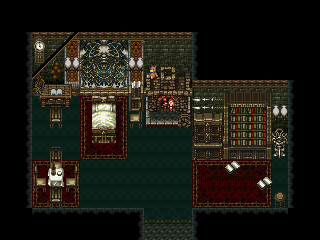
Post by: aboutasoandthis on May 24, 2006, 10:08:05 PM
Robotam: I like your maps just so you know.
Meiscool: Why do you bother posting here? Out of all your maps I've seen I like this one the best. Are you using pictures or double sized charsets?
I know this isn't a map like everyone elses but this place said Screenshot so I'm assuming it's okay for now.
I know the Icons look a little off. I'm using charsets. Soon I'll use pictures to get the placement just right. Right now, I'm wondering what to do with the space. Should I add anything?
Post by: Bluhman on May 24, 2006, 10:22:36 PM
Post by: Robotam on May 25, 2006, 05:36:19 AM
Post by: Meiscool-2 on May 25, 2006, 04:47:42 PM
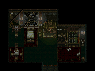
The CMS looks fine. Not as classy as your other ones, but I'm sure you'll make it look better.
As to the water, those would be charsets. If I had a picture, it would be harder to animate, and it would overlap on the birds, which would make them seem underwater.
Slight update on that. What do you think, is the effect to strong?
EDIT: Yes, I do know that the roof of the house is unrealistically reflected, but it looks way nicer this way.
Post by: ZeroKirbyX on May 25, 2006, 08:12:34 PM
Post by: aboutasoandthis on May 25, 2006, 10:51:16 PM
While I'm on the subject, can I get some comments on my beach?This is actually a very heavily edited chipset that I spent a lot of time on. I'm using the same water effect as you (I didn't steal the idea just now. I came up with the water months ago. If you want proof, look on the third page of my thread.
For now ignore how the flowers are in straight lines. I probably should have put in some more levels. Consider the map unfinished. As for my map comments:
Meiscool: Like ZeroKirbyX said, please take out the orange on the roof. You ruined the map for me. The reflection idea is awesome though. Did you use photoshop or did you do what I do (Make picture over one frame of water, save, repeat, then convert to character sets)?
Robotam: I'm a little disappointed in this one. The forest idea is kinda cool, but I'm pretty sure almost anyone could do it (You and Meiscool put how to in your tuts). Could you put in a rain splash effect in the water and in some of the ground? I'm not sure but I think "The Way" had one in there somewhere. It's your map and your decision.
Post by: Meiscool-2 on May 25, 2006, 11:14:10 PM
As to the reflection, it's just a picture. I do that for easy editing.
And, I edited the roof out. Does it look better now?
Post by: Linkforce on May 25, 2006, 11:17:17 PM
>.>
<.<
>.>
XD
P.S.-The roof looks much better this way.
Post by: Meiscool-2 on May 25, 2006, 11:21:33 PM
Quote
Originally posted by Linkforce
If that map was a girl I would lay her down and do her.
>.>
<.<
>.>
XD
P.S.-The roof looks much better this way.
You would.
Post by: aboutasoandthis on May 25, 2006, 11:23:23 PM
My beach, I think it looks odd because instead of a beach, it looks like a lake. If you look close you can see it kinda slide down. I used to have a really good tide charset but I lost it. That is why the sand isn't flat. I don't blame you for thinking it looks wierd.
Post by: ZeroKirbyX on May 25, 2006, 11:28:32 PM
Post by: aboutasoandthis on May 26, 2006, 12:12:07 AM
Post by: ZeroKirbyX on May 26, 2006, 12:17:27 AM
Post by: Meiscool-2 on May 26, 2006, 12:21:45 AM
More of the city:
It's really a small city. Hope you guys like it. For some reason, I just don't know what else to add to it, and to me, it feels empty.
Post by: aboutasoandthis on May 26, 2006, 12:58:55 AM
Meiscool: I don't have much to say. I say just follow your storyline. I would have said just put some grass crack in the ground, but since there are no other cracks in the city, the idea is stupid. This map is wonderful. I don't really have any more comments. Maybe more shadows for the flags and stuff?
Post by: Linkforce on May 26, 2006, 01:04:34 AM
I would still plow it if it was tangible.
Post by: Robotam on May 26, 2006, 08:04:18 AM
I really don't have much to offer. I'll show you a simple interior map.
Post by: aboutasoandthis on May 27, 2006, 12:45:11 AM
Real Reason I posted: I don't know if this is allowed to be asked here but can there be a practice map section for maybe noobs and people like me who want to practice mapping?
This Screenshot Topic is a great idea. Can there be one for maps that aren't really screenshots? Like say you tell someone to read a map tut and they want feedback without messing with this topic or there game topic. In fact, can there be a noob section? You know, that teaches you how to post screens, how to make maps, how to make sigs, and stuff like that?
If this post is illegal I made a map too. It's using the chipset from the Burning Grail. I'm not going to use his chipset. Soon I'll edit my own and make something similar.
Again is anyone interested in my idea? Can I get some comments on my CMS a few posts back too? Please?
Post by: Meiscool-2 on May 27, 2006, 12:57:43 AM
N00b section is called the FAQ section.
That chipset is used everywhere, and is called Mac and Blue.
Really, I don't like your idea. Nothing personal, but it sounds useless. Most people that want feedback on their maps are me, and people that don't bother reading the rules and just throw their maps in some random "games" topic asking them to rate their RTP creations.
Yeah, keepin' it legal:
Post by: Robotam on May 27, 2006, 07:13:39 AM
Post by: Meiscool-2 on May 27, 2006, 02:18:25 PM
Post by: Robotam on May 27, 2006, 06:12:04 PM
I really must have lost my mapping talent, but that's all right cuz in return I got my game making spirit back.
Post by: aboutasoandthis on May 27, 2006, 06:55:53 PM
Post by: Robotam on May 27, 2006, 07:05:45 PM
I like your mountain map Aboutaso, I like it a hell lot more than I like my own map. So your map is way better than mine. :)
Post by: Kijuki_Magazaki on May 27, 2006, 07:09:12 PM
Quote
Originally posted by Robotam
Yeah, I know.
I really must have lost my mapping talent, but that's all right cuz in return I got my game making spirit back.
Nuuuuu...
Alll the maps in here make me look like an ant on a millipide city
Post by: Meiscool-2 on May 30, 2006, 05:58:55 PM
Night time!!!!!
Daytime!!!!!
Post by: aboutasoandthis on May 30, 2006, 08:03:03 PM
Actually, since I'm here, can someone give me chipset advice?
I made a new chipset by mashing together a bunch.
I know, I know, the maps look like ****. I just want to know if it is a good enough chipset and if anyone would bother to use it. There aren't many chipsets like this so I took the time to make this one. I want to know how to make the chipset better. The chipset has already been uploaded to Complete Resources.
Post by: Meiscool-2 on May 31, 2006, 06:43:43 PM
Anyone remember my old floating islands? Well, how does it look rudraized?
Post by: drenrin2120 on May 31, 2006, 08:17:58 PM
Post by: aboutasoandthis on June 02, 2006, 07:44:49 PM
Can I get some comments on this? What looks good, what doesn't, what looks wierd? Can you also give advice on the new charsets of the races? I don't know what to do with the city. I was thinking about using roofs for some slopes, lots of levels, and a bunch of dragons everywhere.
After looking through this thread, I came to realize that I was the only one who didn't post a map as a screenshot. In fact, a lot of the screens here are maps. Everybody here only comments on maps. Most of the screens in this Forum focus on mapping. Only a few threads here show things like a CMS, or a minigame, or battles, or a really cool special effect. Is mapping that important to the graphics?
I was bored.
Post by: jynce on June 02, 2006, 08:53:42 PM
Post by: Meiscool-2 on June 03, 2006, 12:06:30 AM
You would have to put a nice ammount of detail into the map to make it work. Often times (this has happened with me) you make the first 50X50 or so prefect, then start lagging and just wishing it would be done on the rest of the map.
In my opinion with maps that large, if they don't look nice, I won't bother walking through them.
Post by: aboutasoandthis on June 05, 2006, 12:59:12 AM
I don't want to use Mac&Blue for my game, so if someone can help me make Theodore's chipsets look happy, I'd really appreciate it. I don't know how to detail the city. Should I put in grass and vines everywhere? Should I put in a bunch of levels? Should I make it a water city like Venice, Italy? Should I get some dragon sprites and make statues and murals?
Please give me some help here. I really want the city to look nice and I really want to be a good mapper. Please respond.
Post by: Meiscool-2 on June 05, 2006, 01:04:07 AM
Post by: aboutasoandthis on June 05, 2006, 01:14:47 AM
Post by: Meiscool-2 on June 05, 2006, 01:40:55 AM
Post by: aboutasoandthis on June 05, 2006, 07:55:58 PM
Quote
Bah, ToP chipset. I tried, but nothing much came out. I would suggest another chipset, but that's just me. Something like the one I used a page or two back might suit you better.
I'm guessing you mean Tales of Phantasia. Yes those chipsets are hard to use. This was a Theodore chipset though. Ever heard of it? It, and a lot of other Theodore chipsets are set up EXACTLY like Mac & Blue. This one included, is supposed to be like the towns and the castle chipsets.
I guess the colors threw you off. I don't blame you. A lot of good horror games use Theodore, even though they're not really for horror games. The colors are usually very gray or realistic. I did figure out that if I use a lot of white houses, A LOT OF WATER, different grass and leaf sprites, and very colorful NPCs, the map will come out nicer after practicing with it.
After sleeping on it, I decided to use the chipset anyway. I did look back some pages and I guess you were talking about the flooded city. I also looked back at the castle in the mountain. I admit I'm taking some of your ideas (With my own original twist on them) and I'm putting them into the city. I decided that the city will only be 160*120 as 16 different 40*30 maps so I can use a lot of panoramas and pictures.
Expect the first finished product in a day or 2.
EDIT===========================================
Forget the day or 2 thing. I took a day off from making the Equip Menu to really work hard with this chipset. I think it turned out AMAZING! I'm really happy with this map. It's still not finished yet though. I still have to put in the NPC, Waterfalls, Water Effects, Plants, and to animate the water (which should only take me five minutes because I actually know what the **** I'm doing).
I admit I stole some of your ideas Meiscool, but I put my own spin on it. In my game, the city was built under a waterfall, then got hit
by an earthquake. The city was rebuilt on top of the old one to attract tourists. This came from Meiscool's mountain castle. I even used the reflection idea but amped it up by putting a reflection of the sky. If you want credit I'll give you some.
I'm really satisfied with this map but if you have comments for improvements PLEASE GIVE A POST! I HAVE 15 MORE OF THESE TO MAKE!
Post by: Meiscool-2 on June 05, 2006, 10:00:56 PM
As to eventing that place, I would put fish in the water (naturally) and set them to be below the water events (if you used events instead of a picture. I would put lots of birds in (my mapping tut has a real easy bird script you could use if you don't know how) and that's about it for ideas. You could go the extra mile and put crates and sh!t floating in the water, but other then that I can't tell you much else.
Post by: aboutasoandthis on June 06, 2006, 08:16:16 PM
Quote
However, I also know that screenshots tell a must different story then in-game "shots" do, so it all depends.
I'm stupid today (it happens every other day). What did that statement mean. If you mean I should be taking screenshots and not shots of the entire map, I just wanted to see if I was building the city right. The REAL screenshots will be much smaller with text and cutscenes and stuff in them.
With most of the events and stuff put in how does it look now?
I couldn't fade the water and the reflections without it looking weird but I did fade the clouds. Does it look better? Plus it looks a little cluttered to me (You know I like my maps more open). Either way thanks for the mapping tips Meiscool.
This will be the last time I use a really big picture. After this I'm just using normal sized screenshots.
Post by: Zerlina on June 06, 2006, 09:21:20 PM
In reality, when you see a reflection, it shouldn't be an exact mirror image of the object it is reflecting. Depending on the angle you're looking at it, it should be slightly distorted (usually through compression). Otherwise, it seems like the objects exist underwater and are being seen from the top, as opposed to being reflections
Post by: ZeroKirbyX on June 06, 2006, 10:27:04 PM
http://photosbymartin.com/images/ethiopia/bahar-dar/images/177_7764.jpg This is a perfect example. See how theres LOTS near the edges, but none in the open?
Post by: aboutasoandthis on June 07, 2006, 01:50:00 AM
Originally Posted by ZeroKirbyX
Quote
Cool lillies, but look at a real body of water. Lillies tend to float in 'packs' and not just hang around randomly. Most times the majority will be near solid surfaces. Your walls for example. While some do float solo, you should make more clumps.
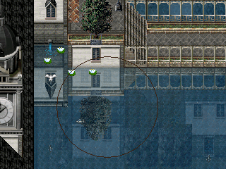
Thanks a lot. Your advice really helped. It actually solved my clutter problem (You can see my underwater city more clearly now). The finished product is attatched. Should I add anything else?
Originally Posted by Zerlina
Quote
In reality, when you see a reflection, it shouldn't be an exact mirror image of the object it is reflecting. Depending on the angle you're looking at it, it should be slightly distorted (usually through compression). Otherwise, it seems like the objects exist underwater and are being seen from the top, as opposed to being reflections
I'm using Panoramas but it will only take me 5 minutes tops to edit. I do it all the time. I don't really understand what you mean about the distortion. I already tried to distort them a little. Should I scrunch them up a space. I got picture examples if you wanna help me.
Reflection 1
I didn't know what to do here. It's a flat building. Should I make it shorter?
Reflection 2
I already tried to distort it a little, so I don't know what you're talking about. If you look, the base of the tree and the grass near it are missing. That's in my first pic. If you look a the stairs and the golden walls, I did the same thing.
Should I scrunch up the reflections or something?
Post by: drenrin2120 on June 07, 2006, 02:21:20 AM
I really like this. Simple but intricate and just... good.
Post by: Meiscool-2 on June 08, 2006, 12:39:23 AM
Where the hell did that second building (the reflection behind the tree) come from?
EDIT: Nvm, it's probally just a house that's underwater.
Post by: Meiscool-2 on June 08, 2006, 11:20:37 PM
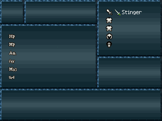
Physical: (from left to right) Monk, Fighter, Knight, Ranger.
Mixed: Dark Knight (<- Looking for new name), Paladin, Rouge, Assassin.
Magic: Wizard (<- Looking for new name), Priest, Witch, Druid.
Post by: aboutasoandthis on June 08, 2006, 11:35:33 PM
This is probably the best use I've seen of Roco art in a long time.
Post by: Meiscool-2 on June 08, 2006, 11:41:12 PM
The Knight:
The Rouge:
The Wizard:
Post by: aboutasoandthis on June 09, 2006, 12:00:24 AM
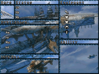
BTW: this was originally reply to the same picture thing but I updated the main CMS to look cleaner. What do you you think?
(THE GIL NUMBERS ARE PICTURES. HOW AM I WRONG?)
Post by: drenrin2120 on June 09, 2006, 12:07:16 AM
Post by: Meiscool-2 on June 09, 2006, 01:19:47 AM
YAY! I got the info thingie done. This is all pictures, none of it is text. You can tell because the pointer hand overlaps the text and the text box. I did however use facesets and text then took a screenshot to make the pictures.
YAYZORS!!! Now I just gotta do the Mixed and Magic sections....
EDIT: Oh yeah...
Blue O means mid
Red -- means low
Green + means high
Blue O with red in it means middle low, and vice versa for green.
ATK: Attack. MAG: Magic . DEF: Defence. SPD: Speed.
EVD: Evade. SKL: Skill Usefuliness DIF: The Difficulty the game will be at should you choose that class (not preset, just means that that class is worse in the game then others)
CST: Cost of items and equiptment EQP: Amount of Equiptment available. TYP: Type, P means Mostly Melee, M means Mostly Magic.
Post by: aboutasoandthis on June 09, 2006, 02:28:58 AM
As to the conditions, at first I was like "OH ****!!!!!!!!!!!!!" and I tried to fix it quickly until I realized, none of my conditions lasted after battle. Now that I think about it, I might have them after battle (for more tiny sprite goodness).
I have the following bad conditions:
Death (Does'nt count. Maybe a skull with 2 crossed bones.)
Poison(I'm thinking bubbles)
Venom(For MP, I'm thinking bared snake fangs.
Darkness(Sunglasses)
Curse(Limit Bar Goes up Slower, maybe a black cross?)
Silence(No clue. Ideas?)
EDIT+3 dots for silence
Berserk(Red Face with steam.)
Confues(Question Mark)
Frozen(Ice sprite)
Petrify(Stone Sprite)
Burn(Fire Sign)
Stop(Clock maybe?)
Sleep(ZZZ?)
Arrested(Halved stats. I'm thinking handcuffs.)
If this post was illegal, here is the edited CMS:
I 1moved it over by one space. I can probably squeeze one more in for a total of 15 shown conditions. If I should make the condidions end after battle, what should I do with the extra space under the HP and MP? Total Ability Points? Character Job name? The bad condition sprites?
BTW: I have a special EXP system in my game that only needs 100 EXP for a level up. It's based on the FF8 one where if you damage, based on the percent of the kill you get exp. I can't understand the default level up system at all.
Post by: Meiscool-2 on June 09, 2006, 02:37:34 AM
A cool status effect that you should add too is bleeding or severed vain.
EDIT: as to my thingies looking small, remember that when playing full screen, it's 400% normal size.
Post by: aboutasoandthis on June 09, 2006, 02:50:24 AM
**** no. My game will have its sick, disgustingly violent, disturbing, and questionable moments, but I can't see how it's a good idea. This is from a programming percpective. Unless I do something like halve the speed or something, what's the difference between it and poison?
I do like the changing the charaset idea though. Still, what if they had more than one condition that animates it like that? I'm using pictures there and I don't want to make all those animations.
Whatever happened to Robotam?
Post by: Meiscool-2 on June 09, 2006, 03:00:36 AM
Anyways, I just made it a really nasty version of poison. I also used custom coding to where if your party takes more then 500 steps or goes 15 minutes without having it fixed, the character dies, and if you revive him, he still has the condiction (that took custom coding too.)
Post by: aboutasoandthis on June 09, 2006, 03:06:12 AM
Post by: Yamaticie on June 11, 2006, 05:47:49 PM
Quote
Originally posted by Robotam
Where do you go in? :p
You break the windows offcourse! :P
Post by: Meiscool-2 on June 19, 2006, 01:41:24 AM
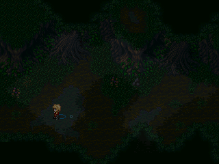
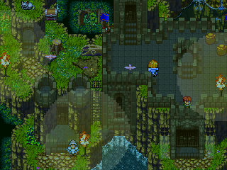
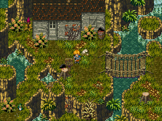
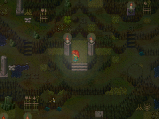
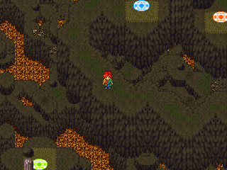
Many of you have seen a map that looks similar to this that I made, same houses, almost same water effects, and same mountainous area. Well, it's ment to basically be the same map, only several years before that map.
Besair!
Yes, I know I have plants growing on the buildings. I like it that way.
Post by: drenrin2120 on June 19, 2006, 05:54:42 PM
Post by: Robotam on June 19, 2006, 06:55:46 PM
Awesome buddy.
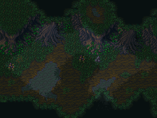
Post by: Meiscool-2 on June 19, 2006, 07:36:57 PM
Quote
Originally posted by drenrin2120
Very nice, but maybe, a tad bit too crowded. Maybe, at first, use more tiles than you're expecting to use, so you have room to work with. Like, you're making a 50 x 50 map, but you make it 80 x 80, just in case it turns out to be a little bigger.
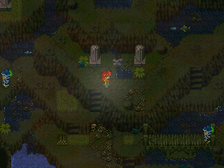
No worries there. I took extra time to make sure that citizens can never get in your way while walking (as in consealing a path and you having to wait for them to move out of the way to get by), and there are several paths you can take to get from place to place, most are by the pillars.
Quote
Originally posted by Robotam
Can't think of anyway to surpass you now. :p
Jigga wah!?
Post by: aboutasoandthis on June 20, 2006, 01:05:08 PM
Post by: X_marks_the_ed on June 20, 2006, 02:48:50 PM
EDIT: Oops! I just noticed that Nemi is standing ON the bush! XP
Post by: drenrin2120 on June 20, 2006, 03:27:03 PM
The maps not bad, but that chipset is.
Notice how the two dead trees line up vertically parralel? Trying moving one of them. When they line up it creates an odd affect and can dispell the sense of multiple ground levels. Try more variations in grass tiles, dirt, etc.
Other than that, not bad.
Post by: aboutasoandthis on June 20, 2006, 03:36:06 PM
Okay, there are some nice things in this map. You have some slopes to the right (flat land raised one level up with some empty spots). In fact, I like the right side. I don't really like the left side though.
The elevation is too high for me. It just looks ugly. And I don't like that second sign on top of the cliff either. The sign in the middle of the screen looks good to me though.
I noticed the tree in the middle that is missing its left branches. I think you wanted to make it look like it was smushed up against the cliff but, can you please take it out? It just doesn't look right there.
My suggestions:
+Move some of the trees around.
+Lower the elevation by at least 4.
+Add more random levels.
+Take out that second sign on the cliff.
+Add more events like animals and stuff.
You might wanna wait for a second opinion from someone like Meiscool or Robotam. They're better with Mac&Blue chipsets than I am.
Post by: Meiscool-2 on June 20, 2006, 03:55:49 PM
Quote
Originally posted by aboutasoandthis
You using that site I gave you? Perfection.
YES! I used that site to create the chipset for that map. It's 4 chipsets in one, and I have an event switching the chipsets so that every damn speck of water in that map is animated.
As for Mac, I'll let Robotam handle that. I think he's better with Mac then I am.
Post by: drenrin2120 on June 20, 2006, 04:24:51 PM

I need tips for what I can do to this palce to make it better. I've got butterflies, Brids, and monsters that run around. But it's lacking something, something to make it stand out.
Post by: xJericho on June 20, 2006, 04:33:39 PM
btw: I'm glad you're using one of my characters ;-)
Post by: drenrin2120 on June 20, 2006, 04:42:14 PM
Post by: aboutasoandthis on June 20, 2006, 04:43:17 PM
Back on subject, I think your map just needs an eye popper. You know, some kind of thing that makes the player look away from your hero.
In most of Meiscool's maps, he uses water and water effects. In Robotam's maps, he uses an extremely detailed place that the player can't reach. I try to use some stuff like that like in my underwater city.
How about a bunch of different flowers (red, blue, orange) in a specific spot you can't reach or something?
I don't know. I'm lost.
Post by: drenrin2120 on June 20, 2006, 04:56:18 PM

That other screenshot may nto have been the best, it was at the top of the map.
Post by: aboutasoandthis on June 20, 2006, 05:02:15 PM
Other than that this looks nice.
Post by: drenrin2120 on June 20, 2006, 05:07:50 PM

I did use charasets for the waterfall because A.) I can get a nice transparent effect and B.) The Chipset didn't have any waterfall tile and C.) If it did, it wouldn't have a transparency effect. :p
Post by: ZeroKirbyX on June 20, 2006, 06:46:16 PM
Post by: Meiscool-2 on June 20, 2006, 06:49:47 PM
And yeah, About is right, I use ALOT of water to make my maps stand out. Can your characters walk in water? Because if they can, I've got some stuff that could help you.
Post by: drenrin2120 on June 20, 2006, 07:11:24 PM
To Meis: Thanks but there's only one part in the map you can go up to the water and you can't walk on it. It's all set. And it's not high enough for clouds. High, but not that high.
Post by: Meiscool-2 on June 20, 2006, 07:31:16 PM
Post by: Ace of Spades on June 20, 2006, 07:36:09 PM
Post by: drenrin2120 on June 20, 2006, 08:07:25 PM
Quote
Originally posted by Ace of Spades
Judas is the name of the character in the screen, dren. xJericho made him, but then later made a better version that was all custom.
Yeah, I thought so. I forgot for a sec the sprite's original name was Judas since I saved it as Seren.
Post by: xJericho on June 21, 2006, 05:43:41 AM
maybe you wanna use this
edit: sorry, that was offtopic
Post by: X_marks_the_ed on June 21, 2006, 02:22:20 PM
Post by: Meiscool-2 on June 21, 2006, 03:32:25 PM
Post by: aboutasoandthis on June 21, 2006, 04:33:52 PM
www.gamingw.net
You might have to take of the >BR on the end of the link. To get all of them, go to Charasets then click on the letter W (If you don't already have them.) Also make everything in the water transparent. Use events to do that. And don't make the water look so box cut.
Alright, this is one of the first maps I've been able to work on. It uses a heavily edited chipset. How do I make this map look better? It feels empty. Don't say add people because I'm planning to make this a Bangaa town. I already tried adding snakes and spiders and stuff, but they look out of place. The only things that made sense were the dogs.
Post by: Meiscool-2 on June 21, 2006, 05:10:05 PM
Post by: X_marks_the_ed on June 21, 2006, 05:39:11 PM
Quote
You might have to take of the >BR on the end of the link. To get all of them, go to Charasets then click on the letter W (If you don't already have them.) Also make everything in the water transparent. Use events to do that. And don't make the water look so box cut.
Thanks. It looks much better.
I should probably fix the splashing though.
Post by: drenrin2120 on June 21, 2006, 06:23:13 PM
Quote
Originally posted by xJericho
*tears of happiness* ;D
maybe you wanna use this
edit: sorry, that was offtopic
Haha, yes! Pure insanity dude, thankyou much. :D
Post by: aboutasoandthis on June 21, 2006, 07:40:31 PM
Too much? Too little? It looks nice to me, but I'm always open for improvements. This is a really tiny map. I can't see how I could fit in shops, 3 houses (that you can't see right now) and a nice castle/government building in a 40*30 map.
xJericho: Can I have that chocobo?
Post by: Meiscool-2 on June 21, 2006, 08:21:01 PM
Post by: aboutasoandthis on June 22, 2006, 02:01:13 AM
A little off topic but, I'm trying to decide whether or not to put this town in my demo. I'm planning a little something special when it gets released. (Let me say now that it involves the Tetra Master Card Game.)
Post by: drenrin2120 on June 22, 2006, 01:20:37 PM
Post by: Meiscool-2 on June 23, 2006, 03:19:33 AM
Post by: xJericho on June 23, 2006, 03:15:35 PM
Post by: aboutasoandthis on June 23, 2006, 03:53:24 PM
Post by: xJericho on June 23, 2006, 04:07:16 PM
of cours you can use them,... they're not mine
Post by: Meiscool-2 on June 23, 2006, 11:26:44 PM
Post by: Weerd Thing on June 25, 2006, 12:41:52 AM


W££rd
Post by: Meiscool-2 on June 25, 2006, 12:44:19 AM
You should put windows on the houses.
EDIT: Poor/rundown looking enough?
EDIT2: Yes, I do notice the upper left corner.
Post by: coreystranick on June 25, 2006, 03:43:27 AM
Post by: aboutasoandthis on June 25, 2006, 04:06:10 AM
Meiscool: It looks okay. Too much inconsistancy for me (mixing Star Ocean and Rudora). I don't like the Star Ocean house. Seeing the wierd gray color next to that work of art of a yard, it doesn't look good. I personally think you should get a new one. Everything else is peachy keen!
Post by: Meiscool-2 on June 25, 2006, 08:08:28 PM
Post by: drenrin2120 on June 26, 2006, 04:55:46 PM
Post by: Me5kuTis on June 27, 2006, 03:53:34 PM
Post by: Robotam on June 27, 2006, 04:13:34 PM
The map may be a little empty but deserts aren't suppose to be too cluttered I guess.
It would be nice if you got some new cloud pictures and maybe if you lighten the map up a little bit.
Post by: Me5kuTis on June 27, 2006, 07:33:27 PM
Can someone figure out how to make normal moving clouds in a 100x100 map bug-free as I'm having much trouble.
Post by: Meiscool-2 on June 27, 2006, 07:58:14 PM
Post by: aboutasoandthis on June 27, 2006, 08:14:11 PM
Post by: Tomi on June 27, 2006, 08:20:48 PM
Post by: Me5kuTis on June 27, 2006, 08:22:30 PM
Here's the current pic with the 'better' clouds.
Post by: Meiscool-2 on June 27, 2006, 08:22:44 PM
Post by: Tomi on June 27, 2006, 08:32:27 PM
Post by: Robotam on June 27, 2006, 08:48:41 PM
Post by: aboutasoandthis on June 27, 2006, 08:51:27 PM
DON'T SHOOT ME!!!!!!!!!!!!!!!!!!!!!!!!!!!!!!!!
Post by: Tomi on June 27, 2006, 08:52:03 PM
Post by: Meiscool-2 on June 27, 2006, 08:55:00 PM
Quote
Originally posted by Robotam
And there my ******* map goes undetected through the system AGAIN.
ROFL!!!!
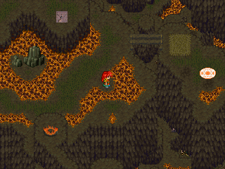
It's good, you're using my favorite classic lava-smog-vent things. The Rudra looks out of place somewhat.
Post by: Robotam on June 27, 2006, 08:55:48 PM
Quote
Originally posted by aboutasoandthis
That's cause it wasn't amazing. Just honest.
DON'T SHOOT ME!!!!!!!!!!!!!!!!!!!!!!!!!!!!!!!!
Well, I'm not an amazing map maker.
Post by: aboutasoandthis on June 27, 2006, 09:34:18 PM
Actually, since I'm here, can I get some input on these concept screens? This probably won't be in the demo but I wanna use it to show how my battles work. I also wanna know if I this DBS looks good enough or if I should go ahead and make a CBS. I've already raped the DBS as far as coding goes so making a CBS should be no problem for me. It'll just take a REALLY long time.
Take Note:
+Ignore the RTP guy. Like Meis said earlier, he's a test guy.
+The Font Patch did not work for 2k3 and this site's font fix tut is missing.
+These are just concept screens. I'm not even close to being done with my real ones.
Post by: ZeroKirbyX on June 28, 2006, 01:48:42 AM
Post by: Meiscool-2 on June 28, 2006, 02:00:28 AM
Post by: aboutasoandthis on June 28, 2006, 02:00:46 AM
Post by: Dragoon de Sol on June 28, 2006, 02:32:09 AM
Basic, but I cannot say it is effective either...
Lags like hell....
The numbers, backslash, and box....they're all pictures...
Surely something is up...
Post by: Meiscool-2 on June 28, 2006, 02:35:48 AM
Post by: aboutasoandthis on June 28, 2006, 02:52:29 AM
Post by: Ace of Spades on June 28, 2006, 02:59:02 AM
Quote
Originally posted by Meiscool
I would largly enjoy having whatever you used to make those little streams.
Likewise.
Post by: aboutasoandthis on June 28, 2006, 03:16:16 AM
(Meis) They are in the water effects chipset at that site I gave you but I color edited them and erased the messy parts.
You'll have to either convert them to charasets or put them in your chipsets and animate them. I used 4 different chipsets.
Put them to good use!
Post by: Meiscool-2 on June 28, 2006, 03:35:54 AM
Just give me awhile.
Post by: Robotam on June 28, 2006, 03:09:50 PM
Not the map of course, but the chipset I used to make it.

Post by: the keyblade master on June 28, 2006, 03:16:01 PM
Nice map Robotam.
Really creative!
Post by: aboutasoandthis on June 28, 2006, 03:25:53 PM
Didn't I say I saw an amazing mapper in there? :D
Post by: Meiscool-2 on June 28, 2006, 05:04:44 PM
Nice.
Post by: Bluhman on June 28, 2006, 05:09:01 PM
Post by: Robotam on June 28, 2006, 05:43:41 PM
I think things like that can be done with many other chipsets.
Post by: MrMister on June 28, 2006, 06:31:17 PM
Post by: Robotam on June 28, 2006, 07:09:26 PM
Post by: Meiscool-2 on June 28, 2006, 07:20:39 PM
Post by: drenrin2120 on June 28, 2006, 07:23:04 PM
Post by: Meiscool-2 on June 28, 2006, 07:53:48 PM
Post by: ZeroKirbyX on June 28, 2006, 07:56:12 PM
Post by: Meiscool-2 on June 28, 2006, 07:57:59 PM
Post by: ZeroKirbyX on June 28, 2006, 07:59:40 PM
Quote
Originally posted by Meiscool
:cry:
Damn straight.
Post by: aboutasoandthis on June 28, 2006, 08:15:45 PM
As soon as I can, I'll get a screen.
Post by: Meiscool-2 on June 28, 2006, 08:18:48 PM
Post by: Tomi on June 28, 2006, 08:25:25 PM
Post by: Meiscool-2 on June 28, 2006, 08:50:42 PM
Better Example?
BTW, I updated the chara set a bit V
Post by: Tomi on June 28, 2006, 08:59:36 PM
Post by: drenrin2120 on June 29, 2006, 04:24:26 PM
Post by: aboutasoandthis on June 29, 2006, 05:53:25 PM
Post by: drenrin2120 on June 29, 2006, 06:27:40 PM


EDIT: The streams are hard to see in screenshots because I made them transparent. But they're quite visible during gameplay.
Post by: Tomi on June 29, 2006, 06:32:27 PM
Post by: drenrin2120 on June 29, 2006, 06:58:48 PM
Post by: Tomi on June 29, 2006, 07:05:49 PM
Post by: drenrin2120 on June 29, 2006, 07:21:52 PM
Post by: neb87 on June 29, 2006, 07:26:34 PM


Post by: Tomi on June 29, 2006, 07:32:23 PM
Post by: aboutasoandthis on June 29, 2006, 09:08:16 PM
neb87: I've never been able to come up with something good looking with those chipsets. This impresses me. I'd like to see the map without the overlay first though. It looks good already from what I can see. [ :vict: (this one has to be the most abused).]
Post by: neb87 on June 30, 2006, 12:49:32 AM

Post by: aboutasoandthis on June 30, 2006, 12:58:30 AM
I can see you were trying to put in some stone pillars, but the two triangle things look too much like roofs. I also don't like the bottom half tiles. The colors make it look "bent."
These are my opinions. You might wanna wait for a second one.
Post by: Meiscool-2 on June 30, 2006, 01:17:03 AM
Neb: Actually decent looking. The chip doesn't give much to work with, so I can't blame you for several tiles not lining up. And put that overlay back on, without it the map isn't as nice.
Post by: neb87 on June 30, 2006, 01:51:11 AM
Post by: the keyblade master on June 30, 2006, 02:51:56 AM
I dont think the hose chipset is that good but there aren't very good modern chipsets that I've seen.
Post by: drenrin2120 on June 30, 2006, 03:24:47 AM
Post by: X_marks_the_ed on July 01, 2006, 04:58:11 PM
Edit: Please, no queries on shadows. I'll do those when I'm ready to.
Post by: aboutasoandthis on July 01, 2006, 05:06:41 PM
Post by: Tomi on July 01, 2006, 07:57:15 PM
Post by: Meiscool-2 on July 01, 2006, 09:19:10 PM
Quote
Originally posted by Tomi
If the map is supposed to be low quality, why post it here?
I concur.
Post by: drenrin2120 on July 03, 2006, 01:52:19 PM
Post by: Robotam on July 04, 2006, 09:41:08 AM
Post by: Emerates on July 04, 2006, 11:12:54 AM
Other guy, good job. It looks the way it should for a snowy dungeon thing. However, I would suggest some panorama in the back, like a big icy waterfall or something along those lines.
Post by: X_marks_the_ed on July 04, 2006, 02:14:56 PM
So far, not a single member has answered my question. Should I change the color of the arrow on the system or just leave it as it is?
I get it, the wall needs work. Then again, it was just a 5-minute map to see the system. There's no need for you guys to post just to say the same exact thing as what the last guy said.
Post by: drenrin2120 on July 04, 2006, 05:23:12 PM
Quote
Originally posted by X_marks_the_ed
Do you guys just look at the pictures and comment?
So far, not a single member has answered my question. Should I change the color of the arrow on the system or just leave it as it is?
I get it, the wall needs work. Then again, it was just a 5-minute map to see the system. There's no need for you guys to post just to say the same exact thing as what the last guy said.
Um... this is screenshot central... Where people get their MAPS evaluated. But i'll answer your question, the blue looks fine. And I did comment on your custom graphics, if even just a little.
EDIT: BTW, that's a pretty slick RTP map Robotam.
Post by: Meiscool-2 on July 05, 2006, 01:52:27 AM
Quote
Originally posted by Robotam
RTP Dungeon.
Hey.. I actually like that.
Post by: Dragoon de Sol on July 06, 2006, 09:51:51 PM
Start of a side-scroller.
Post by: MrMister on July 06, 2006, 11:29:52 PM
Post by: Dragoon de Sol on July 07, 2006, 12:36:02 AM
Post by: Meiscool-2 on July 07, 2006, 01:57:13 AM
Post by: Dragoon de Sol on July 07, 2006, 10:13:30 AM
It is a side scroller.
Post by: Tomi on July 07, 2006, 11:35:31 AM
Cool sidescroller. The maps don't have to be too candyful, otherwise they won't want to scroll to the next part. So if Robotam ever made a side scroller, no one would ever finish it, because at each new screen they marvel at the mapmaster skillz.
Post by: Dragoon de Sol on July 07, 2006, 11:50:36 AM
Post by: Meiscool-2 on July 07, 2006, 05:38:12 PM
Post by: Dragoon de Sol on July 07, 2006, 06:26:25 PM
It'll be an action/adventure side-scroller.
Similar to the of the Goemon series.
Except, since this is Rurouni Kenshin, it'll be more serious.
Post by: Meiscool-2 on July 08, 2006, 02:14:49 AM
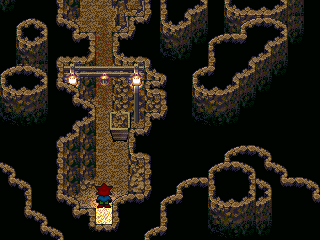
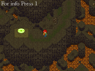
I just finished a "dungeon" for meh game. It's between 66% and 33% of the full "dungeon" size (as I still have to make the cavez)
I'll probally make most of my "dungeons" without bosses at the end this size.
Red lines are lines you have to walk.
Blue lines are lines leading to treasure or upgrades.
Purple lines are lines you might take or might not, but lead to nothing.
EX PIC:
Post by: PlasticNinja on July 08, 2006, 03:12:46 AM
Post by: Bluhman on July 08, 2006, 03:20:49 AM
Yes. I commend that work definetley.
Post by: PyroAlchemist on July 08, 2006, 03:39:22 AM
Quote
Originally posted by Meiscool
Fangame, or just using the Rurouni Kenshin sprite?
I just finished a "dungeon" for meh game. It's between 66% and 33% of the full "dungeon" size (as I still have to make the cavez)
I'll probally make most of my "dungeons" without bosses at the end this size.
Red lines are lines you have to walk.
Blue lines are lines leading to treasure or upgrades.
Purple lines are lines you might take or might not, but lead to nothing.
EX PIC:
Great map. Whats the red X thing in the middle for? =P
Post by: MrMister on July 08, 2006, 04:51:10 AM
Post by: Dragoon de Sol on July 08, 2006, 05:04:56 AM
Nothing I make comes out even close to what I need.
Anf frankly, no one around here likes me enough to put a lot of effort into 20-30 sprite sheets for this game.
Post by: Bluhman on July 08, 2006, 05:08:50 AM
Post by: Meiscool-2 on July 08, 2006, 03:07:18 PM
Quote
Originally posted by MrMister
That chipset combined with the effort you put into the mapping looks sort of like central Venezuela, which is awesome. That dungeon could get boring if you don't load it full of things to kill.
Random Encounters XD Though, I do plan on having some assortment of GoldenSun puzzle solving in the game. It wouldn't be that hard to code.
Bluhman: Looking good. Add a bunch of barrels and crates and you could have a really nice looking Marketing Town thingie.
Quote
Originally posted by Gary
Great map. Whats the red X thing in the middle for? =P
Right. That's so you can't walk under the tree. The middle of the tree is a lower level tile.
Post by: Tomi on July 08, 2006, 03:21:13 PM
Post by: aboutasoandthis on July 09, 2006, 05:51:19 PM
Bluhman: I like it. A little spacious for me but it works well. I'd just put events in like birds and stuff.
I got rid of my old intro. I'm going with this new one. I'm hoping for it to be scarier and darker. This will be the first map you see in the game. Can anyone give me some help with this?
It's supposed to be a makeshift prince's room. Thinking like the king just moved in, so they didn't have time to make it look so dark. Any advice? I can get the sprites easily.
When I'm done, I'll tint the screen dark and add things like rain outside the window, the FF6 Thunder clouds, the people, and some lighting effects.
Post by: Tomi on July 09, 2006, 05:56:35 PM
Post by: Meiscool-2 on July 09, 2006, 06:01:06 PM
In almost ALL my interiors, I have candles. I mean, they didn't exactly have lights back then. Also, the candles have a flickering light charaset above them that's transparent. Lastly (and you can't see this in the screen) I have the tint change from 100,100,100,80 to 100,100,100,100 continously, to make it look like the light is actually flickering.
Add it if you wish.
Post by: Robotam on July 09, 2006, 08:12:29 PM
I made a crappy hotel, didn't like the way it came out.
Post by: Tomi on July 09, 2006, 08:20:58 PM
Post by: aboutasoandthis on July 09, 2006, 08:27:32 PM
The only major problem I see would be in the front with the 2 blue walls. They and there waterfalls just need an extra square. I just don't like that chipset used that way. Meh.
After going to hell and back, I finally managed to put the special effects in. I'm not sure now whether to put in the thundercloud still. Maybe a flash of lightning instead?
Which reminds me Meis, I tried the light flicker thing. It looked really ugly. I don't have any real blue in my picture. It just took the white and made it yellow. Trust me, it hurt my eyes.
another edit
Sorry you can't see it. There's supposed to be rain outside the window, every light animated, and animated fire.
Post by: Bluhman on July 09, 2006, 08:47:11 PM
Quote
Originally posted by aboutasoandthis
Bluhman: I like it. A little spacious for me but it works well. I'd just put events in like birds and stuff.
Well, my style is always very spacious. Not sure why. I used to be a LOOOOOOT worse.
Ex:
Post by: Tomi on July 09, 2006, 08:49:52 PM
Post by: Bluhman on July 09, 2006, 09:00:08 PM
Quote
Originally posted by Tomi
I hope that map is not up for critique.
No. It's up for comparison.
Post by: Meiscool-2 on July 09, 2006, 09:57:30 PM
BTW, I just noticed that the Interior I posted is a "bit" outdated.
Post by: drenrin2120 on July 10, 2006, 01:58:57 AM

Post by: Linkizcool on July 10, 2006, 02:08:09 AM
Post by: drenrin2120 on July 10, 2006, 02:15:00 AM
Quote
Originally posted by Linkizcool
Not bad. Some charsets could spice it up, though.
lol, yeah, it's not 100% done. Just the chipset part is. I posted it cuz it took me a while and I wanted to know what you guys thought of it thus far.
Post by: Meiscool-2 on July 10, 2006, 02:27:41 AM
Post by: drenrin2120 on July 10, 2006, 03:08:22 AM


Post by: Meiscool-2 on July 10, 2006, 03:20:53 AM
Post by: Tomi on July 10, 2006, 10:03:01 AM
Post by: Meiscool-2 on July 11, 2006, 02:58:37 AM
Yeah, I had to put water in... for story purposes.
Post by: xJericho on July 11, 2006, 04:32:07 AM
Post by: Tomi on July 11, 2006, 11:35:46 AM
Post by: Red Fox on July 11, 2006, 03:20:25 PM
Post by: Tomi on July 11, 2006, 03:31:15 PM
Post by: xJericho on July 12, 2006, 06:43:50 AM
Post by: ColdWinterBard on July 12, 2006, 07:22:56 AM
Here's a screen from my game, and I'd like some comments.
Post by: drenrin2120 on July 12, 2006, 01:37:17 PM
RF: It's good, but what Tomi said.
xj: Wow, kudos to you too dude. I like how it's very open but still well designed. You seem to have an elevation issue thoguh in the upper right corner. Might wanna check that.
cwb: Hm... the screen is odd, the 3d ship kinda fits and kinds doesn't. Mostly doesn't. But it's an interesting screenshot. The reflections in the water are very nice, but it seems a little empty in the upper right corner.
Post by: Meiscool-2 on July 12, 2006, 02:54:53 PM
Quote
Originally posted by ColdWinterBard
xJericho, I think the town looks pretty good.
Here's a screen from my game, and I'd like some comments.
Yeah, the ship looks out of place, and the reflections (I dunno if it's supposed to be like this) look lined up wrong.
Post by: Shadowless1 on July 12, 2006, 03:47:26 PM
Post by: aboutasoandthis on July 12, 2006, 04:48:41 PM
Welcome to charas, unless you are jynce! :happy:
Post by: drenrin2120 on July 12, 2006, 04:54:20 PM
I'm talking about [link removed]. See how they got that 3d-ish, computer generated feel?
[Sorry drenrin, but the site contains downloads to rm2k as well as rm2k3, so I can't allow it to be linked to.]
~Ace~
EDIT: Oh, Sh-t! Sorry about that man. Should've looked first. :|
Post by: Meiscool-2 on July 13, 2006, 01:58:24 AM
They arn't of the best parts in the cave, but I didn't feel like going around everywhere taking a lot of shots.
My new "piss you off" dungeon. It's got loads of one-way teleporters that you have to change the color of (different colors mean the warps take you to a different place). If you do it all right with no mistakes, it takes about 2-3 minutes. However, I have yet to have someone test it to see how long it would take them.
As for the "For info press 1" thing, in my game I have tutorials that you can open. I suspect that you'll only open them if you're stumped on what to do, because what they tell you is pretty "duh" material in most cases. I've got the tut for the mountain I posted and the cave before too, as you have to do special things in both of those.
Post by: aboutasoandthis on July 13, 2006, 02:26:20 AM
Meis: Looks nice. Everything's very well detailed. I don't really like the skeletons on the ground, but I'm guessing there's something that eats humans there huh?
This is to everyone here. Check the chipset/charaset sections in a few days. I have some things you all might be interested in.
I've managed to at least get the layout of my equip menu back. How does it look now? I didn't put in any special effects or anything.
(There is a damn good reason why the picture looks like this. Let me say I'm using the DBS...)
Post by: Meiscool-2 on July 13, 2006, 03:31:04 AM
Meiscool says:
I thought you were American, with your crazy hair and all.
§uper §tu says:
Hey, us Brits have the best everything.
§uper §tu says:
And I SWEAR
§uper §tu says:
If you make a "british dental hygiene" joke, I will crush you.
Meiscool says:
I was thinking it.
§uper §tu says:
xD
Meiscool says:
But I hate offending people.
Post by: Tomi on July 13, 2006, 01:44:13 PM
Post by: aboutasoandthis on July 13, 2006, 05:23:18 PM
Post by: MrMister on July 13, 2006, 05:53:10 PM
Post by: Tomi on July 13, 2006, 06:02:05 PM
Post by: aboutasoandthis on July 13, 2006, 08:05:34 PM
And can I get some advice for this?
:yell: THE CHIPSET IS NOT DONE. THAT'S WHY IT'S EMPTY.
I wasn't shouting above. I just don't want people to look at the screens, ignore the words, then go on and post.
What should I add to make this better? I'm thinking spires would be good. Does anyone know where I can get some that would match this? I'm thinking maybe the FFTactics dragons too. How would you finish this chipset?
Post by: Dragoon de Sol on July 13, 2006, 08:16:43 PM
Meaning one is on the left on one tower is on the right in the other.
Post by: Meiscool-2 on July 14, 2006, 04:16:51 AM
Using rips that some German dude made for a game that Ace gave to me, I created this load of crap.
Post by: drenrin2120 on July 14, 2006, 04:42:30 AM
EDIT: Actually, the cliffs seem out of proportion all around.
Post by: coreystranick on July 14, 2006, 04:46:18 AM
Post by: aboutasoandthis on July 14, 2006, 01:39:55 PM
BTW I was asking about what to do with the chipset. It's okay now. I've been making some rare sprite rips so now the castle is coming together.
Post by: Meiscool-2 on July 14, 2006, 01:45:05 PM
Quote
Originally posted by drenrin2120
EDIT: Actually, the cliffs seem out of proportion all around.
That's because you can walk under a bunch of them silly. :jest:
Post by: drenrin2120 on July 14, 2006, 03:25:19 PM
Quote
Originally posted by Meiscool
quote: Originally posted by drenrin2120
EDIT: Actually, the cliffs seem out of proportion all around.
That's because you can walk under a bunch of them silly. :jest:
Well, I understand that dude. Here, let me show you what I mean. The cliffs don't seem as tall as the pillar, so it looks odd. Anyone else see what I mean?
Post by: aboutasoandthis on July 14, 2006, 03:37:06 PM
Noticing that, I think they should be on the same level as the two cliffs on the right.
Post by: Meiscool-2 on July 15, 2006, 12:51:37 AM
I'm not gonna bother changing it, because it looks fine in-game, but I'll remember it for future reference, as I'm still making that map.
As to realistic... pillars like that wouldn't hold up as big of pieces of land as those to begin with. It's a pretty unrealistic map.
I know the preset rain looks better but... what do you think?
EDIT: I have yet to add ripples and ect.
Post by: aboutasoandthis on July 15, 2006, 12:58:56 AM
I'm trying double screenshot forums. Can I get some advice on this beach? The chocobo is just a test character, and the sticks in the water are supposed to be there.
I didn't want to start something in drenrin's forum. Can you PM me or something about your element system and why you got so mad at what I said?
Post by: Meiscool-2 on July 15, 2006, 03:05:40 AM
I would like dat beach though :P (the chipset). Or, at least the sand and the water.
Post by: aboutasoandthis on July 15, 2006, 03:21:22 AM
http://theodore.ikebukuro.cc/other/rpg_sozai/rpg-sozai.html
jis click in the boxes.
As for the water, that too will be posted there. I ripped the river and the beach myself. They're a little buggy. I'm trying to set them up so they'll be easy to recolor. Be a little patient.
Post by: Tomi on July 17, 2006, 01:30:31 AM
Post by: omegarirue on July 18, 2006, 05:15:57 PM
Post by: Tomi on July 19, 2006, 01:43:52 AM
Post by: Meiscool-2 on July 19, 2006, 01:57:53 AM
Quote
Originally posted by Tomi
Some parts, like in the very middle, are a little confusing, but the overall map is very detailed and nice to look at. Gratz.
That's an old map of mine 0_0. He was posting asking for the chipset.
Answer: No. It took me awhile to make that, and I don't care for you enough to share my time.
Post by: Tomi on July 19, 2006, 02:11:50 AM
Post by: omegarirue on July 19, 2006, 03:01:19 AM
Post by: Meiscool-2 on July 19, 2006, 03:06:40 AM
Quote
Originally posted by omegarirue
what is ur problam.
If I don't want to give you a chipset I worked MYSELF using MY own time to you, a person I don't know nore care for, then that's prefectly alright.
Post by: omegarirue on July 19, 2006, 03:08:19 AM
Post by: drenrin2120 on July 19, 2006, 03:26:43 AM
Quote
Originally posted by omegarirue
yeah but u dis me on every forum
Maybe... he doesn't like you? I don't know, I could be wrong.
Post by: coreystranick on July 19, 2006, 04:29:09 AM
Plus I wanted a chipset kinda like this for my game anyway.
Post by: omegarirue on July 19, 2006, 02:14:15 PM
Post by: coreystranick on July 19, 2006, 10:28:05 PM
Also no credit as all i did was copile the stuff.
Yours will msot likely be different from my final version so If you wish just take off my name and everything(or i will if you want me to add other stuff)
Post by: Meiscool-2 on July 20, 2006, 03:27:29 PM
Look ok, or do they clash to much?
Post by: drenrin2120 on July 20, 2006, 03:54:21 PM
What do you guys think of this chipset compialation. Basically what ed did except tilesets are switched and all.
Post by: Meiscool-2 on July 20, 2006, 04:06:04 PM
Post by: drenrin2120 on July 20, 2006, 04:37:36 PM
Post by: Meiscool-2 on July 20, 2006, 04:42:23 PM
You can try that color of castle. It might look better.
EDIT: You'll have to click Material, go under tilesets, click Rudora, and look under castle.
Post by: drenrin2120 on July 20, 2006, 04:56:56 PM
Post by: aboutasoandthis on July 20, 2006, 06:01:02 PM
Post by: Tomi on July 20, 2006, 06:12:20 PM
Post by: drenrin2120 on July 20, 2006, 06:22:21 PM
EDIT: Ignore the bridge in the bottom screen ,that's an easy fix.
and to aboustsoandthis. Yeah, you did, and I favorite'd it, but I forgot about it when doing this. lol
Post by: Meiscool-2 on July 20, 2006, 06:26:25 PM
Post by: aboutasoandthis on July 20, 2006, 06:27:44 PM
I like the first one.
Post by: Tomi on July 20, 2006, 07:28:53 PM
Post by: Meiscool-2 on July 20, 2006, 09:59:03 PM
Post by: aboutasoandthis on July 20, 2006, 10:22:19 PM
There is a little corner to the right where you putting the rock over the floor looks good. And the trees popping out of the ground don't look that great to me. I guess I'm just not a fan of that chipset (even though you gave it to me).
I'm impatient. I made a mock battle screen. I didn't finish the guy's battle charaset. I've yet to put in his Faceset and Limit Bar. I still didn't put the "Link Attack" bar I mentioned in the Program Section up. I didn't code anything yet.
Post by: drenrin2120 on July 20, 2006, 10:53:07 PM
To Meiscol: Pretty much what Asat said. Otherwise, nice map.
Post by: Meiscool-2 on July 20, 2006, 10:54:31 PM
Quote
Originally posted by drenrin2120
To Aboustasoandthis: Wow, I thought that was the DBS at first. Can't wait to see how it turns out.
That is the DBS.
Post by: drenrin2120 on July 20, 2006, 10:58:02 PM
Post by: Tomi on July 21, 2006, 12:00:23 AM
Post by: Meiscool-2 on July 21, 2006, 04:22:29 AM
Cool snuff.
Post by: I Have a Sandwich on July 21, 2006, 04:27:14 AM
Post by: aboutasoandthis on July 21, 2006, 11:35:17 AM
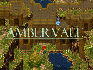
You just had to name it Ambervale didn't you? If you see an Ambervale in my game I did not steal it. That is a legitimate city in Ivalice.
Looks incredible as always. What sucks is that I can't have that...
Post by: I Have a Sandwich on July 21, 2006, 12:01:22 PM
Post by: Meiscool-2 on July 21, 2006, 03:18:01 PM
Anyways, those are just pictures I found on a German RPG Maker website. I made the AmberVale myself (yeah, not the most original name, I know). I animated them by setting them on rotation and moving them across the screen. No other programs.
Post by: I Have a Sandwich on July 21, 2006, 03:23:50 PM
Post by: Tomi on July 21, 2006, 04:50:31 PM
Post by: Skie Fortress on July 23, 2006, 07:32:59 PM
Post by: MrMister on July 23, 2006, 08:26:21 PM
Anyways, I like it, if you mix it up with all the different locations by doing some screen panning and like a little fanfare in addition, it could really add to the feel of the game.
Post by: Skie Fortress on July 23, 2006, 09:04:45 PM
And just so this post isn't entirely off topic...

Post by: aboutasoandthis on July 23, 2006, 10:39:15 PM
Now as for your screenshot, it looks alright. Not the best but far from the norm.
I really like your charasets. I can't shade that well so I respect those sprites (whoever made them).
The map itself is way to simple. You have a lot of straight edges and not that much detail (other than the trees). To me, it looks like you're relying on the chipset to make it look good.
I'd suggest looking a couple pages back on this topic. Meiscool used a chipset like that and it looked amazing. You could learn from that.
BTW, where do you GW people get that font?
Post by: drenrin2120 on July 23, 2006, 10:46:01 PM
Post by: Meiscool-2 on July 24, 2006, 05:16:47 PM
In the game... it's hella darker then that, but I lit it up so you can see stuff.
@Skie Fortress: Unless you plan on sending that out as a demo or something, I would take the Frame out. Also, if you want to make that map better, go ahead and use the one I made with that chipset as reference. You could add a little more height to it, but it looks fine.
Post by: drenrin2120 on July 26, 2006, 12:52:29 AM
Post by: aboutasoandthis on July 26, 2006, 02:30:57 PM
Anyway, I've been working really hard on my demo. This will be an important place you go to.
It's unfinished. It's kind of based off the ruins put in the Mapping Contest. I didn't put in the events in yet. There's a hidden minigame right in the screenshot. See if you can find it.
Post by: drenrin2120 on July 26, 2006, 04:08:29 PM
Post by: Meiscool-2 on July 27, 2006, 02:00:39 AM
About: Nice. I like that chip, but all the ones I fine are really bright in yellow. I don't like yellow/gold a whole lot. You've got some things that look odd (like, in the middle, I don't know if that's a doorway or part of the ground).
Now for me!!!!
By playing Shadow Hearts 3, I walked through one of the coolest dungeons eva. All it was was a house that had been burned down, but it inspired me to do so much.
Meh Haunted House!!! (incomplete untill I find more broken crap to throw in there)
EDIT: Wow, the forum makes it look a bit darker. Well, it's ment to be REALLY dark, but I have lightning flash while you're in there. So basically, you look while the lightning flashes, and move based on memory.
Post by: aboutasoandthis on July 27, 2006, 02:08:32 AM
Oh, and the chipset was a recolor/mix/edit. I see what you mean. Eventually I'll put in a shadow.
Post by: Tomi on July 27, 2006, 02:33:47 AM
Post by: Meiscool-2 on July 27, 2006, 02:43:52 AM
Post by: MrMister on July 27, 2006, 03:26:03 AM
Post by: Meiscool-2 on July 27, 2006, 02:38:34 PM
Quote
Originally posted by MrMister
Yeah, it's still a little weird that the sun is sitting RIGHT on top of that courtyard then. Good work though, show some more of that place.
Yeah, it's moonlight, and I know it's weird. However, there wouldn't be much light if I only showed it coming from the north and west. It's not realistic, but sometimes unrealistic looks better.
As to showing more... most of what I have done are basic hallways and rooms. I've got two main halls that are sorta like foyers (sp?)
^Entry Hall
^Children's old Bedroom
^Main Hall Number2
^Husband's old Bedroom
^Different Section of the second Main Hall
It's a little dark to notice a lot of detailing I put in, like rips in the rugs and stuff, but you can see it clearly in the game, and that's all that counts.
Post by: Raen Ryong on July 27, 2006, 03:19:28 PM
A haunted house is a really nice idea. I'm interested to see whether you can create fear -- something I've never seen an RPG Maker game do (except when badly-used RTP is seen :dry: ). I definitely find eerie things in games fun (hence why I found Shadow Hearts 1 so compelling -- take the Dollhouse subquest for instance). The music will have to be very understated I think, and you'll want a lot of sound effects. Anyway, this is getting away from the screenshot, isn't it?
@About: Those are some really nice ruins... the elevation in particular looks perfect. I agree with Meis that the tiles inside the cave look a bit ambiguous, but otherwise I like it!
Btw, what do you guys think of this screenshot? It doesn't compare in awesomeness to most of them in this thread, but I'm not really a graphics person -- I'm more into the less superficial elements, like balancing, plot, coding etc.
This is supposed to be an optional area -- just a hut in the middle of nowhere kind of idea. A problem I have with doing graphics is if I make an area look genuinely good, it then looks too dramatic. Any suggestions?
EDIT: There is more wildlife than that in the actual map, but they must've all vacated to one of the areas not captured in the screenshot :dry:
There are about 7 butterflies in all, and one more human NPC.
Post by: coreystranick on July 27, 2006, 03:33:09 PM
Post by: Meiscool-2 on July 27, 2006, 04:10:15 PM
As to fear.... that's REALLY hard to pull off in 2d. The only time I've been honestly scared in a game was RE1 remake, because I hated the randomness of the Crimson Heads, and Eternal Darkness, when I looked in the bath tub and saw myself dead and the tub overflowing with blood.
I could try and make it really freaky though, but that might interfear with puzzles I have planned.
The Puzzle, basically, is where no doors in the house are locked. However, to go through doors, you have to do certain things. To go through the first door, (door number one), you have to of not gone through any other doors. Meaning, once you enter, you can't leave. To get through door number two, you have to of gone through an even door first. To get through door number 4, you'd have to of gone through a number less then 4 first. Then, to get through door number 3, you have to of gone through a number greater then 3, OR, you could do through door number five, which requires a number less then 5.
Kinda makes you go to different places and stuff. That's what I like to do, make really small duegeons that require you to enter the same room several times.
Post by: Tomi on July 27, 2006, 05:21:24 PM
Quote
Originally posted by Meiscool
I could try and make it really freaky though, but that might interfear with puzzles I have planned.
lol, pun.
I really like the puzzle idea, its very innovative.
Post by: coreystranick on July 27, 2006, 05:41:07 PM
Post by: Linkizcool on July 27, 2006, 06:31:40 PM
Post by: coreystranick on July 27, 2006, 06:35:35 PM
Post by: Moosetroop11 on July 27, 2006, 07:17:12 PM
Post by: drenrin2120 on July 27, 2006, 11:08:15 PM
Post by: coreystranick on July 28, 2006, 12:33:07 AM
Quote
Originally posted by drenrin2120
I'm sorry, but that map isn't that good. The trees are too small. They should be taller, otherwise, they just look way too odd.
Hmm, I see what you mean, thanks for the advice. I made the leaves overhang alot of the trunk though, that could be making it look smaller. No matter I can fix it.
Quote
Originally posted by Moosetroop11
0_o you don't know how to change the passability settings? Go to the tileset section of the database. a O means you can walk on it, an X means it's not passable (Such as water, rocks, etc) And a triangle means it's above the character.
I know that, it is set as not passable but I can still walk on it. Oh, it is also a Star for above the character.
Post by: aboutasoandthis on July 28, 2006, 01:30:06 AM
The map could be better. Some parts are out of proportion, and waterfalls don't just end like that. Good start.
Post by: coreystranick on July 28, 2006, 02:47:16 AM
EDIT: How else can I improve the maps, this is the chipset I have compiled, and edited (not much just one thing)
Post by: gael on July 28, 2006, 03:08:47 AM
Post by: Meiscool-2 on July 28, 2006, 04:55:57 PM
coreystranick: Your houses need to be WAY bigger, and your waterfalls don't line up with the edges right 0_o
Post by: coreystranick on July 28, 2006, 05:17:44 PM
Post by: MrMister on July 28, 2006, 05:18:05 PM
Quote
Originally posted by Meiscool
Looks pretty cool to me. Kinda reminds me of something Robotam would make.
coreystranick: Your houses need to be WAY bigger, and your waterfalls don't line up with the edges right 0_o
Meiscool is right. Judging from how old that cave looks, it should be erroded in such a way that the waterfall would run down along the cliffside.
Post by: aboutasoandthis on July 28, 2006, 06:19:44 PM
jael: It actally looks pretty cool with the boat inside the cave like that. If you fix is up a bit, it'll look like something out of Shadow of the Colossus with the light shining through it like that. I'd only suggest finding a better light overlay.
Post by: gael on July 29, 2006, 03:29:59 PM
Quote
MrMister: are you talking about corey or jael? I'm confused...
Haha its GAEL....FOO!
And yeah who were you talking to me or the other guy MrMister because I know this sounds gay but the top of the cave is open and the waterfalls are created from a lake that I'm going to put above the cave that empties into the cave....And thats why the waterfalls looks all stoopid like...
My map looks like ROBOTAM'S!?!
Oh wait robotam... weeeooo yesh. Miescool your ruins screenshot you entered for the contest was very neato it looked like something out of shadow of the collosus(I'm sure thats spelled wrong fug it)...I love that game.
-Oh yeah and I just read aboutasoandthis's little post thingy and I diddn't even notice he made a reference to shadow of the colosus too! AND IT WAS ABOUT MY GAME WEEOOOO...um yeah thanks that makes me feel all tingly inside and stuff.
Ok so a better overlay where might I find something a little better on the internet or should I just make the light come from a different direction like the left or right?
And how else can I fix it up just put more **** in it...
Post by: Robotam Plus on July 31, 2006, 10:30:39 AM
Post by: Meiscool-2 on July 31, 2006, 09:35:06 PM
Mine doesn't measure to the previous post... but remember that boss I made? I finished his "den".
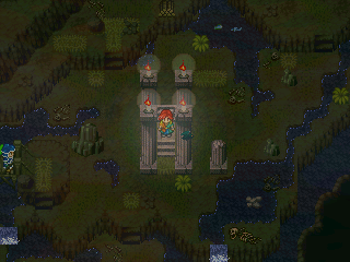
Post by: aboutasoandthis on July 31, 2006, 09:41:15 PM
This is proof that Reminiscence is coming. Yet another important place. It took me ages just to make the chipset.
The city is pretty huge. I'm guessing maybe 8 40*30 maps connected together at certain parts?
The people will be replaced even though I'm gonna use that charaset a lot. It's supposed to be an apartment style complex for a huge mechanical/jungle/castle city. I admit, it looks more like a resort than an empire.
It's unfinished. Advice?
EDIT: I didn't notice your pic. I was talking about Robo.
Post by: Meiscool-2 on July 31, 2006, 09:45:34 PM
Post by: aboutasoandthis on July 31, 2006, 09:50:38 PM
Post by: Skie Fortress on August 01, 2006, 01:41:33 AM


Post by: aboutasoandthis on August 01, 2006, 02:39:05 AM
Intresting, I've never seen the DBS as isometric before. At least it's original.
BTW, Gaming World looks pretty obsessed with the anime style faces getting split in fancy ways.
Post by: gael on August 01, 2006, 03:52:29 AM
YOU HAVE TO COME OUT WITH A DEMO....
or just more screenshots please...
Yeah I know I have no place to say this but your last screenshot was a bit cyclical...but neato none the less...
man I write oh sooo gay...
EXCELSIOR!!!
Post by: Meiscool-2 on August 01, 2006, 03:55:36 AM
Quote
Originally posted by gael
I just flpped through this screenshots forum and I came across aboutthisandthat's pictures and I have to say that I REALLY want to play that game your making aboutthisandthat the screenshot I'm refering to is the one from I believe it was Ivalice. I'm not sure and you can shun me from your forum or whatever for not knowing this but is Ivalice from final fantasy tactics? If thats the same place your game is going to be set in I think thats also the setting for the new Final Fantasy 12 game...right? Man I think the town looks great with the water around it and stuff and I don't mean to be pushy and demanding or anything but...
YOU HAVE TO COME OUT WITH A DEMO....
or just more screenshots please...
Lol, I remember getting this all the time.
Skie: I would choose a different "roof/wall" tile for the insides.
Post by: drenrin2120 on August 01, 2006, 12:51:06 PM
To Meis: Pretty kickass
Robo: Yes, that chipset is way hard to use. I love the use of it here and the watereffects are great too. :D
and Skie: pretty sweet maps, I like the iso battle graphics. Hopefully they come out well.
Post by: aboutasoandthis on August 01, 2006, 01:32:58 PM
I haven't added the background yet. I'm designing the Status Menu Page. I'm looking for just layout advice.
EDIT:
I've finished. I can actually do this menu with pictures. Your thoughts?
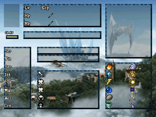
Post by: Raen Ryong on August 01, 2006, 06:05:43 PM
I've made a new map... I've taken four screenshots of it (as it's quite big) which covers most of it.
It's called the Sealed Cave and the overlay is used because it is a very magical area... I haven't finished adding events yet, except for a few, so don't say about the lack of wildlife etc :p
Opinions?
Post by: drenrin2120 on August 01, 2006, 11:05:35 PM
Post by: Raen Ryong on August 02, 2006, 12:46:04 AM
Post by: drenrin2120 on August 02, 2006, 12:52:05 AM
Post by: Raen Ryong on August 02, 2006, 02:09:26 AM
The time of day affects monster encounter rates and other events, so I find it useful to have the timer there. I've always found it a bit annoying how in some RPGs you have to press a button or use an item to see the time.
Besides, It feels nice bending the built-in timer to my will, forcing it to count upwards :D
Post by: Meiscool-2 on August 02, 2006, 02:33:32 AM
Post by: drenrin2120 on August 02, 2006, 01:06:34 PM
EDIT: To about: Wow, that looks kickawesome my friend! :D
Post by: aboutasoandthis on August 02, 2006, 03:47:23 PM
http://www.gamingw.net/forums/index.php?topic=48493.720
I'm releasing two versions of my game. I tell you the people there are :jumpin:. :x
If you go to Gaming World do not say a thing. I respect your opinion but my game is for Charas.
Nice Raen Ryong. The maps have a few mistakes but I like them. I've got a Day/Night system too, even though it uses variables instead of timers.
Post by: drenrin2120 on August 02, 2006, 03:51:41 PM
Post by: Meiscool-2 on August 02, 2006, 04:04:32 PM
Teh Haunted House B-b-b-BOSS!!
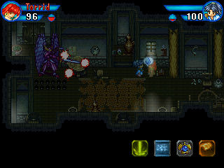
^Flare Sword
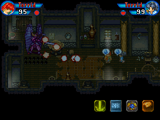
^Flare Sword Again
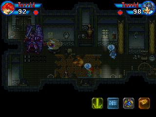
^Rapid fire attack. Shame I only got one flame in it.
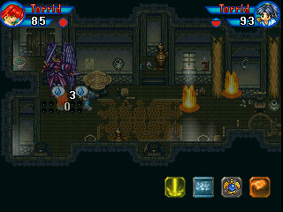
^Eruption Attack
Post by: aboutasoandthis on August 02, 2006, 05:16:42 PM
Where did you get the boss? I don't want it but where do you get your animations? Did this one come animated too?
Post by: coreystranick on August 02, 2006, 05:33:07 PM
MiC: Loving the map, nice and dark. I can see spell boxes. What kind of boss is that? I don't like this boss as much as your last one, but this guy looks bad ***. HAve you completed your haunted house yet. I mean like have you found all the broken down stuff that you want to use in it?
Post by: Meiscool-2 on August 03, 2006, 03:05:34 AM
Anyways, it's the same game, and as you can tell by the poses, it's animated. I get these rips from a German Website. They are rips for BoF2.
It's a pretty annoying boss, much harder (I think) then the last one. This boss relies totally on where you are as to what attacks it uses. If you're far away from it, it will use rapid firing flames, or seeking Flare Swords. The Flare Swords probally won't reach you, but they will keep you from getting close to him... unless you want to get hit with all 3 or 6 of the shots he sends out. If you're close to him, he keeps you moving by making flames fall from the sky or come up out of the ground. Also, because every attack he uses on you causes Torrid Condiction, it's very hard to get a chance to use projectile attacks on him, meaning you're stuck with magic and melee.
And just a note, it might creep the hell outta you when you find out who that monster actually is... in the game I mean :p
Post by: coreystranick on August 04, 2006, 06:10:20 PM
Tell me what you think.
EDIT: I still have some fine tuning to do and I am trying to make almost every open tile(where there is no boarder) access a different part of the mountain.
Post by: Meiscool-2 on August 04, 2006, 06:15:28 PM
Post by: coreystranick on August 04, 2006, 06:19:57 PM
Post by: gael on August 05, 2006, 04:19:06 PM
that pirate ship in a cave. Well someone mentioned something about the waterfalls in the cave...I think...And I said that the reason they were so out of place was because in my game there is a lake that empties into it. So the other day I started to work on the lake and finished but it looks a little odd to me and I'm not sure why
I was just wondering if you guys...or girls (I dunno is there any?)
If you could just critique this screenshot also and maybe give me a little helpful advice...
Post by: coreystranick on August 05, 2006, 04:24:36 PM
Anyway back to the map, umm how do you get out? I mean the mast is coming up through an opening, so how does the boat get out?
Post by: coasterkrazy on August 05, 2006, 04:32:02 PM
Post by: gael on August 05, 2006, 05:55:42 PM
Quote
Anyway back to the map, umm how do you get out? I mean the mast is coming up through an opening, so how does the boat get out?
Well I think I will answer your question with another couple of questions...
1.) How do islands float?
2.) How does Link from The Legend Of Zelda carry all that stuff?
3.) How can massive ships with like four propellers fly?
4.) How is a rainbow made?
5.) How does the positrack on a Plymouth Superbird work?
~~~~~~~~~~~~~IT JUST DOES~~~~~~~~~~~
Post by: Meiscool-2 on August 05, 2006, 07:15:27 PM
I chose to think of myself as an expert with water, so here's the basic thing you should do:
It's highly unrealistic that the water stops at the holes and only flows in through ONE water fall, even though the entire hole is surrounded by water. If would be more realistic if you made waterfalls to flow over the sides of all of it.
However, making the charasets and getting them to look right can take awhile so... I think it's ok the way it is.
Post by: coreystranick on August 06, 2006, 02:25:33 AM
Quote
Originally posted by gael
Ummm coasterkrazy heh heh no its not that complex I kind of just made it like that....
quote: Anyway back to the map, umm how do you get out? I mean the mast is coming up through an opening, so how does the boat get out?
Well I think I will answer your question with another couple of questions...
1.) How do islands float?
2.) How does Link from The Legend Of Zelda carry all that stuff?
3.) How can massive ships with like four propellers fly?
4.) How is a rainbow made?
5.) How does the positrack on a Plymouth Superbird work?
~~~~~~~~~~~~~IT JUST DOES~~~~~~~~~~~
What CK said isn't actually complex I find that a logical reason as I could happen. But you didn't really answer my question by asking a set of 5 questions just to say it does. That means there is some way it gets out, like it flys or they are jsut building the ship in the cave and hope to have it fly. I mean is it shownhow to get out in your game, because I think it is actually a pretty cool idea to have a cave and stuff under a huge lake, just the reasoning for getting in and out of the cave kind makes me think, which is good but I can't figure it out. I geuss I can just wait for you game.
Ohh and the answer "IT JSUT DOES" doesn't really fit for the Rainbow question.
Post by: gael on August 06, 2006, 05:09:54 AM
water fall covering all of the hole thingy and the reason I diddn't is because 1.) I'm a lazy loser and 2.) I wanted the waterfalls to kinda match up with the waterfalls in the pirate cove....(does that make sense)
But anyways thanks miescool for the complement and coreystranick: I diddn't mean anything by what I said hahaha
I just wanted to quote "Joe Dirt".
coreystranick:-well honestly I actually I wanted to prove a point RPGs are not realistic. In RPGs islands float and people can shoot fires from thier swords and ****. And well I diddn't really want to have to have a background story for the ship I just thought it was a neat idea so...I went with it so I'm not sure if you completely understand what I am trying to convey here...Basically all I am trying to say is that you shouldn't think to much about it...It is... what it is... ya know???kinda??? sorry I'm a little buzzed....
-And don't think I want to make myself look cool by saying the whole buzzed thing I'm such a ****ing loser its not funny....
I swears it...
-man I guess I have self esteem issues huh... oh well...
Post by: aboutasoandthis on August 06, 2006, 01:40:35 PM
I like the idea. I like when people mix Mac & Blue (Refmap). I think my only problem is the mast (Or whatever that big bar is called.:P The ship will fit but I can't see how that would fit.
Post by: coreystranick on August 06, 2006, 02:26:43 PM
Post by: EXO Muffin on August 06, 2006, 11:51:52 PM
EDIT: Oh, and the red moss stuff is climbable. I originally put ladders, but ladders aren't naturally occuring(...or are they?), I didn't use it what you might think of,"correctly," because those vine things don't grow evenly. The mountain is supposed to get more barren as you go up, and it's the kind of map where you enter, go though some maze, come out;but higher, move to the next entrance, and repeat until you get to the last entrance.(Which is the big hole at the top.)
Post by: aboutasoandthis on August 07, 2006, 12:30:48 AM
Post by: EXO Muffin on August 07, 2006, 03:56:38 AM
Post by: Meiscool-2 on August 07, 2006, 04:36:01 AM
Post by: aboutasoandthis on August 07, 2006, 10:46:50 PM
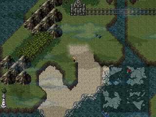
I'm thinking about having the names of the places fade-in on top of the cities.
Post by: gael on August 08, 2006, 02:10:29 AM
World maps kind of take me out of the experience it....damn this is hard to explain... World maps kind of take me out of the game. I'm not really sure why I think its the outrageous disproportions. You know the fact that the character is the same size of the city or almost half the size of a mountain etc. (I know this completely contradicts what I said earlier kind of but please just hear me out)
I think you game would benefit more if you connected major cities, landmarks, and so forth with paths instead of a world map...For example like in suikoden 3 or final fantasy x... I know you must be thinking "This guy is out of his F***ing mind does he realize how long that map took me!?!" I just really want your finished product to be at its finest and thats why I posted this I think having paths connecting major areas would create a more captivating experience for the player and it would keep them more involved with the story...
Like I said before its just an opinion and I only want to help you out if I can but I'm sure if anyone can pull off a good world map its you good luck...
Post by: aboutasoandthis on August 08, 2006, 02:20:03 AM
I wanted 100*100 maps put together. I started by making a small stupid test game with 25 rows and colums strung together.
One row was 1.5 Kilobytes. About the size of 1 MP3. Nothing Special Right?
Now, take that and multiply it by 25 colloms. That's over 35 ****ing Kilobytes! Until, I get faster internet, that will take me ages! and the 25*25 World map only takes 7 minutes to walk through!
The world map idea was just for technical reasons. Less download time. Don't worry. I'm planning some surprises with this world map. Remember, the best you can really do with RM games like this is to make them like Super Nintendo games (Excluding Meis's Game).
Post by: gael on August 08, 2006, 02:21:53 AM
I was just wondering if you guys could give me ideas to make my title screen look better it seems very...blah...
And I know the title is stoopid...
Just look past the stoopid title...
The title actually really works well with the storyline...(yeah heh heh storyline)
Post by: aboutasoandthis on August 08, 2006, 02:29:05 AM
Don't worry about it. Everyone thinks this place is about maps only. I posted some CMS screens here first. Meis posted a few. A lot of these maps are too big to be screens.
You know, we should really start making actual screenshots and not just maps.
Post by: gael on August 08, 2006, 02:32:55 AM
Quote
Remember, the best you can really do with RM games like this is to make them like Super Nintendo games (Excluding Meis's Game).
- Ow reality check...
Im here comparing rpg maker games to ps2 games when I should be comparing it to games like... I dunno I was more of a Sega brat... OH I know! Games like chrono trigger and I think was it FF3 or 4 anyways the rpgs from that era(SNES) did also used world maps and they were very successful...
Hahaha I'm not sure I just don't get "fully immersed" into games like that...
I'm just not a world map guy I guess...
But that doesn't mean I don't want to play your game...
I CAN'T WAIT!!!
-by the way thaks for the title help...
WEEEEEOOOOOO MY TEQUITOS!!!!
Post by: coreystranick on August 08, 2006, 02:43:32 AM
Quote
Originally posted by aboutasoandthis
I'd make the gir transparent and twice as big. Like you'd have to squint to see her. Maybe you can get someone with Photoshop to fix it for you in the Requests section.
Don't worry about it. Everyone thinks this place is about maps only. I posted some CMS screens here first. Meis posted a few. A lot of these maps are too big to be screens.
You know, we should really start making actual screenshots and not just maps.
Mine were actually taken from the "Create Area" function in RM.
If I could get charasets up and more stuff I would take screenshots for everyone, but I will only do that when I get more imput on my last map. Anyone care to look at it(on Page 25 I believe)
Post by: gael on August 08, 2006, 02:53:36 AM
And hmm try to not make the tree tops so skinny in some parts I guess I'm not very good at critiquing but thats one of the first thing that caught my eye was the small tree tops maybe make them wider...
haha I don't know...
I jus wana help...
Post by: coreystranick on August 08, 2006, 03:05:59 AM
As for entreances, it is kinda hard to see But I tried to make it so you get there by stairs, or you can get in from inside the moutain( each house has two entrances one outside one in.) The very bottome one is jsut another part of the house next to it there is no other entrance. You have to go in the hosue and come back out. Ohh and the tree tops are abouve you so you can walk under them. This is suppsed to be like an old moutain town so the people there have lived thorugh many wars and found it easier to live in the mountain with as little entrances to the outside world as possible. So the outside is all complex but once you get in to the mountain(by going in through a house or shop) it is very simple. There will also be areas with monsters between some house that are farther aprt. But I will inform you gusy of that in the game.
Sorry if the post above was confusing.
Post by: EXO Muffin on August 08, 2006, 08:39:36 AM
Post by: gael on August 08, 2006, 07:06:02 PM
-Oh and I understand coreystranick
Post by: EXO Muffin on August 09, 2006, 10:03:01 AM

EDIT: Oooops. I screwed up the grass.
EDIT2: Okay, I think it's better now.

I can easily edit it, because of Photoshop's huge history cache and organized layers.
Post by: gael on August 09, 2006, 04:03:49 PM
I'm sorry I really like it and I'm sure you don't want to make another screen over again if you would like is there a place where I can download the program you made the title with off the net? Then I would gladly do it myself...
Again it looks fantastic just not really what I was going for thank you EXO muffin.
-I know I'm bieng an ungrateful ***hole sorry EXO
Post by: coreystranick on August 09, 2006, 04:06:00 PM
Post by: aboutasoandthis on August 09, 2006, 04:38:26 PM
Post by: coreystranick on August 09, 2006, 04:45:11 PM
Anyway, I have DSL with a speed of 11 MB/s so it probably would be like an hour or so for me. I wish I had it though so I could make a cool menu set up for my game.
Post by: gael on August 10, 2006, 01:17:45 AM
-sorry I'm just not the smartest desk in the future.... :blue-eye:
Post by: I Have a Sandwich on August 10, 2006, 03:56:22 AM
Post by: gael on August 10, 2006, 05:45:35 PM
ITS SO GOOD YOU ROCK I HAVE A SANDWITCH thank you so much if you need me to do something for you I dunno make a level or something...hahaha I'm not very good but I will make one for you if you ever need it.
Oh its so ****ing cool I love my new title screen hooray I have a sandwich
HOORAY BEER!!!!
Post by: EXO Muffin on August 11, 2006, 03:36:59 PM
Post by: Robotam Plus on August 11, 2006, 10:00:08 PM
Post by: aboutasoandthis on August 11, 2006, 10:22:52 PM
Is this an actual screenshot...or just a map?
Post by: Linkizcool on August 11, 2006, 10:28:18 PM
Post by: aboutasoandthis on August 12, 2006, 08:06:49 PM
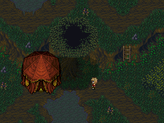
The idea is for the trees with black in the middle to have their own shadows. It looks better with say, the Mac & Blue or the Theodore treetops.
To unrealistic? Should I make it a panorama? Should I move it up a couple of pixels? Or is it just too ugly and I should get rid of it?
Post by: Red Fox on August 12, 2006, 08:22:53 PM
Post by: drenrin2120 on August 13, 2006, 01:07:32 AM
to About: I'm not sure, it looks like it could be good, but is prolly better with mac and Blue like you said.
Post by: Meiscool-2 on August 13, 2006, 07:51:07 PM
Post by: Robotam Plus on August 14, 2006, 03:21:23 PM
Post by: Meiscool-2 on August 15, 2006, 01:33:47 PM
Post by: Robotam Plus on August 15, 2006, 01:47:21 PM
Post by: Tomi on August 15, 2006, 02:58:00 PM
Post by: Meiscool-2 on August 15, 2006, 03:06:23 PM
Quote
Originally posted by EXO Muffin
Way better than mine. Except the bottom of the spirit girl thing. That part's terrible.
You can only use 256 colors though.
Post by: I Have a Sandwich on August 15, 2006, 03:31:48 PM
Quote
Originally posted by EXO Muffin
Way better than mine. Except the bottom of the spirit girl thing. That part's terrible.
Well, there was no bottom to the girl, and I'm not spriting her legs to make a title for a random guy. So I did some brushing under it and messed around with it and gave the bottom of the fence a different feel.
Post by: EXO Muffin on August 15, 2006, 03:44:21 PM
Post by: I Have a Sandwich on August 15, 2006, 04:35:02 PM
Post by: gael on August 15, 2006, 07:45:30 PM
Quote
I'm not spriting her legs to make a title for a random guy
gee random guy huh... cmon guys... IT'S PAPA GAEL...
-um feeling a little unwanted I'm gonna go binge now.... uhmph tequitos so good umph luv you so much...
-its ok anyways I'm happy with the title its pretty and junk.. really um I'm not really making a game right now because first I want to figure out how to use variables properly and I just can't figure it out so right now I'm just kind of making a story and maps...sorry I'm kind of new to this rpg maker thingy... Granted not that new but I believe I have only scratched the surface of the game creating ness
-holy plethora of unnecessary information Batman!
Post by: aboutasoandthis on August 16, 2006, 02:03:36 AM
I think it looks nice but what would you do to make it look more "jungle-ish?"
Post by: coreystranick on August 16, 2006, 02:17:34 AM
Right now it just looks like a complex forest. I like the trees though, I might have to do a map with that type of tree to see what it is like. Very nice BTW.
Post by: EXO Muffin on August 16, 2006, 11:05:08 AM
Post by: Dragonium on August 16, 2006, 11:43:55 AM
I have my own problem. This is the Ruins of Iridor, which is quite a prominent location in my game. Only thing is, it's supposed to look as though it's been there thousands of years, and at the minute it just doesn't look ruiny enough. Can anyone recommend how it could be better?
(By the way, the events in the middle of the map is a statue)
Post by: Meiscool-2 on August 16, 2006, 01:16:22 PM
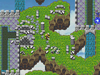
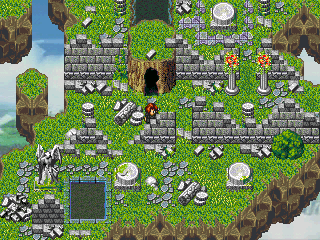
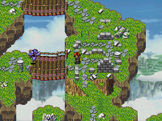
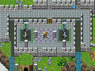
EXO: Not a whole lot to say. It's ok, but it has basically no detail.
About: Just add A LOT of plants. The Rudora plants would probally work nicely. The problem with that map, is that jungles are normally bright green with a lot of weird plant life. Yours is more of a dead forest or something.
Post by: drenrin2120 on August 16, 2006, 03:12:26 PM

Post by: EXO Muffin on August 16, 2006, 03:57:04 PM
Post by: Dragonium on August 16, 2006, 04:17:58 PM
And MIC, thanks. I'll bear that in mind.
Post by: EXO Muffin on August 16, 2006, 04:49:35 PM
EDIT: Would someone, please, post some seagull and fish charsets? I think I really need them.
Post by: Linkizcool on August 16, 2006, 04:53:24 PM
Post by: aboutasoandthis on August 16, 2006, 05:22:30 PM
Oh, and the only real jungle chipsets out there are from SD3 or are Mac & Blue. I try to stay away from those. Reminice on how bad my beach/jungle SD3 map looked.
I put in a lot of jungle stuff. Don't worry about it looking crowded since it's not a real map. I ended up using Mac & Blue +SD3 anyway. _sweat_ I might end up putting in a bog or something with the trees coming from underwater. Comments to make it look better?
I don't really like Mac & Blue so that's why I didn't comment on the stuff above. Nothing constructive here. I'm sorry.
Post by: Meiscool-2 on August 16, 2006, 05:46:38 PM
Quote
Originally posted by drenrin2120
Check this out, look specifically at the transition from water to cliff. It has more of a curviture to it than what I had before making it look more natural.
Now you're catchin' on. Looks better now.
If you wanted to make it look even better, you could use charasets of the water. Example Below.
Quote
Originally posted by aboutasoandthis
I think what throws people off are the colors. You're right about jungles being bright Meis, but I try to stay away from bright colors. It clashes too much unless you put it together just right.
Looks better now. More jungy.
Well, it's not a bright jungle... but it's a bright bog :jest:
|
V
Post by: aboutasoandthis on August 16, 2006, 05:52:19 PM
It still looks nice though. And I still want comments.
Post by: Meiscool-2 on August 16, 2006, 05:54:46 PM
Quote
Originally posted by aboutasoandthis
YOU'RE USING A BUNCH OF LIGHTING EFFECTS AND OVERLAYS!
It still looks nice though. And I still want comments.
Heh, I edited my post to include comments. I realized after I posted that I forgot to say something.
And, I've only got 1 overlay right there, and that's for the tree shading. I have yet to add lighting... this is the slowest I've ever mapped a map before purly because of all the events it takes to make the water.
Post by: Dragoon de Sol on August 16, 2006, 05:56:34 PM
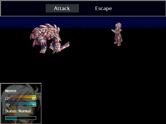
Ashes to Ashes...
Dust to Dust...
Come to kill...
The Demons must...
Post by: gael on August 16, 2006, 05:59:04 PM
-By ze way does anybody know what kind of panorama I can use for this map to make it look not so.... stoopid looking. I was thinking of doing kind of what I did with the "lake empties into cave" picture you know how I just took a screenshot of my game and used it as a panorama... I dunno would that work?
-ooo and aboutsoandthis do you have anymore city screenshots?
If you do I'd love to see them...
Post by: aboutasoandthis on August 16, 2006, 06:06:56 PM
I don't know where to find a better panorama than that. Try something more flat looking. It looks like the map is leaning forward compared to the panorama.
Actually, not right now but coming soon.
Post by: gael on August 16, 2006, 06:20:58 PM
Quote
The 6 little colloms make it out of proportion but I actually like it.
I think your seeing something different the 6 columns are kind of like the roof to the archways...
-I tried to make somethig that resembles 2 concrete arbors.
See look at the picture
Post by: aboutasoandthis on August 16, 2006, 06:24:04 PM
Post by: drenrin2120 on August 16, 2006, 06:25:59 PM
Quote
Originally posted by Meiscool
If you wanted to make it look even better, you could use charasets of the water. Example Below.
Hm... I like that idea...
Edit: That was an eevil quote bug... <_< Hope I got everything you wanted to say dren.
~Ace~
EDIT2: lol, oops. Yeah, that's pretty much it
-dren
Post by: Dragonium on August 16, 2006, 06:31:17 PM
aboutasoandthis, that map looks fine to me. :) The only little thing is the top of the wooden bridge... It looks sort of... Weird.
Post by: gael on August 16, 2006, 06:34:18 PM
-It is the original bridge that came with the chipset though...
Post by: Ace of Spades on August 16, 2006, 06:34:58 PM
Post by: aboutasoandthis on August 16, 2006, 06:39:53 PM
Dragonium: You're talking about gael right?
dren: I think you're talking to Meis.
Ace: Thanks Ace. Post or PM the chipset anyway.
Post by: coasterkrazy on August 16, 2006, 06:46:34 PM
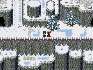
Opening sequence. I realize I have a couple tile issues below the fence, but I probably won't change it now because this is actually a panorama and I don't feel like redoing the map and making it a panorama again just for that.
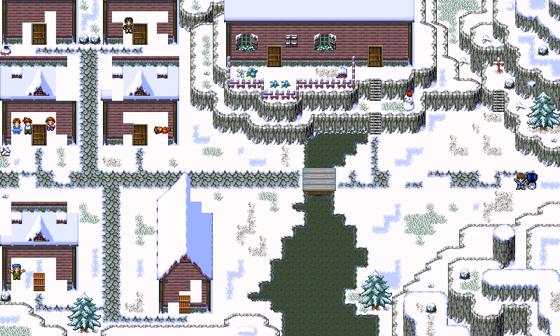
First town. Yes, the buildings on the left are supposed to be destroyed, but the chipset didn't support destroyed buildings so whatever. Not like this is professional or anything. :p
EDIT: Ugh, damn photobucket resize. To see the fullsize image, just paste the image location URL into the address bar.
Post by: I Have a Sandwich on August 16, 2006, 06:52:02 PM
Post by: Ace of Spades on August 16, 2006, 06:59:53 PM
Quote
Originally posted by aboutasoandthis
Okay, now I'm confused.
Dragonium: You're talking about gael right?
dren: I think you're talking to Meis.
Ace: Thanks Ace. Post or PM the chipset anyway.
Eh, I used to have it... before my hd a'sploded. :'( I'm sure you can find it somewhere, though. Here, I captured the tileset within Temporal Flux. This is what the tiles look like, if you want to look for the chipset. Or, feel free to just rip the tiles from the Tileset itself, either way works. I'm not gonna do either though. <_<...
Edit: I added another jungle-esque tileset that's in the same era of CT. If you don't see two tilesets, refresh your browser.
Post by: drenrin2120 on August 16, 2006, 07:00:48 PM
CK: The maps are pretty good, except the destroyed buildings are pretty bad looking. :- I know you weren't aiming for profession but still.
About: Yes, I was talking to Meiscool. Ace confused me with his quote, I thoguht he was quoting us saying those things. I was like, what?? But then I saw your post. lol :p
Post by: aboutasoandthis on August 16, 2006, 07:24:06 PM
Oh, coasterkrazy, they actually look nice even though they're really "straight" looking. What's better is that you posted an actual screenshot instead of a map.
Post by: Ace of Spades on August 16, 2006, 07:30:01 PM
Quote
Originally posted by aboutasoandthis
I have that chipset. I do not like it. That's why my forest looks like above instead of that.
Oh, coasterkrazy, they actually look nice even though they're really "straight" looking. What's better is that you posted an actual screenshot instead of a map.
Fine, be that way! >_<
Hehe, j/k. I never really cared for it either. The one on the right isn't too bad though. It's more of a prehistoric mountain-esque tile rather than a jungle, though. Which would make sense, seeing as that's what it is in the game. :p
Post by: Dragoon de Sol on August 16, 2006, 07:32:17 PM
Post by: aboutasoandthis on August 16, 2006, 07:36:01 PM
The dialogue in the first screen is wierd. Plus, the sky looks strange with the flat building like that.
However, the second screenshot is very attractive for some reason. The background fits. I'd only tint the hero if it's possible.
Post by: Dragoon de Sol on August 16, 2006, 07:46:13 PM
It explains how his brother and sister was killed by a TEK-bot...You'll see.
I had a building as part of the panorama...but the building looked like a gate. So, I covered it up.
I am pretty sure I can tint the hero.
Though, that isn't a charset. They are both pictures.
I'll see what I can do.
EDIT:
There we go...All better.
Post by: coasterkrazy on August 16, 2006, 08:05:57 PM
Quote
Originally posted by I Have a Sandwich
CK man, dont use the [IMG*] code and it'll be fine.
Hmm? Do you mean just attach that one? Yeah, I probably should've done that but oh well. If no one wants to right click and go to view image, then they don't have to.
Dren: Lol I knew that comment was coming up no matter what I said. Well my friend said he doesn't care, so that's all that really matters to me right now. I just wanted to post something on here and get some feedback, as I'm trying to improve my mapping skills. And if it still bugs you, got anything I could use? :p
Dragoon: I like the style of those screens, but as aboutaso said, the first background looks flat. Other than that, I think they really stand out. You seem to be using XP the way it was meant to be used, especially with that charset.
Post by: I Have a Sandwich on August 16, 2006, 08:08:51 PM
Quote
Originally posted by coasterkrazy
quote: Originally posted by I Have a Sandwich
CK man, dont use the [IMG*] code and it'll be fine.
Hmm? Do you mean just attach that one? Yeah, I probably should've done that but oh well. If no one wants to right click and go to view image, then they don't have to.
No, I mean if you use the code
Post by: Ace of Spades on August 16, 2006, 08:11:17 PM
Quote
Originally posted by coasterkrazy
Hmm? Do you mean just attach that one? Yeah, I probably should've done that but oh well. If no one wants to right click and go to view image, then they don't have to.
Nope, he means to use the Tag instead. The "
Post by: Dragoon de Sol on August 16, 2006, 08:12:32 PM
Post by: Ace of Spades on August 16, 2006, 08:14:43 PM
Quote
Originally posted by Dragoon de Sol
Hmm....would it help at all if the moon was moved farther up in the screen?
Is that what that is? I couldn't even tell. <.< ... Anyway, yes, it would.
Post by: Dragoon de Sol on August 16, 2006, 08:22:17 PM
Post by: coasterkrazy on August 16, 2006, 08:26:19 PM
Quote
Originally posted by Ace of Spades
quote: Originally posted by coasterkrazy
Hmm? Do you mean just attach that one? Yeah, I probably should've done that but oh well. If no one wants to right click and go to view image, then they don't have to.
Nope, he means to use the Tag instead. The "
Oh, ok. I'll keep that in mind for next time, thanks.
Post by: Meiscool-2 on August 16, 2006, 09:10:53 PM
CK: You should unstraighten some of your cliff faces, but make sure that they don't hinder the player's area of walking. I make that mistake a lot :eyes:
Gael: Nice. Probally the best use I've ever seen with that chip.
I finished the "Bog". I started with the intention of making it a forest village... but after having so much water, and having the area supposed to the most magical place in the game, I desided to make it reflect the whole "magic" thing and have it be a floating island with limitless water XD.
Post by: coasterkrazy on August 16, 2006, 10:03:45 PM
About my map, I was kind of thinking the same thing after I made it. To be honest, it was really that I got lazy switching back and forth between layers, and I can't plan ahead well enough to do all of one layer like that first. :p
Post by: Meiscool-2 on August 16, 2006, 11:41:42 PM
Quote
Originally posted by coasterkrazy
it makes it look too much as if there's no support ground under the island.
Quote
Originally posted by Meiscool
floating island.
:p
Post by: I Have a Sandwich on August 16, 2006, 11:55:31 PM
Post by: Meiscool-2 on August 17, 2006, 12:06:05 AM
Post by: coasterkrazy on August 17, 2006, 12:51:08 AM
Quote
Originally posted by Meiscool
quote: Originally posted by coasterkrazy
it makes it look too much as if there's no support ground under the island.
quote: Originally posted by Meiscool
floating island.
:p
Gah! In my original post I backed that up as ZKX just did, as well as what you just said about something behind the waterfall. I said that I could see it, but I thought the waterfall took away from it too much.
But anyway, I still just think there should be less waterfall area. I guess it's a matter of preference...
Post by: Tomi on August 17, 2006, 12:55:44 AM
Post by: drenrin2120 on August 17, 2006, 01:48:40 AM


Post by: Meiscool-2 on August 17, 2006, 01:53:01 AM
Post by: drenrin2120 on August 17, 2006, 01:57:21 AM
Quote
Originally posted by Meiscool
Great Dren. Now, remember, if you do things like that, you need to map out the water areas too. Like, add pillars to the pier, grasses, etc. It really does look better though, huh?
Yes, definitely. Adding the fish, crabs and cliffs alone made it look soooo much better. I love it. :heart:
Post by: Meiscool-2 on August 17, 2006, 02:07:07 AM
What's your favorite map that I've ever posted screens of? They all have their ups and downs, I just wanna know which one pleased your eyes the most out of what you've seen.
Post by: coreystranick on August 17, 2006, 02:15:50 AM
Post by: Linkizcool on August 17, 2006, 03:56:00 AM
Post by: aboutasoandthis on August 17, 2006, 11:42:27 AM
Post by: Meiscool-2 on August 17, 2006, 01:55:37 PM
Quote
Originally posted by Linkizcool
Mine would be that huge one coreystranick was talking about and the bog floating island thing. How did you get thatland under the water effect? Did you get the chip into a charset and use transparency?

I posted that on page 12 or something.
Post by: Grunge0Puppy on August 17, 2006, 08:01:31 PM
Post by: Tomi on August 17, 2006, 11:09:25 PM
Post by: Dragoon de Sol on August 17, 2006, 11:11:54 PM
Boss Battle:
Slumlord, Slumlord Lacky*2
Story behind it:
The slumlord is selling women, and Wonrei finds it very immoral to defile the purity of women, so he decides to set them free by killing the slumlord.
What you see:
Wonrei has dispatched the Lacky duo (that's right. Most of the time, you will see dead enemies on the field).
He is now going after the slumlord by using the Ho No Jutsu (Fire Jutsu
Post by: I Have a Sandwich on August 17, 2006, 11:22:16 PM
Post by: aboutasoandthis on August 18, 2006, 02:46:38 PM
It's supposed to be a temple for a certain civilization. Their god is a bull, hence the bull idol. They're supposed to worship wind and I'm trying to create something along those lines.
I'm thinking about having you seal air vents and pop boxes to the ceiling or something. Does anyone know a good way to design a puzzle?
Oh, and does the statue look enough like a bull? The mapping will get better later when I have the basics of the puzzle down.
Post by: Meiscool-2 on August 18, 2006, 02:55:31 PM
Post by: aboutasoandthis on August 18, 2006, 03:14:10 PM
EDIT==========================================
So the thread doesn't get filled up with clutter, I decided to post this here.
I have to make 12 temples in my game that are all based on the zodiac. Each has its own civilization and its own element. The first shrine you know about is called "Vishraba Shrine." Their god is "Chaos" from Final Fantasy 1. His element is wind and in this game, he's a bull.
I already have ideas for some but wind is definitly a hard one.
I do have an earth shrine with the god "Hashumalim" who is a lion though. I'll look that up.
If you haven't guessed, my game is based on the zodiac a lot.
Post by: Meiscool-2 on August 18, 2006, 04:08:53 PM
|
V
A mockup of a status screen menu that About made for me.
Post by: aboutasoandthis on August 18, 2006, 04:21:08 PM
Looking back at my above post, I realized my grammar sucks.
Post by: Meiscool-2 on August 18, 2006, 04:33:46 PM
Post by: I Have a Sandwich on August 18, 2006, 08:19:59 PM
Post by: aboutasoandthis on August 18, 2006, 08:24:46 PM
Post by: Meiscool-2 on August 18, 2006, 08:28:46 PM
Post by: I Have a Sandwich on August 18, 2006, 09:00:26 PM
Quote
Originally posted by aboutasoandthis
It already looks nice, and you even stole my test character. :P I'd just get a better chipset soon as nothing in that chip came from the same game. I can prove it, but it'll take too long.
Well, I stole out of Mic's data files. Its easier just to use chips from otehr games to practice than to try and search on this connection. Talk to him about the unmatchingness. XD
Post by: Meiscool-2 on August 18, 2006, 09:03:56 PM
Post by: karlc on August 19, 2006, 02:33:50 AM
how is it
feedback please
Post by: Meiscool-2 on August 19, 2006, 02:49:14 AM
Post by: karlc on August 19, 2006, 03:20:20 AM
Post by: I Have a Sandwich on August 19, 2006, 04:49:14 AM
Post by: karlc on August 19, 2006, 01:36:38 PM
Post by: Meiscool-2 on August 19, 2006, 03:46:19 PM
Post by: aboutasoandthis on August 19, 2006, 04:28:40 PM
I know it's not realistic right now. Would it bother you if there were lights like this?
Post by: drenrin2120 on August 19, 2006, 04:33:51 PM
Post by: Meiscool-2 on August 20, 2006, 03:09:45 PM
Post by: X_marks_the_ed on August 22, 2006, 01:03:58 PM
This is the main map of my Untitled game. It occurs in the same land as NFT (which was deleted by McAffee. _veryangry_ ) However, it has a different plot.
I know that some chips have different shades of grass. I'll fix that sooner or later.
I have to ask, because of so many blank spots, what should I put in them? I've run out of ideas.
Edit: I forget to mention, but the world map is only used for teleportation, you just select a location the arrow (still yet to be put in) then you teleport to that map.
You can only teleport to castles or a teleporter. There are a few exeptions, though, like Sunset village and one of the trader camps, which have teleporters in them.
Post by: Emerates on August 22, 2006, 01:41:04 PM
Post by: X_marks_the_ed on August 22, 2006, 01:44:39 PM
Quote
Originally posted by Emerates
But, I'm a n00b, so what I think isn't really important in this kinda thread.
In this thread, you're not a noob, you're a future downloader! And nothing matters more than the satisfaction of a future downloader. That leads to more downloads. :D
Your comment will be taken into consideration.
Post by: Emerates on August 22, 2006, 02:27:14 PM
Quote
Originally posted by X_marks_the_ed
In this thread, you're not a noob, you're a future downloader! And nothing matters more than the satisfaction of a future downloader. That leads to more downloads. :D
Your comment will be taken into consideration.
Sweet! This is even better than real life! :D Well, I'm glad at least one of my ideas matter.
By the way, I'll try and post some screenshots from my project when I get the chance, anyone who cares.
Post by: Meiscool-2 on August 22, 2006, 02:46:38 PM
Post by: X_marks_the_ed on August 22, 2006, 03:21:00 PM
The scale for the map is 1 square = 1 mile.
@Aboustasoandthis: Your lighting is great! Could you PM me how you did that? I have a balcony in my Chaos temple that could use that kinda effect.
Post by: Meiscool-2 on August 22, 2006, 10:57:02 PM
Quote
Originally posted by X_marks_the_ed
@Aboustasoandthis: Your lighting is great! Could you PM me how you did that? I have a balcony in my Chaos temple that could use that kinda effect.
Uh, I made a tutorial about that in my Mapping Tut on page 5. Reading that might save you and About some time.
Post by: aboutasoandthis on August 22, 2006, 11:38:07 PM
Post by: Meiscool-2 on August 22, 2006, 11:42:56 PM
Post by: aboutasoandthis on August 23, 2006, 12:28:37 AM
Besides, I don't use Photoshop. Do you think Ed has it if he asked me instead of you?
Post by: Meiscool-2 on August 23, 2006, 12:33:03 AM
Post by: aboutasoandthis on August 23, 2006, 01:00:59 AM
I still think my lighting looks better than yours though. Do lights really go in several directions? Is light that white?
Post by: I Have a Sandwich on August 23, 2006, 01:10:40 AM
Quote
Originally posted by aboutasoandthis
Do lights really go in several directions? Is light that white?
Yes... Yes it does. And yes, yes it is.
Post by: Tomi on August 23, 2006, 01:17:27 AM
Post by: Meiscool-2 on August 23, 2006, 01:20:45 AM
Post by: X_marks_the_ed on August 23, 2006, 12:31:16 PM
I asked Aboutasoandthis becausehe seemed to be really good at it. Besides, I like aboutaso's better.
Seriously, though. Does the teleportation map seem too empty in some regions?
Post by: Meiscool-2 on August 23, 2006, 03:51:22 PM
Quote
Originally posted by X_marks_the_ed
Tomi
He he
Quote
Originally posted by X_marks_the_ed
Seriously, though. Does the teleportation map seem too empty in some regions?
It looks fine.
Post by: X_marks_the_ed on August 23, 2006, 03:57:35 PM
Quote
Originally posted by Meiscool
quote: Originally posted by X_marks_the_ed
Tomi
He he
Darn! Gotta remember to read names, not sigs.
Quote
It looks fine.
That feels good coming from someone who can actually make maps. :D
Post by: Robotam Plus on August 23, 2006, 03:58:41 PM
Post by: aboutasoandthis on August 23, 2006, 08:03:53 PM
Let's just get over this and go back to screens. Meis, you know I didn't say to ignore all your posts.
Quote
Uh, I made a tutorial about that in my Mapping Tut on page 5. Reading that might save you and About some time.
Just do not post something like that again.
Anyone got a nice screenshot? Ed, There are a couple of mistakes to it but it's an overall nice world map. I never liked that chipset though. I didn't think it looked too crowded.
Post by: Meiscool-2 on August 24, 2006, 04:14:50 AM
Post by: EXO Muffin on August 24, 2006, 05:52:29 AM
Post by: X_marks_the_ed on August 24, 2006, 11:53:54 AM
Quote
Originally posted by aboutasoandthis
There are a couple of mistakes to it
Like...
Post by: Robotam Plus on August 24, 2006, 12:00:09 PM
Post by: Zerlina on August 24, 2006, 05:23:51 PM
ie: going outside).
Sorry, I know you guys like maps with lots of stuff scattered around ^^' but I dunno, I'm too used to playing 3d games to be able to put stuff over the map like that. Maybe one day ^^.
I know this is going to sound stupid, but there's little details like dirt between the grout near the exit to the garden etc. Enjoy ^^ and please be nice >.<
Post by: Emerates on August 24, 2006, 06:19:45 PM
Zerlina, I like that chipset. Looks good.
Post by: Meiscool-2 on August 24, 2006, 07:26:14 PM
Post by: aboutasoandthis on August 24, 2006, 07:58:09 PM
Meis: It looks alright. What are the pipes for? And why are you making it and not Robbie? Just wondering.
Zerlina: I hate the chipset but I love the lighting and the rug, even though some of the lighting doesn't make sense to me. I'm looking at the one with the two torches the most. Where does that one big shadow in the middle of the room come from?
Post by: Zerlina on August 24, 2006, 08:01:34 PM
Quote
Originally posted by Meiscool
Zerlina: I like the garden thing. I can't imagine how cool that'd look in-game.
Thanks! ^^ I like your subway, it looks very professional and creepy.
Quote
Zerlina: I hate the chipset but I love the lighting and the rug, even though some of the lighting doesn't make sense to me. I'm looking at the one with the two torches the most. Where does that one big shadow in the middle of the room come from?
Well, those aren't torches for one thing lol. They're magic stones so they glow a bit.
Hm...maybe take a look at the shape of the big shadow in the middle of the room, and consider it's in the roof of a cathedral ;).
Post by: aboutasoandthis on August 24, 2006, 08:03:49 PM
Post by: I Have a Sandwich on August 25, 2006, 03:43:28 AM
Post by: Meiscool-2 on August 25, 2006, 03:45:15 AM
You used a floor tile for the walls of the doorway. The bottom half looks a bit square, but over all, it's fine.
Post by: I Have a Sandwich on August 25, 2006, 03:50:32 AM
Quote
Originally posted by Meiscool
To spacious. Though, if a realistic look is what you want, fine.
You used a floor tile for the walls of the doorway. The bottom half looks a bit square, but over all, it's fine.
Actually, it leads to the living quarters. The stair lead to the dining hall.
Post by: Zerlina on August 25, 2006, 02:48:36 PM
Quote
Originally posted by I Have a Sandwich
quote: Originally posted by Meiscool
To spacious. Though, if a realistic look is what you want, fine.
You used a floor tile for the walls of the doorway. The bottom half looks a bit square, but over all, it's fine.
Actually, it leads to the living quarters. The stair lead to the dining hall.
lol for a second I read that as "lead to the dining hell" which is something completely different :P.
It's nice, but maybe you could make the part near the bottom a bit smaller? Also, what does it look like when you go up those diagonal stairs? Have you tried having your character walk up it...from what I remember it doesn't work so well with diagonal stairs like that. Last time I tried that, I ended up just turning the stairs into flower pots lol.
Anyways, if you made the bottom part a bit shorter, and maybe put a darker or lighter coloured rug in the middle (leaving the edges as the other rug colour) I think it would look a lot better ^^. Just my opinion though
Post by: I Have a Sandwich on August 25, 2006, 06:48:06 PM
On the topic of stairs, you just have to set it so that a start on touch event is on the stairs that moves you up/right or whatever the neccessary amount.
Post by: aboutasoandthis on August 25, 2006, 08:04:26 PM
I've never liked that chipset so...it's actually the best use of it I've seen.
Post by: I Have a Sandwich on August 25, 2006, 08:22:18 PM
Quote
Originally posted by aboutasoandthis
I think the parts next to the stairs should have som railing to the wall. I've never seen a building like that without them.
I've never liked that chipset so...it's actually the best use of it I've seen.
Oh right. I knew that it seemd off. Looks better now. Thanks man.
Post by: Meiscool-2 on August 26, 2006, 03:20:04 AM
I'm making a.... I guess "Tree House" village. All the area you can walk in the map will be on bridges connected by trees. I don't have much done yet... but here's what I got.
Post by: aboutasoandthis on August 26, 2006, 12:05:21 PM
I think you're just missing variety, since you're using that chipset a lot. Is this still the floating island of Besair, or is this a new town?
Post by: Red Fox on August 26, 2006, 05:54:17 PM
Post by: drenrin2120 on August 26, 2006, 09:14:26 PM
EDIT: Does the train move?
Post by: Linkizcool on August 26, 2006, 09:26:02 PM
Quote
Originally posted by Meiscool
Same chipset, different use.
I'm making a.... I guess "Tree House" village. All the area you can walk in the map will be on bridges connected by trees. I don't have much done yet... but here's what I got.
Nice, just try a different treetop. It looks kinds odd with the small ones.
Post by: Red Fox on August 27, 2006, 11:56:42 AM
Quote
Originally posted by drenrin2120
Sweet map RF. I like it alot.
EDIT: Does the train move?
Thanks ^^. Nah the train stands still.
Post by: drenrin2120 on August 27, 2006, 04:19:11 PM
Quote
Originally posted by Red Fox
quote: Originally posted by drenrin2120
Sweet map RF. I like it alot.
EDIT: Does the train move?
Thanks ^^. Nah the train stands still.
Ah, too bad. Still cool though.
Post by: Arcanagirl on August 27, 2006, 09:07:21 PM
Hehe, Meiscool, your tree top village sounds awsome and the train screeny was really nice.
Edit: umm, this is just a suggestion, but maybe round out the ends of the bridges...might give it a better feel then all square ends and what not....not saying its bad just something I noticed that might look better round, unless your feel is square then works fine...
Post by: EXO Muffin on August 27, 2006, 09:43:21 PM
Post by: aboutasoandthis on August 27, 2006, 10:05:02 PM
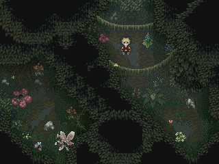
I still like Meis's shot. Remember, it's unfinished. Oh, and I like your pic Red Fox.
This isn't really a screenshot. More like a chipset experiment.
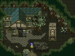
It's unfinished. Try not to judge the map too much. What would you add to the chipset? I'm thinking about switching out the cliffs for maybe...castle walls and better cliffs?
Post by: Meiscool-2 on August 28, 2006, 04:52:06 AM
Quote
Originally posted by aboutasoandthis
I think you're just missing variety, since you're using that chipset a lot. Is this still the floating island of Besair, or is this a new town?
It's teh floating island in the past... before it started floating.
I know there's bound to be some HUGE problems with it, as making bridges in trees will probally cause a lot of things to not line-up well. But, for what I can do with the chipset, I'm doing the best I can.
As for tree tops, I'll probally wait untill the whole map is finished, and then I'll use pictures.
Post by: I Have a Sandwich on August 28, 2006, 05:24:45 AM
Post by: Meiscool-2 on August 28, 2006, 05:50:21 AM
Quote
Originally posted by I Have a Sandwich
Why don't you edit some of the tiles? I had to to get those stairs workin.
I did already. I'm out of space for making new tiles that I need. I could make charasets, but I don't think the map is important enough.
Post by: EXO Muffin on August 28, 2006, 06:26:05 PM
Post by: Meiscool-2 on August 28, 2006, 07:00:03 PM
Forest1. (http://i26.photobucket.com/albums/c105/Meiscool2/Forest1.png)
Forest2. (http://i26.photobucket.com/albums/c105/Meiscool2/Forest2.png)
Forest3. (http://i26.photobucket.com/albums/c105/Meiscool2/Forest3.png)
Forest4. (http://kevan.org/brain.cgi?Meiscool)
Post by: aboutasoandthis on August 28, 2006, 07:02:10 PM
I edited the chipset to include castle stuff. Can someone use it to see if they have any problems? Please?
Post by: I Have a Sandwich on August 28, 2006, 07:02:27 PM
Other than that they look fine. Especially the fourth one.
Post by: Meiscool-2 on August 28, 2006, 07:03:18 PM
Post by: I Have a Sandwich on August 28, 2006, 07:03:51 PM
Post by: aboutasoandthis on August 28, 2006, 07:08:35 PM
It still has some space if you want something extra. I'd take out thr Rudra trees.
Post by: I Have a Sandwich on August 28, 2006, 07:12:30 PM
And don't worry about that, I dont play for favors.
Post by: EXO Muffin on August 29, 2006, 01:47:43 AM
Post by: gael on August 29, 2006, 04:15:58 PM
- I kind of wanted to make something different looking and the way the building is designed right now goes perfectly with my ideas for the interior also.
- I just really wondered if someone could take a look at it and tell me if it looks too weird and maybe tell me how I might be able to fix up the building and hopefully keep the same kind of layout going...
- I know this is really random but aboutsoandthis I was checking out some screenshots from your game and is your main character named Gale?...hahaha thats so cool if it is my main guy is also called Gale but you know spelled all gay like...LIKE THIS G-A-E-L.
Post by: aboutasoandthis on August 29, 2006, 07:55:36 PM
Post by: EXO Muffin on August 29, 2006, 09:51:01 PM
Post by: Meiscool-2 on August 29, 2006, 09:53:14 PM
# 1
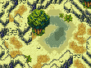
#2
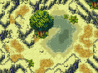
BTW, Yay for SoM desert water animation rips!
Post by: neb87 on August 29, 2006, 10:04:17 PM
Post by: aboutasoandthis on August 29, 2006, 10:04:30 PM
Nice overall map Meis. There are a couple of cliff mistakes (blame the chipset, not your skills), and some of the rock ground and the middle of the dark water looks squarish.
Post by: I Have a Sandwich on August 29, 2006, 10:57:11 PM
Post by: Arcanagirl on August 29, 2006, 11:23:24 PM
Ok here is a screenshot of the finished menu system. Well only what you see if finished, items and what not still in works.
Screenshot:

Comments welcomed.
Post by: aboutasoandthis on August 29, 2006, 11:43:08 PM
Post by: Arcanagirl on August 30, 2006, 02:48:22 AM
Post by: Meiscool-2 on August 30, 2006, 02:52:09 AM
Post by: I Have a Sandwich on August 30, 2006, 03:22:04 AM
Quote
Originally posted by Meiscool
I don't like the space between each number, but that's just me.
Well I think they're evnts, not pics.
Post by: Meiscool-2 on August 30, 2006, 03:33:11 AM
Quote
Originally posted by I Have a Sandwich
quote: Originally posted by Meiscool
I don't like the space between each number, but that's just me.
Well I think they're evnts, not pics.
Yeah, I know. I'm trying to convince her to use pictures.
Post by: I Have a Sandwich on August 30, 2006, 03:36:21 AM
Post by: Arcanagirl on August 30, 2006, 03:57:40 AM
but I already calculated the spaces between all pictures. And I think it looks fine how it is now. Yes pictures, spaced them enough, and I am done fiddling with that anymore lol...
Edit: And the before events where spaced much worse then that lol.
:firefox:
Post by: Zerlina on August 30, 2006, 04:29:53 PM
Post by: Meiscool-2 on August 30, 2006, 04:50:21 PM
Post by: Arcanagirl on August 30, 2006, 07:14:14 PM
Post by: aboutasoandthis on August 30, 2006, 08:00:11 PM
Post by: I Have a Sandwich on August 30, 2006, 09:24:18 PM
Post by: aboutasoandthis on August 30, 2006, 09:41:16 PM
Post by: I Have a Sandwich on August 30, 2006, 09:44:00 PM
Post by: Zerlina on August 30, 2006, 10:05:44 PM
Post by: Meiscool-2 on August 30, 2006, 10:16:19 PM
Post by: I Have a Sandwich on August 30, 2006, 10:39:31 PM
Post by: Meiscool-2 on August 31, 2006, 03:23:41 AM
Finished the "desserted" island that's actually a bandit's nest. Doesn't show much of the middle, but I got some nice pictures of the mini-game you play. Basically, you need to get of the island without being seen, and to do that, you have to steal a boat. However, the boat is guarded, so you need to go around and cause enough problems so that they call the guards away from the boat to start looking for you.
Screens:
1) Upper Left, A guard is fishing and sees you.
2) Middle Left, The guard that saw you follows along the side of the cliff untill he finds a slope to take him up to your level.
3) Upper Right, Same guard walks right past you as he thinks that you turned around and went the other way.
4) Middle Right, A guard comes our from behind the tree. Sneaky little bastard:p
5) Lower Left, Using a bird, you create a noise distraction for the Guard.
6) Lower Right, A guard barly sees you as you exit the cave, and rushes out to catch you. When he doesn't see you, he goes back in, thinking it was just him imagination.
Post by: I Have a Sandwich on August 31, 2006, 03:33:11 AM
Post by: Arcanagirl on August 31, 2006, 07:06:49 PM
*Jenna Gives 4 :*: s *
Post by: aboutasoandthis on August 31, 2006, 07:50:28 PM
Post by: deithe2 on August 31, 2006, 08:52:13 PM
Post by: aboutasoandthis on August 31, 2006, 09:00:06 PM
Post by: deithe2 on August 31, 2006, 09:02:47 PM
Post by: Skie Fortress on August 31, 2006, 09:15:38 PM

Post by: Meiscool-2 on August 31, 2006, 09:41:13 PM
Quote
Originally posted by deithe2
yeah this is the size that it is when u print screen it, its fine when its ful size but ur not the 1st to have said that man, ill try to get a better one for tommorow when i add the last character in and sort it out a little thanx for the comment though keep en comin in
No... it's blury because you saved it as a jpg.
Your screen is nothing but a ripped background, pictures clearly made using paint, and stolen sprites. That is NOTHING to be proud of.
Skie: Looks kinda cool, but I don't like the mixture of different sprites.
Post by: aboutasoandthis on August 31, 2006, 09:58:29 PM
You should post here more. I notice you coming on the main page, yet you don't post that much. :)
So how's Gaming World? You know I'll bother you till the end of time with that. :p
Post by: Arcanagirl on August 31, 2006, 10:04:35 PM
Padona House 1, take 506:

I hate when some chipsets just dont hold the house filly, to where you can customize it how you want.
Post by: EXO Muffin on August 31, 2006, 11:47:40 PM
Post by: Arcanagirl on September 01, 2006, 12:32:32 AM
Please comment as a whole. More of, does it look good all together, the chipset and town is still needing a lot of work, so please keep that in mind.
Item shop test 1:

Post by: aboutasoandthis on September 01, 2006, 01:06:53 AM
Oh, and everything does match well. That flat roof looks a little strange. That messes up the depth perception a bit.
Where exactly are you getting these chipsets? Is there a specific game? I like the style.
Cute. :p
Post by: Meiscool-2 on September 01, 2006, 01:27:24 AM
Post by: Arcanagirl on September 01, 2006, 02:19:31 AM
Post by: Meiscool-2 on September 01, 2006, 02:57:07 AM
Quote
Originally posted by aboutasoandthis
Please do a tutorial on this kind of AI. I could really, REALLY use it.
Talkin' to me?
Post by: m a k o on September 01, 2006, 11:51:29 AM
Post by: aboutasoandthis on September 01, 2006, 08:13:41 PM
That's a Zorn and Thorn joke if you got it. Yes, I would like to see how you program your Artificial Intelligence.
Do you focus more on Position with your variables, or do you have variables set up for things like "emotion" or something wierd like that? (I mean like Variable[2345]Guard1Anger or something like that.)
Remember, I'm not using random battles so this could really be useful.
Post by: deithe2 on September 01, 2006, 08:41:59 PM
Post by: I Have a Sandwich on September 01, 2006, 08:44:14 PM
Quote
Originally posted by deithe2
fort id ave another go, ma last screenshot was apparently awful, i still dont think this wont be much better but ill work on the gfx until you think its okay then ill get the other characters in, theyve changed it will now be deithe (me) black-mamba (next door neighbour) and cookie (next door neighbours sister)
FOR THE LOVE OF GOD TYPING IN ******* ENGLISH!
Post by: aboutasoandthis on September 01, 2006, 09:23:14 PM
Post by: deithe2 on September 01, 2006, 10:40:30 PM
Post by: EXO Muffin on September 01, 2006, 11:40:43 PM
Post by: Skie Fortress on September 02, 2006, 01:10:47 AM
A screenie

Well, I'm getting somewhere now. Command menus are harder than I thought what with all the mini menus and so on...or maybe I just suck. Anyways I'm still working on it. And the character sprite's are slowly replacing the placeholders as they're made...>.>
Post by: Zerlina on September 02, 2006, 02:57:37 AM
Post by: Meiscool-2 on September 02, 2006, 03:46:15 AM
Quote
Originally posted by aboutasoandthis
Do you focus more on Position with your variables, or do you have variables set up for things like "emotion" or something wierd like that? (I mean like Variable[2345]Guard1Anger or something like that.).
Let's see.... Well, I used Varibles for the Guard's site. Basically, he can see 2 tiles in all directions regardless of how he's facing, and 5 tiles in front of him. If you're in that area, you're seen. However, I put special X and Y locations to where even if you're in the area, he doesn't see you unless you move. As for the anger, those are just played out events. I don't use a varible to show how mad they are.
Post by: EXO Muffin on September 02, 2006, 04:26:40 AM
SWAN-KAY.
Post by: Zerlina on September 02, 2006, 04:32:30 AM
I'm not an advocate of overlays, but I thought it was kinda necessary.
This is a map you've seen (by the time you reach this point in the game). The spirit which is "controlling" Titania's dreams keeps bringing her here. Unfortunately, since it's a ghost, it can't speak and can't tell her why its always bringing her back.
Post by: I Have a Sandwich on September 02, 2006, 04:53:57 AM
The overlay looks good, but it's kind of skimpy in some spots.
Post by: deithe2 on September 02, 2006, 11:16:56 AM
nemesis, the person who made that game, did not make the cbs or cms for the game, it was a demo for a game called eternal dreams posted on a gamingw forum
the sprites were stolen from kindred saga the first ever game to feature a cbs
nemesis made only a couple of resources for that game, i think maybe a couple of items, all the sprites and tilesets were either found from websites or inculded in the demo
so please stop saying i robbed stuff from this game, only one resource has been used from that game, that resource wont even be there in the final version
Post by: Thunderstrike on September 02, 2006, 02:38:29 PM
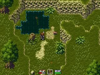
heres my game, its an action battle system, I haven't got a title yet, but its coming along smoothly :D
what do you think? :jumpin:
Post by: aboutasoandthis on September 02, 2006, 02:51:33 PM
I'd see deithe2's topic for a post to make it less blurry.
deithe2: Relax. It was a laugh for a bit. :p If I really made you mad, I apoligize. I even noticed Colt from "The Evil Inside."
This might be off-topic deithe2. Could you use more periods, and capital letters and stuff? It's hard to read what you type. You can type like that on IM or MSN or something, but it is really hard to read here in a forum for me.
Post by: Thunderstrike on September 02, 2006, 03:10:05 PM
thats what the gameplay is supposed to be similar to...
but I'm using the Rudra sprite (with alot of redrawn stuff to make him run, run with sword, and all the attack sprites where edited by me)
I agree, the map could be better, but its alright for now
I'm trying to make the battle more action-packed at the moment, and then I'll continue creating the game/storyline :D
Is it really too much SD3-ish? :(
Post by: Zerlina on September 02, 2006, 03:29:16 PM
Quote
Originally posted by I Have a Sandwich
It can control the path and direction of her dreams, but cant speak to her in said dream? Couldn't it indirectly speak with her?
In Homeric legend the dead can't speak unless they drink the blood of the living. Because of this, the ghost can't talk, but she brings Titania here to try and warn her and hope she figures it out herself.
Post by: deithe2 on September 02, 2006, 04:04:43 PM
Post by: aboutasoandthis on September 02, 2006, 04:06:36 PM
Quote
Is it really too much SD3-ish?
No. I just didn't like the HUD in that game. That's just me. Don't worry about it.
I think when making a game with an ABS, you should make a really flashy screenshot to get people excited about it. I mean, the Rudra Guy (Sion Right?) is facing upward. I can't really see how he attacks. Nice pose though. Also, I'd put a special attack or a really big monster in the screen too.
Those are things I like. :happy:
Post by: Meiscool-2 on September 02, 2006, 04:21:15 PM
Quote
Originally posted by Thunderstrike
a "rip from SD3"?! :O
thats what the gameplay is supposed to be similar to...
but I'm using the Rudra sprite (with alot of redrawn stuff to make him run, run with sword, and all the attack sprites where edited by me)
I agree, the map could be better, but its alright for now
I'm trying to make the battle more action-packed at the moment, and then I'll continue creating the game/storyline :D
Is it really too much SD3-ish? :(
Use a better HUD. Secert of Mana, Zelda, any of those would be better picks to rippoff and make your own versions of.
Post by: Thunderstrike on September 02, 2006, 04:29:55 PM
I'll be adding spells, power ups, and a custom leveling system
anybody got a mock-up of what the HUD would look better as?
Post by: Arcanagirl on September 02, 2006, 05:28:57 PM
Post by: EXO Muffin on September 02, 2006, 06:00:56 PM
Post by: Meiscool-2 on September 02, 2006, 06:03:11 PM
Quote
Originally posted by Thunderstrike
anybody got a mock-up of what the HUD would look better as?
I didn't get far enough in this to show weapons, status, and magic/skills, but I did get far enough to show health. Just a SoM rip, but it looks good in-game.
Post by: Thunderstrike on September 02, 2006, 06:51:14 PM
I'll let you guys know how it turns out
should I ditch the health and mana bars and use only numbers?
Post by: coreystranick on September 03, 2006, 12:39:49 AM
Post by: Thunderstrike on September 03, 2006, 01:09:43 AM
man, it takes alot of patience, but so far I got the current health to show up currectly, now I'm working on the Max health part
EDIT:
finally finished!
how would you suggest spiffing this up a bit?
perhaps adding a transparent picture behind it, or something decorative to make the HUD look a bit better?
What do you suggest?
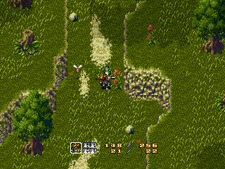
Post by: gael on September 03, 2006, 03:21:34 AM
Oh yeah and I freakin love shadow of the colossus. Everyone else in my family hates it though they say its to barren but in stoopid talk for example my brother said. I don't like that game its got big fields but no people to talk to and no towns."
INFIDELS!!!
Post by: Meiscool-2 on September 03, 2006, 04:43:03 AM
Quote
Originally posted by Thunderstrike
I'm already starting the code for the number-based HUD
man, it takes alot of patience, but so far I got the current health to show up currectly, now I'm working on the Max health part
EDIT:
finally finished!
how would you suggest spiffing this up a bit?
perhaps adding a transparent picture behind it, or something decorative to make the HUD look a bit better?
What do you suggest?
When you add things like Weapon Showing HUD- Equipted items, status (like, poisoned, ect) and other things, it'll spiff up on it's own, believe me.
Post by: aboutasoandthis on September 03, 2006, 11:57:25 AM
Tell you what. Since 3 out of 4 of my beta testers went awol, when I'm finished, do you want to beta test?
Respond by PM so this topic doesn't get cluttered.
Post by: Arcanagirl on September 04, 2006, 06:01:38 AM
Screen 1:

Screen 2:

Post by: I Have a Sandwich on September 04, 2006, 06:03:19 AM
Post by: Tomi on September 04, 2006, 11:55:39 AM
Post by: Arcanagirl on September 04, 2006, 08:04:22 PM
Post by: dragon_food on September 07, 2006, 06:07:43 PM
Edit: i noticed the missing bottom of the cliff in the middle right of the screen.
Post by: Black Massacre on September 07, 2006, 06:15:00 PM
Quote
Originally posted by dragon_food
Hi everyone, im fairly new around here. this a screenshot of my (so far) untitled game. What do you think?
Edit: i noticed the missing bottom of the cliff in the middle right of the screen.
You should make the screenshot smaller.
Post by: EXO Muffin on September 07, 2006, 06:31:44 PM
Post by: dragon_food on September 07, 2006, 06:51:47 PM
"sighs" why was I born a fool... :blush:
while im here
Post by: aboutasoandthis on September 09, 2006, 02:17:43 PM
Which background looks better?
Number 1
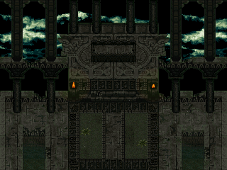
Number 2
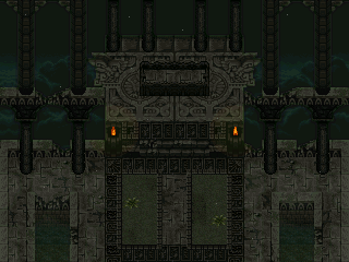
Number 2 makes more sense proportion wise, but with Number 1 I can add a better lightning flash than just flashing the background. They're a little hard to see, but there are lighting effects in there. Those white dots are moths. They look better in-game.
dragon_food: Not bad. I'm not a fan of Mac & Blue (REFMAP) so...I don't have much to comment on.
Post by: I Have a Sandwich on September 09, 2006, 05:37:31 PM
Post by: aboutasoandthis on September 09, 2006, 06:35:43 PM
Post by: Meiscool-2 on September 10, 2006, 01:31:10 AM
Night background looks good. It's to dark to notice the difference between the pillars and the background. I'm sure you want it to be night, but you should use a brighter night-time background... one with a bright moon or something.
If you do use one, use 2.
Also, MY GOD! How many freaking chipset mixs are you going to do? Your maps and chipsets look good, but how the hell to you think that having SoM, ToP, Rudra, FF6, as you say; 'recolored Mac', Theodore, SD3, Bahamut's Lagoon, and SoE, will look and fade well together? I even stop to think at times that mine don't look well together, because I mix Rudra with SD3 at times, but you've seriously got some issues there. The chipsets themselves might look fantastic, but the transistion from map to map it probally going to suck because of the huge difference in each tileset's origin.
I'm not saying this to be mean... I'm just trying to help you understand that consistancy in a game is important, especially in it's graphics.
Post by: aboutasoandthis on September 10, 2006, 02:02:04 AM
It's a storm. No rain. Just a thunderstorm.
I try to use color, grass, and water to stay consistent. The main grass and the water come from Theodore.
I try to flow from one color to the next. You begin the game looking at that chipset's color, the lightning color is important. You see that same lightning color in the next scene. Then you see the Bahamut Lagoon Graphics. Then the Bahamut Lagoon stuff is put into the next scene...
I take one little color from the last scene, and put it in the next to transition it. You'd have to see it in-game.
Actually I did use SD3. Maybe not that much in the screenshot, but it's there. One of the chipsets I'm using.
You'll have to see it in-game. :| Of course I'm trying to stay consistant. I just do it through "color" and not through what game the sprites came from.
Ever heard of "Seeker of the Sun?" That game had some nice consistancy. They used color to keep things consistant. They mixed Star Ocean, Chrono Trigger, and some FF6 just by color alone. Go to gaminggroundzero.com and try it out. I take a lot of inspiration from that game.
Just so you know, I haven't had the time to map my game out. I've been too busy coding. I only do a map for fun-ish when I have a specific cutscene I want to do. I haven't done the dungeons, the towns, blah blah blah.
I don't go in order. I just code, get bored, look through my storyline for a cutscene I can do, make the chipset, map it, make cutscene, go back to coding.
Damn, what a long post.
EDIT:
A lot of your game isn't very consistent...
Post by: Meiscool-2 on September 10, 2006, 03:57:11 AM
And no, I haven't played Seeker of the Sun, but I don't play rpg maker games much. Unless they are ABS, or some active CBS, I don't normally play them unless requested to, because they are horridly repeative, and they all try to grab you on a un-thought-out plot. DBS games don't have much to offer IMO, just because I get bored with them quick. Yours could be different, if I ever bother to try it.
For the hell of it V As you can see in the lower screen, I actually bothered to rip out the statue and railing and make them events that go above the pictures of light and hero.
Post by: I Have a Sandwich on September 10, 2006, 05:11:34 AM
Post by: aboutasoandthis on September 10, 2006, 11:27:40 AM
Let me put it this way. Give me one DBS based game with a working Mimic skill. You'll have to see my game to believe it. I revamped the battle system entirely.
Otherwise, don't play it. :p
I actually like these lights more than your other ones, even if they don't make sense.
Post by: Meiscool-2 on September 10, 2006, 02:20:10 PM
Quote
Originally posted by I Have a Sandwich
What are those marks on the top bar of Whats-Her-Names hud?
New thingie. It's the critical bar. It flashes red from time to time, and if you swing your sword while it's still red, you land a critical blow, which is 1.5 times as powerful as a normal blow. I've been working on adding more to the HUD. Like, when you cast a spell, a bar appears under the health numbers telling you how long you have untill the spell is recharged. I also want to make a sort of "Mental Health" that could also cause you do die. It would go down when you take damage, but it would go down the same rate regardless of what the damage is. It would also go down when you use a spell, read a scroll, or get a status effect like silence placed on you. I dunno if people would like that, or if it would just piss them off.
Post by: Arcanagirl on September 11, 2006, 05:02:18 PM
Quote
Originally posted by Meiscool
quote: Originally posted by I Have a Sandwich
What are those marks on the top bar of Whats-Her-Names hud?
New thingie. It's the critical bar. It flashes red from time to time, and if you swing your sword while it's still red, you land a critical blow, which is 1.5 times as powerful as a normal blow. I've been working on adding more to the HUD. Like, when you cast a spell, a bar appears under the health numbers telling you how long you have untill the spell is recharged. I also want to make a sort of "Mental Health" that could also cause you do die. It would go down when you take damage, but it would go down the same rate regardless of what the damage is. It would also go down when you use a spell, read a scroll, or get a status effect like silence placed on you. I dunno if people would like that, or if it would just **** them off.
In my opinion its a very unique idea and would seperate your game from others. I personally like the idea of a critical bar, gives you some what more control over your criticals then just by chance or a certain percentage.
Post by: Red Fox on September 15, 2006, 04:27:43 PM
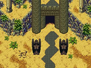
Post by: Meiscool-2 on September 15, 2006, 08:13:29 PM
Very nicly combined. You did a good job there.
Post by: Red Fox on September 16, 2006, 06:09:13 AM
By the way wich looks better the first one I posted or this with the tempel burried in the sand
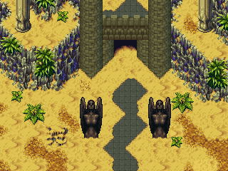
Post by: aboutasoandthis on September 16, 2006, 11:28:16 AM
Hmm...I think the problem comes from Rudra having a different depth perception then regular games. I can see what you're trying to do. Maybe, you should take the second screen's sand and move it pixel by pixel to match the bottom of the castle. It looks like a sand "cliff" around the castle.
Post by: Meiscool-2 on September 16, 2006, 03:33:56 PM
Or, just keep #1.
Post by: Red Fox on September 17, 2006, 09:24:12 AM
Edit:
Turned out like this.. It looks strange, I maybe give it another try later..
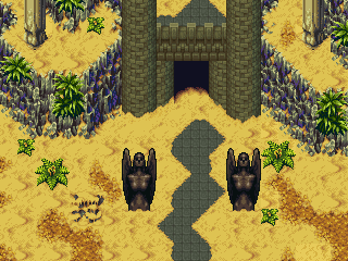
Post by: coreystranick on September 17, 2006, 12:16:26 PM
Post by: aboutasoandthis on September 17, 2006, 12:18:45 PM
Post by: Red Fox on September 17, 2006, 12:26:41 PM
Post by: gael on September 18, 2006, 01:32:57 AM
sorry just had to put that out there and I mean cmon its not like my opinion is worth fukle anyways.
Aboutsoandthis's game may not have "consistancy" or "revolutionary ideas" personally none of the ideas I have seen in this forum are any ideas that I haven't seen in another "real" game. I have yet to see a revolutionary genuine idea...
-I know this topic is irrelavent and late...sue me....kill me...cut my toes off and feed them to packs of angry puppies for all I care...
I just want to bring everyone in this forum back to reality I know you fantasy lovin folks hate this kind of thing but its not like anyone here is actually making their own graphics or programing anything ITS RPG MAKER DON"T LET YOUR HEAD GET TOO BIG NOW...blah blee blah blah blee blow me blah blee blee blah...
-Call it an epiphany<(bad spellers of the world UNTIE!)or whatever but I don't have much time before bootcamp and I relized that I have wasted months on this stupid rpg maker game...IN THE END IT AMOUNTS TO NOTHING ZERO... Go run outside get out or something... I just don't want anyone to feel like they have lost a chunk of thier life like I have... Its not worth it... waaaaaaaaaaaaaaaaaaaaaaaaaaaaaaaaaaaa
-ITS ALL BEEN A PACK AH LIES!!!!!!
-my um computer crashed... I lost everything...*cries*ev-ry-thing... I had to do a destructive recovery... My name is matt and Alcohol is now my antiRPG... I loveded you Stranger I loveded you gooooD!
Post by: drenrin2120 on September 18, 2006, 01:42:45 AM
I've said it before, I'll say it again, RPG Maker is for fun. You've got to do it for yourself, cuz in the end, RPG Maker in itself is just a game.
Post by: Meiscool-2 on September 18, 2006, 05:50:57 PM
Quote
Originally posted by gael
miescools!
Seeing that just made my day.
Post by: aboutasoandthis on September 18, 2006, 09:41:15 PM
To be honest Meis, I'm trying to stop my game from looking like yours. Remember, I get my mapping and overall graphic skills from you. I don't want my graphics to be compared to yours TOO much. Also Meis, we each have our own fanboys. I'm not sure, but have you heard of Khold? He was supposed to be my 4th Beta-Tester:
Linkforce
dren2120
gael
Khold
He's been a rather supportive guy. He's even been helping me with my storyline, battle system, and art direction. We each have our own fanboys *looks at Mako.
With that being said, I'm trying to make this screenshot.
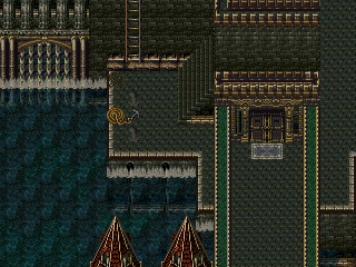
It's supposed to be part of a war-city. It's that same Archadia a few pages back. It still looks a little wierd to me. I know everything is in proportion. It needs something extra. I'm mostly looking at that back wall next to that small dock. Keep in mind, it's not finished yet. Yes, it will be an actual screenshot.
Blame the chipset as I can add pretty much anything, if I don't have to sprite it. Am I using gold too much? Should I switch it to silver?
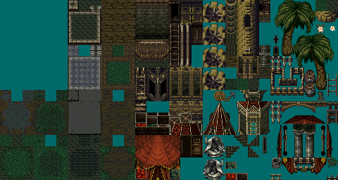
If you're wondering how this city, the realistic beach, and the tower can possibly flow, you'll have to see it in-game.
Trust me. :D
Post by: Meiscool-2 on September 19, 2006, 09:15:34 PM
Mehness V
Post by: aboutasoandthis on September 19, 2006, 09:31:49 PM
No mapping advice...yep. I'm a little surprised you like the water splashes. That stuff is pixelly.
Now for your map. I hate the map, hate the chipset, LOVE the lighting. I don't really like the white window light from the bottom left going up like that, but the rest is cool. I'd say just use some still water instead of flowing water. The water moving like it's deep seems...wierd.
Post by: Anubis_Soldier on September 20, 2006, 10:32:54 PM
Post by: Arcanagirl on September 20, 2006, 10:52:45 PM
Quote
Originally posted by Anubis_Soldier
geez, your maps make my self esteem lower dramaticaly
Yes he has that quality that just makes you feel your maps just dont cut it. Other members also have this quality, their called talented map artists.
Post by: Meiscool-2 on September 20, 2006, 11:07:59 PM
Post by: aboutasoandthis on September 20, 2006, 11:30:44 PM
Arcanagirl, that was cold...
Post by: Anubis_Soldier on September 21, 2006, 12:34:13 AM
Quote
Originally posted by aboutasoandthis
It's a hallway with lights under the piping. It's like he's doing what I used to do (getting around the mapping with "flashy special effects"). He steals ideas. _sweat_
Arcanagirl, that was cold...
lol i don't mind, i guess i can post a pic of a lab in my game, nothing fancy but what the heck
lol wrong pic, oh well
Post by: aboutasoandthis on September 21, 2006, 12:40:55 AM
I'm guessing you're just starting out. You've got most stuff in proportion. except for the big stone bridge, it makes sense. RTP is good to practice with, but it's like...pain in your eyes. . It's just boring. Replace it later.
My 2 cents. Any extra?
BTW. I pretty much threw out that chipset and map. I agree. It is boring. I'm making a much better one. I'm actually going to sprite for it. :p
Not that many cathedrals out there, other than Mac & Blue.
Post by: Anubis_Soldier on September 21, 2006, 12:43:41 AM
to have a tiny bridge span a large distance
Post by: DragonBlaze on September 21, 2006, 12:47:28 AM
Post by: Anubis_Soldier on September 21, 2006, 12:59:40 AM
Post by: DragonBlaze on September 21, 2006, 02:03:29 AM
Here we go. :)
Post by: Anubis_Soldier on September 21, 2006, 02:25:18 AM
Quote
Originally posted by DragonBlaze
I don't think I every posted a screeny here yet, so let me find one to post...
Here we go. :)
I urinated in the well, water, :blush:
Post by: aboutasoandthis on September 21, 2006, 10:40:16 AM
Post by: DragonBlaze on September 21, 2006, 01:00:06 PM
Quote
Originally posted by aboutasoandthis
I'd get rid of that light flash in the menu. It's a little hard to read. I'd get the font fixed too. Maybe...an extra way out for the receptionist. Other than that. :)
Yeah, I was thinking about getting rid of the light flash. I use it in the character menus in my cbs, but a sprite is layed over it, so it looks cool. I wanted it to match that, but I think it'll be best if I take it out.
Whats wrong with the font?
Quote
I urinated in the well, water
I KNEW IT!
Post by: Meiscool-2 on September 21, 2006, 07:10:00 PM
Quote
Originally posted by aboutasoandthis
It's a hallway with lights under the piping. It's like he's doing what I used to do (getting around the mapping with "flashy special effects"). He steals ideas. _sweat_
What have you done that I already haven't? I was the first to post maps with lighting effects. I was the first to post maps with the water effects. It doesn't matter if you had them before I posted them or not, because you didn't post them before me. This means I had no way of knowing, or taking for that matter, your ideas.
Frankly, your pissy attitude is begining to get rather annoying.
Post by: aboutasoandthis on September 21, 2006, 08:05:40 PM
Who cares? Just pretend I don't exist or something.
Post by: Meiscool-2 on September 21, 2006, 08:18:33 PM
Post by: aboutasoandthis on September 21, 2006, 10:57:52 PM
Post by: Anubis_Soldier on September 21, 2006, 11:17:44 PM
Post by: drenrin2120 on September 22, 2006, 12:00:15 AM
Quote
Originally posted by Anubis_Soldier
Hope i am not interrupting anything but here is a picture of a throne room
To be supportive and kind, with a few adjustments it'll be great!
To be blunt and obvious, it sucks and will only not suck with a lot of adjustments.
:| sorry dood
Post by: Anubis_Soldier on September 22, 2006, 12:21:41 AM
Post by: aboutasoandthis on September 22, 2006, 12:41:45 AM
A really old screenshot of mine. Sad that I'm not using it. Hope you can see through the darkness.
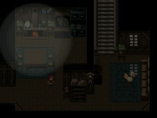
To start an indoor room, use the black box tiles for the roof. Draw the outside of your indoors.
Next, put in the walls. I usually do three tiles going up to touch the roof. Next put in the floors.
If you plan to make stairs indoors, be careful. It could look a little out of proportion. Make all the levels match.
To start, I'd check Meiscool's Dos and Don't of Mapmaking Guide. It's a wonderful guide. If you can find em, I'd check Robotam's guides too. Just remember to try keep stuff in proportion. Make sure as much as possible makes sense. Put in lots of detail. Like Meis and I were fussing over (I think), make sure nothing clashes. That shouldn't be a problem with one chipset.
There ya go.
Post by: Anubis_Soldier on September 22, 2006, 01:09:37 AM
Post by: I Have a Sandwich on September 22, 2006, 02:03:51 AM
Post by: Anubis_Soldier on September 22, 2006, 02:05:33 AM
Post by: DragonBlaze on September 22, 2006, 02:25:51 AM
Quote
DB: The problem with the font is the pixel space between letters. Sometimes it's one, sometimes it's two, and I think I even saw three in one place. That's ok if it's supposed to be between the words, but it doesn't appeal very much if it's between the letters in a word.
But err, I'm using the defult font. Its not something I can really 'fix'...
Post by: Anubis_Soldier on September 22, 2006, 02:28:46 AM
DB if you don't mind go rate my game intro/thingy
Post by: EXO Muffin on September 22, 2006, 06:41:30 AM
Post by: Meiscool-2 on September 22, 2006, 05:47:35 PM
Quote
Originally posted by DragonBlaze
quote: DB: The problem with the font is the pixel space between letters. Sometimes it's one, sometimes it's two, and I think I even saw three in one place. That's ok if it's supposed to be between the words, but it doesn't appeal very much if it's between the letters in a word.
But err, I'm using the defult font. Its not something I can really 'fix'...
Quote
Originally posted by EXO Muffin
Download a font packet patch for MS Mincho and MS Gothic. RM 2000 font is like, anti-proportional.
This is an old screen, but here's the font with one of the many fixes out there.
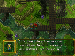
Also, one way to get the fix, would be to download my game's RTP and copy it into your game's rtp folder. Someone said they did this and got my fonts/icons.
Post by: DragonBlaze on September 22, 2006, 07:11:59 PM
I'll try that, if it doesn't work, I'll look for a font patch.
Post by: drenrin2120 on September 22, 2006, 07:28:51 PM
Post by: Meiscool-2 on September 22, 2006, 08:40:44 PM
Quote
Originally posted by DragonBlaze
Lol, are you trying to get me to download your game MIC :p
Not at all. I think you already played them anyways.
More stuffz belowz. The bottom right are vents... didn't do to well on that.
Post by: aboutasoandthis on September 23, 2006, 02:26:11 PM
Post by: Robotam Plus on September 23, 2006, 02:55:06 PM
I tried something new today with Mac and Blue's forest chipset. Do you guys think the red leafs that hangs from the tree even slightly adds more feeling to the place?
Post by: Pixelmaster on September 23, 2006, 03:07:24 PM
Post by: Robotam Plus on September 23, 2006, 03:11:01 PM
Post by: aboutasoandthis on September 23, 2006, 03:55:52 PM
This is complicated. I see what you're doing, but it doesn't look that great to me. I like the forest though.
Post by: Meiscool-2 on September 23, 2006, 04:55:47 PM
And, I like it Robbie. Though, IMO, it doesn't look like leafs. Looks more like vines to me. I think that if you made a big forest and used a program to makes some lighting effects that it would look pretty sweet.
Post by: aboutasoandthis on September 23, 2006, 08:04:01 PM
It's a cathedral. It's important that it look like one. Does it look like a church so far? *crosses fingers.
If not, what would you improve on? When I get the general hang of it, then I'll put in the detail. The rain, the shadows, that kind of stuff.
Post by: EXO Muffin on September 23, 2006, 08:35:59 PM
Palm trees and flowers made me laugh. It's just so out of place.
Post by: Meiscool-2 on September 23, 2006, 09:20:03 PM
I really like that though. It'd be nice to have that chipset, but I could understand if you want to keep it just for your game.
Lastly, I would put stained glass in the areas I circled below. It would add an excellent touch.
Post by: aboutasoandthis on September 23, 2006, 09:27:08 PM
Post by: I Have a Sandwich on September 23, 2006, 09:29:52 PM
Post by: Meiscool-2 on September 23, 2006, 10:06:41 PM
Post by: I Have a Sandwich on September 23, 2006, 10:23:15 PM

See? They usually have plain windows and not bright glass, and that's only if they cover the arches.
Post by: aboutasoandthis on September 24, 2006, 01:20:50 AM
BTW Meis, of course you can have it. Just not now.
Remember, I only really make chipsets when I can't find the stuff out there. Ever really seen a beach that isn't Mac & Blue or SD3? Everything in my game that is not an XYZ file will be in the public domain. This way, nobody else will have to waste time looking like I did.
Okay, what I'm about to say never really happened in real life. I know that. I'm using the names as a good example. It's kind of the background to my setting without any real spoilers.
Remember the ruins? Let's say that place is like mexico. There were a bunch of Natives that lived there. They built the ruins.
Let's say the spanish came and took them over. They didn't know what to do with the ruins, so they left them alone. The spanish worshipped a church, and they built buildings to worship it.
They found out the heads of the church were evil nutjobs. Everyone left. Now that the religion is gone, the government doesn't know what to do with it. They decided to leave it alone like a tourist attraction. They would help set up a government for the Seeq. They are pig people, who were poor and oppresed.
So now the place is a jungle, with forbidden ruins inside it. An ex-religion built a religious city there. Now the pigs moved in and they're living in the church city.
I want it to look like this. Click for a bigger size.
 (http://i75.photobucket.com/albums/i316/aboutasoandthis/Cathedral.png)
The church could have a slightly evil thing with it. Just not too much. Otherwise, no one would've worshipped it. I think that since I got rid of the gold, and the shiny looking FF6 stuff, it only had black and silver left. that should be why it looks so dark.
I'd have to find the stained glass to try it. The stuff tried to make myself looks like a blurry light to me.
The only other real stained glass out there is Mac & Blue or Romancing Saga.
My posts are way too long. _sweat_ And no that was not sarcasm.
Post by: Meiscool-2 on September 24, 2006, 01:41:05 AM
Post by: aboutasoandthis on September 24, 2006, 01:48:50 AM
Look at M & B.
EDIT=
You know, it actually doesn't look that bad. I'd have to change the colors but it kinda works. Watcha think Mace?
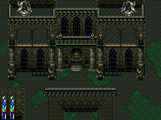
Post by: coasterkrazy on September 24, 2006, 02:41:22 AM
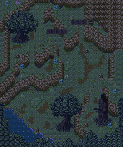
There may be a tile wrong in there somewhere, but I think I fixed whatever I had wrong. Also, I added an opening in the wall in the top-right for a cave.
Post by: Meiscool-2 on September 24, 2006, 02:45:54 AM
loltomiisaloser: Kinda linear, and I see a few places that the tiles are missing from, but other then that, it's nice. You've got some ok bridges and slopes there :)
Post by: aboutasoandthis on September 24, 2006, 02:48:27 AM
Post by: I Have a Sandwich on September 24, 2006, 02:56:49 AM
Post by: Robotam Plus on September 24, 2006, 07:36:56 AM
Post by: Tomi on September 24, 2006, 12:45:18 PM
Post by: Meiscool-2 on September 24, 2006, 05:13:43 PM
Post by: drenrin2120 on September 24, 2006, 05:15:16 PM
Quote
Originally posted by Meiscool
Mac and Blue + Chrono Trigger + BoF never looked so good my man.
True dat. Awesome combo.
Post by: aboutasoandthis on September 24, 2006, 08:04:35 PM
BTW, nice Robotam. Do you still have any Legend of Lea demos out? I've never got to play one.
Ignore the moogle and the floating statue.
Post by: I Have a Sandwich on September 24, 2006, 08:16:32 PM
Gargoyle (http://upload.wikimedia.org/wikipedia/en/b/b2/Gargoyle.600px.jpg)
Like so, but those look good.
Post by: aboutasoandthis on September 24, 2006, 08:19:31 PM
Post by: coasterkrazy on September 24, 2006, 08:42:16 PM
Quote
Originally posted by Robotam Plus
The classic.
Wow, that's cool. Except I noticed around the edges of the treetops the darkness area is inconsistent in color, like it's completely black at the far ends of the screen but close to the edges of the tops it's like a greenish black. Other than that, it's really neat. It's amazing how simple a map can be to look so cool.
Post by: Meiscool-2 on September 25, 2006, 01:42:55 AM
This part of the intro shows how powerful Gallen, one of the main characters, actually is. It's got a lot of neat effects, starting with a time-screen slowing (I used Fade-Screen in a lot of places to make it seem like the game is lagging, therefor giving the cutseen a slow-mo effect), a bunch of jumping around with slashes, and lastly, he throws his sword like a boomerang at the enemies. It's all inspired by a cutseen from Velsarbor, which is a major point of inspiration to my game making.
Post by: Robotam Plus on September 25, 2006, 07:24:49 AM
Quote
BTW, nice Robotam. Do you still have any Legend of Lea demos out? I've never got to play one.
Oh, thank god no. That screenshot is a new one from the re-maked version I never got around to finish. If I manage to finish that demo, I'll make sure you know.
And that scene of yours looks extremely cool, MIC. But I'd rather see it as a mediaplayer clip than in screens.
Post by: Pixelmaster on September 25, 2006, 08:54:49 AM
Post by: Meiscool-2 on September 25, 2006, 06:08:13 PM
http://www.filefactory.com/file/d8b666/
Maybe when I'm not so lazy, I'll put up a smaller file, but I doubt it.
Post by: Ace of Spades on September 25, 2006, 07:04:58 PM
Post by: drenrin2120 on September 25, 2006, 07:17:50 PM
Post by: Meiscool-2 on September 25, 2006, 07:23:59 PM
Post by: Black Massacre on September 25, 2006, 07:24:42 PM
Quote
Originally posted by Meiscool
Alrighty... I uploaded it. The file size is huge, and I really don't care. If you've got fast interent, yay for you, you can download it and watch it. If you have dial up, you're screwed.
http://www.filefactory.com/file/d8b666/
Maybe when I'm not so lazy, I'll put up a smaller file, but I doubt it.
Your gonna get your ass chewed off by EXO.
Post by: drenrin2120 on September 25, 2006, 07:25:18 PM
Post by: Meiscool-2 on September 25, 2006, 07:27:09 PM
Hence supporting my "Meiscool is always right" theory.
Post by: Black Massacre on September 25, 2006, 07:31:49 PM
Post by: Ace of Spades on September 25, 2006, 07:32:20 PM
- times better than pretty much all amateur games.
Post by: Meiscool-2 on September 25, 2006, 07:39:56 PM
EDIT: OMFG!!! YOU CALLED ME AMATURE! I KILL!!!! :p
Post by: Black Massacre on September 25, 2006, 07:43:29 PM
Post by: Meiscool-2 on September 25, 2006, 08:57:04 PM
B: What the hell did you expect from the screens?
Post by: I Have a Sandwich on September 25, 2006, 09:22:18 PM
Seriously though, I'm dl'ing it.
Post by: Black Massacre on September 25, 2006, 09:27:12 PM
Quote
Originally posted by Meiscool
B: What the hell did you expect from the screens?
To be good...
Post by: Pixelmaster on September 25, 2006, 10:03:26 PM
Post by: I Have a Sandwich on September 25, 2006, 10:19:04 PM
Quote
Originally posted by Black Massacre
quote: Originally posted by Meiscool
B: What the hell did you expect from the screens?
To be good...
I'm curious to see you make somethin like that that's 'good'.
As for the video, tat was pretty cool. My only problem was when he threw it it looked like it became a giant star.
Post by: aboutasoandthis on September 29, 2006, 09:57:07 PM
If you want the fire, it's not that I don't want to give away, I just set it up in a wierd way because I use chipsets instead of charasets. I'd be glad to give them away if I could.
It still has all 8 fluid frames ripped from FF6. I love you Animget.
By the way, I'm having trouble making the first town not boring. Since I loved the colors so much, it's gonna end up looking like an old design of mine.
Not this map but similar. Palm trees and everything. :p
It does have some nice rare chipsets from Bahamut Lagoon to make up for it.
Post by: Meiscool-2 on September 30, 2006, 02:53:07 AM
For anyone that liked my one intro thingie... here's a way better one, better lighting, actual plot, text, war, and small file size. It's one minute in length, and the midi-studder in the middle is because fraps wouldn't let me make a vid more then 30 seconds long. Also, sometimes the vid might get distorted, but I'm sure you know that's because of the compression and not the actual game.
http://www.filefactory.com/file/0361e4/
Post by: aboutasoandthis on September 30, 2006, 10:12:27 AM
The phonograph is from Bahamut Lagoon. They do look alike. :p
BTW, I played Velsarbor. It owns.
I feel like a noob because of it.
EDIT
I did a lot of work, and this version of the town was the best looking to me. Whatcha think?
In case you're wondering, yes he is standing on the roof. If you can get up there, you can walk on the roof. If you're wondering what those railroad things are for, you'll see. They're important.
Post by: Pixelmaster on September 30, 2006, 08:45:20 PM
Post by: I Have a Sandwich on September 30, 2006, 09:19:06 PM
Post by: Pixelmaster on September 30, 2006, 10:24:08 PM
Post by: aboutasoandthis on September 30, 2006, 10:38:40 PM
It looks okay, but it looks a little too plain. For a battle system like that, you should overload the screen with HUD's and stuff. Also, the red over the red bar is a little hard to read.
To make it look a little better, I'd try this. First, get these two programs Ultimate Paint, and Graphics Gale. They're both free downloads. Ultimate Paint is DAMN useful if you don't have photoshop. Graphics Gale can Antialias fonts and wording well. These two will be your best friends when making mini-menues if you don't have a professional program.
Next, since there isn't much going on in the background, I'd put the enemy's information in the upper-left and your info on the upper-right.
For a screen like that, what will impress people the most is how you display the info. That's because so far, you've just got a fancy background and some fire emblem sprites. Anyone and their mother can do that. If you can make a cool display beside that, people will be impressed.
3 posts and no town comments...Is it bad or something? I didn't put in the people or the SFX yet. Give me closure god damnit! :p
Post by: Emerates on September 30, 2006, 10:51:17 PM
Post by: aboutasoandthis on October 01, 2006, 12:06:00 AM
Post by: Meiscool-2 on October 01, 2006, 01:03:42 AM
Sorry dude, but looking at it confused the hell outta me about what goes where and ect.
Post by: aboutasoandthis on October 01, 2006, 01:13:12 AM
It's not supposed to be just a town. It's supposed to have it's own plot. I Think that's what messes people up.
Unless...You could make a test map for me. I'll PM you about it.
Post by: Pixelmaster on October 01, 2006, 01:45:41 PM
Post by: aboutasoandthis on October 01, 2006, 02:33:17 PM
I'm tryin a less is more approach. Now, the houses are two far apart. It looks like a plain old town and not the overpopulated slums I want. I'll find a way to get from roof to roof...somehow.
Post by: I Have a Sandwich on October 01, 2006, 03:28:55 PM
Post by: Pixelmaster on October 01, 2006, 03:46:12 PM
Post by: aboutasoandthis on October 01, 2006, 03:50:40 PM
Okay, so slums. Maybe the Chrono Trigger trash in the street? I think I'll put in some of the FF6 broken house stuff too. I need to stop using so many different games. The best looking RM games only use like...3.
Pixel, thanks. That clears up a lot. Make sure you post that when you're making your battle system.
Post by: I Have a Sandwich on October 01, 2006, 03:56:46 PM
Post by: aboutasoandthis on October 01, 2006, 04:01:35 PM
I forgot to say thanks Sammich.
Post by: I Have a Sandwich on October 01, 2006, 04:24:07 PM
Post by: aboutasoandthis on October 01, 2006, 05:06:05 PM
It ain't much, but it's something. I think I'll stick with this way.
Post by: I Have a Sandwich on October 01, 2006, 05:51:00 PM
Post by: aboutasoandthis on October 01, 2006, 06:31:04 PM
Post by: crossfire on October 01, 2006, 11:01:31 PM

Post by: Pixelmaster on October 02, 2006, 10:26:46 AM
Post by: crossfire on October 02, 2006, 09:50:29 PM
Post by: Meiscool-2 on October 02, 2006, 09:55:15 PM
Post by: crossfire on October 02, 2006, 10:23:48 PM

Post by: aboutasoandthis on October 02, 2006, 10:55:53 PM
I'd fix the stairs. They look wierd. Have them go into the black, ceilings.
I know this wasn't in the original game, but you can fix the shadows around the wood to match the fire. Just right-click on the wood, and while holding shift, draw over the shadows on the left and right of the checker board. Have the shadows face only one direction.
Post by: crossfire on October 02, 2006, 11:22:32 PM

Post by: Meiscool-2 on October 02, 2006, 11:41:20 PM
Post by: Domo_46_Kun on October 02, 2006, 11:43:12 PM
Post by: crossfire on October 02, 2006, 11:57:49 PM

Post by: Pixelmaster on October 03, 2006, 10:38:55 AM
Post by: Moosetroop11 on October 03, 2006, 05:34:31 PM
Post by: Zerlina on October 03, 2006, 08:49:22 PM
Here are three new screenshots.
In the first one Nichi (in red) is playing a song on his flute that Belial (blue haired guy) recognizes. For Belial it's extremely important, because he has lost much of his memory.
The second one is a dream sequence, where a strange lady in pink robes constantly brings Titania (in blue) before a strange pool in a fragmented temple.
The third is when Nichi comes to the house of a very poor family in the countryside.
Post by: Black Massacre on October 03, 2006, 08:52:11 PM
Quote
Originally posted by Zerlina
I really like your interior one, crossfire. It's simple but very nice.
I like the first one the best.
Post by: Meiscool-2 on October 03, 2006, 09:03:51 PM
Been working on my intro... and I got a gay little tutorial that you can choose to view. I'm leaning more towards to top, but which one do you like more?
Probally most my tutorials that don't have to deal with dungeon puzzles or something will be like this.
Post by: Zerlina on October 03, 2006, 09:40:10 PM
Post by: Meiscool-2 on October 03, 2006, 09:42:55 PM
Post by: crossfire on October 03, 2006, 10:10:21 PM
Post by: aboutasoandthis on October 04, 2006, 12:54:06 AM
Post by: I Have a Sandwich on October 04, 2006, 03:26:30 AM
Post by: Meiscool-2 on October 04, 2006, 06:25:49 PM
Post by: I Have a Sandwich on October 04, 2006, 06:30:42 PM
Post by: Meiscool-2 on October 04, 2006, 06:32:36 PM
Post by: I Have a Sandwich on October 04, 2006, 06:43:06 PM
Post by: plightofthepureblood on October 04, 2006, 06:43:17 PM
Give it some texture, you know, to keep the eyes busy.
*******************
Anyways, this screen is a test. its not to be used in a game or anything. The Map will be.
But it was kindof just a test to see how the chipset I designed would play out on screen.
The grass looks rather plain, but Im still trying to make overlays...I dont want to decide how detailed the grass will be until I know how the Pictures to be added will affect the look.
But Input would be nice.
(I found my old chipsets looked a bit too rtp-ish so Im trying new stuff)
Post by: drenrin2120 on October 04, 2006, 07:21:42 PM
Post by: Meiscool-2 on October 04, 2006, 08:30:31 PM
Post by: aboutasoandthis on October 04, 2006, 08:37:18 PM
I liked the log cabin for some reason Sammich.
Post by: plightofthepureblood on October 04, 2006, 08:40:19 PM
Post by: Pixelmaster on October 04, 2006, 08:43:09 PM
Post by: Meiscool-2 on October 04, 2006, 08:51:21 PM
Also, so prevent overuseage of graphics, I really don't wish to share the site.
Post by: I Have a Sandwich on October 04, 2006, 09:24:31 PM
Quote
Originally posted by Meiscool
Also, so prevent overuseage of graphics, I really don't wish to share the site.
So, to prevent him from using sprites you didn't make and got from a public resource site, you're not going to tell him?
Post by: Pixelmaster on October 04, 2006, 09:41:13 PM
Post by: aboutasoandthis on October 04, 2006, 10:32:44 PM
After working on it, I've decided to redesign the custom menu. It will not look like this.
Tough luck to those who liked them. :p
I'm gonna try to make them look more Old-Style Maplike. I want it to look more uniform.
All I really wanna know is if I can use the smaller sprites instead of the big-goofy ones. I'll have to do something about the two black icons, but would these be easy to recognize?
Keep in mind, if you view at full screen, it's very easy to see.
Post by: I Have a Sandwich on October 04, 2006, 10:34:33 PM
Post by: aboutasoandthis on October 04, 2006, 10:38:09 PM
I forgot to mention that...
Post by: Meiscool-2 on October 04, 2006, 10:46:12 PM
Quote
Originally posted by I Have a Sandwich
quote: Originally posted by Meiscool
Also, so prevent overuseage of graphics, I really don't wish to share the site.
So, to prevent him from using sprites you didn't make and got from a public resource site, you're not going to tell him?
I see nothing wrong with that.
Plus, the FF fan-game or whatever failed horribly. It's not even worthy of mention.
Use the smaller ones. I would suggest you make a new one for the sword/X. In small form, I can't tell what it is.
Post by: I Have a Sandwich on October 04, 2006, 10:57:50 PM
Post by: aboutasoandthis on October 04, 2006, 11:19:40 PM
Little Icons from Left to Right.
Silence
Frozen
Poison
Venom
Burn
Petrified
Blind
Paralyzed
Zombie
Arrested
Or do you wanna see if they match their respective status enough?
Post by: Pixelmaster on October 04, 2006, 11:42:12 PM
Post by: Zerlina on October 05, 2006, 01:11:52 AM
Quote
Originally posted by Pixelmaster
Can you please PM me the url or something, cuz it would work perfectly with my game. I wouldnt tell anyone where to get it, you are my favourite guy, I found out about this forum cuz of your game (Searched for Metal Gear, but spelled Metal Tear)
Subtle.
Post by: Pixelmaster on October 06, 2006, 12:06:00 AM
Post by: crossfire on October 06, 2006, 05:29:48 AM
Post by: Pixelmaster on October 06, 2006, 08:49:38 AM
Post by: Ace of Spades on October 06, 2006, 05:58:15 PM
Post by: Pixelmaster on October 06, 2006, 07:07:42 PM
Post by: Ace of Spades on October 06, 2006, 08:01:57 PM
Quote
Originally posted by Pixelmaster
Oh sorry, members have respective topics? Or do the make them?
I meant their game threads.
Post by: Pixelmaster on October 06, 2006, 09:31:12 PM
Post by: Zerlina on October 06, 2006, 10:09:42 PM
This imitating thing is really messing with my mind.
Post by: Pixelmaster on October 06, 2006, 10:33:26 PM
Post by: aboutasoandthis on October 06, 2006, 10:53:35 PM
So it's not comepletely off topic, how do the cliffs look in this? Do they match enough? I tried to limit everything to Bahamut Lagoon, FF5, and FF6. I admit, the vine and the little wierd flowers were from different places.
Would anyone mind if I used some FF1&2 Dawn of Souls? Those graphics are incredible, yet nobody uses them.
Post by: Zerlina on October 06, 2006, 11:56:05 PM
Here's a screenshot. Before you go "zomg ur lighting efx r soooo overdone" let me explain.
This scene is supposed to be overly dark (except near the torches). It's because at this moment, Malice is stepping out of the familiar and relative innocence and moving into what Nichi calls "The world of shadows" (ie: the real, violent, heartless, unsure world). The fog and darkness are supposed to constrast with the light of the torches. It's to make the point that the city (or the familiar, and living in ignorance) is often much more inviting than reality. It also makes Malice and Nichi's choice to leave seem much more hard.
Plus, when it's actually in the game (ie bigger) you can see what's going on better.
Post by: aboutasoandthis on October 07, 2006, 12:00:49 AM
How exactly is that a screenshot? Or did you take two pics and put them together?
Post by: Pixelmaster on October 07, 2006, 11:20:40 AM
Post by: I Have a Sandwich on October 07, 2006, 04:03:19 PM
Quote
Originally posted by Pixelmaster
Its sorta like fanart.
He wasn't talking to you. At all.
Post by: Pixelmaster on October 07, 2006, 04:27:54 PM
Post by: I Have a Sandwich on October 07, 2006, 04:35:57 PM
Post by: aboutasoandthis on October 07, 2006, 08:33:23 PM
It looks...off. How would you fix it? Should I just get a new font? If so, do you know where I can get some RPM Maker fonts? The only ones I know about are the Shear Destiny ones at Gaming Ground Zero.
And BTW, I've been lazy. Every page of my CMS will look somewhat like my Main Page. It will have that same background each page and stay the same style. :P
I wanna get it finished. So far, It's done enough so my game is at least playable.
Post by: Zerlina on October 07, 2006, 08:44:28 PM
Quote
Originally posted by I Have a Sandwich
Zerlinas is too tall to be a single screenshot. Pay attention and maybe you'll learn something.
Yeah I took one shot where he was talking, and one shot where he wasn't. Then I just put the dialogue below it so you can see what's going on while still knowing the dialogue.
Quote
Originally posted by aboutasoandthis
I know it sucks. I need advice on the textbox.
It looks...off. How would you fix it? Should I just get a new font? If so, do you know where I can get some RPM Maker fonts? The only ones I know about are the Shear Destiny ones at Gaming Ground Zero.
And BTW, I've been lazy. Every page of my CMS will look somewhat like my Main Page. It will have that same background each page and stay the same style. :P
I wanna get it finished. So far, It's done enough so my game is at least playable.
That map is too empty, and you can see where the square of your border ends as it's gray not black.
Post by: MrMister on October 07, 2006, 08:47:02 PM
Post by: I Have a Sandwich on October 07, 2006, 08:47:58 PM
Quote
Originally posted by MrMister
abootasoanddis, I think the textbox looks cool. Also, which chipset is that? It's quite sex.
Agree'd, but I think that the top and left sides of the large box are too bright.
Post by: aboutasoandthis on October 07, 2006, 08:56:49 PM
If you're wondering where that house came from, it's Final Fantasy 2 (The old one with Frion) for GBA. You can get those graphics at vgmaps.com/atlas.
Post by: Meiscool-2 on October 07, 2006, 09:42:31 PM
I know the well and the fountain in the center don't work well, and will be changed to blend in better, but I'm posting what I got now.
Post by: Pixelmaster on October 07, 2006, 10:09:08 PM
EDIT: oh ya and sorry for being stupid about the dotzoot stuff.
Post by: aboutasoandthis on October 07, 2006, 10:52:40 PM
Plus, the way the white stone on the ground comes out, it just messes with my head a bit.
I like the fountain, even though it kind of goes with the inward thing I was talking about.
Post by: Pixelmaster on October 07, 2006, 11:55:19 PM
Post by: I Have a Sandwich on October 08, 2006, 01:15:10 AM
Post by: drenrin2120 on October 08, 2006, 01:23:46 AM
Undeniably around a 98% A+
Post by: aboutasoandthis on October 08, 2006, 01:41:31 AM
Any eye problems with the following? Is the outer edge of it annoying? Is it too hard to understand? Is the small font too hard to read?
Those are the last thing I want. If this works, almost every menu other than the big main one will look like this with a blue box in the middle, a slot telling you which menu you're using, with the info in the middle. I'm even using more than one page for different stuff so it's not overcrowded.
This one hurt my eyes the least. If things are too dark, the white letters kind of hurt.
BTW, it's not important, but in case you're wondering how this menu works, it just says what elements are a part of you. If it's lit up, you get it.
If "Attack" is lit up, your "Main" attack has that element. Only this kind of attack can have more than one. Link Attacks only get one.
If "Defense" is lit up, that kind of attack's damage is halved to you.
The third says "Null" and that means that element will do no damage to you. If you're wondering why I've got Defense with this, it's because some stuff is triggered by attacks of a specific element. With this, you can't use those triggers. If you've played Vagrant Story, it's kind of like the Defense Links and stuff.
I admit the last is hard to read. It's supposed to be "Absorb." You guessed it, you absorb the element. You can attack your own characters so this might give you some extra strategy.
This came out to be a long post...Consider it a sneak preview of the battle system.
Post by: I Have a Sandwich on October 08, 2006, 01:53:06 AM
Absorbs can sometimes suck. I remember I was playin FF9, Vivi could absorb fire, and I was fighting 2 fire monsters way stronger than my party. All three except Vivi died, Vivi was doing literally no damage with attacks, he was out of MP and MP restore items, and these monsters only had fire attacks XD
Post by: aboutasoandthis on October 08, 2006, 02:29:45 AM
dren is right. The fact that you or someone else Meis managed to recolor that kind of chipset is excellent. I should know. It'll probably look better ingame anyway.
Post by: Meiscool-2 on October 08, 2006, 03:19:06 AM
Also, the white stone that you don't like was made completely by me :P
Post by: Arcanagirl on October 08, 2006, 06:17:07 PM
I have seen worse maps and chipsets, so this work is excellent. :corn:
Post by: aboutasoandthis on October 08, 2006, 06:29:11 PM
That place under the equipment will have a sub menu to the other menus. That element menu was one.
Post by: Ace of Spades on October 08, 2006, 06:43:34 PM
Post by: MrMister on October 08, 2006, 07:48:02 PM
Quote
Originally posted by aboutasoandthis
Sort of a mockup even though most of it's coded. I just have to put in the call events and stuff.
That place under the equipment will have a sub menu to the other menus. That element menu was one.
TOO
MANY
STATS
Magic and intelligence, why? por que?
Post by: aboutasoandthis on October 08, 2006, 07:58:05 PM
You can't cheat this way. Intelligence is like "Magic Defense."
Look at the real FFs. They have at least 7 each, not counting Health.
Post by: MrMister on October 08, 2006, 09:09:11 PM
Post by: drenrin2120 on October 08, 2006, 09:15:35 PM
Quote
Originally posted by MrMister
quote: Originally posted by aboutasoandthis
Sort of a mockup even though most of it's coded. I just have to put in the call events and stuff.
That place under the equipment will have a sub menu to the other menus. That element menu was one.
TOO
MANY
STATS
Magic and intelligence, why? por que?
This is probably a preference thing, but I like the loads of stats, there's just the right amount. Gives more of a definitive difference between characters.
Post by: MrMister on October 08, 2006, 11:11:28 PM
Post by: drenrin2120 on October 09, 2006, 12:22:50 AM
Quote
Originally posted by MrMister
If they do the same thing, some just become useless and annoying, and you never know what you're supposed to actually up. They don't make **** difference. All you need is like, attack, defense, constitution, intelligence, and luck.
Like I said, it's a preference thing.
Post by: Meiscool-2 on October 09, 2006, 12:28:59 AM
Def
Speed
Those are all you need. Just ask FireEmblem :p
Post by: I Have a Sandwich on October 09, 2006, 12:32:56 AM
Quote
Originally posted by Meiscool
Attack
Def
Speed
Those are all you need. Just ask FireEmblem :p
You have absolutly no idea how the fire emblem battle system works do you?
Post by: MrMister on October 09, 2006, 01:34:23 AM
Post by: aboutasoandthis on October 09, 2006, 02:06:33 AM
If you wanna try to bum rush people:
Build up your strength.
Don't use link attacks.
If you want a tank:
Build up your HP
Build up Defense
If you want a mage:
Build up Magic.
Build up Intelligence.
Let me warn you now. Using one throughout the game won't work. lol >:
It's an FF Fangame. It copies Final Fantasy. Why else would it take so long?
Post by: Meiscool-2 on October 09, 2006, 10:55:14 PM
Quote
Originally posted by I Have a Sandwich
quote: Originally posted by Meiscool
Attack
Def
Speed
Those are all you need. Just ask FireEmblem :p
You have absolutly no idea how the fire emblem battle system works do you?
Dude, an army of swordmasters, assassins, and other characters with high evade (lords like Lyn and Erika) is litterally unstoppable.
Post by: I Have a Sandwich on October 09, 2006, 11:07:28 PM
Quote
Originally posted by Meiscool
quote: Originally posted by I Have a Sandwich
quote: Originally posted by Meiscool
Attack
Def
Speed
Those are all you need. Just ask FireEmblem :p
You have absolutly no idea how the fire emblem battle system works do you?
Dude, an army of swordmasters, assassins, and other characters with high evade (lords like Lyn and Erika) is litterally unstoppable.
So, thats not just what the system depends on. Magic and Int are needed as well.
Besides, Swodmasters, assassins and lords are for pussies. Use archers and fighters like a real man.
Post by: Meiscool-2 on October 09, 2006, 11:20:19 PM
Aside from that, Magic is the same as Attack in FE.
Post by: I Have a Sandwich on October 09, 2006, 11:37:51 PM
Quote
Originally posted by Meiscool
Axes suck.
Aside from that, Magic is the same as Attack in FE.
Too many other games between, forget FEs terminology. You need Str, Skill, Spd, Lck, Def, and Res to make the system.
As for axes, tell that to my 20/20 Dorcas/Bartre combo. They'll wipe the f***in floor with anyone. I literally took on the entire final chapter with them aided only by a valkyrie. I pwnd them all.
Post by: aboutasoandthis on October 10, 2006, 01:00:20 AM
BTW, I kinda screwed up about the Intelligence thing. I got two sets of coding mixed up, so I copy/pastes Evasion next to magic. That's true Magic Evasion.
This might be my last screen for a while before the demo comes out. I'm making some special hidden screens and scenarios that you won't see yet. Expect it soon...hopefully.
Post by: Meiscool-2 on October 10, 2006, 02:19:16 AM
Quote
Originally posted by I Have a Sandwich
quote: Originally posted by Meiscool
Axes suck.
Aside from that, Magic is the same as Attack in FE.
As for axes, tell that to my 20/20 Dorcas/Bartre combo. They'll wipe the f***in floor with anyone. I literally took on the entire final chapter with them aided only by a valkyrie. I pwnd them all.
Any swordsmaster could beat a warrior. Warriors have horrid defence and accuracy(add in the swordmaster's evade as well), as well as evade. The only way they would win is luck.
Post by: crossfire on October 10, 2006, 02:19:42 AM
Post by: I Have a Sandwich on October 10, 2006, 02:26:48 AM
Quote
Originally posted by Meiscool
quote: Originally posted by I Have a Sandwich
quote: Originally posted by Meiscool
Axes suck.
Aside from that, Magic is the same as Attack in FE.
As for axes, tell that to my 20/20 Dorcas/Bartre combo. They'll wipe the f***in floor with anyone. I literally took on the entire final chapter with them aided only by a valkyrie. I pwnd them all.
Any swordsmaster could beat a warrior. Warriors have horrid defence and accuracy(add in the swordmaster's evade as well), as well as evade. The only way they would win is luck.
Thats what they thought until I literally maked out Dorcas' def and came damn near close with Bartre. Dorcas could hit anything by the end. You must've just gone with the easy way, leveling up characters that are naturally asy to level, swordmasters and lords.
Post by: Meiscool-2 on October 10, 2006, 02:28:52 AM
Post by: I Have a Sandwich on October 10, 2006, 08:26:34 PM
Quote
Originally posted by Meiscool
Thiefs are easy to level?
Funny, no where do I see theif in my last post. I see swordmasters, and I see lords, but I don't see theif. Maybe you're just going crazy.
Post by: MrMister on October 10, 2006, 10:36:22 PM
Quote
Originally posted by I Have a Sandwich
quote: Originally posted by Meiscool
Thiefs are easy to level?
Funny, no where do I see theif in my last post. I see swordmasters, and I see lords, but I don't see theif. Maybe you're just going crazy.
SCREENSHOTS NOW.
Post by: I Have a Sandwich on October 10, 2006, 10:43:47 PM
Quote
Originally posted by MrMister
quote: Originally posted by I Have a Sandwich
quote: Originally posted by Meiscool
Thiefs are easy to level?
Funny, no where do I see theif in my last post. I see swordmasters, and I see lords, but I don't see theif. Maybe you're just going crazy.
SCREENSHOTS NOW.
Look at the post and refresh. I managed to turn the whole post into a giant image of itself! Freakin crazy I know, but its real man. REAL.
Post by: plightofthepureblood on October 10, 2006, 10:46:56 PM
Post by: crossfire on October 10, 2006, 11:12:50 PM
Post by: Pixelmaster on October 10, 2006, 11:43:50 PM
Post by: Black Massacre on October 10, 2006, 11:51:36 PM
Post by: Meiscool-2 on October 11, 2006, 12:29:33 AM
Gonna try a card game.
Not completly custom... just edits... blah blah.
Post by: I Have a Sandwich on October 11, 2006, 12:35:26 AM
Quote
Originally posted by Meiscool
Mini-game...
Gonna try a card game.
Not completly custom... just edits... blah blah.
Card game you say? Sweet, another set of small easy **** to preoccupy my time.
Post by: crossfire on October 11, 2006, 12:50:45 AM
Quote
Originally posted by Meiscool
Mini-game...
Gonna try a card game.
Not completly custom... just edits... blah blah.
Cool. That one looks like Ariel from the Little Mermaid...no offense, just saying.
Post by: aboutasoandthis on October 11, 2006, 01:22:30 AM
Nice Rudra Edit.
Post by: Black Massacre on October 11, 2006, 01:24:31 AM
Quote
Originally posted by Meiscool
Mini-game...
Gonna try a card game.
Not completly custom... just edits... blah blah.
For Metal Tears?
Post by: I Have a Sandwich on October 11, 2006, 01:49:55 AM
Post by: Meiscool-2 on October 11, 2006, 02:09:14 AM
Quote
Originally posted by I Have a Sandwich
quote: Originally posted by Meiscool
Mini-game...
Gonna try a card game.
Not completly custom... just edits... blah blah.
Card game you say? Sweet, another set of small easy **** to preoccupy my time.
I honestly can't tell what this is supposed to mean :eyes:
Post by: Meiscool-2 on October 11, 2006, 02:57:51 AM
I'm not the most confindent spriter... you guys like these two?
Gallen has the larger sword, Rengard is in armor.
Post by: I Have a Sandwich on October 11, 2006, 03:02:53 AM
Quote
Originally posted by Meiscool
quote: Originally posted by I Have a Sandwich
quote: Originally posted by Meiscool
Mini-game...
Gonna try a card game.
Not completly custom... just edits... blah blah.
Card game you say? Sweet, another set of small easy **** to preoccupy my time.
I honestly can't tell what this is supposed to mean :eyes:
Well, alternate HUDs for example. You tend to be the only person to ever ask me for mindless little ****. Its fun to make.
Post by: plightofthepureblood on October 11, 2006, 03:10:10 AM
Quote
Originally posted by I Have a Sandwich
quote: Originally posted by Meiscool
quote: Originally posted by I Have a Sandwich
quote: Originally posted by Meiscool
Mini-game...
Gonna try a card game.
Not completly custom... just edits... blah blah.
Card game you say? Sweet, another set of small easy **** to preoccupy my time.
I honestly can't tell what this is supposed to mean :eyes:
Well, alternate HUDs for example. You tend to be the only person to ever ask me for mindless little ****. Its fun to make.
Sometimes I wish I had mindless diversions like that....
Cards.....Skill Icons....Something of that nature.
I try to make things like that for myself to do, to distract myself...whilst still working on the current project....but then I over think how im going to implement it into gameplay....
If anybody ever wants to Code a card minigame or something to that effect, Id be glad to help.Nay, It would be a help, as I would steal the mini game. Thhen somebody else has done the part I lose intrest in. Im not content with doing charsets as a distraction anymore......they bug me.......Theyre too small, and they make my eyes squinty.....At least with cards, I can make a big image and reduce it.....
HOLY LOOKAT ME RAMBLE!
Heres My screen.
Another of the same town I posted earlier
Post by: crossfire on October 11, 2006, 04:03:08 AM
Quote
Originally posted by Meiscool
DOUBLE POST OMFG STFU N00b.
I'm not the most confindent spriter... you guys like these two?
Gallen has the larger sword, Rengard is in armor.
I like them.
Post by: MrMister on October 11, 2006, 04:05:14 AM
Quote
Originally posted by Meiscool
DOUBLE POST OMFG STFU N00b.
I'm not the most confindent spriter... you guys like these two?
Gallen has the larger sword, Rengard is in armor.
Striking resemblance to Bahamut Lagoon.
hm
Post by: Meiscool-2 on October 11, 2006, 07:15:50 PM
Post by: aboutasoandthis on October 11, 2006, 07:58:16 PM
What will your game be like? Is is position flipping like Tetra Master and Triple Triad, or is it like Yu-Gi-Oh or something?
If your game involves numbers at all, My only suggestion would be to make them bigger so the numbers are easy to see.
Post by: Meiscool-2 on October 11, 2006, 08:28:11 PM
It involves Card Status. Each Card will have 4 points of status. They are:
Element: Either Fire, Water, Wind, or Earth.
Faith: Science, None, or Religion.
Weapon: Axe, Lance, or Sword (subject to change because of FE ripp-off)
Stratagem: Offencive, Defencive, Tactical, or Balanced.
If you place a card next to another card (Left, Right, Up, or Down), a battle will start. If you're attacking a card above you, and your Weapon Type is facing up, then the battle will be based on the defending Card's Weapon Type. If they're weapon type is a type that's even or beatable by yours, you get the card. If not, then you don't get the card, and the turn ends.
This way, there are several combinations to cards and you can battle in several ways. I think this makes your card battling placement more important then the FF games, but card status won't matter as much. Hence, I'll probally be really lazy and only code Five cards for your hero to have at a time.
Tactical Victorys: Each Status has a weakness and a strenght. They generally have one thing they can beat, and one thing they lose to. Those are:
Elements: Fire loses to Water. Water loses to Wind. Wind loses to Earth. Earth loses to Fire. If Water and Earth battle, nothing happens. If Wind and Fire battle, nothing happens.
Faith: If your character is unlucky enough to have the None status, then you're screwed for Faith. None cannot win any battles. Religion beats None, and Science beats Religion. Science is the best status you can have for this, but it's very uncommon.
Weapon type: Axes beat Spears. Spears beat Swords. Swords beat Axes.
Stratagem: Offencive beats Defencive. Defencive beats Tactical. Tactical beats Offencive. Balanced cannot lose or win, so it's a comfort zone basically.
The game ends when all boxes are filled. Rewards are based on how badly you beat the enemy. Again, because I'm lazy, you WON'T be able to select a card to remove from your enemy's hand and place into your own should you win. If you lose, typically you'll fork over EXP or Money. If you win, depending on how gracefully you win, you could get player EXP, Money, Status Jewels (status jewels are like Lvling up. You spend EXP to use the Jewel), Potions, Scrolls, or even Spells.
For the most part, coding the enemy AI will be the hardest thing to do. Everything else is already blueprinted in my mind.
Post by: aboutasoandthis on October 11, 2006, 09:46:14 PM
Edit.
Since Meis kind of talked about his card game, I decided to post something on mine.
My cards look like crap. Even if this is just a mockup, it's too full. I'm still not done with the info yet. :(
If you can figure out what game I ripped this off from, kudos.

Post by: Meiscool-2 on October 12, 2006, 10:49:12 PM
Post by: I Have a Sandwich on October 12, 2006, 10:59:32 PM
Post by: aboutasoandthis on October 13, 2006, 12:29:42 AM
+Some kind of icon next to the Blue X
+Another Icon for "Support Effects"
Post by: Meiscool-2 on October 13, 2006, 12:40:33 AM
By the looks of things.... good luck coding your little mini-game.
Newer version of card below.
Post by: I Have a Sandwich on October 13, 2006, 01:54:47 AM
Post by: MrMister on October 13, 2006, 02:20:20 AM
Quote
Originally posted by I Have a Sandwich
That would be rather... large in game right?
Average, I'd say.
V pl0x V

edix: Also, in maker, he can scale it to whatever size he wants.
edixedix: Assuming he is using it as PICTURE
Post by: I Have a Sandwich on October 13, 2006, 02:24:01 AM
Post by: MrMister on October 13, 2006, 02:28:12 AM
Post by: I Have a Sandwich on October 13, 2006, 02:38:23 AM
Post by: MrMister on October 13, 2006, 04:10:51 AM
Post by: I Have a Sandwich on October 13, 2006, 04:17:03 AM
Post by: MrMister on October 13, 2006, 04:45:00 AM
Post by: Meiscool-2 on October 13, 2006, 07:49:06 PM
EDIT: As to size... yeah, it's too big. Went about 10 pixels over what I want height-wise, so that means I need to take 3 or 4 pixels off of each card.
Post by: I Have a Sandwich on October 13, 2006, 10:14:47 PM
Quote
Originally posted by MrMister
10 sux
ur face sux
And Matt, I'll do em. Mindless crap is all I can seem to do sprite wise, I can't do anything long winded lately. Explain next time you get on MSN.
Post by: Meiscool-2 on October 15, 2006, 07:15:51 AM
So, he's already done, and I'm really pleased with what he did. I'm gonna have to pay him back for this one somehow... but it never seems like I can.
Anyways, mockup below. Note that the icon descripts are there for you to know what is what. They arn't on the actual game board.
Post by: Moosetroop11 on October 15, 2006, 08:39:38 AM
Post by: Zerlina on October 15, 2006, 12:48:39 PM
I only ask cause when it's done I want to download it, but my PC's on the verge of dying even though right now I'm only using less than half the space on the computer. Windows ME much?
Here's a hint to everyone. If your dad (or anyone) says "This is Windows M.E. It's millenium so it has to be good."
RUN.
Post by: aboutasoandthis on October 15, 2006, 01:15:34 PM
I think I'm gonna settle on this kind of card. I just gotta figure out how to not make the yellow parts look like cheese.
If you really want an explanation for the game, go here as it's heavily based off of this game.
http://tinyurl.com/y25trw
I picked this game because it would be easy to code. The enemy AI is just a fancier version of rock/paper/scissors and setting a random number. I can already display numbers in charasets without much coding. Making the actual cards is what will take long.
Post by: MrMister on October 15, 2006, 02:00:58 PM
Post by: coreystranick on October 15, 2006, 02:28:23 PM
Post by: Meiscool-2 on October 15, 2006, 04:46:03 PM
Yeah, my game is basically a rip-off of Triple Triad from FF8. I could do the corners now, but I dunno. It would kinda be overpowering for the card that's put in the middle.
For you coreystranick, a shortened version of my game:
Each card has 4 stats, one on each arrow. Depending on what arrow the stat is on, is which direction that stat attacks in. If ELEMENT is on the right arrow, and you place your card to the left of another card then isn't yours, then a battle will take place based on ELEMENT of that card and your card. If your element can't beat theirs, you win the card. If not, then nothing happens, and your turn ends.
Post by: aboutasoandthis on October 15, 2006, 05:23:48 PM
There are 180 cards in the game. One for each monster. Each card is assigned its own element. What element they are gives you sort of a background on how the card is used.
There are 6 Elements with 30 monsters in each group. They don't necessarily get attack boost on the other types, but they have slight advantages.
Fire-Large (Circle) attack
Ice-Great of (X) Effects
Thunder-Can switch to other monsters really fast.
Water-Lots of HP
Earth-Great Support Effects
Wind-Extremly Strong but the Support Effects are Risky.
The goal is to beat 3 of your opponents monsters by getting their HP down to zero. You do this by simply attacking.
Attacking is kind of like rock/paper/scissors. That number on your attack is deducted from your opponents HP.
These are where the Effects come in. About 3/4 of the cards in the game have Support Effects. You attatch them to your card after you select an attack but before you use your attack.
There are also X effects which will happen if you select X instead of Circle or Triangle.
It'll be better explained in the game. The Playstation game was very easy to understand and I'm going off of that. You'll have a basic tut ingame, and a second tut in the Tutorial Menu.
================
BTW, I'm replaying FF8 right now. At first I didn't like Triple Triad, now I LOVE it. It's addictive. I've only gotten to Timber on disc 1, an i've got a little over 5 pages worth of cards filled out. Can't wait to play your version. :)
Post by: Meiscool-2 on October 15, 2006, 11:48:43 PM
Quote
Originally posted by Zerlina
Just curious MIC, how big is your game?
I only ask cause when it's done I want to download it, but my PC's on the verge of dying even though right now I'm only using less than half the space on the computer. Windows ME much?
Well, by the times it's finished, it will probally be around 30 MB (the game folder) which can be sized down to around 24 with winrar.
It's at 23 right now, so I'm actually looking at uppermost filesize. My chipsets and picture/panos take up a lot of space, and I still have lots to do. Every map with lighting effects means a 50 KB (usually less) overlay, and I have a lot of maps with light, so it might get a bit larger. I honestly can't see it going over 30MB though.
Post by: aboutasoandthis on October 16, 2006, 12:32:20 AM
If you want, after you finish the game I could resize it for you. It would be after I release my game though.
Post by: Meiscool-2 on October 16, 2006, 12:34:04 AM
Post by: Zerlina on October 16, 2006, 12:51:43 AM
I have only wav and mp3 files in my game, so that might help ^^'. Recently file size has been a big issue. It doesn't help that my ultimate paint won't let me save PNGs properly. I have to use bitmaps and they take up a hell of a lot of space.
Post by: I Have a Sandwich on October 16, 2006, 12:57:16 AM
Post by: Meiscool-2 on October 17, 2006, 07:28:17 PM
Wanna be in my game?
You can!
All you gotta do, is make a Bahamut Lagoon styled sprite of your character/alias/avatar (try shy guy or google for sprites) and post here/send it to me. The colors don't have to be the same as I use, as long as they are similar (no super bright colors and ect). Try to make these human, or humaniod. No dragons or crap. Moose are accepted.
I will only be accepting sprites from more well-known members that have been here for awhile. People like Ace, Robotam, Sai, Zerlina, MooseTroop11, ect. Newbies may post a sprite, but odds are I won't use it.
ACE! I expect a sprite from you. Your character should be easy to make. Do it.
Post by: MrMister on October 17, 2006, 08:22:39 PM
Post by: Moosetroop11 on October 17, 2006, 08:30:07 PM
Meis: Something in your post tells me you expect one from me XD I might do one in a few days when I have time, I have a week off school coming up.
Post by: Zerlina on October 17, 2006, 09:13:00 PM
Quote
Originally posted by I Have a Sandwich
Zerlina, don't you have photoshop?
I do but it messes up the colours. That's why I use UP for 256.
Quote
Originally posted by Meiscool
Hey guys.
Wanna be in my game?
You can!
All you gotta do, is make a Bahamut Lagoon styled sprite of your character/alias/avatar (try shy guy or google for sprites) and post here/send it to me. The colors don't have to be the same as I use, as long as they are similar (no super bright colors and ect). Try to make these human, or humaniod. No dragons or crap. Moose are accepted.
I will only be accepting sprites from more well-known members that have been here for awhile. People like Ace, Robotam, Sai, Zerlina, MooseTroop11, ect. Newbies may post a sprite, but odds are I won't use it.
ACE! I expect a sprite from you. Your character should be easy to make. Do it.
Sure I'll do that. ;).
Post by: MrMister on October 17, 2006, 09:43:43 PM
herr you go
Post by: Zerlina on October 17, 2006, 10:24:10 PM
Crap, I made a walking sprite. Ok well here it is anyways (just 1 view cause I wanted to check if it was ok)
Post by: Meiscool-2 on October 17, 2006, 10:44:07 PM
Take a look at MrMister's newest sprite with the big axe.
Also, I forgot to include this, but to anyone that makes a card, I'll need to know 4 things about them.
Is their main weapon: A sword, lance, axe, claw, or magic. (maces and other things will go under axe)
Is their main magic: Fire, Earth, Water, or Wind.
Is their fighting style: Offencive, Defencive, Tactical, or Balanced.
Is their idea of exsistance based on: Science, Religion, or Neither.
The personality desides what's on the card as far a stats. Please don't lie to be an uber card.
Post by: Daetyrnis on October 17, 2006, 11:04:48 PM
Magic
Fire
Offensive
Neither
The sprite was complete custom, I never realised how hard the Bahamut Lagoon style was. >_>
Post by: Meiscool-2 on October 17, 2006, 11:39:51 PM
Been working on a mini-game other then the card game. Ace is the only person to have seen screenshots of this, and I now bring you a movie of horrid quality. It plays in windows media player. Enjoy.
http://www.filefactory.com/file/ba0102/
Post by: I Have a Sandwich on October 17, 2006, 11:44:11 PM
Post by: MrMister on October 17, 2006, 11:45:32 PM
Post by: aboutasoandthis on October 17, 2006, 11:50:25 PM
Post by: drenrin2120 on October 17, 2006, 11:54:38 PM
Post by: Daetyrnis on October 18, 2006, 12:00:27 AM
And yes, put it as Daetyrnis.
Post by: aboutasoandthis on October 18, 2006, 12:05:55 AM
Now I need to make my Airship Battle Minigame more awesome, especially since I haven't seen your game.
Hopes you don't have Farming, Chocobo Breeding, Racing, and Cooking Minigames (Yes you may eat the Chocobos :p)
Post by: Meiscool-2 on October 18, 2006, 12:06:59 AM
Well, if you mean the flipping thing by attacks, then that's not an attack, that's a dodge. If a lazer is coming your way and you can't move, you can jump.
If you mean the one attack that was laggy-looking on the guard firing arrows, then yeah, it's kinda crazy. It's laggy because of the media player and quality controll, but I'll honestly say it doesn't look real great in the game.
As to monotonous... yeah. It will have magic, but other then that, that's how the mini-game is gonna be. Won't happen a whole lot, so I'm not gonna put a full battle system's time into it.
How long do you think each "lvl" should last? I've got this one at about a minute. I think that at 50 seconds it stops being fun and just gets annoying, so I think 60 is a good place to quit.
Post by: Daetyrnis on October 18, 2006, 12:08:22 AM
Post by: coreystranick on October 18, 2006, 01:12:03 AM
It is a bit of an edit from one of the guys. Instead of a lance thing I made it a sword and got rid of the helmet and armor and shortened the pants. Anyway, his stuff:
Sword
Earth
Tactical
Religion
Post by: aboutasoandthis on October 18, 2006, 01:33:49 AM
Tobias (If you mind a cameo)/Navarro
Sword
Earth
Balanced
Religion
How exactly do you make an Uber card? I could see it in Triple Triad if someone tried to make A, A, A, A on all sides, but this is kind of Rock/Paper/Scissors ish.
If you decide to put me in, but you want a smaller sprite, I'll get one.
Forgot Pic

Post by: Daetyrnis on October 18, 2006, 01:54:24 AM
Post by: Meiscool-2 on October 18, 2006, 07:53:43 PM
Normally only monsters have claws, but they don't have a faith, so they have an up and a downside. All humans typically are well rounded, and special cards (like FF9 had cards of castles and ect) are generally better then all others.
I try to make all cards except special cards equal and random. The character cards (Derek, Kara, Gallen, Mia) are made to be a bit more useful, especially the Kara General card (On the mockup, its the second Kara Card, with Balanced, Science, and Magic instead of sword), but other then that, all cards should be of the same usage.
I'll try and put you both in if I have room by the finishing. I wanted more... representation perhaps? Like, Corn, you for example don't really have a popular sprite/avatar, which is the same as me. The same goes for you about. However, AceOfSpades has a very well known sprite character, as does Razor and ect.
But, like I said, if I run into a shortage of cards (which I probally will), I'll use your guys.
Post by: Ace of Spades on October 18, 2006, 08:18:02 PM
Post by: coreystranick on October 19, 2006, 11:03:18 PM
Post by: I Have a Sandwich on October 20, 2006, 03:20:24 AM
Post by: Linkizcool on October 20, 2006, 03:26:24 AM
Post by: aboutasoandthis on October 21, 2006, 01:09:12 AM
Should I try to move the tile space over so it looks less annoying? Or am I worrying about nothing and should just leave it?
Post by: drenrin2120 on October 21, 2006, 01:17:31 AM
Post by: I Have a Sandwich on October 21, 2006, 01:20:53 AM
Quote
Originally posted by Linkizcool
Looks cool. You might wanna detail the body a bit more though.
Detail what? Thats all Roy is is a guy with lomg brown hair, red overshirt, gray shirt, and blue pants. Not much more to him. Check it out at in game size(400%). It looks fine.
Post by: aboutasoandthis on October 21, 2006, 01:46:36 AM
Quote
Try moving the numbers over a bit, toher than that. pretty sweet. But wow dude, I've been seeing you post screens of the menu for a long time. How much have you got done?
I haven't had as much time to work on it as I had hoped, school mostly. I've had a lot of homework, and I've been going to a bunch of my little brother's basketball games.
I have a lot of it coded as far as memorizing stuff, but I gotta make the backgrounds to go with it, then put in the Call Events, then check it for glitches. You know, I gotta do stuff like that.
Still, all I have to do is finish this and the equip menu, then my game will at least be playable. I've gotta a lot to do. I make my own charasets, I need to work harder on the battle system than most with a DBS, and I'm trying to make some good cutscenes and stuff.
I'm tryin. :p
BTW, I like Roy. It looks a little shiney though. Like there's a gradient thing going on or something. Maybe that's what Linkizcool meant.
Post by: drenrin2120 on October 21, 2006, 01:50:28 AM
To IHAS: I actually like that sprite. The full size one is rad and the style is cool too.
Post by: I Have a Sandwich on October 21, 2006, 02:11:18 AM
Post by: Pixelmaster on October 21, 2006, 02:20:41 PM
Post by: I Have a Sandwich on October 21, 2006, 04:45:48 PM
Post by: Pixelmaster on October 21, 2006, 04:48:24 PM
Post by: Pixelmaster on October 22, 2006, 04:38:37 PM
Post by: Meiscool-2 on October 22, 2006, 04:59:55 PM
Post by: Pixelmaster on October 22, 2006, 06:22:45 PM
Post by: I Have a Sandwich on October 22, 2006, 06:30:04 PM
Post by: Pixelmaster on October 22, 2006, 09:28:49 PM
Post by: Zerlina on October 23, 2006, 12:23:45 AM
This is going to sound really morbid, but -as I'm pose-making impaired- could you tell me if this actually looks like a body? I've gotten kind of mixed reviews from my friends.
Also, do you like my new message box? ^^ It's kinda hard to tell in this SS, since there's detail behind it, but there's ivy and stuff on the message box.
PS: This is the third time I've installed a non-working font patch. I'm getting really pissed.
Post by: Meiscool-2 on October 23, 2006, 04:52:24 PM
The message box is ok, but you'll need to change the font color if you're going to use that.
the body looks like a dead... something :p That's for sure. I think something "laying" down is one of the hardest poses to make, so your pose should be fine.
Post by: drenrin2120 on October 24, 2006, 08:13:45 PM


Please note: this system is fully coded.
Post by: aboutasoandthis on October 24, 2006, 08:35:04 PM
ColdWinterBard: Some of the flowers hurt my eyes, and the Suikoden trees look kinda wierd, but this is a good shot. Can't wait to see it with people.
drenrin2120: For the fact that it's coded. At 4x Size I can still read it.
Post by: Meiscool-2 on October 24, 2006, 08:35:12 PM
Something similar to the bottom left of this screen is what I mean:
Post by: drenrin2120 on October 24, 2006, 09:53:28 PM
Quote
Originally posted by Meiscool
I say you need to flash it up a bit more dren. Show %s of the status increase/decrease or show pros and cons.
Something similar to the bottom left of this screen is what I mean:
I realyl don't know how else I can spice it up. It may sound stupid, but that's really all there is to class changing in ym game. A class just gives you different skills you can learn, that's all it does. Even now, in my game, there pretty much are no levels, only Class Levels. If you change a class it brings your class level back to 1 but keeps your stats as they were. I'm not sure how that will work out, but we'll find out.
Post by: I Have a Sandwich on October 24, 2006, 09:59:46 PM
Post by: drenrin2120 on October 24, 2006, 10:03:22 PM
Post by: aboutasoandthis on October 25, 2006, 12:38:18 AM
To dren: Maybe you should put what kind of skills the characters learn in a little text box or something. Like...
If icon is on "Warrior Class" or something: You see "Uses mainly offensive skills and skills that boost defensive stats."
I think it looks fine, but maybe this will work.
Post by: drenrin2120 on October 25, 2006, 01:45:32 AM
Post by: DeusExMachina on October 25, 2006, 02:05:45 AM
Post by: Meiscool-2 on October 26, 2006, 07:45:11 PM
Overlays like that are generally used for small areas where the screen can't move or for cuts.
Post by: ColdWinterBard on October 26, 2006, 07:52:28 PM
EDIT: What about the mapping? BTW, the full forest is on the previous page.
Post by: aboutasoandthis on October 27, 2006, 09:06:58 PM
To keep me from getting bored, I decided to change my skill system. It was basically a rip-off of FF6's Esper system. Now it's a rip-off of FF12. :| I'll need some extra originality soon. I just wanted to show something new.
The screen and overall look of it is far from done. Here's what it looks like so far.
There are 12 Grids that are basically classes, one for each Esper. Each space has it's own Stat Boosts, Skills, Magic, Link Attacks, and Defense Links. The idea is to unlock as many squares as you can.
Being able to see the backround behind it usually means it's unlocked. If you see one of those Crystal Things, that means that there is Magic there. If it's transparent, you'll need the matching stone to unlock that kind of Magic.
In a way, it plays like Minesweeper. If you seem a little lost trying to plan how to build your character, remember this. If you just want the magic, try to think of the Zodiac sign and follow that.
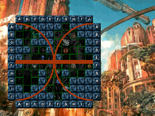
If you want the Stat Boosts, and the Extra stuff to back up the class, try to follow the Outside of it.
How's the menu? And if not that, do you like the idea? It's a rainy day so I don't think I'm going anywhere. :(
Post by: DeusExMachina on October 27, 2006, 09:13:26 PM
Post by: aboutasoandthis on October 27, 2006, 09:28:56 PM
I don't blame you for being confused. If it gets too confusing, I might just drop the idea. Anyone else confused?
Post by: DeusExMachina on October 27, 2006, 09:39:45 PM
Post by: Meiscool-2 on October 28, 2006, 08:05:39 PM
I've been thinking about my game's battle system, and after some though, I concluded that, though it's fun at the moment, I don't believe that it will remain fun for long in the game. I'm positive that after the first few areas, people will find the battles repeative and annoying + lacking in difference. Hence, I've been coding a new battle system.
Not much to show yet. I've got movement, dashing, backflipping, attacking animations, getting hurt effects + animations, guarding effects + animations, charged attacks, and magic animation. I've also made a few move active things, such as if you press 'Shift' various times while charging up, it could result in more power or a completly different attack all together.
Mainly, I wanted to see if you guys like the HUD. There are a max of three players at a time, and the fourth box at the end is your player information panel. That panel will show your status, be you dead, poisoned, silenced, ect.
The three bars, as labled, are Health, Mana, and Fury. Fury is used for charge attacks and various melee attacks. Health is duh. Mana is for magic.
The box labled Health, Mana, and Fury will show a % of what's left. If you have 50% of your health left, then it will show half the bar and a 50 where the health box is.
Faces are Roco recolors and tempary. I'll probally recolor the ToDN3 sprites after I get everything coded, then recolor the face to match. If you havn't noticed, Tales Of sprites are pretty hard to recolor.
Post by: m a k o on October 28, 2006, 08:52:38 PM
Post by: I Have a Sandwich on October 28, 2006, 08:57:02 PM
Post by: aboutasoandthis on October 28, 2006, 10:34:05 PM
Are you still keeping your old one with this as a Mini-Game? Or something else (getting rid of your old one, having this one equal the other,). Coding a battle system like that is cool. It reminds me of Valkyrie Profile or a Fighting Game.
Post by: Meiscool-2 on October 28, 2006, 11:11:24 PM
I was planning on these being the main battles. I might keep the old battles to use in a tactics mini-game or something, because it's already coded and it would be a waste to remove them, but other then that, I'll probally have these be the new battles.
BTW, if anyone has some recolored or rare Tales Of spirtes or sheets, PM me them please.
Post by: Dragoon de Sol on October 28, 2006, 11:18:16 PM
Post by: m a k o on October 28, 2006, 11:35:22 PM
Post by: I Have a Sandwich on October 28, 2006, 11:38:18 PM
Post by: Meiscool-2 on October 29, 2006, 03:31:43 AM
Post by: I Have a Sandwich on October 29, 2006, 03:57:30 AM
Quote
Originally posted by Meiscool
Well, if you want to do recolors for me, I'll gladly let you. However, I don't want you to do it unless you want to. I'd feel bad giving you something to do that I can do myself, just because I don't wanna take the time to do it.
Well, as I'm sure you've figured out, my games go nowhere, I just wanna make stuff for em. Just shoot me a pm with the sprites and what you want the colors to be (As MSN is being bitchy) and I can do em.
Post by: m a k o on October 29, 2006, 03:43:20 PM
Post by: aboutasoandthis on October 30, 2006, 11:46:08 PM
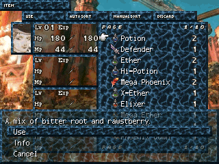
Post by: Skie Fortress on October 31, 2006, 03:41:26 AM


Post by: Meiscool-2 on October 31, 2006, 07:17:16 PM
The seconds one, I don't really like the hair on any of them. Looks to bold.
Post by: Aleister on November 11, 2006, 01:50:36 AM
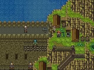
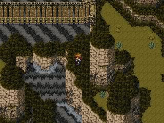
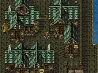
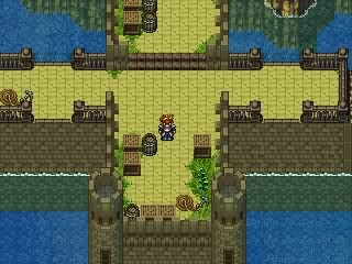
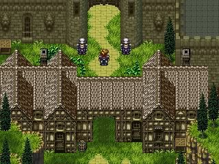
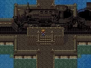
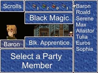
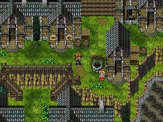
Post by: drenrin2120 on November 11, 2006, 02:06:45 AM
It's tough to say though, I'm not sure if I like it or not...
EDIT: BTW, welcome to Charas!
Post by: Meiscool-2 on November 11, 2006, 03:46:37 AM
The chipsets are horrid.
First, they don't match in style or color. If you recolored one to match the other, it might look better, but Rudra and FF6 have very different depth perception.
Second, you didn't even edit the auto tiles to match.
Example: http://i26.photobucket.com/albums/c105/Meiscool2/Uhuh.png
In the red are some areas that don't match. You've got no transistion from light to dark grass, and you also use a completly different type of grass that has no transistion either.
So, the mapping is good, but the chipsets have to be changed. Also, I recomend not using both Rudra and FF6 charasets. Choose one or the other.
Post by: aboutasoandthis on November 11, 2006, 02:18:55 PM
I don't really like the bright green grass, however I think everything else looks unique. It looks fantastic to me. And kudos to you or someone else for ripping the river. I did it once so I know it's hard to do.
If you could replace all of the Rudra grasses with FF6 ones, It'll look better. I think my favorite screens are 2, 3, 5, 6, 7 (like the menu even though the letters are big), and 8.
Like Meiscool said, I'd choose one style of charaset.
BTW, I think I have the waterfall from FF6's Ulei River. I'm not going to use it. Do you want to use it? It'll match the 2nd screenshot. PM me about it.
Welcome to Charas.
Post by: m a k o on November 11, 2006, 04:47:47 PM
Post by: ZeroKirbyX on November 11, 2006, 05:59:07 PM
Post by: Meiscool-2 on November 11, 2006, 10:54:00 PM
Post by: aboutasoandthis on November 12, 2006, 06:21:06 AM
Some may not like the style, but I'm sticking to it. I've even got some stuff that will help me map it.
I'll be using FFTA, and Tactics Ogre recolored to match FFTactics.
I need to go to bed. G'night.
BTW, yes that's an attempted Garif in the back.
Post by: Meiscool-2 on November 12, 2006, 07:14:04 AM
I've got one of those big movie thingies. Shows where I am in the battle system of the past screens I've post. Not very far, as school and life has taken a lot of my time latly.
http://www.filefactory.com/file/653a20/
Kinda laggy due to using fraps. Also, you might be amazed, but even though I have all those pictures AND 6 bars that change pictures at intervals less then a second each, the game has no lag at all. I know I was amazed. Saved me some work.
Post by: plightofthepureblood on November 12, 2006, 07:21:44 AM
Post by: Glitch on November 12, 2006, 01:49:50 PM
Looks like it would be alot of fun. Reminds me alot of the "Tales of" games. Can you do it with multiple people in your party or just the one person? Either way it's still pretty awesome.
Post by: Ace of Spades on November 12, 2006, 04:50:28 PM
Post by: drenrin2120 on November 12, 2006, 06:39:02 PM
To Meis: Flippin' sweet. :smoke:
Post by: m a k o on November 12, 2006, 08:25:18 PM
Post by: Meiscool-2 on November 12, 2006, 09:05:40 PM
Pictures are gonna be pretty hard. I use 1 for each projectile, which I'm assuming there will be many, around 5 for each hero and their effects, 15 for the HUD, and 2 for area-effects. That only leaves enough for 2 - 3 enemies. Don't know how I'm gonna show the damage.
I think I'll have that INFO thingie in the upper right show how much damage that character's last attack did. That way, I don't have to bother with picture placement and I can save pictures. I'll probally be forced to use pictures of 0-99 instead of 1 picture per digit.
As for showing damage that your character just took, I probally won't do that. You'll just have to look at the health meters.
Post by: Abstrakt Alchemy on November 13, 2006, 08:30:24 PM
And worked out some kinks in the window color options, as well as made the message script more space efficient. Look at all the possibilities you have to customize your in-game windows! You have complete control!
NOTE: I'm still trying to figure out why NPC speach bubbles blur and have that funny line before every space, while PC bubbles don't. They should both have the blur, and neither should have the weird line.... Still working...
Post by: Skie Fortress on November 14, 2006, 03:27:16 AM

Post by: ZeroKirbyX on November 14, 2006, 03:39:30 AM
Post by: Meiscool-2 on November 16, 2006, 10:23:00 PM
Guess which sprite I edited and I'll give you a cookie.
Kara, teh main character of teh game.
Post by: Skie Fortress on November 16, 2006, 11:47:12 PM
Post by: Meiscool-2 on November 16, 2006, 11:53:26 PM
Post by: m a k o on November 17, 2006, 12:25:48 AM
LoOk| Redesigned sprites for my game and a little mockup! Oh and I've gotten most of my chips sets to work.
v
Post by: m a k o on November 17, 2006, 12:28:08 AM
Post by: John6187 on November 20, 2006, 03:04:33 AM
Please gimme some pointers that would be awsome. :frag:
is this on rpg maker 2003?!
Post by: Meiscool-2 on November 20, 2006, 03:11:30 AM
 ) button and change your signature. Copy and paste the text below into your signature box, remove the starts ( These are the stars: * * *), then hit ok.
<*img src=http://charas-project.net/forum/attachments/26178_1163991873.gif*>
Post by: InsaneJP on November 20, 2006, 06:09:13 AM
Post by: Skie Fortress on November 21, 2006, 03:33:50 AM
Post by: aboutasoandthis on November 21, 2006, 10:34:21 PM
Question for everybody...since I'm not using the top-down view anymore, should I just post them in the Comeplete Resources? Would anyone use them.
Post by: Meiscool-2 on November 21, 2006, 11:05:41 PM
Post by: m a k o on November 22, 2006, 12:49:58 AM
Post by: Meiscool-2 on November 22, 2006, 08:30:46 PM
Post by: aboutasoandthis on November 22, 2006, 10:02:10 PM
Edit
I just noticed that little shadow in the upper-right corner. What is it? I like how it blends with the picture still.
Post by: Moosetroop11 on November 22, 2006, 10:20:47 PM
Post by: m a k o on November 22, 2006, 11:28:36 PM
Post by: alsokay on November 24, 2006, 05:07:11 AM
Post by: m a k o on November 24, 2006, 10:46:24 PM
Post by: elementalhero76 on November 25, 2006, 10:20:44 PM
I blow it up and maybe i shouldn't but does it look good or does it need work. One thing i noticed the rain isn't visible here. I may need to make it tinted.
Post by: Moosetroop11 on November 25, 2006, 10:32:15 PM
You should try and make the map less square, for one. Play around with the chipset some more, find out what it all does.
Post by: elementalhero76 on November 25, 2006, 10:50:50 PM
Um how do you make it darker because of the rain?
Post by: elementalhero76 on November 25, 2006, 11:06:32 PM
Post by: ZeroKirbyX on November 26, 2006, 04:13:42 AM
Post by: InsaneJP on November 26, 2006, 04:25:18 AM
Post by: Ben on November 26, 2006, 04:28:49 AM
Seriously.
MASTER'D
Post by: Meiscool-2 on November 26, 2006, 07:32:27 AM
Post by: elementalhero76 on November 26, 2006, 04:58:08 PM
joo were still banned. the map here goes up but I can fix the "square" parts nonetheless.
Post by: elementalhero76 on November 26, 2006, 05:10:11 PM
The top of the water fall messes up how can I fix that?
Post by: Bluhman on November 26, 2006, 06:36:42 PM
Post by: drenrin2120 on November 26, 2006, 06:49:11 PM


Post by: InsaneJP on November 26, 2006, 08:50:40 PM
Post by: Meiscool-2 on November 26, 2006, 11:33:14 PM
First, you used the auto tile for the cave "roof" in some places. That makes the tops look squared off, I don't like that much. Second, you've got a waterfall that looks like it's going down, and then you've got ground right next to it that's flat leading to both the top and the bottom. Elevation issues I guess you could say.
Post by: elementalhero76 on November 27, 2006, 11:08:29 PM
Quote
Originally posted by Bluhman
Pen's rock. Remember that. So does the shift key while mapping, but not in inane suplements.
pens? I know the shift key thing but I think I tried that already it may be the tile.
Edit: oh pencil! ok! But it still messes up even with the shift key. the waterfall can't be helped. Now what do I do?
Post by: Meiscool-2 on November 28, 2006, 04:52:04 AM
Post by: drenrin2120 on November 28, 2006, 11:02:25 PM
I think I get what you were talking about meis. Sooo... Check this out.

Post by: Meiscool-2 on November 29, 2006, 12:13:57 AM
Post by: Ben on November 30, 2006, 01:56:48 AM
And I need input
Now, the map is glitchy right now, its an experimaental map.
My advice required is as such
Ive got the chips drawn up for all of this stuff, as you can see. But I have no Autotiles as of yet.
Now, the use of autotiles is inevitable, but I do plan on using Panoramas as well.
How I would do this is as such:
Im going to have a panoramic background of on repeating tile, in this map that tile would be grass.
I would make other autotiles for things like a path, and long grass tufts and such.
Now, aside from needing a shading of some sort to help with the change from grass to tree line, Im wondering...
Suggestions?
Im already workiong on shadows....
Autotiles always are a pain.
Any suggestions for autotiles to make this work better?
Other suggestions?
(Aside from OMG nub, you suck at maps, because I dont, Im trying to debug the concept of my chipset, and as such, didnt make a pretty map, just a functional one)
Keep in mind, the charset grows and shrinks in perspective, like in FF7,8,9 etc....I just dont have the script properly tweaked for my systems yet
Post by: drenrin2120 on November 30, 2006, 03:27:40 AM
Post by: coasterkrazy on November 30, 2006, 03:46:50 AM
Post by: InsaneJP on November 30, 2006, 05:50:59 AM
Post by: Ben on November 30, 2006, 07:23:20 AM
How does it look with these chips?
Post by: ImmortalDreamer on November 30, 2006, 12:39:00 PM
Post by: drenrin2120 on November 30, 2006, 09:07:12 PM
Post by: InsaneJP on December 01, 2006, 02:50:44 AM
Quote
Originally posted by drenrin2120
Hm.. I think you're getting there, but something still seems odd about it. The stone tiles maybe, but to me, your chipset is like a cross between iso and non-iso(whatever you call it).
thats exactly the problem.... the stone path isnt 3D its flat compared to the rest thats why it looks wierd
Post by: Ben on December 01, 2006, 05:20:06 AM
(God, that one should be a pain to make, If I cant find one already)
EDIT: No Im not that guy who made the game.
Post by: jynce on December 02, 2006, 05:43:47 AM
Post by: jynce on December 02, 2006, 05:46:24 AM
Post by: jynce on December 02, 2006, 05:48:57 AM
Post by: drenrin2120 on December 02, 2006, 06:31:50 AM
Tip2: when you take screenshots take them in full screen, they'll come out better.
Tip3: Read some mapping tuts and play some good games made with rm2k3 by other people for ideas.
Post by: jynce on December 02, 2006, 07:09:18 AM
Post by: Ben on December 02, 2006, 07:19:06 AM
Post by: jynce on December 02, 2006, 07:35:15 AM
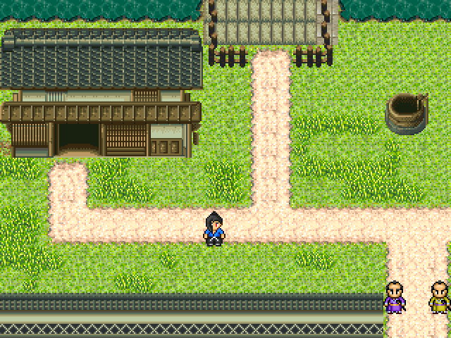
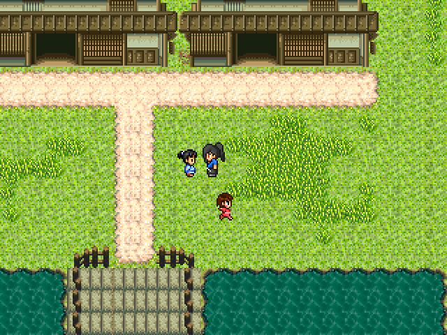
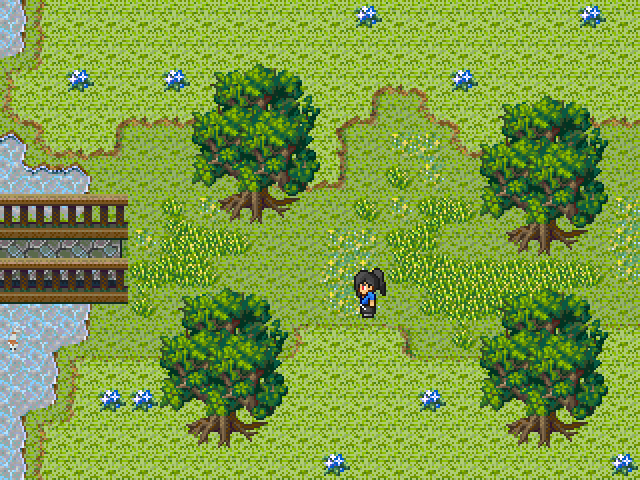
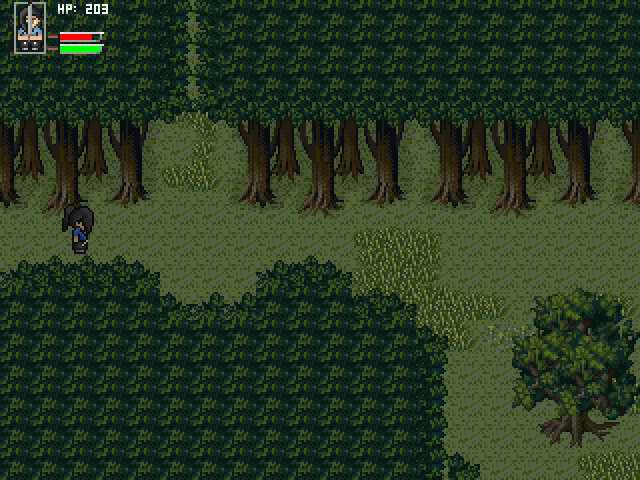
Post by: Tiduril on December 02, 2006, 07:51:06 AM
Quote
Originally posted by CoolZidane
That part was actually changed a while ago, but I haven't uploaded a new screen of that part.
I think it looks like the Gba game Sword of Mana!
Post by: drenrin2120 on December 02, 2006, 08:11:54 PM
Jynce: Your maps don't such, they just need some help. Nothing wrong with that.
Post by: jynce on December 03, 2006, 12:29:06 AM
Post by: drenrin2120 on December 03, 2006, 12:55:39 AM
Look in the Tut section for some of MIC's mapping tuts, I'm pretty sure he made atleast one real useful one.
Post by: jynce on December 03, 2006, 01:29:03 AM
Post by: drenrin2120 on December 03, 2006, 02:06:53 AM
Post by: Dragoon de Sol on December 03, 2006, 02:20:07 AM
Like they're from an RM2K3 game that was already made...
Post by: Meiscool-2 on December 03, 2006, 02:20:44 AM
Post by: jynce on December 03, 2006, 02:48:10 PM
i fixed that i used the same tile i used last time but with no grass border.The maps i have trouble with is town maps because most of the japanese chipsets suck so i gotta work with what i have but thanks for the help.
Post by: maxine on December 03, 2006, 08:37:51 PM
http://i12.photobucket.com/albums/a247/FFPmaxine/firstattempt.png
Post by: Dragoon de Sol on December 03, 2006, 08:43:47 PM
Your screens look stolen to me.
Post by: maxine on December 03, 2006, 08:50:36 PM
Quote
Originally posted by Dragoon de Sol
I am glad you think I am being funny, but I am not, Jynce.
Your screens look stolen to me.
hope that last line still were to Lynce B'cause i made it myself (Not proud though)
Post by: Meiscool-2 on December 03, 2006, 09:08:02 PM
Jynce, you've stolen screens from other games and called them your own before, so why wouldn't you try and do it again? I really don't care if you stole the screens or not, because they are crap to begin with, but you had best watch out for people that do care, especially the creator of the game.
Max, It's an ok use of RTP. It looks good like that, but in-game, I think it would look a bit plain.
Post by: jynce on December 03, 2006, 11:27:22 PM
EDIT:Meiscool i didn't steal the screens i copied the map =D
Post by: Bluhman on December 04, 2006, 12:50:05 AM
Quote
Originally posted by jynce
EDIT:Meiscool i didn't steal the screens i copied the map =D
Yes. That's exactly what you're doing wrong, here.
Post by: Thunderstrike on December 04, 2006, 02:38:21 AM
You'd better give credit (for not altering barely any coding at all) :badboy:
Post by: ZeroKirbyX on December 04, 2006, 04:36:40 AM
Post by: Meiscool-2 on December 04, 2006, 05:47:34 AM
Post by: maxine on December 04, 2006, 11:56:03 AM
Quote
Originally posted by Meiscool
I can't wait to see how much my game gets ripped once I give out a full demo.
Meis you interested in doing some maps for my mobile games? O course you will get credits, probably as much as i will. Im doing the source code. We can take it through PM if you'd like.
Post by: ZeroKirbyX on December 04, 2006, 02:51:35 PM
Quote
Originally posted by maxineQuoteOriginally posted by Meiscool
I can't wait to see how much my game gets ripped once I give out a full demo.
Meis you interested in doing some maps for my mobile games? O course you will get credits, probably as much as i will. Im doing the source code. We can take it through PM if you'd like.[/B]
Why didn't you take it through PM in the first place?
Post by: maxine on December 04, 2006, 02:59:06 PM
Quote
Originally posted by ZeroKirbyXQuoteOriginally posted by maxineQuoteOriginally posted by Meiscool
I can't wait to see how much my game gets ripped once I give out a full demo.
Meis you interested in doing some maps for my mobile games? O course you will get credits, probably as much as i will. Im doing the source code. We can take it through PM if you'd like.[/B]
Why didn't you take it through PM in the first place?[/B]
Because i was about to post another part of my map on the road but something went boomshine with it. And i just took it up.
Post by: Meiscool-2 on December 04, 2006, 08:51:56 PM
Post by: ZeroKirbyX on December 04, 2006, 10:26:57 PM
Post by: Meiscool-2 on December 04, 2006, 11:10:57 PM
Post by: maxine on December 05, 2006, 11:01:28 AM
Quote
Originally posted by ZeroKirbyX
Hey Meiscool, would you do a map for my game?
You dont have to take it further, but i guess ur just the way you are *sigh*
Post by: Ben on December 13, 2006, 11:21:53 PM
Its made with a chipset I just made.
The only non-origonal thing in it is the rockface, which is heavily edited RTP.
I tried making a script for changing the Sprite size for the intent of a 3-d/perspective effect.
It didnt work.
I tried using a script somebody else made.
It sucked.
Im doing the perspectives though mutiple sprite sizes and on-map events.
This screen illustrates all of this.
The one where David is far away, I couldve stood to make the sprite smaller, but this gives the effect.
I still have a little bit of tweaking to do, but I figured Id post for the sake of input.
I hope you enjoy it. :Plight:
Post by: Meiscool-2 on December 14, 2006, 08:26:51 PM
Post by: Ben on December 15, 2006, 02:21:59 AM
Actually, Im nixing the shadow tiles, and making the white borders one consistent color, and making that white-ish line the new transperancy shade.....so it blends better, while leaving the whoarfrost-look to it.
Here is a quick screen of the batttle.
Im still trying to figure out how to script the DBS differently.
The DBS is used in only a few small parts, the most of the battle is in the SBABS from my eartlier posts.
But the DBS plays out comic book ish.
Im still trying to find out how to change the font color to dark brown, and the in-battle font to Comic Sans MS, to fit the rest of the game.
Here it is though.
The hero is shown in one outfit. There are a few used.
Post by: FHZebedee on December 15, 2006, 04:02:55 AM
I've got a humble offering of my own. I'm trying to do a sort of modern setting game, so things SHOULD look a little less natural and alive, but I need to strike a balance. (Raises shields and readies for a midlife crisis inciting criticism)
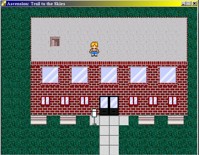
I've got some of my battle stuff in the game topic. It's not that good, fairly standard DBS with a little bit of weirdness. Custom monsters is about the best thing I have going.
Post by: drenrin2120 on December 15, 2006, 05:59:51 PM
To Gem: Dear lord! That's an awesome battle screen. When you attack will it say stuff like "Kablam!" lol, that'd be pretty nifty.
Post by: Ben on December 15, 2006, 07:00:41 PM
Im not quite using "Kablam" perse...expletives are a bit too marvel for what Im going for. But I imagine it is unavoidable in some of the attacks.
Ive got a new battle screen with the attack animations I made last night.
Ill post them.
Hopefully Tonight Ill be able to get another monster made, with animations, and perhaps even a new special attack. Every weapon and Monster has their own set of animations. I want no generics here.
But uh.....here it is.
Im almost done editing my winter chips. I got rid of the white lines, and Am trying to find a way to add definition whilst keeping a congruent style.
Ill post that when its ready too. Stupid dial up....takes me 5 minutes to upload these things. 28 kb/s is the suck.
Post by: ZeroKirbyX on December 16, 2006, 06:27:48 AM
Post by: drenrin2120 on December 16, 2006, 04:23:15 PM
Post by: jynce on December 20, 2006, 02:37:29 AM
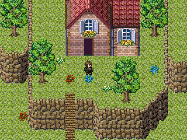
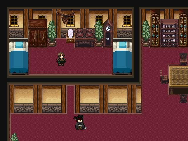
Post by: Tomi on December 23, 2006, 03:45:55 PM
Post by: jynce on December 27, 2006, 02:25:20 AM

Post by: aboutasoandthis on December 27, 2006, 02:51:07 AM
Oh and the trees on the edge of the cliff, and the waterfall look a little wierd...
Post by: Meiscool-2 on December 28, 2006, 02:13:16 AM
Post by: A Forgotten Legend on December 28, 2006, 05:08:27 PM
Post by: Tomi on December 28, 2006, 07:00:18 PM
Post by: ImmortalDreamer on December 28, 2006, 07:41:56 PM
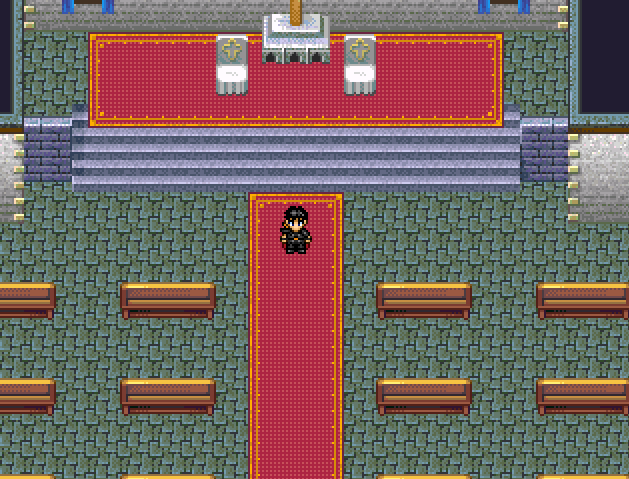
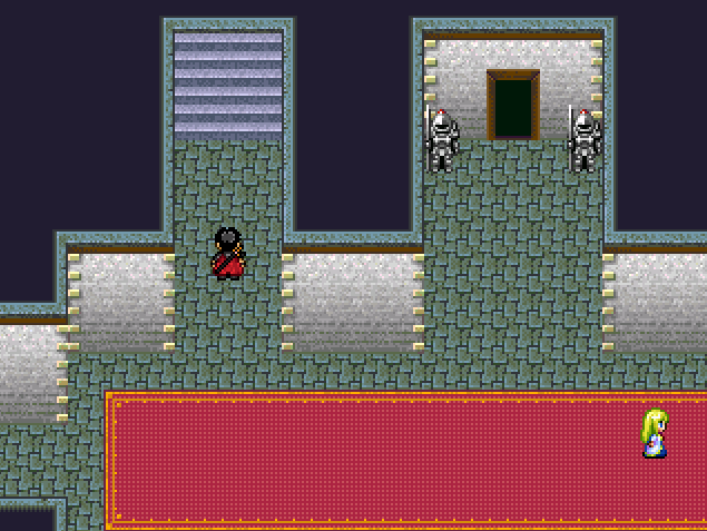
Post by: jynce on December 28, 2006, 09:26:00 PM
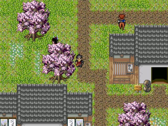
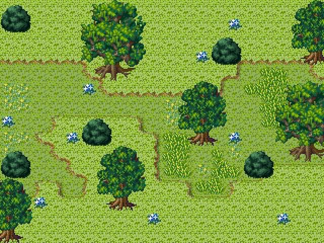
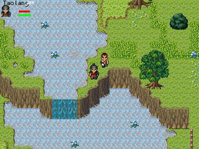
Post by: Meiscool-2 on December 29, 2006, 09:54:01 PM
Can you read? I posted a very easy to follow and rather expansive guide to using the print scrn button just a few posts above. Gain some freaking common sense and reread something if you forgot it.
ImmortalDreamer: Looks good. Did you get premission to use that character? I know the author, and he's not a real nice guy, so I doubt he would give it out, but just asking.
jynce: Quit showing the same damn screenshot. I've seen that 2nd screen twice in here now and once in one of your many game threads.
Post by: aboutasoandthis on December 30, 2006, 12:25:01 AM
Okay, so you've found the Prnt Scrn button. Press it right now. Look at what is on your moniter right now, it should be this post, and remember it.
Go to any image program and press Paste. You should see exactly what you are seeing right now in your image program. Please save your file as a PNG. If you save your image as a bitmap, or a JPEG, it will look blurry.
To take a screenshot using this method, start up your RPG Maker program and play your game at full screen. Press the Print Screen button while playing the game. Stop the game somehow, then Paste it in an image program.
On another note...I'm still working on FFR. Jesus, it seems like I'm programming that thing at least an hour a day. I'm working on the graphics too. I've made a lot of rips from Tactics Ogre Snes, GBA, and FFTA. I'm using some of my old Roller Coaster Tycoon and The Sims stuff too.
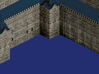
The architecture is the easiest part. But the trees and stuff are hard to edit. I need to find a way to make them look less cartoony.
I'm working on a side project too called "The Witch King." It's not a fangame (not Lord of the Rings) so I'm really proud of the story.
It'll just be a small game: simple ABS, lots of puzzles, no enemies, no real NPCs, only eight bosses, an AI girl who follows you around, maybe non tile based movement,. I don't need a CMS or anything for this. :D It's inspired by Ico and Shadow of the Colossus but it is original.
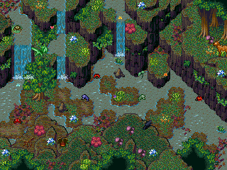
This map will have the first boss. How is the map? It looks like it's missing something (Other than the boss). I'm thinking about taking out those tree leaves on the bottom and in the cliff. Does it need more space? It's gonna be a "puzzle game" so there are no fancy spells or anything.
Post by: Dragoon de Sol on December 30, 2006, 01:15:30 AM
Post by: Meiscool-2 on December 30, 2006, 01:45:43 AM
Also, that map looks real nice. But, as said above, unless the battle is ment to be real tight or the enemies are small, it doesn't look like a good place for an ABS fight.
Also, as to non-tiled movement, are you planning on using pictures?
Post by: Bluhman on December 30, 2006, 01:48:18 AM
Post by: aboutasoandthis on December 30, 2006, 01:56:24 AM
I forgot to mention that you can climb on the cliffs, and that the battle doesn't just take place on one map, but yes I will open the maps up. Comments were appreciated. :)
For your picture question Meis, yes (for both games actually). I saw that topic in the Programming section. I decided to use it for a "Custom Movement System" in FFR that uses pictures.
It's coming along well, but I'm using this game for extra practice before I finish the other. Since there are no real NPCs or anything, I figured this would be good.
The only collision detection in this game I'd have to worry about would be the bosses, the map, and the AI girl who follows you around.
With FFR, I want NPCs, and over/underpasses and stuff. That takes layering and a little more effort.
Edit.
Didn't see you Bluhman. If you squint you can see Tactics Ogre shaped indents. Is that why it looks like FFTactics?
Post by: jynce on December 30, 2006, 04:24:16 AM
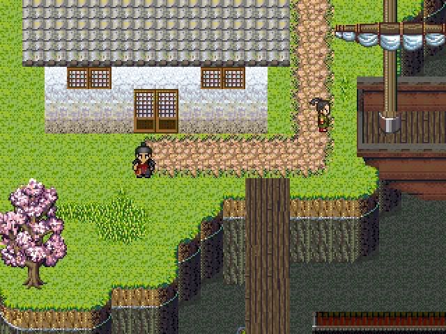
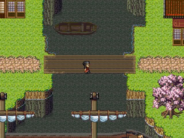
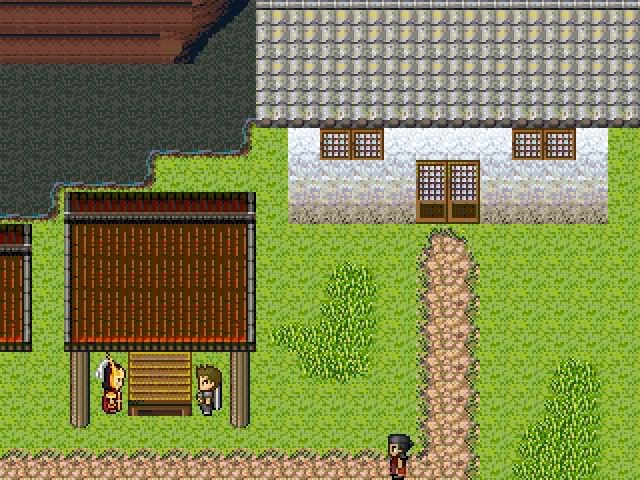

Post by: ZeroKirbyX on December 30, 2006, 04:35:34 AM
Post by: drenrin2120 on December 30, 2006, 05:05:14 AM
Post by: Skie Fortress on January 01, 2007, 04:23:59 AM

Post by: Collin152 on January 03, 2007, 12:48:29 AM
Quote
Originally posted by A Forgotten Legend
On the laptop i'm using the prnt scrn key is shared with the insert key. HOW DO I'M MAKE IT SO I AM USING PRNT SCRN!!!!!! I got the idea, i did it on my mom's computer.
Anyway. This time, i really want advice on this screenshot.
I think i'm going to upload my images to my freewebz account... :)
AHH I FORGOT TO CHECK THE BOX!!!!!!!!!!!!!!
oh well lets try again.
So, I take it you found the function key?
Post by: coreystranick on January 03, 2007, 01:47:54 AM
Quote
Originally posted by A Forgotten Legend
On the laptop i'm using the prnt scrn key is shared with the insert key. HOW DO I'M MAKE IT SO I AM USING PRNT SCRN!!!!!! I got the idea, i did it on my mom's computer.
Anyway. This time, i really want advice on this screenshot.
I think i'm going to upload my images to my freewebz account... :)
AHH I FORGOT TO CHECK THE BOX!!!!!!!!!!!!!!
oh well lets try again.
You hit print screen go into paint and hit ctrl+v and it will paste into paint. Not that hard.
Post by: Meiscool-2 on January 04, 2007, 10:06:08 PM
Post by: Zatham on January 05, 2007, 01:57:56 AM
Oh I guess I could post some of my own screen shots.
My RPG, "The DOTH Scriptures", takes place in a modern-day era so it's quite difficult to find adequate chipsets and charsets.
On with the show!

The outside maps of my game have what I call the "Mario RPG effect", where the land is suddenly cut off into nothingness, making the player feel as though they are on a game board or something. I think it's fun and different but can sometimes be stifling when designing a map.

This is the interior of the main character's house. Nothing special.

And here is the yard. Again, nothing special.

Here is a mini-game that appears throughout the game. I call it the "Intense Convo system". When the person you're talking to says anything, you get one of three options for answers. One answer will move the yellow bar in your favour, one will move in the opponent's favour, and one option will have no effect on the bar.

Here's part of a dream sequence at the beginning of the game.

Here's a battle scene I am reluctant to post because I am redoing the battle sprites to be much more grandiose.
Post by: aboutasoandthis on January 05, 2007, 02:52:03 AM
I like them. I'm glad your screens look kind kind of "happy" even though you're using Theodore. I'm tired of seeing those chipsets used in horror games.
My biggest fear here is that you're mixing up sprite styles. The maps are okay, but some of the sprites don't really match. Like in that screenshot of the yard, I see refmap, theodore, tales of phantasia, etc. They're matching to me so far, so it's just a fear.
I don't like that bottom screen with the box looking parts on the top. This is your game board look?
I don't know what else to comment on. I'll leave Meis to this since...he kind of taught me.
I like your houses too.
Post by: Zatham on January 05, 2007, 03:36:44 AM
I'm really anal about consistency when it comes to tiles and charsets.
And as for the last screen shot, I'm not sure how I will present battle backgrounds. I'm tired of the same old "scenic background lols" so I'm going to for something different (continuing with the "game board theme")... but I just haven't decided on what yet.
Post by: ZeroKirbyX on January 05, 2007, 03:45:22 AM
Post by: Ben on January 05, 2007, 06:40:02 AM
I hope you enjoy it. Ive still got some tweaking to do, and thats why Im only posting the one.
Please, Input Input input (as long as its constructive)
Post by: Meiscool-2 on January 05, 2007, 08:11:44 PM
Those plants look like tats. Did you use some of your tat art to make these?
Looks real good BTW. Great for custom.
Post by: Ben on January 05, 2007, 08:53:58 PM
As the game progresses, certain things will be coloured. Or if I can find a small artisically inclined slave, to color them well....
The greyscale in the plants and some objects is a bit too green. I forgot to greyscaLE the pencil work.. They are not tats, but Its cool that you made that observation....I guess the style will show through more, now that Im using a pen-esque tool as opposed to a jerky, crappy optical mouse.
In 2 days, Ill be moving to my new place, and have high speed again, so Ill be able to post more frequently. Ive been off work for a couple of days, and had the free tiome to wait for stupid dial up..... So I posted this. But Ill be posting alot more very soon.
Thanks for the shazznit Meis.
Post by: A Forgotten Legend on January 08, 2007, 10:44:06 PM
I am going to be working on the first of my A Forgotten Legend Series... Does anyone know where i can learn how to make chipsets? I suck at making them myself.
Well anyway, here is my world map for AFL II.
Post by: Tomi on January 09, 2007, 12:24:50 AM
Post by: ZeroKirbyX on January 09, 2007, 12:37:17 AM
Post by: Emerates on January 11, 2007, 01:38:31 AM
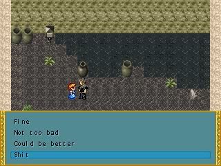
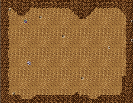
Finally, I post images from my game!
Please do not destroy my ego.
Post by: ZeroKirbyX on January 11, 2007, 01:45:07 AM
Post by: Meiscool-2 on January 11, 2007, 02:19:00 AM
Quote
Originally posted by Emerates
Finally, I post images from my game!
Please do not destroy my ego.
Anything I say would result in the slow and painful destruction of your limited ego, so I won't say anything regarding the quality of those screens, or the highly original words choosen to be placed in them.
Post by: A Forgotten Legend on January 13, 2007, 12:08:33 AM
Tomi- "Don't make the edges of anything flat. It doesn't make it look very good."
Do you mean the edges of the land masses? Or the Forests and mountains?
I'm attaching an midi file. can anyone tell me if it is any good? I plan on using it for my title screen.
Post by: Daetyrnis on January 13, 2007, 12:12:57 AM
Quote
Originally posted by A Forgotten Legend
I found a nice chipset that had parts of FF1 and FF2, and i edited it. I posted on charas and sited the original creator/ripper.
Tomi- "Don't make the edges of anything flat. It doesn't make it look very good."
Do you mean the edges of the land masses? Or the Forests and mountains?
I'm attaching an midi file. can anyone tell me if it is any good? I plan on using it for my title screen.
First, don't make anything have a large flat edge, that includes, land as well as forests and mountains.
Second, midi questions don't belong in a screenshot thread.
Post by: A Forgotten Legend on January 13, 2007, 12:16:21 AM
Post by: MaDDy on January 13, 2007, 03:00:45 PM
>> Screenshots << (http://img220.imageshack.us/img220/1864/dreamlessmadeby5rp.jpg)
Hope you enjoy that screenshots.
Not enough? Watch the Dreamless-Trailer (http://www.youtube.com/watch?v=LRpQwPATDJY)
Cya MaDMaX
Post by: Robotam Plus on January 14, 2007, 04:52:56 PM
But you're going to have a hard time scaring people with 2D graphics. :p
Post by: coasterkrazy on January 15, 2007, 03:03:52 AM
Quote
Originally posted by Robotam Plus
Not bad, Maddy. Not bad at all.
But you're going to have a hard time scaring people with 2D graphics. :p
I've actually played a pretty crazy horror game made in RM that actually was pretty scary. I bet he can scare some people with that. :p
Looks amazing!
Post by: A Forgotten Legend on January 15, 2007, 06:05:36 PM
Post by: Ben on January 15, 2007, 11:52:23 PM
Try to make it look less like it was made in a box factory.
Asymmetry is your friend.
:Plight:
Post by: Meiscool-2 on January 17, 2007, 01:52:38 AM
Post by: A Forgotten Legend on January 17, 2007, 11:16:41 PM
I hate only being able to see everything in event mode.
Post by: drenrin2120 on January 19, 2007, 10:06:05 PM
Post by: Meiscool-2 on January 20, 2007, 09:13:58 PM
And yes, the lower right is going to have an overlay. I just havn't gotten that far.
Post by: Sion Suncrest on January 22, 2007, 10:20:07 PM
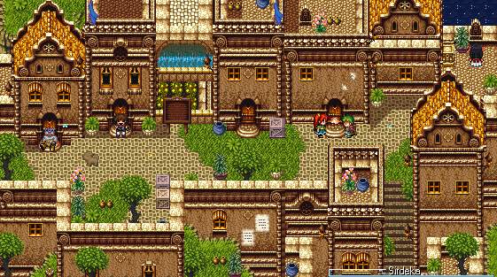
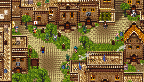
Inspired by the unadulterated awesomeness that is Meiscool.
~Sion
Post by: Meiscool-2 on January 23, 2007, 02:59:48 AM
Maybe someone will comment on my new dead people. It's my favorite four dead people that I've made.
1st Favorite: Upper right, guy that got torn appart by vines. Is animated, he moves up and down while the vines move.
2nd Favorite: Upper Left, girl hung by vines, though you can't see the rope in the shot :/
3rd Favorite: Lower Left, dude with split head. Is animated, blood drips from his "little" wound.
4th Favorite: Lower Left, girl with vines popping out her head. Animated as well.
If you're thinking: "That's sick." or something similar, good. That's what I want people to think.
Post by: Fortet on January 23, 2007, 03:23:15 AM
Nice maps, Meis :D
Post by: Ace of Spades on January 23, 2007, 03:28:12 AM
Post by: Koopapooper on January 23, 2007, 02:07:22 PM
Post by: BlindMind on January 27, 2007, 07:38:44 PM
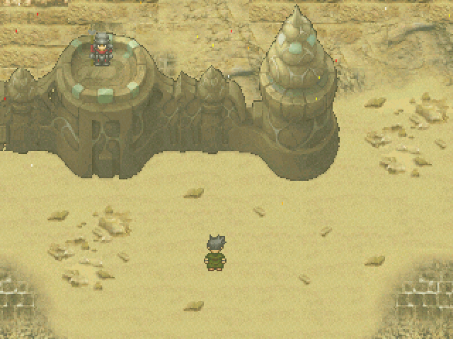
Click for the full version: http://i19.photobucket.com/albums/b190/Blindmind028/NewDesert.png
Post by: ZeroKirbyX on January 27, 2007, 08:11:40 PM
Post by: BlindMind on January 27, 2007, 08:17:01 PM
Post by: Meiscool-2 on January 27, 2007, 09:52:42 PM
Post by: BlindMind on January 27, 2007, 10:10:03 PM
Is this any better? =P
Post by: Meiscool-2 on January 27, 2007, 10:45:38 PM
Post by: Skie Fortress on January 29, 2007, 03:37:24 AM


Post by: Ben on January 29, 2007, 04:47:58 AM
A couple of awesome sweet shots.
Post by: Robotam Plus on January 30, 2007, 03:16:02 PM
Post by: Meiscool-2 on February 01, 2007, 02:46:24 AM
I really love seeing buildings built into mountains and rocks. Which is why I seem to do it a lot....
Post by: Skie Fortress on February 04, 2007, 09:30:26 PM


Post by: aboutasoandthis on February 04, 2007, 10:08:39 PM
"That picture in the background of the menu is way too distracting." lol
Post by: Meiscool-2 on February 05, 2007, 05:07:08 AM
The menu looks good. Real good. Good font and color choices.
The second is meh. Anyone can take a background, put two faces on it and some text.
The third is ok. The backgroud doesn't have a whole lot of detail. The character poses are cool, but I don't think you made them.
BTW Skie, how many games are you making? About every month I see new screens of various stuff that couldn't possibly be related. One was a CBS, another was a DBS with edited Tales sprites, another with rudra battle charas. Then there is this one.
Post by: neb87 on February 05, 2007, 07:23:46 AM
A menu am workin on

Post by: Skie Fortress on February 05, 2007, 12:28:26 PM
Quote
Originally posted by Meiscool
*sigh* another copy/paste from gamingw.net.
The menu looks good. Real good. Good font and color choices.
The second is meh. Anyone can take a background, put two faces on it and some text.
The third is ok. The backgroud doesn't have a whole lot of detail. The character poses are cool, but I don't think you made them.
BTW Skie, how many games are you making? About every month I see new screens of various stuff that couldn't possibly be related. One was a CBS, another was a DBS with edited Tales sprites, another with rudra battle charas. Then there is this one.
The game isn't highly exploration based, nor am I one of those gifted mappers that can make mapping look like art, so sorry if it doesn't measure up to your 'masterful' mapping standards. -_-
As for your question, the CBS was and still is an ongoing experimental look into custom battle systems. Not any sort of real project, though if I suddenly miraculously start understanding custom systems, I do have a story and characters ready for it.
The DBS with Tales sprites is from my main project called 'Mystic Legends' which goes highly ignored everywhere, so I wouldn't be surprised if no one knew of it.
The rudra one was 'Axis Saga', which I'm thinking of dropping because it's a huge failure and to salvage it, I'd need to start over and rethink my approach to it.
As for other stuff I'm making there's this game 'Angelic Awakening', probably the only project that people seem to know exists, which I'm focusing on now, and then there's database and modified DBS for 'Mystic Legends 2' which won't be truly started until ML is complete.
So that makes...oh, two, possibly three projects and two side things. So there's your explanation on my various screens...
Post by: ImmortalDreamer on February 05, 2007, 06:23:21 PM
I've been improving on my mapping skills and I just finished Meiscool's mapping tutorial. So I hope this is pretty good.
http://i17.photobucket.com/albums/b92/ImmortalDreamer17/GaiaRPG/FirstTownMap.png
Post by: Meiscool-2 on February 05, 2007, 06:54:46 PM
ImmortalDreamer: I like how none of the houses look the same. I would recommend putting in more property things like fences, boxes, jars, ect. Also, a little more elevation here and there would add more than just a flat ground :p
Revamped the Custom Text Box.
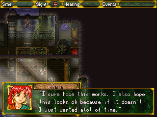
And animations from my CBS, which is all picture based.
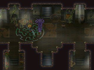
The Velsarbor sword is just a fill-in till I think of what kinda weapon I want to give him.
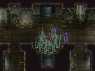
Post by: A Forgotten Legend on February 05, 2007, 08:11:14 PM

EDIT: I am going to find a different chipset, Meiscool. :)
Post by: Kageri on February 06, 2007, 07:24:30 AM
Quote
Originally posted by Skie Fortress
Probably the last batch of Angelic Awakening progress screens until a demo come's out or whatever. The Levelup CMS is finished, I just need to find a way to correctly space out the words under Secondary and Influence, since those are charsets, and I'm fixing up the intro and the beginning before continuing on.
Your game makes my "game" look like obese hairy men. But hey, it looks like that without even comparing.. =/ Nice anyhows, looking forward to yours.
By the way, is that RMXP?
Post by: A Forgotten Legend on February 06, 2007, 12:17:30 PM
:(
Oh well. Wow Meiscool. I worship your ability to manipulate chipsets by using overlays. :bend: I really like Skie Fortress's stuff, mostly the character's images. It doesn't look like XP because XP doesn't have facesets. And the chipset seems more along the 2000/2003 area. Of course I don't use Xp much anymore sice my trial ran out :(
Post by: A Forgotten Legend on February 07, 2007, 09:40:29 PM
Post by: A Forgotten Legend on February 07, 2007, 09:43:05 PM
(Made it on Paint. Took about 30 min)
Post by: Moosetroop11 on February 07, 2007, 10:42:28 PM
Plus I'm jealous of your name >.>
That is all.
Post by: Zatham on February 09, 2007, 07:37:39 AM

This is part of the intro. It looks cool when it's all animated because the book pages are flipping and the candles are flickering and the guy in the middle is hovering and stuff k.

Also part of the intro. This takes place in a Church k.

Alright so one of the bad guys comes out of the wall and starts to mess with the dreams of the protagonist. Scary!

Just some charsets I'm working on.
Comments? Anybody? I'll take anything. ;)
Post by: A Forgotten Legend on February 11, 2007, 12:23:35 AM
I made my own chipset today using two RTP sets and a music hall set... does this church look ok? The raised area is a place oh healing.
The guy sitting at the organ is mourning his Fiance's death that happened five years before. (it is the anniversary of her death)
The song playing is actually perfect for the scene because it makes it seem as if the guy is actually playing the organ.
Look at the last page and tell me about my other screenshots!
Post by: A Forgotten Legend on February 11, 2007, 12:45:09 AM
Post by: A Forgotten Legend on February 11, 2007, 12:57:52 AM
Post by: Oceans Dream on February 11, 2007, 01:32:53 AM
I really like the organ in the Church screen, but aside from that, it kinda doesn't look much like a Church. However, it does look practical, since it's small.
Post by: A Forgotten Legend on February 12, 2007, 01:11:37 PM
Post by: Oceans Dream on February 14, 2007, 06:48:27 AM
Screen of my current project: The purple shells have been replaced since then, and some other minor changes, but nothing major for this area.

Post by: A Forgotten Legend on February 14, 2007, 01:16:29 PM
Post by: Oceans Dream on February 14, 2007, 04:37:14 PM
 (http://imageshack.us)
There's a touch encounter system rather than a random encounter one, so you have the enemy sprites on screen as well. Here, it's flying fish. Also, I have a different character in front this time, you make the characters like in FF1, but you can also choose their gender.
I think someone is going to mention it, so I might as well say it now. The tree and the vine decorations on the battle screen are in every battle background, it's like a frame. The thing that changes is the top bar depending on your location.
 (http://imageshack.us)
Post by: A Forgotten Legend on February 14, 2007, 08:55:37 PM
Post by: A Forgotten Legend on February 14, 2007, 09:06:58 PM
Post by: BlindMind on February 15, 2007, 02:55:06 AM
Post by: Meiscool-2 on February 15, 2007, 03:52:46 AM
Oceans Dream: Nice. I've seen a bit of your stuff at GW and LCG, so I know that those custom tiles. They look real great, and capture the classic look well.
Zatham: Looks good as well. Only problem I've got is the number of chipset types. Might seem odd to see those several different types and styles in one game:p Also, could you post that cross in the second screen? I don't think I've ever seen that before.
A Forgotten Legend: I think people are just humoring you. Honestly, not only do your choices of graphics stink (original RTP, which is ok for getting used to the maker or just making random crap), but you're mapping could use alot of work as well. Read a tutorial or something. Because of the vocab and writing styles I've seen you use, I do believe you are around as old as you claim, but at such an age you should be able to tell yourself that nobody is impressed by a day/night system where all you do is change the screen tint.
Post by: Oceans Dream on February 15, 2007, 05:11:11 AM
A Forgotten Legend: Meiscool is right about the mapping. I would suggest not only tutorials, but also considering how a similar building/area might look in real life. If you were to walk into a weapon store in real life, would you see a ton of swords on the floor? Put some tables so people can place the weapons on there, or maybe have some hanging on the walls. If it's a place to forge weapons, you could have a fireplace, still some tables, anvils, tools and stuff around. I think you should take a look at professional games maps and also some other RM games that have good maps for inspiration.
Post by: A Forgotten Legend on February 15, 2007, 10:28:35 PM
I made this on XP. I think its better than most of my maps. It is towards the beginning of my XP project. I am working on one 2003 and an XP. right now I am focus on my XP.
EDIT: I just realized that I made it so the second story windows are level (look level) with the first story windows on the other part of the house. hmm... I should fix that.
Post by: Glitch on February 15, 2007, 11:13:14 PM
Also, if they are trees, where are the trunks?
Post by: Ben on February 18, 2007, 03:57:25 AM
I was working on A townset..
The project Im designing this for is a TBS...So Ive also been trying all sorts of templates. I made a few templates...they looked cool, but not with the TBS.
So Ive been looking at other templates that were similar, And I came up with the one I used for the sprite in the screen.
But uh.....How are the Chips looking? I tried to give it a different feel than the standard rtp...A bit more earth toned and less-saturated with colour.
It took along longer to make this set than it looked like.
But uh....
Yeahs
Post by: Bluhman on February 18, 2007, 04:35:05 AM
Post by: Meiscool-2 on February 19, 2007, 02:06:32 AM
Post by: Glitch on February 19, 2007, 02:07:44 AM
Post by: A Forgotten Legend on February 25, 2007, 07:47:10 AM
And its like 3:05 A.M and I'm not tired, so here are the four maps in the intro.


Post by: Oceans Dream on February 26, 2007, 12:14:10 AM
Screen. Ignore the vines/clocks on the corners, they were added because I need to use this for a non-RM project. In the game, they won't be there.

Post by: A Forgotten Legend on February 26, 2007, 12:42:06 PM
Post by: Meiscool-2 on February 27, 2007, 04:15:02 AM
Time to bring it back or something maybe.
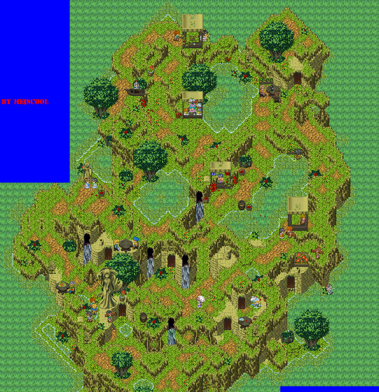
Ocean: Yeah, it looks like a school. I think a paper airplane somewhere would be an awesome effect. You've got a very Zelda TMC look going, be that what you wanted or not:p
Post by: omegarirue on March 05, 2007, 01:21:33 AM
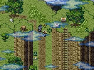
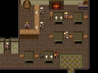
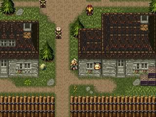
are these good?and can you tell me how to make one of those huge screen shots miescool has?Also meiscool may I have a link to ur game.I figured it would be kewl to play it.
Post by: Meiscool-2 on March 05, 2007, 05:03:24 AM
You're mapping has gotten a lot better. It still needs some help on making attractive interiors and mountains, but your town looks good, even though I'm suspecting that you stole that method of mapping from the "Devil Hunter Seeker Of Power" game.
Post by: omegarirue on March 05, 2007, 02:33:10 PM
set shape.and nice mountain.
Post by: Moosetroop11 on March 05, 2007, 05:15:49 PM
Post by: Ben on March 05, 2007, 07:46:56 PM
If I could find like one or two other people to help, Id love to make a set of non rtp, non ripped, fully origonal chips... But nobody really does chips...
Id like to have custom sets, but its too daunting making a full games worth of chips myself.
And Teams dont seem to fly here. Not to bash the community, but people seem pretty non-commital.Otherwise Id start a custom Chipset project...But Im also so busy trying to get the base work for Genia established, so time is scarce, and its unmotivating being the only one working on it. But the chipsets are half the reason I got my Graphics Tablet in the first place.
So alas, Ive resigned myself to editing XP's RTP.
Post by: A Forgotten Legend on March 05, 2007, 10:52:45 PM
Post by: omegarirue on March 06, 2007, 12:32:08 AM
Post by: coreystranick on March 06, 2007, 01:26:57 AM
Post by: A Forgotten Legend on March 09, 2007, 09:03:07 PM
...sorry if I confused you.
Here is the edited map. did i put the new house in the right spot? I also added a small graveyard. And some different grasses
Post by: omegarirue on March 09, 2007, 10:09:28 PM
Post by: omegarirue on March 10, 2007, 07:54:39 PM

I posted this on gw but a reply would be nice.
Post by: A Forgotten Legend on March 10, 2007, 10:29:51 PM
Post by: omegarirue on March 10, 2007, 10:33:38 PM
Post by: A Forgotten Legend on March 10, 2007, 10:41:45 PM
Here is a map, it is also part of my beginning.
Post by: Meiscool-2 on March 11, 2007, 05:13:38 AM
Quote
Originally posted by omegarirue
Hey fogotten legend I think me and you are the only pepole who post here anymore.
That's right. You guys turned up the suck so much that the rest of us left. NICE GOING.
Post by: Finality on March 11, 2007, 05:40:57 AM
Nice map but one thing caught my attention. If it is a town built into a hill then (not saying what you have is impossible) wouldn't it make more sense for the river to be running vertical instead of horizontal. I guess that is just being nitpicky but it caught my attention.
@Rirue
I actually do like that map. my only complaints would be with things I know rpg maker just does so no complaints with you. ^^
Post by: omegarirue on March 11, 2007, 01:53:35 PM
ROFL
Post by: A Forgotten Legend on March 11, 2007, 05:28:15 PM
Quote
That's right. You guys turned up the suck so much that the rest of us left. NICE GOING.
...somehow I'm not surprised meiscool said that. _sweat_
Post by: aboutasoandthis on March 12, 2007, 01:01:00 AM
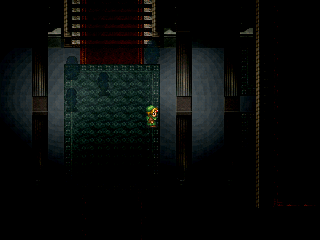
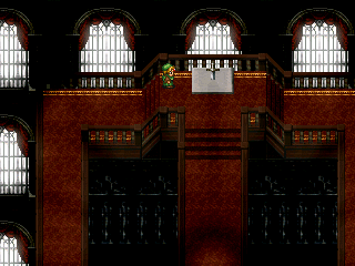
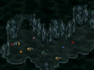
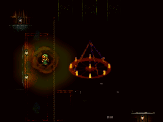
Just so you know, things like the bubbles and the fire will be a bit more transparent in the game. I admit, they're a little rushed and sucky looking.
One more thing, my personal problem with this thread comes from just mapping instead of trying to show an actual screenshot. I'm not trying to sound mean or anything, but you post the little 320*240 screens in you game thread and not giant pics of maps.
In some cases, you can do this, but this is only if you create a new chipset style or something like what Meiscool does. I can't really say this about you two
Rirue: Your town looks okay, but after playing Devil Hunter, it looks like you copied the style and everything. I'm not calling you a thief, I'm just saying a screenshot of that really isn't necessary.
A Forgotten Legend: Slightly the same problem. Its a well thought out interior, but it isnt that hard to make a small room like that. There isnt much to comment on. Id rather see this with some people and some dialogue.
One more thing I noticed, that town at the top of the page you used is a Mac & Blue/Refmap chipset. This room is Terranigma. If you start using chipset styles that clash already, your game will look much uglier. Try to mactch your chipsets by the Game/Spriter it came from, Game Company, or Color. Take it from me as I used to do it all of the time. :)
Post by: Meiscool-2 on March 12, 2007, 02:42:13 AM
I gotta complain about those windows in the second pic though. Kinda makes me wonder if it's all window and no wall.
Post by: aboutasoandthis on March 12, 2007, 02:45:42 AM
Quote
I really like that water cave. Your maps kinda give off a haunted feel, but not horror, if that's what you're going for.
Exactly what I was working towards.
I can see what you mean about the windows. It's supposed to be a surreal WTF room where the sword is. I forgot the castle is underwater. I'll do something about it eventually.
Post by: Bluhman on March 14, 2007, 09:47:09 PM
Quote
Originally posted by aboutasoandthis
Oy. You're using the same Chips I'm using. Only every thing's too dark to see through. Now that I'm looking at it, though, I don't think my tester won't particularly love to play the game. (Not saying the game is bad; It's just that she's not paticularly a fan of scaaary games.)
But it looks waaaaay better than anything I'll ever make in my lifetime.
Anyway, here's a random map of my game.
Post by: aboutasoandthis on March 14, 2007, 10:51:40 PM
For your town I wanna see the people and stuff, but it does look nice.
Post by: Bluhman on March 14, 2007, 11:21:12 PM
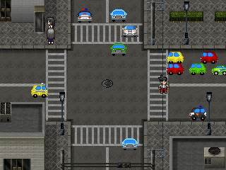
Post by: Meiscool-2 on March 15, 2007, 11:39:45 PM
Post by: Bluhman on March 16, 2007, 12:51:54 AM
Actually, I did find a matching charset for cars, but it was done in a more chipset fashion, with the different parts of the car being put in 16x16 tiles of charset instead of a more effective 16x32 tile. In addition to that, they were old-world cars, like Volkswagen's and freight trucks.
Post by: Ben on March 16, 2007, 12:54:07 AM
Post by: Bluhman on March 16, 2007, 08:01:46 PM
Quote
Originally posted by gemini
That city tileset....Where was that one? Is it for 2k3 or XP? or basically...um.....Can I have it?
The chips were made by the VERY talented guy at Teddy Plaza. His works include very accurate medieval towns, 20's era cities, modern cities, mansions, caves, and other dribs and drabs. Sadly, you can't find them on his website; he's moved on to making drawings of silly anime girls, and single sprites that could possibly be used in RPG maker if it weren't for the fact they weren't in a set. His work can be found in various places. PhanxGames has a bit of them, while you can get a complete set from a thread in Gaming World.
Post by: Meiscool-2 on March 28, 2007, 03:47:11 AM
I'm bored with my project while people are beta testing, so I'm screwing around with my old side scrolling stuff that I made awhile ago. Like? The bottom is cut off because I don't know what to put down there yet :P
Post by: Ben on March 28, 2007, 03:57:16 AM
Post by: Meiscool-2 on March 28, 2007, 06:49:24 PM
Quote
Originally posted by gemini
It looks sweet meis. It would look sweeter if it was a multi toned sky...Like dusk or dawn...So warm colours in the sky would give it a gnarly feel. Just my advice.
Orange and pink and stuff like that?
Post by: Dragoon de Sol on March 28, 2007, 09:06:43 PM
You'll have to tell us all how you did that eventually.
Post by: aboutasoandthis on March 28, 2007, 09:11:05 PM
I've barely been touching Reminiscence...and I ended up messing with the menu and the title screen.
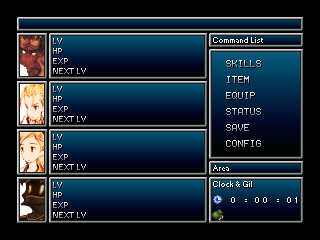
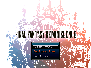
Don't know what to do about the facesets. I think I'm gonna try a CBS. I'll have screens on that eventually. The game is no longer isometric. I ended up having too much "Asian" stuff, and I'm staving what I've got for something else. :|
Post by: Meiscool-2 on March 29, 2007, 03:12:49 AM
Post by: Dragoon de Sol on March 29, 2007, 03:16:33 AM

Hiten Mitsurugi Style! Ryu Sho Sen!
Post by: Meiscool-2 on March 30, 2007, 06:53:54 PM
Post by: Dragoon de Sol on March 30, 2007, 08:12:06 PM
The Kenshin is from Jump Superstars, as is the faceset. The Gohei is editeed form some big guy from Jump Superstars, and I've recolored them both to SNES quality, since I enjoy the nostalgia.
Post by: aboutasoandthis on April 01, 2007, 02:55:53 PM

As for what kind of CBS it is, it's based off of Star Wars: Knights of the Old Republic and Final Fantasy 12.
I just wanted to know if the interface looks good. I think I'm gonna stick with it. Comments?
Oh, and when you select an action, the name of it appears over your ATB bar. That's why they are down lower than the numbers.
Post by: Meiscool-2 on April 01, 2007, 07:31:35 PM
It looks good though. I've never been a fan of such dark colors, but all your colors seem to work well together. Also, what about MP?
While we are on the subject of HUDs.....
Post by: Bluhman on April 01, 2007, 08:54:01 PM
Post by: aboutasoandthis on April 01, 2007, 08:55:03 PM
About my HUD, what you mean cut off? It's a 320*240 picture. I admit, I'm using the "Set Event Place" command to squeeze 4 sets of numbers into 3 spaces though.
Post by: drenrin2120 on April 02, 2007, 03:15:40 AM
Meis: You make those screens? Very impressive, though that red is just blinding and bad.
Post by: Meiscool-2 on April 02, 2007, 03:37:48 AM
Quote
Originally posted by aboutasoandthis
About my HUD, what you mean cut off? It's a 320*240 picture. I admit, I'm using the "Set Event Place" command to squeeze 4 sets of numbers into 3 spaces though.
Well, when I play my rpg maker 2003 in full screen, it cuts off 5 or 6 pixels from each side. I thought that's how everyone's was. :p
As to the red, I guess I should've pointed out that that's the tranparent color the picture uses, I just don't have a suitible background yet.
Post by: Oceans Dream on April 05, 2007, 04:41:06 AM
@aboutsoandthis: Nothing really to critique, I like it.
@Meiscool: I like the borders, glad that the red isn't permanent. I personally think the sprites should stand out more, but I think you did say you were changing the background.
Something I'm working on while on Spring break: The purple hair girl is Vivian, the brown hair girl is Sabrina. They're at the Volleyball area they and their friends set on the beach. The sprites are custom, everything else is Sword of Mana.

And testing out the message box (Posted because Meiscool wanted me to)

Post by: Arcanagirl on April 05, 2007, 04:46:21 AM
Post by: Meiscool-2 on April 05, 2007, 04:51:37 AM
Quote
Originally posted by Oceans Dream
@Meiscool: I like the borders, glad that the red isn't permanent. I personally think the sprites should stand out more, but I think you did say you were changing the background.
Thankye. Also, I'm glad you don't think the sprites stand out. Sorta unorthadox, but I like my colors to be the same for everything. Charasets, animations, chipsets, ect. Thus, the color I would use for grass, I would also use for a green shirt. Just a slightly different color in the event that the shirt is next to the grass. I guess I'm just writing this because you're the first one to comment on the sprites :P
Quote
Originally posted by Oceans Dream
Something I'm working on while on Spring break: The purple hair girl is Vivian, the brown hair girl is Sabrina. They're at the Volleyball area they and their friends set on the beach. The sprites are custom, everything else is Sword of Mana.
Nice. You should show that other screen with the cool message box too. I liked that.
Post by: Oceans Dream on April 05, 2007, 05:52:42 AM
Quote
Originally posted by Arcanagirl
Oooo I like that screen Oceans, I think the character sets blend nicely here. I am impressed by your custom characters. :flower:
Thank you!
Quote
Originally posted by Meiscool
Thankye. Also, I'm glad you don't think the sprites stand out. Sorta unorthadox, but I like my colors to be the same for everything. Charasets, animations, chipsets, ect. Thus, the color I would use for grass, I would also use for a green shirt. Just a slightly different color in the event that the shirt is next to the grass. I guess I'm just writing this because you're the first one to comment on the sprites :P
I see. Personally, I like sprites to stand out so that you can easily see them, but I see what you mean by this.
Posted the other screen above. :jest:
I just need to animate the side poses for those 2 characters and they're finished with their walking animations.
Post by: aboutasoandthis on April 05, 2007, 12:42:29 PM
And I like your sprites.
Post by: ImmortalDreamer on April 05, 2007, 12:49:31 PM
Quote
Originally posted by Oceans Dream
Awesome screens on this page!
@aboutsoandthis: Nothing really to critique, I like it.
@Meiscool: I like the borders, glad that the red isn't permanent. I personally think the sprites should stand out more, but I think you did say you were changing the background.
Something I'm working on while on Spring break: The purple hair girl is Vivian, the brown hair girl is Sabrina. They're at the Volleyball area they and their friends set on the beach. The sprites are custom, everything else is Sword of Mana.
And testing out the message box (Posted because Meiscool wanted me to)
Your games always look so bright and happy. Its a nice change from most RPGs.
Post by: Oceans Dream on April 05, 2007, 05:06:38 PM
Here's the chipset, you can steal the tree from there:

Post by: aboutasoandthis on April 05, 2007, 06:32:57 PM
Post by: Meiscool-2 on April 05, 2007, 07:10:46 PM
Quote
Originally posted by aboutasoandthis
Thanks!
In regards to the PM you sent me, your box is full, so if you want a reply, delete a few PMs.
Post by: aboutasoandthis on April 05, 2007, 07:21:32 PM
Post by: Oceans Dream on April 06, 2007, 01:03:20 AM

Post by: Meiscool-2 on April 06, 2007, 01:24:46 AM
Post by: Oceans Dream on April 06, 2007, 01:45:05 AM
Thank you, just fixed it. Good thing I didn't make that many items yet!
Post by: Arcanagirl on April 06, 2007, 09:01:04 PM
Post by: macubex on April 11, 2007, 02:00:57 AM

Post by: Meiscool-2 on April 11, 2007, 02:07:53 AM
Post by: macubex on April 11, 2007, 02:39:28 AM
Enough with the images, here's a movie!
http://www.youtube.com/watch?v=s590YpmzqFU
Post by: Meiscool-2 on April 11, 2007, 03:20:50 AM
I'll watch the movie tomorrow, it's late here and I'm going to bed :P
Post by: aboutasoandthis on April 11, 2007, 10:22:49 PM
So I made this concept screen. Linkforce already saw it and liked it. I'm not too sure about the mapping, and it'll probably change soon. The map is bigger ingame, and the graphics overall look better ingame.
Hopefully I can finish this. XD
Post by: Meiscool-2 on April 12, 2007, 01:15:38 AM
EDIT: By lighter, I mean more transparent.
As to the recently posted movie, that's cool. The abilities and stuff could make for some interesting dungeons. The movie itself was bland though, seeing as there wasn't much purpose in it other than showing the three skills.
Post by: aboutasoandthis on April 12, 2007, 08:41:18 PM
Edit: I mean, I admit the screenshot is a little hard to look at, but the overlay is too important to change. It's not that there is a big, shiny light coming from the mermaid. It's that without the mermaid you cannot see, at alll... It's an important part of the game.
I've made several overlays, and done a lot of tests throughout the day. This is the one I've settled on. If my beta-testers have complaints too, only then I'll change it.
Post by: Meiscool-2 on April 15, 2007, 07:29:26 PM
Also, everything in the screen (other than the waterfall, fish, and hero) is a part of the chipset. Water/weeds/grass animates via "sub tile" command.
Post by: Ben on April 15, 2007, 07:44:21 PM
I like it better than your other maps for some reason.
I quite like the waterfalls, and would like to see it animated.
I wish you used XP, and we traded chips like dorky...um....dorks.
Post by: A Forgotten Legend on April 15, 2007, 07:53:11 PM
I love it. I like the chipset. :) How did you make the waterfall?
Post by: aboutasoandthis on April 15, 2007, 07:59:43 PM
My only gripe with it would be that the hills are a little too orange.
My game may not be isometric anymore, but I've taken what I've learned and tried to make new chipsets with it. I'm surprised with what I've come up with.
It's no where near finished, but I think it looks cool. I'm working on finding matching stuff to put in it. The shadows are set up like Mac & Blue and Theodore. It even has lights even though I don't show them.
Post by: Meiscool-2 on April 16, 2007, 12:27:18 AM
A Forgotten Legend: The fronts of the waterfalls (the stuff you can actually see) is a charaset based on a rip from SD3. The side and backs of the waterfalls are sorta mini-customs based off of one of the rudra water tiles.
Post by: Dragoon de Sol on April 20, 2007, 10:15:48 PM
Please do not rip from the screens.
EDIT:
I tried posting an image, but it kept getting resized.
Post by: Meiscool-2 on April 23, 2007, 03:01:30 AM
Also, is the beackground animated durring the charge up? It looks like it's in the same place in each screen.
Post by: Dragoon de Sol on April 24, 2007, 01:25:39 AM
I love the nostalgia of those kind of graphics, so I made them that way ^^.
As for the background, I've already fixed that.
Post by: *-^-CociCookie-^-* on April 24, 2007, 06:10:33 AM
Post by: omegarirue on April 27, 2007, 08:11:30 PM
Quote
Originally posted by Meiscool
New chipset stuff I've been screwing with. Still have a bit to add, like a waterline and such.
Also, everything in the screen (other than the waterfall, fish, and hero) is a part of the chipset. Water/weeds/grass animates via "sub tile" command.
you never cees to amaze me. It's ripped from tresure of the rudras but how do you do such good ediating? I can't rip those house tile, you made the cliffs sunsety and under water ones to which is what I'm trying to do right now with my rips. I know I'm not on your best list but could you put those house tiles and rocks on a seprate chipset and Pm it to me. You'll get full credit. (how do you spell cees?)
Post by: Dragoon de Sol on April 27, 2007, 08:42:25 PM
Quote
Originally posted by *-^-CociCookie-^-*
Cool screens. But on an off topic note you spelt it miraigaming, it's miraigamer.net :P
Actually, no, it's not.
Post by: A Forgotten Legend on April 27, 2007, 09:58:16 PM
Quote
Originally posted by omegarirue
(how do you spell cees?)
Cease maybe? Or is that a different word?
Can anyone tell me a good free program to record your screen? I want to record the choreography for a scene in my game for you people to watch.
Post by: Ben on April 27, 2007, 10:04:27 PM
Quote
Originally posted by aboutasoandthis
I think I see where gemini is coming from. This map looks open-spaced, yet full.
My only gripe with it would be that the hills are a little too orange.
My game may not be isometric anymore, but I've taken what I've learned and tried to make new chipsets with it. I'm surprised with what I've come up with.
It's no where near finished, but I think it looks cool. I'm working on finding matching stuff to put in it. The shadows are set up like Mac & Blue and Theodore. It even has lights even though I don't show them.
Dude....you know what would like...put the icing on the cake? The tiles are drab. I like em. But a tin screen command with the saturation level down a few points...
It wouldnt be very dramatic...But it would make the Sprite blend in even better. I really like these tiles though. It looks great as is. Id like to see a finished map with these. You win.
Post by: aboutasoandthis on April 27, 2007, 10:14:55 PM
Edit: Maybe not. I'm actually going for rich in color and not drab. I don't want my game to look depressing.
When I said "set up like theodore and refmap," I mean't how the tiles were arranged on the chipset.
(What I use is stolen, so it takes a while to do anything good though. Otherwise, it's like iDraw.)
Come to think of it gemini how do you usually pic colors? I like to fill my chipsets up with little detail sprites, but I can't really get them to match.
I'll post some new screens soon. I just need help on tat.
Post by: Ben on April 27, 2007, 10:39:40 PM
Another big thing I do is never use Black. Never pure black. The closest thing to black I use is a Deep greyed Blue or brown, and then if the time comes that I ever need to use the colour black, it has much more dramatic effect, and stands out way more.
But yeah....Muted pastels dude. Then you can pull off Bright colours, or drab overcast.
Then if your grapics are even super cartoony, you can make the lighting look authentic to some extent.
EDIT: I havent posted much here lately. Ill show you later
Post by: Meiscool-2 on April 27, 2007, 11:39:53 PM
I'd like to release them to the public, but I know they'd be gobbled up instantly.
Post by: aboutasoandthis on April 28, 2007, 01:02:15 AM
But everything else is just peachy. I love the inside screen.
Post by: Bluhman on April 28, 2007, 02:13:10 AM
Post by: A Forgotten Legend on April 29, 2007, 01:15:40 AM
The room looks great too.
The second battle screen looks neat too. (although at first I thought the one tree was attached to the guy)
The other maps look like all you other maps, so I have nothing else to say.
(I didn't mean that in a bad way! :blue-eye: )
Post by: Oceans Dream on April 29, 2007, 02:56:47 AM
Post by: A Forgotten Legend on April 29, 2007, 05:52:35 PM
(Laugh at the name, its all I could think of!!!)
Its Foretra.
Yeah... anyway...
Post by: Moosetroop11 on April 29, 2007, 07:59:44 PM
Post by: Bluhman on April 29, 2007, 08:03:39 PM
As far as I'm concerned with MT11's comment, he's right. Must be the result of too much praise, eh? But really, I think your mix of M&B and those other sets doesn't work too well. Also, there's this random darkened band in the middle of one of your maps, which doesn't make much sense.
Post by: Pixelmaster on April 29, 2007, 08:58:06 PM
Post by: drenrin2120 on April 30, 2007, 12:07:10 AM
Post by: aboutasoandthis on April 30, 2007, 12:51:50 AM
Like, you used the color of the Rudra's Treasure wood, and recolored the Seiken Densetsu (sp?) tables and beds to match it to force them to match. The Mac & Blue tents, Rudra houses, and the SD sand being all the same color, next to the bright and shiny colored stuff (Plants, mountains) look bad to me.
In that sunny, cliff area you posted earlier with the orange hills, I noticed you used the same color as the mud.
Your maps themselves look fantastic, but the colors don't blend. Instead of taking surrounding colors, I think you should find matching colors instead. I'm using this thing
http://hlrnet.com/colormatch/
and some help sites. I coud even edit some of your chipsets if you want. I've gotten better.
Still not done with my chipsets...Taking so damn long.
Post by: Meiscool-2 on April 30, 2007, 03:49:02 AM
Ocean: Yeah, the red is just the background color untill I find something I like. I typically use red or pink as my background colors in paint.
Pixelmaster: The charlotte sprite is at The Spriters Resource. The Soma one is mine. No, you can't post in my topic because I don't really have one.
About: Yeah... I use the same colors for pretty much everything. Most my rocks/cliff faces have the same colors, most my water is the same, most my plants/flowers use the same greens, my bushes and trees all have the same colors, and everything wooden uses the same colors. I really don't think finding new colors will help with the difference in style between the game's spriting. Also, it appears you like drab more than vivid, so there's a clash of interests.
As to the clutter thing... I really don't map for games anymore. I just map to make cool looking places, and typically open space doesn't reflect the look of "awesome". Once I'm finished with a bunch of my edits, I'd like to put them all in a thread and show a few example screens of how they could be used here and there.
I'm gonna try to go on to making my own XP chipsets and scripts. Hopefully, it will be more fun than 2003, because I'm kinda feed up with that :p
Post by: aboutasoandthis on April 30, 2007, 08:41:11 PM
Quote
Also, it appears you like drab more than vivid, so there's a clash of interests.
I no can do bright n pretty colors? :(
Post by: Dele on May 01, 2007, 06:41:55 PM
I'm not exactly the best mapper I admit. In fact I would rather work on events, stoyline, and the database itself than the actual mapping itself. But since I'm doing it all myself I have no choice. :s
Anyways here's a map from my game. I think this is how you guys throw your screeny's together didn't bother to look that far into detail. :P

Not the best mapping I know. It's the entrance to an underground temple which extends into the mountains. I plan to make the area a mix between the temple, and an outdoor mountainy area where you can see the town below. Sounds intresting to me. :D
Post by: Meiscool-2 on May 01, 2007, 11:04:28 PM
Quote
Originally posted by aboutasoandthis
Originally Posted by MeiscoolQuoteAlso, it appears you like drab more than vivid, so there's a clash of interests.
I no can do bright n pretty colors? :( [/B]
XD No, I've just noticed you work with more realisitic colors like Theo and FF6, that's all :p
Post by: Dele on May 02, 2007, 12:00:15 AM
Quote
Originally posted by Meiscool
It looks quite good. I would change some of your events though. The statues, door, and painting have very different colors that look kinda odd.
I noticed that too this morning. I'm currently trying to see if I can bring the brightness and contrast down on the charsets themselves to make it sorta match the interior a little better. Hopefully it'll help but I got sidetracked so I havnt had a chance to try yet. ^^;
The wall inside the building seems kinda bland too but I'm short on ideas right now so I'll come back to it later. I'm not sure what I want to do with it yet...
Post by: aboutasoandthis on May 02, 2007, 01:53:01 AM
My only suggestion would be to change the shadow flooring. I never liked that part of the chipset. Maybe refilling it while holding the shift key to get rid of the shadows?
Post by: Dele on May 02, 2007, 02:26:35 AM
I probably will just edit it out manually, it is rather annoying.
Post by: A Forgotten Legend on May 02, 2007, 10:32:39 PM
Question already asked: Anyone know a good program to make demo videos and stuff with? Downloaded one and it sucks. It slowed the computer down so much it the game didn't run well at all.
Post by: Ben on May 02, 2007, 10:51:10 PM
But once I converted them to XP size and format, the converter I was using sucked, and It wouldve been another 2 hours of editing per chipset. This made me sad. Because I love those sets. Especially for dungeony feeling of happy good time.
Yeah. It was a bummer. I love your chipset edits.
Post by: Dele on May 05, 2007, 08:00:22 AM

I might throw a few different grasses along the way to fill up the green spots though. Other than that... perfect. (the bottom part looks strange because I didn't make the panorama loop so it kinda didn't wanna screenshot too great. Looks good ingame though.
Post by: A Forgotten Legend on May 06, 2007, 02:43:09 AM
Quote
Originally posted by A Forgotten Legend
Question already asked: Anyone know a good program to make demo videos and stuff with? Downloaded one and it sucks. It slowed the computer down so much it the game didn't run well at all.
....third times the charm?
I made this interior from a a ff chipset mixed with an RTP...
this would be the inside of the last building on the right in my earlier town map.
Post by: Ben on May 06, 2007, 03:02:30 AM
I think the map would be waaay more awesome if you had more underwater stuff
Post by: Dele on May 06, 2007, 07:09:41 AM
AFL- looks good but I'm not a fan of the inside + outside houses in the same map. ussually I separate them but hey, it's your game do what you want make it look the way you want it to look. :)
Just to clarify, the original panorama I was going to use for the bottom was this, however it was not the right format so when I changed it to the proper format, it came out rediculously dark and I had to get rid of the clouds. :(

Post by: A Forgotten Legend on May 06, 2007, 09:33:25 PM
I wanted to see if I should use the inside being able to see outside or just the inside with black all around it.
...I guess third time wasn't the charm.
Post by: ellie-is on May 06, 2007, 11:34:10 PM
AFL: Try to use a better chipset. :D You should make the house a little bit smaler too. And I am not a big fan of inside-outside too.
I took whole 5 minuts to make the attachment.
Post by: coasterkrazy on May 07, 2007, 01:04:24 AM
Post by: ellie-is on May 07, 2007, 11:43:00 AM
Post by: ZeroX5 on May 09, 2007, 01:11:18 PM
whatever...
I'm back O: and a new project
I think my mapping got better and... here's a little screen of my village. But the map isnt finished.

Post by: Ben on May 09, 2007, 01:34:43 PM
Quote
Originally posted by lucas_irineu
Dele: Make the clouds more transparent.
AFL: Try to use a better chipset. :D You should make the house a little bit smaler too. And I am not a big fan of inside-outside too.
I took whole 5 minuts to make the attachment.
This screenshot made "Grandma" by kind diamond come to mind.
GRAAAAAAANDMAAAAAAAAAAAAAAA
my moustache tickles with awesomnessticity
Post by: Dele on May 09, 2007, 08:12:32 PM
Post by: A Forgotten Legend on May 10, 2007, 10:09:26 AM
Looks like a nice screenshot.
(That earlier screenshot, the chip was my second attempt at mixing some chipsets... and I guess I didn't do too well...)
Post by: ZeroX5 on May 10, 2007, 12:53:59 PM
@dele no the map is bigger, the screen is only a part of the map.
@AFL Im not ZeroKirby :D
edit: ah sry dele i know now what do you mean...
http://mugen.otaku-love.de/Dorf.JPG <--- how does it looks now O:
I hope you all like my mapping, i try to make a sound effect into the game.
I mean... if youre stand next to a waterfall, the sound is loud, but if youre far from the water the sound is more quieter
(man I think my english very bad at this moment lol....) I hope you get it?
Post by: A Forgotten Legend on May 10, 2007, 09:13:48 PM
Post by: Dele on May 11, 2007, 08:03:00 AM
Quote
Originally posted by ZeroX5
thx u two.
@dele no the map is bigger, the screen is only a part of the map.
@AFL Im not ZeroKirby :D
edit: ah sry dele i know now what do you mean...
http://mugen.otaku-love.de/Dorf.JPG <--- how does it looks now O:
I hope you all like my mapping, i try to make a sound effect into the game.
I mean... if youre stand next to a waterfall, the sound is loud, but if youre far from the water the sound is more quieter
(man I think my english very bad at this moment lol....) I hope you get it?
Ahh yes that's much better thank you. As for the waterfall part are you using a variables system to make a range or just throwing switches and slowly fading it in chip by chip?
And AFL the map looks good, but it doesn't stand out much, not sure why just can't put my finger on it. Maybe adding another elavation insted of just 1 flat spot. (That's what I do when my maps seem bland, throw an extra level on top of it haha.)
Post by: ZeroX5 on May 11, 2007, 09:52:37 AM
Quote
Originally posted by Dele
Ahh yes that's much better thank you. As for the waterfall part are you using a variables system to make a range or just throwing switches and slowly fading it in chip by chip?
And AFL the map looks good, but it doesn't stand out much, not sure why just can't put my finger on it. Maybe adding another elavation insted of just 1 flat spot. (That's what I do when my maps seem bland, throw an extra level on top of it haha.)
Yea, i make a range but with switches, but ... i think with variables are more easier... hm... O:
@AFL looks good but its a little empty for me. Mabye you can add some grass or something like that.
Post by: Ben on May 16, 2007, 07:20:42 AM
while waiting for a ten slot equip script to be made compatible with my system...
Ive been making my town map into the ultimizzle.
F'rizzle.
I had a script made for sprite colour and tint screening for lighting effects.
Ive also Been making a tonne of interior maps, and eliminating the HUGE AMOUNTS of lag via scripts, clever eventing and breaking up maps. Im proud of the map transitons. Flawless scrolling. Ive got 4 maps and in game you would never know that it wasnt one huge one.
But I cant show you the coolest stuff. So heres a screenie of my light effects in use with my Custom RTP edits and my very own gemini sprites.
Im debating an overlay...Like...round line of vison style. The lighting wouldnt be affected by it either...But Im afraid it may be too much nnight time.
Anyways...
EDIT: Still trying to find a way to fix the light overlapping the posts. The ground light has no scripting, but the lamp does.
Perhaps if I jack up the priority on the posts...but that could mess me up in otherplaces.
tips?
EDIT EDIT: Im probably just going to make new lighting sprites for my lampposts.
Post by: Dragoon de Sol on May 17, 2007, 12:51:10 AM
Guardian Video (http://youtube.com/watch?v=pymqOQbdF_w)
Post by: Meiscool-2 on May 17, 2007, 01:39:19 AM
Dragoon: Nice work. Might get boring if you can only have one character at a time, but looks cool thus far. Ygadra Union (sp?) sprites are cool, but I havn't found anymore than the ones you've shone, the Valk and the Bandit. If you know of more, please let me know :)
Just Communication is a cool song too, though other Gundam Wing stuff is better.
Not much into making rpg maker stuff now. Kinda screwing around with other things, random art and the such.
Hence:
Fire Emblem Edits and Customs. Male and Female fencers. I'll probally make a little sheet for the both of them, maybe 9 or so frames.
Any good?
Post by: Dragoon de Sol on May 17, 2007, 01:50:13 AM
And as for battles, they wont be cause via enemies on the map or random battles.
All battles take place in the story. It forces the character to spend their Life Points wisely.
Post by: Ben on May 17, 2007, 08:18:45 AM
Also, A Day-time shot to illustrate the contrast. And some close ups of the changes. And the Sign sez "Bitches"
Post by: Ace of Spades on May 18, 2007, 01:30:00 AM
Post by: Ben on May 18, 2007, 07:05:52 AM
Post by: Meiscool-2 on May 20, 2007, 04:55:47 AM
Also, I really don't think people will care all that much about the lightness of grass in places.
Remember, if you make some shadows, you'll probally have to end up making shadows everywhere.
Post by: A Forgotten Legend on May 23, 2007, 12:15:21 AM
Post by: Linkforce on May 23, 2007, 12:21:19 AM
Post by: Meiscool-2 on May 23, 2007, 02:04:03 AM
Post by: Linkforce on May 23, 2007, 02:44:03 AM
Quote
Originally posted by Meiscool
Yeah, you should look at some of Linkforce's screens. He uses that same chipset you use (or one very similar) very well, and you could learn a lot from looking at his interiors.
:]] Thanks Meis.
But yeah, I have learned to use those chipsets to their full abilities. If you'd like me to post some examples of my inners, just let me know. Or, check out my game thread. Either or.
Post by: zuhane1 on May 23, 2007, 08:17:18 AM
Quote
Originally posted by Meiscool
Hmm, really, I just wanna know if the overlay is too strong or not. Note, this isn't the kinda overlay that sticks on your map like a frame, you can actually walk and the shadows will stay in place.
Dude, where did you get that chipset? How did you add the shadows? You are genius.
Post by: zuhane1 on May 23, 2007, 08:38:04 AM
Quote
Originally posted by drenrin2120
Here's a new pic of my favorite place in Wizen Heights.
I need tips for what I can do to this palce to make it better. I've got butterflies, Brids, and monsters that run around. But it's lacking something, something to make it stand out.
A purple, orange, pinky-green sunset in the distance. It would just set the mood perfectly.
Post by: Meiscool-2 on May 25, 2007, 10:14:34 PM
Try to make your comments on the higher page numbers from now on :)
Post by: A Forgotten Legend on May 26, 2007, 01:40:19 PM
Anyway. I decided to use FSM stuff, and some other stuff I've found that looks FSM-ish... anyway... here's a screenshot of that one room with a bit o' text that i was going to post a long time ago...
(Things changed since this screen: Text font, where the teddy bear is, and I think thats it...
Post by: game_maniac on May 27, 2007, 11:00:12 AM
Btw, I think you should get a new font, that one looks too mashed and hard to read. I actually thought he was saying "fell her" instead of "tell her".
Post by: Meiscool-2 on May 27, 2007, 04:19:25 PM
Post by: game_maniac on May 27, 2007, 04:32:05 PM
Post by: A Forgotten Legend on May 27, 2007, 05:10:43 PM
Does anyone have the font patch? (RPG Advocate version)
Thanks. I posted a different version of the map with the different chipset with no message box, but all you're missing is some empty space. :)
Post by: Meiscool-2 on May 28, 2007, 11:54:30 PM
A site with "Crank" in the url will have what you are looking for.
Post by: Dragoon de Sol on May 29, 2007, 12:57:37 AM
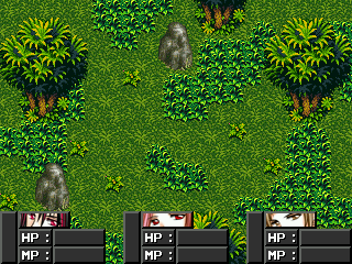
This is something I've been messing with.
It's not much yet, but I'm posting on opinions of what style of graphics to use. I was thinking of Rudra or even Minish Cap graphics. Any suggestions?
Post by: Meiscool-2 on May 29, 2007, 02:35:51 AM
As to the hud, a little more design than just a plain color might be nice. Also, a bit of trans would be cool as well.
Ummm, you can't post that link because it has downloads to RPG Maker. That's the reason I didn't put the link in my above post.
Post by: aboutasoandthis on May 29, 2007, 02:39:32 AM
Enterbrain Add-On
Rudra's Treasure
Final Fantasy 1 & 2
Bahamut Lagoon (With Effort)
Seiken Densetsu
Terranigma
Pokemon
Secret of Mana (Certain Sets)
Theodore/Refmap/Zelda should each be left alone as they don't seem to match anything...
The chipsets I'm making use the topset. I've been working like hell on them and yet I can't make screens...
Post by: Meiscool-2 on May 29, 2007, 02:50:05 AM
Post by: Dragoon de Sol on May 29, 2007, 03:04:39 AM
@Meiscool: I was actually referring to characters to use in battle
@aboutasoandthis: I've copied the list and I plan on looking at each tomorrow after school
Post by: Meiscool-2 on May 30, 2007, 02:26:12 AM
Post by: Dragoon de Sol on May 30, 2007, 02:30:27 AM
Post by: drenrin2120 on May 31, 2007, 01:09:07 AM
Post by: aboutasoandthis on May 31, 2007, 01:38:04 AM
Do you want me to recolor it for you? (I'm kinda bored, and it's easier than it looks.)
Post by: drenrin2120 on May 31, 2007, 01:40:32 AM
Post by: aboutasoandthis on May 31, 2007, 01:55:11 AM
Edit: It still kinda stands out. I might do something like blur it tommorow.
I thought I'd show a screen of that inside chipset I posted a while back. I'm not finished, nor pleased. Some of the golds stand out, and it's lacking "stuff." I'm getting there.
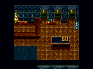
Wait till you see my outdoor chipsets and my CBS. ^ ^
Post by: drenrin2120 on June 01, 2007, 03:17:34 AM
Post by: Dele on June 03, 2007, 06:56:39 AM
(I'm actually just looking for some new ideas lol, gamers block.)
Post by: aboutasoandthis on June 05, 2007, 02:13:05 AM
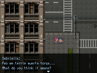
The pink haired one is the chick because I say so. ;P
Post by: Meiscool-2 on June 07, 2007, 05:45:48 PM
Any of that chipset custom?
Post by: aboutasoandthis on June 07, 2007, 05:53:52 PM
The building to the left is an RMXP tileset resized. I only make chipset edits. I find sprites and textures.
I don't make original chipsets. (At least not yet.) *lightning strikes*
Post by: Linkforce on June 11, 2007, 10:32:49 PM
Old:
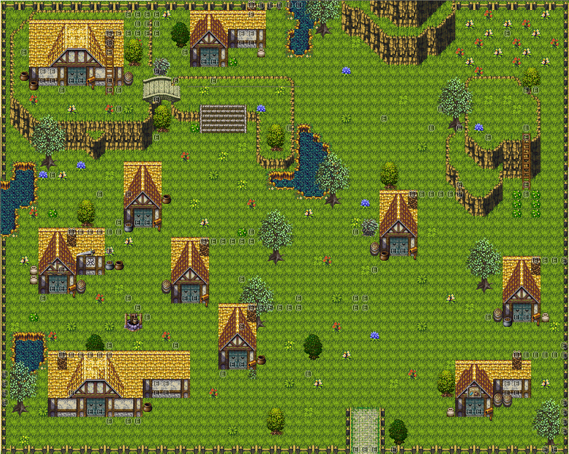
New:
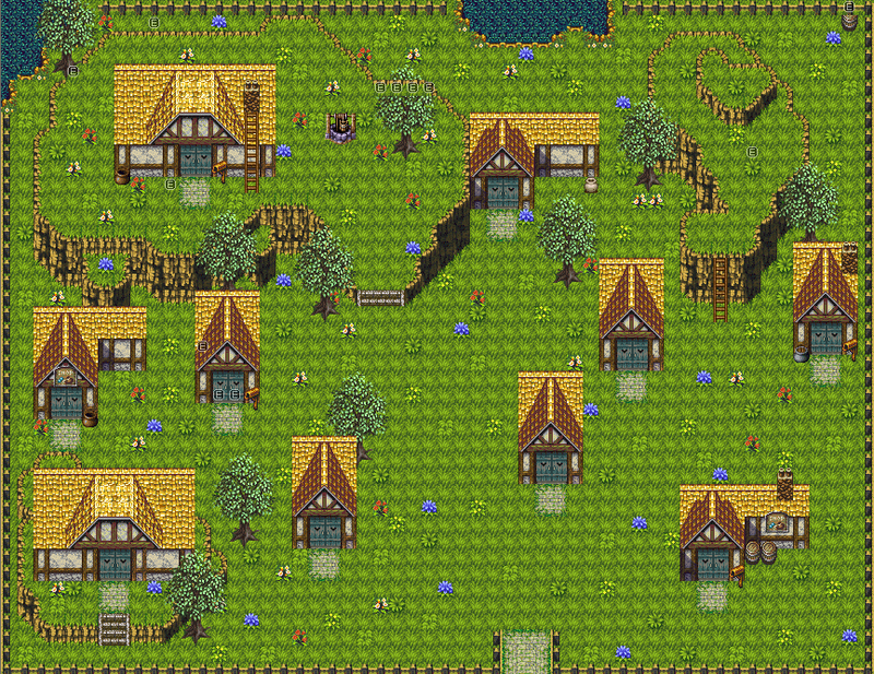
(Not completely edited though.) (A.k.a. trees, etc.)
Post by: Meiscool-2 on June 12, 2007, 02:03:15 AM
However, I think you still have too much open space. Also, the autotile you used for stones doesn't match up with the grass autotile.
Post by: Linkforce on June 12, 2007, 02:21:47 AM
Post by: Meiscool-2 on June 12, 2007, 03:50:50 AM
Post by: Dragonium on June 12, 2007, 09:45:30 AM
The ballistae are mine. ^_^
Also, those events on the trees are layering, in case you were wondering.
Post by: drenrin2120 on June 12, 2007, 05:14:12 PM
Well, I got an experiment of my own. Just a chipset compilation. I'm gonna be experimenting with water events later and stuff, but for now, I'm just trying to get things that match.
Post by: aboutasoandthis on June 12, 2007, 05:19:02 PM
BTW, I love the ballistae. It might make a little more sense to put them over every entrance though.
I was coding my game, and I made another concept screen. You like?
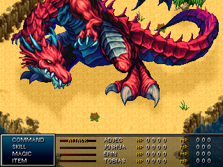
I know the map behind it is a little plain. My game plays sortof like an abs and I want to keep it open. I've got a ways to go, but I want my game to look exactly as above.
Just now noticed Dren. The cliffs actually look nice. I'd just change the log to Theodore's log instead of a Mac & Blue one.
Post by: drenrin2120 on June 12, 2007, 05:38:37 PM
Oh, and about your map. It's cool and all, the colors blend well and look nice, but I don't see how your ABS is going to work.
Post by: Dragonium on June 12, 2007, 05:44:58 PM
Quote
Originally posted by drenrin2120
Hey, that's pretty nifty. maybe add a shadow affect under the fortress, it looks kinda odd all bright and stuff where the fortress looks like it goes over the ground. The big open space in the front is kinda odd too, needs something, not sure what. But so far, definitely looks great.
Heh, thanks. I would add some kind of shadow (Makes a lot of sense now you mention it), but of course iDraw doesn't work on Vista, and MS Paint severely restricts my spriting abilities. :|
That big open space is there since throughout the game there'll be various events taking place there outside the fortress, and there'd be too little space otherwise. I should've said.
But anyway, thanks for the feedback.
Dren, that set is awesome. I love those trees. I agree with aboutso though, that log looks like it doesn't match. Good so far though. :D
EDIT: Log is much better.
Quote
Originally posted by aboutsoandthis
Dragonium: To be honest, I've never liked that chipset. (srry meiscl...) The grass is too bright, the castle looks a little too muddy, and the Mack and Blue trees to the side with the color loss kindof hurt my eyes. I think that if everything in the screanshot came from Rudra's Treasure unedited, it would look better. I might do something like that later.
I've been wanting to do some serious recolour on the set actual. With no offence to Meis, the grass is just the wrong colour and it doesn't match the castle. I like the brown "muddiness" for the castle though, since it gives the "ruined" feel I'm after. But of course, I can't do what I want at the moment, since recolouring a an entire chipset in MS Paint is like redecorating the Sistine Chapel with a kid's painting set.
The ballistae were over every entrance, but:
a) It was a bit too much, if you get my meaning. Too cramped.
b) I was going to put some other things over the other entrances, namely a ladder in the centre and maybe something else.
Glad you like the ballistae though. :D
By the way, as to your screen, I like it. If you have lots of action going on you don't want the background to be too distracting, so simple means better. I fugging love that dragon by the way, although the bright red looks a little out-of-place. Just a personal opinion though.
Post by: drenrin2120 on June 12, 2007, 06:11:13 PM
Post by: Meiscool-2 on June 12, 2007, 09:16:35 PM
Post by: Roland_Deschain on June 13, 2007, 01:14:04 AM
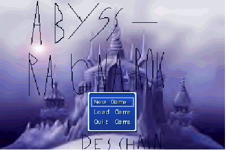
My title screen. Lettering's drawn in Coreldraw, but....
A bit of the beginning story.
A guy who's about to die says his last words....
Told ya....
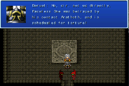
This guy needs a new face.
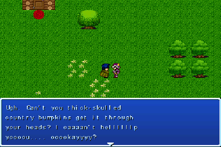
It looks like an RTP chipset, but it's not. I made it myself (kinda) in coreldraw!
So, yeah, advice 'n stuff.
~Deschain
Post by: Meiscool-2 on June 13, 2007, 04:09:59 AM
Roland_Deschain: You're screenshots are pretty distorted, and I don't feel like going through the effort of clicking on them and opening the link in a different window just to look at them properly. However, I can tell already that your map is FAR to open.
---~---~---~---~---~---~---~---~---~---~---~---~---
Before I posted all my chipsets, I was working on one final chipset that didn't have an example yet.
Here's what I've got of an example so far.
Post by: Dele on June 13, 2007, 04:42:55 AM

Edit: here's another.

This one is a puzzle, You have a limited time to touch the proper orbs by the colors the energy beams generate randomly.
Post by: aboutasoandthis on June 13, 2007, 02:58:32 PM
Dele: The first screen looks boring, but you've given me a chipset idea with the second screenshot.
Post by: Roland_Deschain on June 13, 2007, 05:03:25 PM
Post by: drenrin2120 on June 15, 2007, 01:47:19 AM
Post by: Dele on June 15, 2007, 04:19:25 AM
aboutasoandthis: Uhh, thank you I guess. =P The first screenshot the statues, when the switches are turned off the eyes are gone, when the switches are turned on the eyes light up. Other than that I couldn't think of too much detail for the map, the chipset I was using had little to work with as far as floor details go, but had alot of wall details so I tried to compensate by adding alot of statues candles and other figures and tiles onto the walls. I could probably add some more detail if I wanted to, but the tower itself is quite large (test playing it from the bottom to the top took me 3 hours once everything was created and completed glitch-free and whatnot) so it's hard to think of many unique ideas for each room or area of the tower. I tried to fill it with as many puzzles and things you can do on the side as I could think of to add length to the time spent in the zone. Worked pretty good actually.
If you have some suggestions as to how I could make it look a little better I'd gladly take some advice though. If you're willing to help I can post some other spots in that area that could use some work.
Edit: here's some more garbage screenshots of my game, don't expect much.
Murder?!

I really hate this map and everything about this area. I didn't want to use this chipset but it matched what I needed to get done.

This town is a little bit better done, but it's still nothing compared to the stuff you guys make.

(Inside the pub shown in the screenshot above) different bands play in this pub as you progress in the game.

Flashback scene of the final boss in my game and several key characters from the storyline. (Sorry I couldn't get the entire boss's face in the screenshot)

Faceoff with the final boss for the first time in his lesser form. Tillian wants to make a stand here and protect the main character with his life.

*Spoiler*
Supposed to be a serious cutscene where Naito falls from the top of the tower and dies. (Haha, a spoiler for a game that will never see the light of day. =P) It looks better in the game itself, I kinda caught it at a bad spot, the castle side looks more detailed below and above the spot in the screenshot and Naito is actually spinning as he falls lol.

May be bland and unenteresting but I've seen worse. =P
Post by: Moosetroop11 on June 15, 2007, 10:49:23 AM
It looks like one of my old games.
Post by: Dele on June 15, 2007, 03:46:16 PM
Post by: drenrin2120 on June 16, 2007, 01:37:38 PM
Post by: X_marks_the_ed on June 16, 2007, 02:24:50 PM
-I already know the picture covers Elder White's wing, the pictures there until...
-I actually implant the picture on the wall in the chipset.
-What people say is unreadable
-The room's not supposed to have windows or doors except for the exit.
-There originally is a grand door in the hallway below, but Monk Zephr opened it in this pic.
So, on with the suggestions/comments/insults.
Post by: ellie-is on June 16, 2007, 02:28:52 PM
Post by: *-^-CociCookie-^-* on June 16, 2007, 02:41:00 PM
Wow, first post in..... AGES!
Post by: Dele on June 16, 2007, 02:46:41 PM

Post by: Martiz on June 20, 2007, 01:54:08 PM

P.S.: I know it isn't the best
Post by: Roland_Deschain on June 22, 2007, 06:15:36 AM
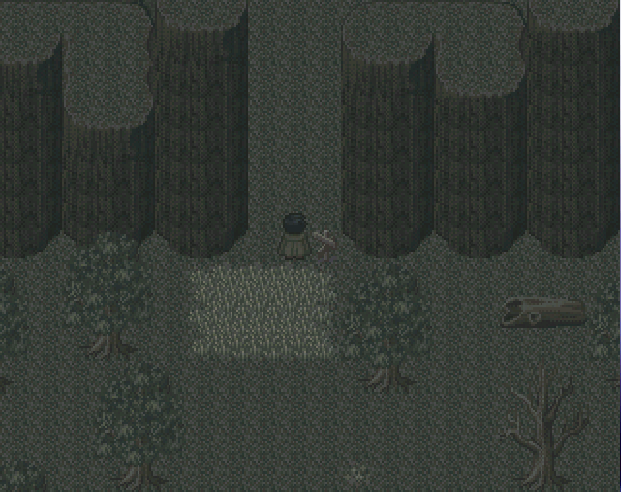
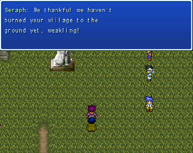
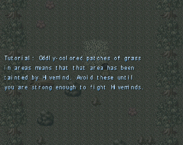
I'll post better screens soon, these were for the games thread as a preview.
Post by: ellie-is on June 22, 2007, 12:54:35 PM
Post by: Roland_Deschain on June 24, 2007, 03:46:25 AM
Post by: Meiscool-2 on June 24, 2007, 03:55:26 AM
If you're going to show a plain with just one grass tile and a few random things here and there... don't. Anyone can do that.
Quote
Originally posted by Martiz
P.S.: I know it isn't the best
For being RTP, that's a pretty cool way of using it.
Post by: A Forgotten Legend on June 24, 2007, 10:51:17 AM
Quote
Originally posted by Meiscool
Roland_Deschain... don't use your game's storyline to try and pass off why something should look undetailed and effortless. I mean, the screens look fine, the top one is better than most the others things I've seen by you, so that means you're improving; but I hear the whole "The map is suppost to be plain" all the time.
If you're going to show a plain with just one grass tile and a few random things here and there... don't. Anyone can do that.QuoteOriginally posted by Martiz
P.S.: I know it isn't the best
For being RTP, that's a pretty cool way of using it.[/B]
:o
Post by: Roland_Deschain on June 24, 2007, 07:13:54 PM
Quote
Originally posted by Meiscool
Roland_Deschain... don't use your game's storyline to try and pass off why something should look undetailed and effortless. I mean, the screens look fine, the top one is better than most the others things I've seen by you, so that means you're improving; but I hear the whole "The map is suppost to be plain" all the time.
If you're going to show a plain with just one grass tile and a few random things here and there... don't. Anyone can do that.
I'd actually LIKE to improve the map, but I can't find a good forest set that looks, well, less natural. As for the one plain tile, it SHOULD NOT exist, and I don't know how the hell it got there. The grass isn't supposed to be that.
As for "supposed to be plain," it's not. I'd really like to put more detail in. So far, honestly, I've been putting more effort into the story than maps, I'm afraid. But that's done now and so I'm back to improving the maps.
BTW, here's the chipset I used for the forest if anyone can give me a suggestion as to what I can do to put in more detail.
Post by: aboutasoandthis on June 25, 2007, 02:02:05 AM
Post by: Meiscool-2 on June 25, 2007, 02:13:45 AM
Post by: Roland_Deschain on June 25, 2007, 02:44:41 AM
Post by: Dragoon de Sol on June 25, 2007, 09:35:09 PM
The Jump system in action ^^
Post by: Roland_Deschain on June 26, 2007, 12:42:50 AM
Post by: Dragoon de Sol on June 26, 2007, 12:56:00 AM
Post by: Roland_Deschain on June 26, 2007, 02:10:44 AM
Maybe posting a less blurry shot would help. I don't know, maybe my computer just sucks.
Also, I recommend using a tiny bit less smoke and dust. It kinda looks like the ground exploded...
Post by: Dragoon de Sol on June 26, 2007, 02:15:06 AM
Post by: Roland_Deschain on June 26, 2007, 02:17:01 AM
Post by: Dragoon de Sol on June 26, 2007, 02:40:42 AM
Post by: drenrin2120 on June 28, 2007, 03:11:25 AM
Post by: Dele on June 28, 2007, 01:37:43 PM
Post by: aboutasoandthis on June 28, 2007, 02:46:59 PM
Post by: drenrin2120 on June 29, 2007, 04:44:34 AM
To About: Well, it has to do with the setting, which is post Nuclear Holocaust, so those are kind of leftovers of what once was and the normal fencing is what's being rebuilt.
Post by: Rowan on July 01, 2007, 05:40:58 PM
Post by: Martiz on July 02, 2007, 03:12:24 PM
There's "nun" written on the trucks :D
Post by: Dragoon de Sol on July 02, 2007, 05:39:56 PM
Post by: Meiscool-2 on July 02, 2007, 08:06:03 PM
Post by: aboutasoandthis on July 02, 2007, 08:33:45 PM
Post by: Rowan on July 03, 2007, 06:41:07 AM
Post by: aboutasoandthis on July 05, 2007, 01:27:38 PM
I tried getting it to render itself, but the textures got all messed up.
Think I should continue? I'm still doing the RPG Maker thing though.
Post by: A Forgotten Legend on July 05, 2007, 01:45:06 PM
I made this city... and it doesn't looks too city-ish... I had a plan on paper, but the chipset didn't agree with the chipset.
Doesn't look Capital city-ish anyway....
Post by: aboutasoandthis on July 05, 2007, 01:52:40 PM
As to your city, it doesn't feel focused. The walls around it feel to randomly placed. Since a lot of your city uses sharp corners, I'd take out the round windows and replace them with square ones.
Post by: A Forgotten Legend on July 05, 2007, 05:39:46 PM
Post by: Ace of Spades on July 05, 2007, 07:35:39 PM
Quote
Originally posted by A Forgotten Legend
originally, my plan was to use slanted walls on some of the buildings, but, none of the city looking ones I had, had slanted walls. Ok, thanks.
You can make your own slanted walls if you have Photoshop.
Post by: A Forgotten Legend on July 05, 2007, 07:49:29 PM
Post by: Fortet on July 07, 2007, 05:21:47 AM
The tree is off, I know. It's weird. I need to work on it.
EDIT: >_<; ATTACHMENT BUTTON!!!!!!
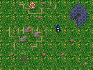
Post by: Dele on July 08, 2007, 05:41:16 PM
Post by: Moosetroop11 on July 08, 2007, 08:22:16 PM
The pieces on their own are pretty good though ^.^
Post by: Fortet on July 08, 2007, 10:58:16 PM
Still no tree change. Having a hard time with it >_<;
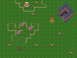
Also, as part of a graphics overhaul, I've changed the Chaos Gate:
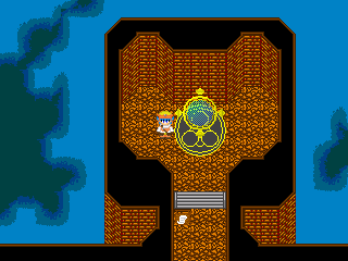
Post by: A Forgotten Legend on July 11, 2007, 09:45:55 PM
Post by: SonicChaos7 on July 13, 2007, 03:12:23 PM


Those a few menu/status pics of my current project on XP. I won't create a topic for my game here because I want to see how far I get and I don't want people to have expectations and ****. So, you'll just get screenshots when I decide to take some.
Post by: A Forgotten Legend on July 13, 2007, 04:35:24 PM
Looks nice. Any in-game ones(map ones)? I wanna see the tilesets you are using.
Post by: SonicChaos7 on July 13, 2007, 04:41:05 PM
Post by: aboutasoandthis on July 13, 2007, 05:37:43 PM
I do like the artwork. I think you should move the second a little more to the left, and the third a little more to the right. They kinda overlap the numbers and signs.
Post by: SonicChaos7 on July 13, 2007, 06:47:12 PM
Post by: Oceans Dream on July 16, 2007, 05:23:52 AM
A screen since I haven't posted here in a while.

Post by: Ben on July 16, 2007, 05:30:57 AM
Ive tried a few different CMS scripts with my project...but ive never seen that one.
Post by: Meiscool-2 on July 16, 2007, 05:53:42 AM
Post by: ellie-is on July 16, 2007, 01:28:29 PM
Post by: SonicChaos7 on July 16, 2007, 01:40:32 PM
lucas: It's one script and all the pictures are set to a certain location on the status screen. So, as I sad, not much I can do about it unless I edit the pictures, which it will screw up with paint.
Post by: Oceans Dream on July 16, 2007, 03:32:39 PM
Quote
Originally posted by Meiscool
That's great ocean. I love how you put the Q's on the edges of buildings and lamposts and... pretty much everything lol. I've seen the one on gamingw, and really liked the trees a lot. If you wouldn't mind, do you think you could send me the trees you've made? There is a shortage of good tropic-trees.
Yeah, the Q's are supposed to be Spirals to represent Waves. I'm trying to make stuff like buildings have a more natural feel to them, so right now I'm trying to get inspiration from seashells, waves, and all that fun stuff.
Various Trees:

Post by: aboutasoandthis on July 16, 2007, 03:41:02 PM
A little more 3D practice. The people I've already shown it to say it's a little plain, but a good effort. I'm working on the sprite effects and trees so I can get some foliage in.
Post by: A Forgotten Legend on July 17, 2007, 05:20:27 PM
Here is a map of the part of Soren Fields I have done. Its only done elevation wise I hope. Too much elevation, too little elevation? Just really want suggestions on the elevation.
Post by: Ace of Spades on July 29, 2007, 11:01:12 PM
Quote
Originally posted by lilsniffs
I'm a noob when it comes to RPG maker.
Don't spam, please. This thread is for posting screenshots and criticism.
Post by: Ben on July 30, 2007, 12:14:07 AM
the 3d
is that in RPG maker/are those chips youve made
what gives...
Im intrigued....
Tell me more, good sir... that really makes me want to experiment...
Post by: aboutasoandthis on July 30, 2007, 01:58:00 AM
I've also managed to make it almost realistic. Here's how.
-Map in Google Sketchup. It's free.
-Download Blender. It's also free.
-Find plugins to export Google Sketchup into Blender.
-Look up "Texture Packs" and "Level Editor" for textures. I use hi-res ES4 Oblivion, hi-res Thief, Tomb Raider, and Prince of Persia.
-Download the Gimp.
-Find the "Normal Map" and "Bump Map" Gimp Plugins.
-Export to Blender, add Normal Maps and Bump Maps, Render, and Enjoy.
No screens yet. Took me hours just to convert everything into bitmaps. Plus I'm doing something amazing.
Post by: lilsniffs on July 30, 2007, 02:14:47 AM
Quote
Originally posted by lilsniffs
I'm a noob when it comes to RPG maker.
Heres a picture
Post by: Ben on July 30, 2007, 03:06:12 AM
jeez...A guy could make some crazy templates for crazy chipsets.
Post by: Meiscool-2 on July 30, 2007, 03:42:23 AM
Quote
Originally posted by lilsniffs
I'm a noob when it comes to RPG maker.
LOL ROFL LMAO OMG LOL WTF!?!?!?!?!?!
This just made my day, AND it's only 12:46 here; meaning I still have a whole lot of day left.
Post by: aboutasoandthis on July 30, 2007, 03:49:52 AM
Quote
Originally posted by gemini
Huh.... And it renders it into a useable image for RPG maker?
jeez...A guy could make some crazy templates for crazy chipsets.
This is a free set from the main website. Keep in mind that this screenshot was directly exported from Sketchup. Also keep in mind that this was not properly rendered at all.
You'd be surprised at what you can do with this program.
Post by: Fortet on July 30, 2007, 10:57:17 PM
Please help :P
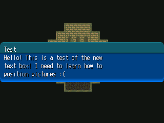
Post by: drenrin2120 on July 31, 2007, 04:21:06 PM
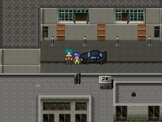
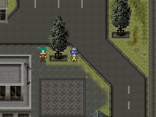
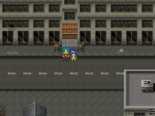
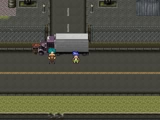
EDIT: That pictures looks positioned just fine to me fortet. Just experiment with the X and Y coordinates. X is the horizontal axis(positive number push the picture to the right, negative push the picture to the left) and Y is the vertical axis(positive numbers push the picture up, negative number push the picture down). Hope that helps.
Post by: Meiscool-2 on July 31, 2007, 08:20:50 PM
Fortet - CTS are pretty easy. I can explain the process of making one via PM if you still need help. Yours looks pretty good so far.
Oceans Dream - Thanks for the trees. I used one in the screen belows.
On to me.... I've been bored enough lately (due to issues with my car and my 3 best friends being on vacation), so I went back to a little screwing around in rpg maker.
I changed my favorite map I've ever made into a floating island. I pretty much ruined the map itself, but the outcome isn't bad at all.
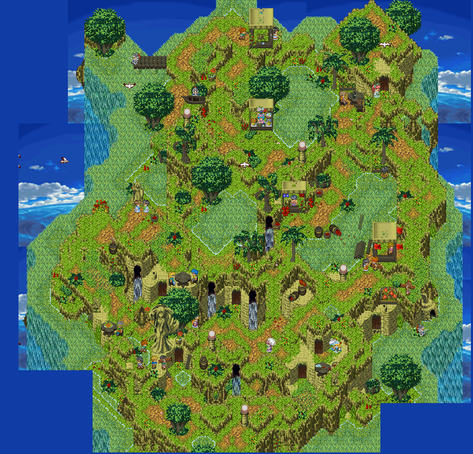
And... some random ruins I felt like making... Inspired by the fact that I restarted playing DarkCloud 2
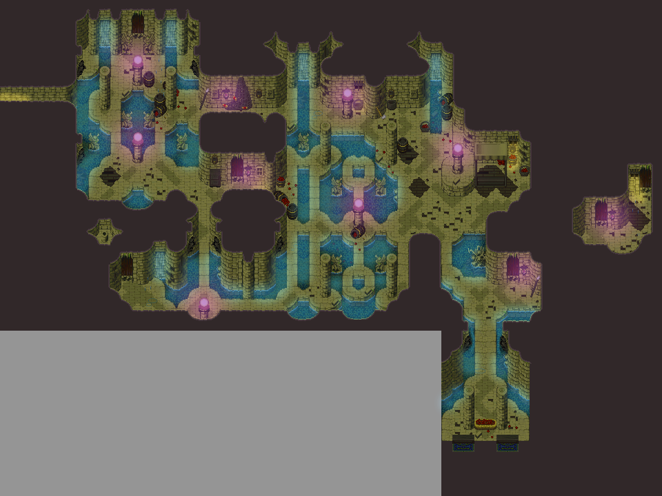
Post by: aboutasoandthis on July 31, 2007, 09:13:19 PM
I've found a fancy little recolor technique. It might make that chipset match a little better. Would you mind if I did something with it?
Post by: Archeia on August 01, 2007, 12:07:28 AM


Post by: Bluhman on August 01, 2007, 01:24:20 AM
Quote
Originally posted by drenrin2120
I'm having trouble deciding on Sprite sizes. Tall or normal sprite size. The tall size looks awkward by some things, such as cars, and some door ways. But the normal looks a bit awkward by the trees. How do you guys feel about it? I want to use the tall sprites, but I don't know if it'll be worth it.
EDIT: That pictures looks positioned just fine to me fortet. Just experiment with the X and Y coordinates. X is the horizontal axis(positive number push the picture to the right, negative push the picture to the left) and Y is the vertical axis(positive numbers push the picture up, negative number push the picture down). Hope that helps.
If you're not afraid to make a special sort of template, I'd fully suggest creating characters that are inbetween 'Tall' and 'Normal' height status.
Buuut if that's not your cake, I'd go with Normal size. Has more options. Both for sprites, and pose making.
Post by: drenrin2120 on August 01, 2007, 04:43:21 AM
Everything else is really nice on the eyes.
Bluhman: I took your advice and came out with an interesting sprite. I may make a template and go with it. It's the one in the middle.
Post by: Meiscool-2 on August 01, 2007, 06:08:44 AM
Quote
Originally posted by aboutasoandthis
Are you still using the chipsets you posted in your thread?
I've found a fancy little recolor technique. It might make that chipset match a little better. Would you mind if I did something with it?
Knock yourself out. :P
Post by: aboutasoandthis on August 01, 2007, 01:54:20 PM
Post by: Archeia on August 01, 2007, 03:51:00 PM
Quote
Originally posted by drenrin2120
Archeia: I like the style of your game, even the battle sprites are nice. Tho that background is RTP and doesn't fit the style of everything else.
That was only a place holder my dear :D This isn't the final version yet ^^
Post by: drenrin2120 on August 01, 2007, 04:26:19 PM
Quote
That was only a place holder my dear This isn't the final version yet ^^
Ah, I should've figured so.
EDIT: finding a good car sprite is proving difficult.
Post by: drenrin2120 on August 06, 2007, 02:48:40 PM
Post by: aboutasoandthis on August 06, 2007, 08:07:01 PM
Post by: drenrin2120 on August 07, 2007, 03:54:11 AM
Post by: A Forgotten Legend on August 07, 2007, 10:03:38 PM
So, here is the finished version of Map A of Soren Fields.
Comments?

Post by: drenrin2120 on August 09, 2007, 03:56:11 AM
Post by: A Forgotten Legend on August 09, 2007, 11:03:03 AM
Post by: Desimodontidae on August 09, 2007, 05:59:25 PM
I just thought I should post a screen. Anyways. This'll probably be released tomorrow, or later today if I really put some effort into it. But I've been working on it like crazy. So. Who knows.
Post by: aboutasoandthis on August 09, 2007, 06:23:24 PM
Are you using charasets or pictures? Either way, I think I can make a fade in effect with it.
Post by: Desimodontidae on August 09, 2007, 06:34:45 PM
Post by: A Forgotten Legend on August 09, 2007, 09:09:30 PM

I'm confused as whether I'm using the waterfall charsets right....
Post by: SC3K on August 16, 2007, 02:02:14 PM
Quote
Originally posted by A Forgotten Legend
I don't think you would have to change the charsets color...
So, here is the finished version of Map A of Soren Fields.
Comments?
I suggest creating the city itself, zooming out the most appropriate view, screenshotting it and then convert it to the panarama.
The screenshot in the post above mine looks very cool; although the top right hand corner of the bridge is a little off, and you should try and make the ground slope a bit in the bottom right corner, since technically they are walking downwards/upwards. Apart from that, great, the chipset you used is probably one of my favorites.
Post by: Phayre on August 16, 2007, 03:32:08 PM
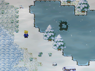
Does this look okay?
Post by: A Forgotten Legend on August 16, 2007, 05:38:55 PM
Post by: Meiscool-2 on August 24, 2007, 12:20:09 AM
Post by: aboutasoandthis on August 24, 2007, 01:45:08 AM
Map=Awesome
Post by: Meiscool-2 on August 24, 2007, 03:57:37 AM
Post by: A Forgotten Legend on August 24, 2007, 11:15:18 AM
Post by: aboutasoandthis on August 24, 2007, 09:54:53 PM
Quote
Originally posted by Meiscool
Colors in general, or just the houses?
Like AFL says, mostly the houses, but there's something about the grass that I don't like.
I like those little blue flowers btw. They give me an idea. What game are they from?
Post by: Dragoon de Sol on August 24, 2007, 10:00:15 PM

The Legend of Zelda: Gems of Chaos WIP Battle Screen.
Post by: Meiscool-2 on August 24, 2007, 10:16:28 PM
@Dragoon de Sol - Honestly, I think trying to make a zelda fangame is a bad idea... there are so many of them already out.
Post by: Dragoon de Sol on August 24, 2007, 10:29:45 PM
Post by: A Forgotten Legend on August 24, 2007, 10:32:18 PM
Good luck.
Post by: Dragoon de Sol on August 24, 2007, 10:49:42 PM
The trading system
The slashing of bushes
Bombing of Rocks
The dungeon crawling gather-the-items story line
Post by: aboutasoandthis on August 24, 2007, 10:56:47 PM
And if you think about it, Charas doesn't have any games. No idea should be scrutinized...unless it's pitiful...
Post by: the illusionist on August 25, 2007, 01:24:50 PM
Post by: Dragoon de Sol on August 26, 2007, 09:27:50 PM

New screen. Link attacks!
Post by: A Forgotten Legend on August 26, 2007, 09:48:57 PM
Looks like. I like the system2 image.
Post by: Dragoon de Sol on August 26, 2007, 09:58:47 PM
Post by: A Forgotten Legend on August 26, 2007, 11:37:57 PM
Post by: Dragoon de Sol on August 26, 2007, 11:49:42 PM
Post by: Dragoon de Sol on August 28, 2007, 01:54:25 PM

Thus begins the story in every Legend of Zelda game that tells the background of the objects to gather, etc etc.
And apologies for the double post ^^
Post by: ZeroKirbyX on August 28, 2007, 05:03:45 PM
Post by: Dragoon de Sol on August 28, 2007, 08:35:48 PM
Post by: SC3K on September 01, 2007, 03:32:22 PM
Heres a World Map that took me forever to make, although I really like the final outcome.
The smaller version on the bottom left hand corner of the screen is the map that gives you your location as you wonder around. Exploration ftw!
Post by: ZeroKirbyX on September 01, 2007, 04:34:17 PM
Post by: Ben on September 01, 2007, 04:56:06 PM
Post by: SC3K on September 01, 2007, 09:51:30 PM
Quote
Originally posted by ZeroKirbyX
Can I get that chipset?
Yeah, sure.
Post by: A Forgotten Legend on September 01, 2007, 10:47:56 PM
Post by: Dragoon de Sol on September 12, 2007, 06:39:39 PM

Post by: A Forgotten Legend on September 12, 2007, 07:18:14 PM
The "face" graphic looks neat though.
Post by: Dragoon de Sol on September 12, 2007, 07:22:48 PM
Post by: DragonBlaze on September 16, 2007, 05:43:17 PM
Post by: aboutasoandthis on September 16, 2007, 10:42:44 PM
That is a beautiful screen Dragonblaze. Why is Linkforce's character in there though?
Post by: DragonBlaze on September 16, 2007, 10:47:22 PM
Quote
Originally posted by aboutasoandthis
I'm surprised no one has commented yet. This topic is so dead...
That is a beautiful screen Dragonblaze. Why is Linkforce's character in there though?
Idk, I just picked 4 random sprites from a charset callled 'orphans' and where i got it, I don't know (its pretty old). Only one of the human characters is important anyway. Which one is Linkforce's character?
Post by: aboutasoandthis on September 16, 2007, 11:08:25 PM
Post by: DragonBlaze on September 16, 2007, 11:31:10 PM
Anyway, this is just a little earlier in the animation.
Post by: Linkforce on September 17, 2007, 12:23:52 AM
Quote
Originally posted by DragonBlazeQuoteOriginally posted by aboutasoandthis
I'm surprised no one has commented yet. This topic is so dead...
That is a beautiful screen Dragonblaze. Why is Linkforce's character in there though?
Idk, I just picked 4 random sprites from a charset callled 'orphans' and where i got it, I don't know (its pretty old). Only one of the human characters is important anyway. Which one is Linkforce's character?[/B]
It's ok DB. It's not like I created it or something. It's for everyone's use. Lol, but thanks for removing it I guess? Lol
Post by: DragonBlaze on September 17, 2007, 01:01:13 AM
Post by: Linkforce on September 17, 2007, 01:31:57 AM
Post by: Dragoon de Sol on September 21, 2007, 10:32:33 PM

Post by: redwallmax on September 25, 2007, 07:51:41 PM
Post by: Dragoon de Sol on September 25, 2007, 08:14:03 PM
Post by: redwallmax on September 25, 2007, 08:41:08 PM
Post by: lilsniffs3 on September 25, 2007, 09:48:16 PM
Post by: BlindMind on September 26, 2007, 06:48:53 PM
http://i19.photobucket.com/albums/b190/Blindmind028/RiverArea.png
Post by: Moosetroop11 on September 26, 2007, 09:13:49 PM
Basically, you just need to spend a bit more time working out how the chipset works :p
Post by: MrMister on September 26, 2007, 10:29:46 PM
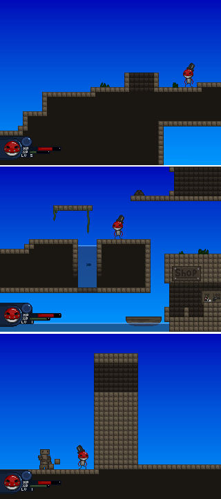
Post by: Dragoon de Sol on September 26, 2007, 10:42:58 PM
Post by: Meiscool-2 on September 26, 2007, 11:10:17 PM
Quote
Originally posted by BlindMind
Edit: I noticed there was no apparent option to display images at full size? Is there any way around this, other than just linking to the images? >.>
http://i19.photobucket.com/albums/b190/Blindmind028/RiverArea.png
Use <*img src=*Link*> without the *
Like so:

Anyways, it's pretty good. I think you used the chipset better than I did (and I notice some nice edits). Don't like the way you used the tall weeds awhole lot, but that's probally just my personal perference.
MrMister: Looks really cool. Reminds me of castlevania. I really think you should try and make an actually background though... shouldn't be to hard, just repeating bricks with a few variations or something.
Dragoon de Sol: The system looks like. You could do a few things here and there to sleek it up, but it serves it's purpose nicely. Don't really like the background though... I think there are a lot more things you could to to make that fit better.
Post by: MrMister on September 26, 2007, 11:12:20 PM
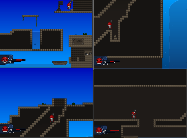
the backgrounds will be gradients w/ stuff mixed in there
kind of like this
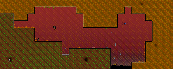
Post by: Dragoon de Sol on September 28, 2007, 08:24:25 PM

Drifter is on hold for this very old school styled game.
Post by: BlindMind on October 04, 2007, 01:48:04 AM


Some generic forest areas. I think I have about 20 of these in my game.
Post by: Dragoon de Sol on October 04, 2007, 03:35:57 AM
Post by: SC3K on October 04, 2007, 05:46:53 PM
Post by: Moosetroop11 on October 04, 2007, 08:10:19 PM
MrMister, I'm in strange awe of that screen with the water and the shop... that game looks promising.
Post by: ZeroKirbyX on October 04, 2007, 09:38:18 PM
Stop it.
Post by: Bluhman on October 04, 2007, 09:48:04 PM
Post by: ellie-is on October 04, 2007, 09:51:08 PM
Post by: A Forgotten Legend on October 04, 2007, 10:31:09 PM
I love the maps themselves though. those chipsets are enchanting...
Post by: Eviled on October 06, 2007, 11:51:17 AM


Post by: SC3K on October 06, 2007, 12:34:44 PM
Post by: Ben on October 06, 2007, 02:54:46 PM
Either way.....looks impressive
Post by: Eviled on October 06, 2007, 03:49:16 PM
As you can see when you are too scared this visual range becomes smaller and begins turning.
The maps are made with 3Ds max + photoshop, and the music is made by me (with Fruity Loops and other programs).
Post by: Moosetroop11 on October 06, 2007, 04:03:40 PM
The only thing I'm worried about is that at points I think it might become pretty difficult to work out what's going on.
Also, I love the reveal thing and the twisting ideas but it looks a little ugly as a square :p
Post by: Ben on October 06, 2007, 04:08:30 PM
its the only thing i prefer 2K3 to, over XP.
the whole map building thing, and having the panoramas show up in the process of tile placement was sweet. I cant do that with XP. Not properly. things get messed up.
Id very much like to play this game.
Post by: redwallmax on October 06, 2007, 04:51:44 PM
Post by: Martiz on October 07, 2007, 07:00:34 AM
It's the attack of a giant frog o_O
Post by: Dragoon de Sol on October 07, 2007, 07:03:07 AM
Redwallmx, look in their Battlecharsets for some possible edits youc an do to their choices. The weapons floating too, so it'll help fix that.
And it's a Gigan Toad, w00tz!!!1111oneone1one
Post by: A Forgotten Legend on October 07, 2007, 10:04:40 PM
Post by: lilsniffs3 on October 09, 2007, 09:35:55 PM
Post by: Dragoon de Sol on October 10, 2007, 01:02:52 AM
Post by: ZeroKirbyX on October 10, 2007, 01:48:41 AM
Post by: lilsniffs3 on October 10, 2007, 02:28:17 AM
Post by: Dragoon de Sol on October 10, 2007, 03:17:51 AM
The sephirtoth top needs brighter shading to fit the KH style, while the pants just suck period.
Post by: lilsniffs3 on October 10, 2007, 03:24:19 AM
Post by: A Forgotten Legend on October 10, 2007, 09:24:36 AM
Post by: lilsniffs3 on October 13, 2007, 07:51:55 PM
Post by: Dragoon de Sol on October 13, 2007, 09:32:41 PM
Post by: lilsniffs3 on October 13, 2007, 09:34:46 PM
Post by: cherko on October 14, 2007, 08:16:23 AM
Am I doing it right?
Post by: A Forgotten Legend on October 14, 2007, 02:29:40 PM
Quote
Originally posted by lilsniffs3
Is yellow good?
I meant to change the hair color in Paint...
Also, that town looks ok, even though you only showed us one building. Try showing us more of the twon so we can gather better opinions.
Post by: Skie Fortress on October 25, 2007, 02:57:07 PM


Post by: Ganocide_of_a_Kingdom on November 06, 2007, 08:17:54 AM
This is the last place that I am currently working on before the demo is released. It's called Abandoned Castle. It's a rather empty place with 70% of it broken and it is not meant to be pretty in any way (I edited the chipset to make sure it's not) and it's very dark, I might add. I also included a picture of the Castle's garden which is very much ruined with debris everywhere and I am trying to give a feel where you don't really know where things belong to. So here it goes......be kind.


Post by: RPG noob on November 07, 2007, 05:41:42 PM
Post by: Dragoon de Sol on November 07, 2007, 06:55:32 PM
@RPG Noob: Try adding some rocks, flowers, and trees in there, and maybe some patches of grass. Wildlife helps too.
@Skie: Your stuff still looks the same as most of your other stuff.
Post by: Ganocide_of_a_Kingdom on November 07, 2007, 07:41:25 PM
Quote
Originally posted by Dragoon de Sol
@Ganocide: Use a different type of hair. The Lloyd irving hair doesn't match well with the RTP.
Yeah, I have been thinking about that, but I guess I was being lazy since I am using Lloid's battle charset and didn't really feel like editing it since I have been doing a lot of that with battle animations. But I do feel the hair stand out quite a bit too much at times plus I believe he is kind of short, too. So I will have to definitely do some editing. Thanks.
RPG noob: I can also recommend not to make the edges of cliffs and such so even, try to make the shapes as unusual as they come in nature as you can...unless of course there's a reason for you to make it that way, like for example, it's man made, otherwise don't make the edges so perfectly shaped.
Post by: Dragoon de Sol on November 07, 2007, 07:58:57 PM
Post by: Ganocide_of_a_Kingdom on November 08, 2007, 01:34:08 AM
Post by: RPG noob on November 09, 2007, 03:38:53 PM
Post by: Dragoon de Sol on November 09, 2007, 03:56:12 PM
Post by: Meiscool-2 on November 14, 2007, 09:29:49 PM
Quote
Originally posted by RPG noob
Any better?
Yes, the bird and rabbit instantly makes it super better.
Post by: Ben on November 14, 2007, 10:12:29 PM
Post by: RPG noob on November 15, 2007, 07:22:26 PM
Quote
A little, add a few more trees, flowers and such, and maybe give it a snowstorm effect. Try making the cliffs look less straight as well.
Thanks I'll have a go at changing the cliffs. There is a snowstorm effect but you can barely see it from the screenie lol I've changed it to high anyway now.
Quote
try adding some mini cliffs to the masses of void snowy ground
Thanks I'll try that.
Quote
Yes, the bird and rabbit instantly makes it super better.
I don't need sarcasm thankyou, _sweat_ constructive criticism is welcome though.
Post by: A Forgotten Legend on November 15, 2007, 10:32:43 PM
But, yes, mini-cliffs should do the trick like gemini said
Post by: Meiscool-2 on November 18, 2007, 04:53:48 AM
Quote
Originally posted by RPG noob
QuoteYes, the bird and rabbit instantly makes it super better.
I don't need sarcasm thankyou, _sweat_ constructive criticism is welcome though. [/B]
Here's your criticism:
it sucks
Post by: RPG noob on November 18, 2007, 07:04:57 PM
Quote
I don't need sarcasm thankyou, constructive criticism is welcome though._sweat_
Post by: Bluhman on November 18, 2007, 07:13:08 PM
Post by: RPG noob on November 18, 2007, 07:23:32 PM
Post by: Bluhman on November 18, 2007, 07:29:42 PM
Aaaanyway, what you need is to make the cliffs on that cave less flat. make 'em more bumpy; add some undulation to its structure, making certain parts jut out and cave in.
The map, though it does have stuff on the ground, needs more variation in its tiles. Try adding streaks of different ground tiles to vary things up.
Finally, I'd suggest getting rid of the animals you added, as it'd ruin the mood of the scene you're trying to depict, I'd imagine. I hope that helps.
Post by: aboutasoandthis on November 18, 2007, 07:31:26 PM
The problem with that screen is that there isn't enough to criticize. With criticism, it's supposed to be a slight tweak. The map could use a total overhaul, no offense.
If it helps, here is an excellent mapping tutorial by yours truely. Page three especially should help you with that chipset. It is also a good idea to go back through the screenshot topic for some ideas.
http://charas-project.net/forum/showthread.php?threadid=14984&forumid=29&catid=6&page=1
Post by: RPG noob on November 18, 2007, 07:33:55 PM
Post by: Meiscool-2 on November 20, 2007, 02:22:11 AM
But yeah, you've got a lot of negative space that you need to fill... and not just random here-ya-go-happy? filling, more like holy-****-there's-a-big-cool-thing filling.
Post by: ZeroKirbyX on November 20, 2007, 02:45:27 AM
Post by: RPG noob on November 20, 2007, 03:12:11 PM
Quote
~Rules~ 1. No Flaming - When criticizing someone's game in a negative way, you must follow this one rule: State Why In other words, negative feedback toward the game must be backed up by reason. If you just post "Sorry, but your game sucks." then the post will be deleted, because it is considered a flame toward the maker's game. Any flaming or bashing of a person's game, the person making the game or another user in the thread is strictly forbidden and will result in your post being deleted.
Anyway enough about that. From what most people have said I figure filling most of the space with cliffs and different terrain would mainly do the trick so I'll post another edit in a few days.
Post by: Meiscool-2 on November 20, 2007, 08:05:54 PM
Or she is right, cuz guys have balls and don't cry a lot.
Post by: RPG noob on November 20, 2007, 10:07:02 PM
Quote
Dudes.... he is right, I was flaming him.
:Plight:
Post by: ZeroKirbyX on November 21, 2007, 02:58:41 AM
Post by: MrMister on December 15, 2007, 02:23:22 AM
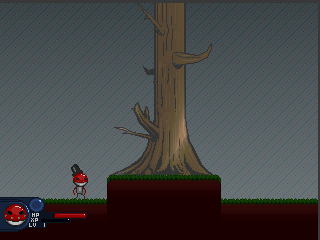
Post by: Fortet on December 15, 2007, 02:29:52 AM
Anyways, looks nice. But something about the plateau under the tree that seems a bit strange...
Post by: Red Fox on December 15, 2007, 03:50:56 PM
Post by: MrMister on December 16, 2007, 10:54:12 PM
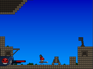
Is that some kind of weapon?!?
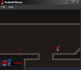
It's a Goblin Bitch!
Post by: Meiscool-2 on December 18, 2007, 07:54:33 PM
Post by: Moosetroop11 on December 18, 2007, 08:50:11 PM
Post by: ThexXtremeXx on December 22, 2007, 07:16:20 PM
Post by: aboutasoandthis on December 22, 2007, 08:14:14 PM
Post by: ThexXtremeXx on December 22, 2007, 08:22:25 PM
Post by: Hioko on December 25, 2007, 08:47:38 PM
It has several mini-games!
By:Thigo
Santa Klaus - The True (Papai Noel - A Verdade)

Download:
http://www.box.net/public/6zr4v6s1xx
Not RPT
Post by: Hioko on December 25, 2007, 08:53:48 PM
Papai Noel - O Retorno


Download:
http://www.box.net/shared/zvqpf0t4cw
Post by: A Forgotten Legend on December 26, 2007, 09:51:10 PM
This area is for screenshots.
Post by: Emerates on January 07, 2008, 09:37:19 PM
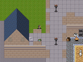
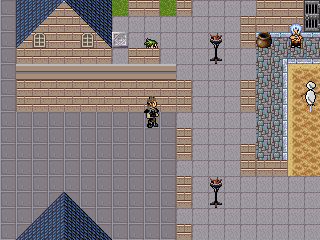
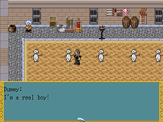
These are from the main city of the game I'm making (title still being debated), which I have been adding a lot to lately. The old dude is semi-custom made. I used Charas.Ex to make the main body, then edited him to have crossed arms. The dummys are original creations, though probably will need some improvement in shading, and the chipset is a large edit of one I had.
If you think it looks bad, trust when I say this is a vast improvement on what i had before.
Post by: MrMister on January 12, 2008, 06:01:52 PM
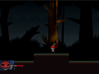
Back in the forest.. hey.. what?
Post by: A Forgotten Legend on January 13, 2008, 01:19:18 PM
Quote
Originally posted by Emerates
I've never been much for sharing my stuff, aside from semi-finished MIDIs, but whatever.
These are from the main city of the game I'm making (title still being debated), which I have been adding a lot to lately. The old dude is semi-custom made. I used Charas.Ex to make the main body, then edited him to have crossed arms. The dummys are original creations, though probably will need some improvement in shading, and the chipset is a large edit of one I had.
If you think it looks bad, trust when I say this is a vast improvement on what i had before.
You maps look really flat, your walls, look like they are part of the ground. and the maps look too tiled.
Post by: Jirbytaylor on January 22, 2008, 07:57:29 PM

Wow. I really timed my PrtSc press right. :V Gore weee.
Oh yes, I need to fix up the anti-aliasing on the System2 bar.
Post by: Moosetroop11 on January 22, 2008, 09:23:35 PM
Quote
Originally posted by A Forgotten LegendQuoteOriginally posted by Emerates
I've never been much for sharing my stuff, aside from semi-finished MIDIs, but whatever.
These are from the main city of the game I'm making (title still being debated), which I have been adding a lot to lately. The old dude is semi-custom made. I used Charas.Ex to make the main body, then edited him to have crossed arms. The dummys are original creations, though probably will need some improvement in shading, and the chipset is a large edit of one I had.
If you think it looks bad, trust when I say this is a vast improvement on what i had before.
You maps look really flat, your walls, look like they are part of the ground. and the maps look too tiled.[/B]
Alas, I have to agree, since we're here to critisise. You need a certain level of mapping skill so that the player can enjoy the game. It doesn't have to be photo perfect, but you probably have to work on your maps some more if you're planning let other people play this game.
Post by: HobomasterXXX on January 24, 2008, 01:51:08 AM
Post by: HobomasterXXX on January 24, 2008, 02:12:43 AM
Post by: Red Fox on January 24, 2008, 04:58:21 AM
Post by: HobomasterXXX on January 24, 2008, 10:17:10 AM
Post by: Phayre on January 24, 2008, 11:29:03 AM
Post by: Moosetroop11 on January 24, 2008, 01:04:39 PM
Post by: Yellowvanblake on January 24, 2008, 06:07:06 PM
Quote
Originally posted by Moosetroop11
I dunno, that second screen looks pretty okay. I'd work on other areas of the game before trying to perfect individual maps like that.
Agreed.
Yes, I'm sure there are a grip of things that can be done to 'improve' it, but honestly there are probably much better things to do RPG maker wise than getting a major in map perfection. If you're new to making maps look 'leet', you'll probably just burn out on the whole trying to do so.
Post by: omegarirue on January 24, 2008, 10:36:05 PM
ONto the miescool part. Everysingle person sayed this but just ignore meis he's a critic and there is a lot of them in the world. You got to take what they say or else you wont get anyway in life ya know. you sounded a lot like me to put it slighly. Oh and change those char sets there so bloody skechty to my eyes. Good luck with your game xd.
Post by: macubex on January 29, 2008, 05:54:45 PM

Post by: A Forgotten Legend on January 29, 2008, 06:31:55 PM
Looks good though.
Post by: MrMister on February 03, 2008, 05:49:10 AM
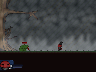
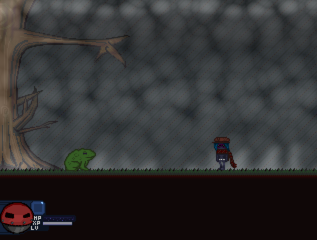
edit: robutt looks like a bow-legged motherfucker in that first screen but hes bobbin down in one frame of his idle animation, in which i took the screenshot
the second screenshot shows a character named Dandé de Lyon. A rival guy.
Post by: Moosetroop11 on February 03, 2008, 05:56:00 PM
Post by: Meiscool-2 on February 05, 2008, 08:43:07 PM
Post by: Martiz on February 07, 2008, 09:42:53 PM

P.S.:Ignore the fact that the top is cut off, I already fixed that :dry:
Post by: Red Fox on February 07, 2008, 09:45:15 PM
Post by: MrMister on February 09, 2008, 02:39:15 AM
Post by: Fortet on February 09, 2008, 02:43:24 AM
It's like an orgasm for the eyes . . .
An eyegasm . . .
Yea . . .
Post by: A Forgotten Legend on February 13, 2008, 10:34:48 PM
Quote
Originally posted by Martiz
@macubex faceset needs fixing, characters look like pigs with those noses (AKA nose tip too low problem)
<a href="http://i178.photobucket.com/albums/w262/Martiz255/RM2K3dung1.png"><a href="http://i178.photobucket.com/albums/w262/Martiz255/RM2K3dung1.png"><img src="http://i178.photobucket.com/albums/w262/Martiz255/RM2K3dung1.png" width="320" height="210.645669291 alt="http://i178.photobucket.com/albums/w262/Martiz255/RM2K3dung1.png" border=0></a>
P.S.:Ignore the fact that the top is cut off, I already fixed that :dry:
Next time, try taking it in game, and if its a map that large, take multiple ones to get the whole thing. As we can't see what those events are. But, like Red Fox said earlier, the walls shouldn't be so straight and wildlife is good. :)
Post by: Demonic Angel on February 14, 2008, 02:03:05 AM
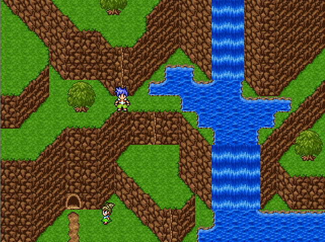
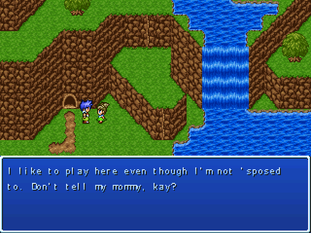
Post by: Fortet on February 14, 2008, 02:11:51 AM
Other than that, nice use of RTP! There's not much somebody can do with it, but I have a feeling you will become an excellent mapper :)
Post by: Demonic Angel on February 14, 2008, 02:18:17 AM
Also, I see what you mean now that you mention it. Thanks for the tip! n_n
EDIT: Fixed!
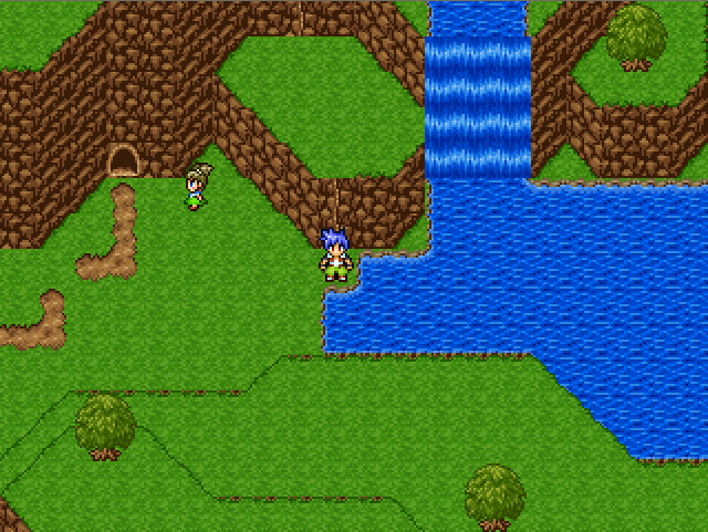
Post by: Ben on February 22, 2008, 02:15:00 AM
SERIOUSLY
Post by: dakota49 on February 22, 2008, 02:39:50 AM
All you need now is a dragon that holds the key and a bat that takes you away when you're a second away from winning.
Post by: Ben on February 22, 2008, 03:00:29 AM
Post by: Prpl_Mage on February 22, 2008, 06:55:28 AM
Mostly because I assume that you are close to finish it.
Post by: A Forgotten Legend on February 22, 2008, 04:16:30 PM
Post by: ellie-is on February 22, 2008, 05:50:05 PM
Post by: MrMister on February 24, 2008, 12:02:35 AM


Post by: ellie-is on February 24, 2008, 12:09:52 AM
Post by: MrMister on February 27, 2008, 04:01:51 AM
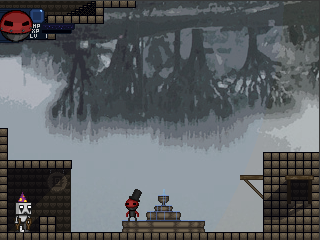
tryin out some gay lighting bullshit
oh thats a computer chip shop run by adrian the robot(loves black metal and has a broken leg) which upgrades you stats i guess? maybe gives skills
and above that screen is the skytrain station which is a cool mode of transportation
Post by: Moosetroop11 on February 27, 2008, 03:43:36 PM
Post by: Ben on February 27, 2008, 11:04:39 PM
Post by: ThexXtremeXx on February 29, 2008, 09:47:09 PM

ok this is a picture of a game ive been working on latley.
And if you were wondering there is an effect on the image.
Post by: A Forgotten Legend on March 01, 2008, 12:10:25 AM
Also... your sig... is really big.... and pain is spelled wrong....
Also.... where can I get that chipset?
Post by: ThexXtremeXx on March 01, 2008, 12:32:06 AM
http://i249.photobucket.com/albums/gg235/yukidao/blablabla/1608.png
Post by: MrMister on March 01, 2008, 09:56:53 AM

Post by: ThexXtremeXx on March 01, 2008, 04:56:29 PM
EDIT: ( I DON'T HAVE A SIG ********)
Post by: A Forgotten Legend on March 01, 2008, 09:08:23 PM
Quote
Originally posted by ThexXtremeXx
no it's the person's name and the chip set:
http://i249.photobucket.com/albums/gg235/yukidao/blablabla/1608.png
I think I'm gonna combine some stuff from this chipset with the REFMap one....
Post by: MrMister on March 02, 2008, 02:43:32 AM
Quote
Originally posted by ThexXtremeXx
the boss looks kinda stiff, other than that it's pretty good.
he shakes around violently when animated
also you have anime signature, dont even comment
i think i will try to get robutt done in time to enter it in the next indie games festival
ive been told robutt has a cool style and the 3 people who have played it say its fun so.. you could see me showing up in the next IGF
Post by: Ben on March 16, 2008, 11:27:12 PM
Post by: ellie-is on March 16, 2008, 11:40:04 PM
wtf is that? XD
Post by: Ben on March 17, 2008, 12:08:28 AM
the majority of the maps will be panoramas with a few object-tiles, rather than tilesets for houses, rocks, ground....theyll all be in the pano.
The project is the same one ive been trying to tackle for years.
Genia.
Post by: ellie-is on March 17, 2008, 12:11:47 AM
Post by: Dominicy on March 17, 2008, 12:19:36 AM
Quote
Originally posted by gemini
rpg maker vx, with super special graphics enhancing panoramas and a naked custom gemini template sprite
the majority of the maps will be panoramas with a few object-tiles, rather than tilesets for houses, rocks, ground....theyll all be in the pano.
The project is the same one ive been trying to tackle for years.
Genia.
I don't get VX. It's just a remake of RPGmaker 95. It even uses some of 95's graphics.. Like if you kicked the crap out of XP, ripped it apart, and replaced the missing parts with the disemboweled corpse of RM95.
Post by: Ben on March 17, 2008, 01:52:39 AM
there is potential here, despite its flawed default mapping.
there is so much possibility, and im only beginning to experiment. I will destroy your soul with awesomegame within the year
Post by: Red Fox on March 17, 2008, 07:46:43 PM
Got vx a couple of days ago but haven't done anything with it yet...
Post by: zuhane1 on March 17, 2008, 08:19:25 PM
VX is out now? Where was the red carpet and announcements and stuff?
Post by: Ben on March 17, 2008, 08:34:11 PM
Post by: MrMister on March 29, 2008, 10:10:13 PM

and heres some unrelated pix


Post by: A Forgotten Legend on March 29, 2008, 11:27:33 PM
Post by: ellie-is on March 29, 2008, 11:31:20 PM
Post by: Archeia on March 30, 2008, 12:34:04 PM

Post by: Moosetroop11 on March 30, 2008, 12:40:25 PM
That screen looks good, Archeia. What is it, though?
Post by: Archeia on March 30, 2008, 01:54:16 PM
Post by: A Forgotten Legend on March 30, 2008, 09:21:22 PM
Post by: MrMister on March 31, 2008, 08:54:27 PM


edit: thumbnails
also i know the hP bar is hard to see im makin it brighter
Post by: koomarz on April 13, 2008, 05:50:07 PM


Post by: aboutasoandthis on April 13, 2008, 06:13:35 PM
I can read Spanish so I get to play! :D
Post by: ellie-is on April 13, 2008, 07:07:46 PM
Also, looks great.
Post by: A Forgotten Legend on April 13, 2008, 07:22:15 PM
Post by: MrMister on April 15, 2008, 06:20:54 PM
http://uk.youtube.com/watch?v=ZOWI5ZZnf0w
Post by: MrMister on April 15, 2008, 06:29:06 PM
Post by: MrMister on April 15, 2008, 10:15:23 PM
http://uk.youtube.com/watch?v=g4IBv1gC2dQ
Post by: MrMister on April 20, 2008, 04:21:02 AM
this is a minigame in robutt
looks better in motion, will film eventually.


Post by: A Forgotten Legend on April 20, 2008, 04:40:20 AM
Post by: Ben on April 20, 2008, 05:55:52 AM
Post by: MrMister on April 20, 2008, 08:15:25 AM
Quote
Originally posted by gemini
How the hell do you get banned from pixeljoint?lol
i made a comment that was just the word niqger
it owned. hard.
Post by: MrMister on April 21, 2008, 11:46:17 PM
http://uk.youtube.com/watch?v=9cjw90lrMcQ
Post by: alchemyindex101 on April 22, 2008, 04:01:02 AM
<a href="http://s29.photobucket.com/albums/c260/therocko101/?action=view¤t=screenshot3.jpg" target="_blank"><img src="http://i29.photobucket.com/albums/c260/therocko101/screenshot3.jpg" border="0" alt="Photobucket"></a>
this is from the intro
<a href="http://s29.photobucket.com/albums/c260/therocko101/?action=view¤t=screenshot2.jpg" target="_blank"><img src="http://i29.photobucket.com/albums/c260/therocko101/screenshot2.jpg" border="0" alt="Photobucket"></a>
and this is just a random shot of a jail
<a href="http://s29.photobucket.com/albums/c260/therocko101/?action=view¤t=screenshot1.jpg" target="_blank"><img src="http://i29.photobucket.com/albums/c260/therocko101/screenshot1.jpg" border="0" alt="Photobucket"></a>
Post by: Pixelero on April 24, 2008, 08:24:24 AM
I also completed this face a while ago, please let me know what you think about it all guys.
Post by: Moosetroop11 on April 24, 2008, 03:55:23 PM
My only problem is that it all looks a lot like the rtp for some reason...
And MrMr, Sweet looking videos. Nice to see how it'll work in motion.
Post by: Pixelero on April 24, 2008, 05:35:04 PM
This chipset is actually a remake of one i started for rmxp but after some though i decided that 2k3 was better for the first game for a couple of reasons.
Here's a picture of the XP chipset :), this was not the original color of the tileset, i was messing around with color changes in the maker here.

Forgot to add, i fixed the right eye for that face portrait because it looked like it was popping out a tad.
EDIT!!!
Been improving my work, here's a better look.

Post by: aboutasoandthis on April 27, 2008, 11:46:01 PM
I don't think I'm supposed to be showing this, but it's the best thing I've done in a while. I'm almost done with the Chain Game. Technically this's the only thing I've ever released. _sweat_
Post by: Red Fox on April 27, 2008, 11:55:45 PM
Post by: drenrin2120 on April 28, 2008, 01:43:42 AM
Quote
Originally posted by aboutasoandthis
I don't think I'm supposed to be showing this, but it's the best thing I've done in a while. I'm almost done with the Chain Game. Technically this's the only thing I've ever released. _sweat_
Well, whatever happened to that game you were making but never told anyone about? Remember, the one I made that song for? Please tell me you're still working on that. =P
Post by: aboutasoandthis on April 28, 2008, 02:56:50 AM
Quote
Originally posted by drenrin2120QuoteOriginally posted by aboutasoandthis
I don't think I'm supposed to be showing this, but it's the best thing I've done in a while. I'm almost done with the Chain Game. Technically this's the only thing I've ever released. _sweat_
Well, whatever happened to that game you were making but never told anyone about? Remember, the one I made that song for? Please tell me you're still working on that. =P[/B]
Oh Final Fantasy? Of course I'm working on that (and it's coming great!). ;)
I just wanted to put out something small first to see if I could do it.
Post by: Bluhman on April 28, 2008, 03:58:21 AM
Quote
Originally posted by aboutasoandthis
<img src=http://i75.photobucket.com/albums/i316/aboutasoandthis/ChainScreen.png>
I don't think I'm supposed to be showing this, but it's the best thing I've done in a while. I'm almost done with the Chain Game. Technically this's the only thing I've ever released. _sweat_
Daamn... THAT'S how the game is gonna look?
Post by: Pixelero on April 28, 2008, 06:17:05 AM
Looking good man, the only thing that bothers me is that the characters are way too bright and colorful against the surroundings in this particular screenshot, i don't know if the rest of the game has this dark look but if it does i suggest you decrease saturation some so that it will look better together.
Post by: aboutasoandthis on April 28, 2008, 09:09:26 PM
Quote
Originally posted by Pixelero
@ aboutasoandthis
Looking good man, the only thing that bothers me is that the characters are way too bright and colorful against the surroundings in this particular screenshot, i don't know if the rest of the game has this dark look but if it does i suggest you decrease saturation some so that it will look better together.
From what was played, yes it does have a dark look. Red Fox actually modeled it after Silent Hill. The blondes in the screenshot are my new characters, so only they will get the recolor.
Post by: A Forgotten Legend on April 28, 2008, 09:15:10 PM
YES> I CAN'T WAIT TO GET THIS.
Post by: drenrin2120 on May 03, 2008, 03:04:20 PM
Quote
Originally posted by aboutasoandthisQuoteOriginally posted by drenrin2120QuoteOriginally posted by aboutasoandthis
I don't think I'm supposed to be showing this, but it's the best thing I've done in a while. I'm almost done with the Chain Game. Technically this's the only thing I've ever released. _sweat_
Well, whatever happened to that game you were making but never told anyone about? Remember, the one I made that song for? Please tell me you're still working on that. =P[/B]
Oh Final Fantasy? Of course I'm working on that (and it's coming great!). ;)
I just wanted to put out something small first to see if I could do it.[/B]
Oh, well that makes me happy. :) And the screen looks nicely done.
Post by: xX LinkMasTer Xx on May 09, 2008, 12:44:40 AM
I'm new here, just passed by to post a few screens of my game.
I come from a Spanish RPGMaker Community, I'm developing the game and I just want to show you some SS's.
I hope you all like them. :D


In case you wanna check out the videos:
1. http://www.youtube.com/watch?v=1IQ2pfEoAIw
Intro & the first 6 mins of gameplay.
2. http://www.youtube.com/watch?v=vCH5rNxlNAA
Teaser #1
I'm in a hurry right now, so I'll just post the pics here, when I'm back from work or maybe tomorrow I'll post the full Game's Info (need to translate it first xP).
I hope you all like the screens and Zelda. xP
Dew.~
Arigatou.~
Post by: Ben on May 09, 2008, 02:22:55 AM
Post by: Moosetroop11 on May 09, 2008, 01:07:01 PM
Anyway, keep it up!
Post by: A Forgotten Legend on May 09, 2008, 08:11:55 PM
Post by: drenrin2120 on May 09, 2008, 09:01:00 PM
Post by: xX LinkMasTer Xx on May 10, 2008, 03:33:11 AM
First of all, thank you all for your comments, yes, I'm gonna translate the Demo, the available languages are gonna be Spanish/English (since those two are the only ones I speak xP)
The Battle System is gonna be an ARPG and a Side-View ARPG (kinda Megaman for example).
Imma try different Battle Systems to make the game more fun and variated.
I'm gonna post the complete Topic soon, anyway, if you want a taste, I can leave the test of the Custom Name Election System.
You can download it here (http://www.mediafire.com/?los11mgyptd).
Dew.~
Arigatou.~
Post by: Percival on May 10, 2008, 04:50:18 AM
Make an animated title screen?
Make a press start and a new game/continue screen seperate?
Make a cursor follow the mouse?
if you can answer those i will wub you!
Post by: zuhane1 on May 10, 2008, 08:16:15 AM
Quote
Originally posted by Percival
... O_O in the first minute of the first vid you posted, you done a million things i never thaught you could do... how did you:
Make an animated title screen?
Make a press start and a new game/continue screen seperate?
Make a cursor follow the mouse?
if you can answer those i will wub you!
Right the first two I'm sure have been done some other way. If the game was in English I would be able to tell. Oh, the cursor doesn't follow a mouse if you watch it carefully, the keyboard moves it. But I believe there is an rm2k3 mod that lets you use a mouse in-game somewhere. But I've heard you need a pretty decent computer.
Post by: xX LinkMasTer Xx on May 10, 2008, 03:17:59 PM
Power Mode.
An RM2k3 add-on, pretty sweet huh?
You can control an image using the mouse (Yep, that's the actual mouse, not the keyboard working), you can rotate images a few degrees now and keep them that way, skip the Default Title Menu and build your own in-game (That's why it's animated), you can use all, yes, I mean A-L-L the keyboard keys (download the Custom Name Selection System trial I did here: (http://www.mediafire.com/?los11mgyptd), to take a look, you actually "write" your name using the keyboard instead of selecting the words), you can call the 'Load Menu' and close the game (back to Windows) at anytime, and more things.
It's hella awesome, and you can do a loooooooooooot of things now....
Scripts?...pft...RM2k3 is getting closer....*evil laugh*
Dew.~
Arigatou.~
Post by: A Forgotten Legend on May 10, 2008, 03:19:29 PM
Post by: MrMister on May 10, 2008, 07:49:01 PM


phone your secretary to save
if u wanna see more robutt heres a blog (http://zygote.fortsigma.net/blog)
Post by: Sion Suncrest on May 11, 2008, 01:57:31 AM
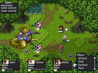
Almost forgot about this place. Seeing as I displayed this over at RMN and GW
there's no issue showing it here. It's the current progress of Chaos Generations'
CBS. The three monsters you see there are animated.
~Sion
Post by: aboutasoandthis on May 11, 2008, 02:36:52 PM
Post by: Sion Suncrest on May 11, 2008, 04:42:49 PM
~Sion
Post by: alchemyindex101 on May 15, 2008, 02:56:14 AM
it's a shrine to a god.
Post by: Archeia on May 15, 2008, 12:03:30 PM

Post by: MrMister on May 17, 2008, 03:20:23 AM

Post by: A Forgotten Legend on May 17, 2008, 03:30:26 AM
Archeia: :o
MrMr: GREEN ALIEN!!!!!!!!!!!!!!!!111!!!!one!!one!!!1111!
Post by: ZeroKirbyX on May 17, 2008, 04:18:05 AM
Post by: HobomasterXXX on May 19, 2008, 10:00:48 AM
Its up to you to figure out what HaM is an abbreviation of. Or I could tell you.
Post by: HobomasterXXX on May 19, 2008, 10:35:03 AM
Post by: Ben on May 19, 2008, 06:16:12 PM
Post by: MrMister on May 20, 2008, 04:23:09 AM

Post by: ZeroKirbyX on May 20, 2008, 05:51:14 AM
Post by: Moosetroop11 on May 20, 2008, 03:11:07 PM
Post by: MrMister on May 20, 2008, 10:20:24 PM
Quote
Originally posted by ZeroKirbyX
So how much gameplay time would you say is in Robutt at this point?
very hard to estimate that because there are very few functional enemies, cut scenes, and npcs. it took me like 6 minutes(longer than it sounds..) to briefly explore the amount of mappage that i have completed. i imagine after ive added all of those things it would be like 40 minutes
Post by: Ben on May 20, 2008, 10:27:29 PM
Post by: MrMister on May 21, 2008, 12:01:53 AM
http://zygote.fortsigma.net/Trash/RobuttDemo1.exe (http://zygote.fortsigma.net/Trash/RobuttDemo1.exe)
Post by: Ben on May 21, 2008, 12:04:10 AM
Post by: HobomasterXXX on May 21, 2008, 07:49:16 AM
Post by: MrMister on May 26, 2008, 05:15:08 AM
it has some kewl paralax backgrounds..
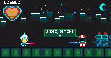
Post by: MrMister on June 03, 2008, 07:54:32 PM

Post by: Moosetroop11 on June 03, 2008, 11:29:06 PM
Post by: redwallmax on June 11, 2008, 06:47:29 PM
Post by: Phayre on June 11, 2008, 09:03:57 PM
Post by: A Forgotten Legend on June 12, 2008, 09:22:13 PM
http://i202.photobucket.com/albums/aa18/aforgottenlegend/AForgottenLegendScreens.png (http://i202.photobucket.com/albums/aa18/aforgottenlegend/AForgottenLegendScreens.png)
Of course, I still need to change the character sprites, etc... Face graphics are gonna give a challenge.
Post by: Red Fox on June 12, 2008, 09:27:50 PM
Post by: Phayre on June 12, 2008, 10:52:54 PM
Post by: A Forgotten Legend on June 13, 2008, 12:41:22 AM
Post by: Dominicy on June 13, 2008, 12:59:32 AM
Post by: A Forgotten Legend on June 13, 2008, 01:34:42 AM
Post by: ellie-is on June 14, 2008, 03:49:11 PM
I like GM. Its pretty fun. Did all the images here from scratch. It feels nice to have a game thats 100% your own :P
Post by: A Forgotten Legend on June 15, 2008, 06:39:44 PM
Post by: Archeia on June 19, 2008, 06:02:35 AM
Post by: Moosetroop11 on June 19, 2008, 12:47:12 PM
And lucas, how the hell did you manage to master gravity on gamemaker without your character sinking partially into the floor??? Teach me!
Post by: loftyD on June 19, 2008, 01:53:13 PM
(http://www.loftyd.net/images/route1.PNG)
(http://www.loftyd.net/images/zoo.PNG)
(http://www.loftyd.net/images/tunnel.PNG)
Post by: zuhane on June 19, 2008, 01:58:58 PM
(http://i302.photobucket.com/albums/nn111/zuhane/Screenshots.png)
Post by: A Forgotten Legend on June 19, 2008, 04:25:41 PM
Also, what is in the middle of your floor in the first inside map?
Post by: zuhane on June 19, 2008, 04:38:37 PM
Post by: Red Fox on June 27, 2008, 08:04:37 PM
(http://i6.photobucket.com/albums/y237/DeepShitL/SleepingAngelRemakeScreen1.png)
Post by: ThexXtremeXx on July 04, 2008, 06:42:26 PM
I really want this to look impressive, so fell free to tell me whats wrong!
Post by: Ben on July 04, 2008, 06:48:34 PM
Just for the love of god, dont just slap on a fog over the whole screen
Also, its not really a screenshot if you photoshop it man. I dont think 2k3 can support 1533 colours in a chipset.
If you want it to look impressive, do so in the mapping, and not with photoeffects
Post by: ThexXtremeXx on July 04, 2008, 07:09:00 PM
Post by: Ben on July 04, 2008, 07:21:45 PM
Post by: ThexXtremeXx on July 04, 2008, 07:27:39 PM
Post by: Zerlina on July 04, 2008, 07:51:55 PM
(http://img.photobucket.com/albums/v92/greenabsinthe/whaliaswood.png)
Post by: Red Fox on July 05, 2008, 07:26:19 AM
Post by: A Forgotten Legend on July 05, 2008, 05:25:56 PM
Post by: Zerlina on July 05, 2008, 05:52:29 PM
I want to add more broken furniture but even by adding the dresser I was pushing it, since no one has lived here for 700 years and everything would probably be fertilizer by now...not to mention that that book would be dust...shhhhhh. >.<
But I guess if I push it that far, maybe I should push it further and add some old chairs? What do you guys think?
Post by: Fisherson on July 05, 2008, 05:58:42 PM
of decomposition.
Post by: Moosetroop11 on July 05, 2008, 06:38:13 PM
Post by: Red Fox on July 05, 2008, 07:33:19 PM
Post by: drenrin2120 on July 12, 2008, 01:02:26 AM
But I love that hole in the wall effect, how did you do that?
Post by: Zerlina on July 14, 2008, 10:15:09 PM
The holes in the walls and floor are really great additions, but if the place is 700 years old, you may want to consider breaking it down a little more than that. Consider: Broken floorboards, dust/dirt buildup, broken furniture, scattered old/disintegrating papers, stagnant water, etc. The list goes on, depending on the background story.
But I love that hole in the wall effect, how did you do that?
Thanks! I'll add that in.
And as for how I did it, I edited a screenshot in photoshop then improted it as a panorama :). It's how I do a lot of the crazy stuff in my maps. Shhhh
Post by: Muraiko on July 15, 2008, 12:08:26 PM
Monu Tribe Before: (http://i276.photobucket.com/albums/kk1/Muraiko/MyOldMonu.png)
Monu Tribe After: (http://i276.photobucket.com/albums/kk1/Muraiko/MyNewMonu.png)
I think I'm improving... at least it looks decent now, and not just a huge block of green that I called trees. Any ideas on how I can make it look better? (I'm not sure if I did the tops of the trees right...)
Post by: Fisherson on July 15, 2008, 05:39:08 PM
water?Becuase it doesn't look like it.
Post by: Muraiko on July 15, 2008, 05:51:57 PM
(I still think the tops of the trees look flat. Any ideas on how to make it look more three deminsional?)
Yeah, the blue thinggy is supposed to be a small pool, but now I realize that it may be a bit too "squary", as well as not a really good water texture.
Post by: Red Fox on July 15, 2008, 05:55:29 PM
Post by: Muraiko on July 15, 2008, 06:11:58 PM
You mean the top right corner of the whole sceen shot? There's really more to it, but it couldn't fit on the screen. I actually just have openings in the trees, even though you never will be able to walk there. I guess I just thought it wouldn't look good if it was just black all the way around the map.
I'll work on the water, and make it look more natural.
Post by: Fisherson on July 15, 2008, 06:19:04 PM
And also wher'd you get that tent?I need some
camping tents like that to go with a desert
chipset i have.
Post by: Red Fox on July 15, 2008, 06:30:04 PM
Post by: Muraiko on July 16, 2008, 01:41:02 PM
I can't remember where I got that tent... I think maybe it was from RPG Maker XP, but I just shrunk it down to work for RPG2k3.
Post by: A Forgotten Legend on July 18, 2008, 11:03:57 PM
Post by: Fisherson on July 18, 2008, 11:56:25 PM
I can't remember where I got that tent... I think maybe it was from RPG Maker XP, but I just shrunk it down to work for RPG2k3.Ok,what program did you use,becuase it worked out good.
I wish some one whould shrink VX sprites like that.
Post by: Muraiko on July 20, 2008, 05:06:54 PM
Post by: Master Yoda on July 20, 2008, 08:35:31 PM
(http://i9.photobucket.com/albums/a85/Defilus/MoreFire.jpg)
Post by: Koomar on July 22, 2008, 04:41:52 PM
Here the screenshots:
The Screen:
(http://img257.imageshack.us/img257/6859/01to2.png)
Choose Tecnic:
(http://img301.imageshack.us/img301/4771/08dk2.png)
Choose Enemy:
(http://img243.imageshack.us/img243/417/09jf8.png)
Doing the tecnic:
(http://img516.imageshack.us/img516/3113/04yt5.png)
The limit complete:
(http://img301.imageshack.us/img301/7686/07hj5.png)
Greetings!
P.D.: The screenshots that no have number on hp and mp, it's because there are more older.
Post by: lilsniffs3 on July 22, 2008, 04:43:31 PM
Post by: Felix-0 on July 22, 2008, 07:54:36 PM
Post by: Moosetroop11 on July 22, 2008, 08:42:06 PM
Post by: ellie-is on July 24, 2008, 01:29:07 PM
Well, pretty awesome screenshots. Cool sprites as well.
Post by: MrMister on July 25, 2008, 07:15:41 AM
(http://zygote.fortsigma.net/blog/wp-content/uploads/2008/07/skycastle.PNG)
Post by: Meiscool-2 on July 25, 2008, 10:08:38 AM
Tell me about the stacking. Is the game going to be semi-puzzle driven?
As for me.... It has been a long time since I've shown anything.
(http://i26.photobucket.com/albums/c105/Meiscool2/Mala.png)
Post by: Moosetroop11 on July 25, 2008, 12:14:37 PM
Also, what? What's this character for? I never thought you'd even open rm2k3 again :p
Post by: Felix-0 on July 25, 2008, 06:18:07 PM
Post by: Ben on July 25, 2008, 08:10:20 PM
Post by: MrMister on July 25, 2008, 08:38:39 PM
Fantastic as always MrMister, I'm glad I got to see those before the link broke.theres no stacking puzzle stuff thats just a group of enemies that works together. also u should prob give your characters sprite a definite outline so it doesnt blend so much into the background.
Tell me about the stacking. Is the game going to be semi-puzzle driven?
As for me.... It has been a long time since I've shown anything.
(http://i26.photobucket.com/albums/c105/Meiscool2/Mala.png)
Post by: MrMister on July 25, 2008, 08:48:13 PM
looks p nice tho
Post by: MrMister on July 26, 2008, 08:02:31 PM
Post by: Ben on July 26, 2008, 08:15:57 PM
Personally I would make some of those little stars a bit more of a yellow, to reduce the huge contrast from the yello crown on the purple back, but Im viewing things out of context here, so I could very well be wrong.
Post by: Fisherson on July 27, 2008, 12:49:11 AM
It looks so awesome,i'd love to play even tough it is
a side scroller.
Post by: MrMister on July 27, 2008, 04:27:57 AM
Post by: Fisherson on July 27, 2008, 04:56:18 PM
i made it by putting a drawing of robutt and the blood of a magic the gathering fan in a magic circle and using ancient incantations to fart out a video game. im repixeling robutts sprite currently because its ugly and has no brightness or contrast to it..i ment which maker did you use.Game maker or Rmk2003?
Post by: MrMister on July 27, 2008, 06:42:56 PM
Post by: A Forgotten Legend on July 27, 2008, 06:44:41 PM
Post by: ellie-is on July 27, 2008, 06:46:54 PM
Post by: Ben on July 27, 2008, 07:12:29 PM
Do that thing where you look at your most recent posts, and see if they were necessary.
Post by: HobomasterXXX on July 28, 2008, 06:08:10 AM
Post by: Fisherson on July 28, 2008, 04:39:17 PM
(http://i286.photobucket.com/albums/ll106/cadeskywalker10/kewskreenS2.jpg)
Post by: ellie-is on July 28, 2008, 04:44:24 PM
Post by: blaman on July 28, 2008, 04:46:18 PM
Post by: Fisherson on July 28, 2008, 04:51:02 PM
You should fix the watter but other than that its not bad. And the RTP boat is really out of place, that rock as well.
Yeah,I plan to get make or find a custom raft.I just needed it to test the water.
Those are pretty good, but as Lucas already pointed out, the boat seems a little out of place, and the water could be fixed so it matches the grass. Otherwise, they're pretty good. Nice job. :DThank you! ;D I'm glad my map making skills are inproving.What exactly do you mean match the grass?
Do you have an example?I found this chip in the CR,i didn't make it.
Post by: ellie-is on July 28, 2008, 05:31:14 PM
Post by: blaman on July 28, 2008, 06:00:10 PM
Post by: MrMister on July 30, 2008, 05:37:20 AM
prob needs some tweaking. hat and stuff added w/ equipment.
Post by: Uberpwn_w00t on July 30, 2008, 05:52:22 AM
Post by: Ben on July 30, 2008, 05:53:20 AM
the light red is nice, I think it suits him more. Its looking good though
Post by: Felix-0 on July 30, 2008, 03:14:41 PM
Secrets of gaia
(http://img359.imageshack.us/img359/6119/screen2ww5.png)
(http://img359.imageshack.us/img359/4025/screen1ye0.png)
Post by: Red Fox on July 30, 2008, 03:41:36 PM
Post by: Felix-0 on July 30, 2008, 03:59:25 PM
Post by: Moosetroop11 on July 30, 2008, 04:32:09 PM
However, it's a quick rpg made round someone's house... Graphics are hardly important.
Post by: Meiscool-2 on August 04, 2008, 11:25:54 AM
Post by: MrMister on August 09, 2008, 03:31:51 AM
forgot to make it 2x. anyway. save for backgrounds this is what the game kinda looks like now.
Post by: coasterkrazy on August 09, 2008, 05:40:12 AM
Fantastic as always MrMister, I'm glad I got to see those before the link broke.
Tell me about the stacking. Is the game going to be semi-puzzle driven?
As for me.... It has been a long time since I've shown anything.
(http://i26.photobucket.com/albums/c105/Meiscool2/Mala.png)
I know I'm a bit late, but cool. Does this mean you're getting back into RM? I still haven't; I'm just here for the ride. :P
Oh and your last edit thing on your signature just completely threw me off and I was about to question it.
Post by: Moosetroop11 on August 09, 2008, 12:22:07 PM
(http://zygote.fortsigma.net/blog/wp-content/uploads/2008/08/robuttstuff.PNG)Do the different hats give you different abilities?
forgot to make it 2x. anyway. save for backgrounds this is what the game kinda looks like now.
Post by: MrMister on August 09, 2008, 03:45:19 PM
Post by: Ben on August 11, 2008, 02:37:51 AM
Post by: Meiscool-2 on August 11, 2008, 04:12:23 AM
Post by: A Forgotten Legend on August 11, 2008, 05:01:50 PM
So I started a project in 2k3, using meiscool chipsets, and this is a screen I just made. The backdrop worked really well I think.
Old one
[spoiler](http://i202.photobucket.com/albums/aa18/aforgottenlegend/GiazHousehold.png)[/spoiler]
Just added a few more things:
(http://i202.photobucket.com/albums/aa18/aforgottenlegend/GaizHousehold.png)
Post by: Felix-0 on August 11, 2008, 05:04:01 PM
(http://img147.imageshack.us/img147/1777/slashsj5.png)
Post by: A Forgotten Legend on August 11, 2008, 05:17:40 PM
Post by: Red Fox on August 11, 2008, 05:22:47 PM
Post by: Meiscool-2 on August 11, 2008, 06:44:43 PM
Felix, that looks like a cool abs. I would recolor some of the charsets so that they better match, especially the golden sun thingie.
I've been screwing around, makin' a new chip. Comments?
(http://i26.photobucket.com/albums/c105/Meiscool2/Screw.png)
Post by: A Forgotten Legend on August 11, 2008, 07:20:24 PM
Thanks red fox and meiscool.
I like the chipset. I really like how it goes into the water from the land. Could use some more color though. Its really green right now. Although if its new, I guess there is still more to come for it.
Post by: Fisherson on August 11, 2008, 07:54:11 PM
Post by: MrMister on August 11, 2008, 08:25:55 PM
Dude, the hats totally should give different abilities. The rad factor would rise exponentiallyyeah but as far as i can tell game players dont like prioritizing. and that would be a problem. you get abilities by finding hidden shrines throughout the world and you use them by mashing button combos.
the game is kinda like actraiser meets vagrant story.
Post by: A Forgotten Legend on August 11, 2008, 10:43:25 PM
AFL, that screen is amazing! Are Meis chipsets in the CR? I must have them.Look around the resource section of the forum.
I tried finding the meiscool mapping tut, took me ages, but some of the images were broken. I think it was rotobam's addition. :(
EDIT: Post number 2222.
And... here is the link. =P
http://www.charas-project.net/forum/index.php?topic=20441.0
Post by: Meiscool-2 on August 11, 2008, 11:54:30 PM
Post by: drenrin2120 on August 12, 2008, 01:35:33 AM
(http://img.photobucket.com/albums/v244/drenrin2120/AoA%20Screens/Chapter%20III/1.png)
(http://img.photobucket.com/albums/v244/drenrin2120/AoA%20Screens/Chapter%20III/2.png)
If anyone followed my game at all, these from Chapter III, I haven't done anything much with the game lately though, but I have been screwing around with this. I feel the second scene is a little empty, but I'm still getting the feel of the chipset and how to use it best.
Post by: Meiscool-2 on August 12, 2008, 01:46:34 AM
The outside of the house looks very good. Try editing the chip to add some vines or skulls or something hanging from the walls and trees for a gloomy feel.
Post by: drenrin2120 on August 12, 2008, 02:03:53 AM
Post by: A Forgotten Legend on August 12, 2008, 03:27:05 PM
In the top screen, the white wall looks kinda random compared to the brick wall on the rest of the building. o.o
Post by: drenrin2120 on August 12, 2008, 04:17:06 PM
Here's a screen from a menu I'm working on. It's not finished yet. It's a change party member screen, I guess you'd call it.
(http://img.photobucket.com/albums/v244/drenrin2120/AoA%20Screens/Chapter%20III/3.png)
I'm gonna fill in the spots where there's just empty boxes with important character stats like Level and two other boxes will be labeled "Battle Party" and "Non-Combat Party", or something along those lines. The basics of it are done and it functions just fine it's just not so pretty yet.
EDIT: Damn, I just realized I've been making this game for almost two years exact... That's not including the work I did for a year before I decided to start over... wow, what the hell is taking me so long? haha
Post by: ZeroKirbyX on August 12, 2008, 04:18:14 PM
Post by: drenrin2120 on August 14, 2008, 12:43:26 AM
(http://img.photobucket.com/albums/v244/drenrin2120/AoA%20Screens/Chapter%20III/3-1.png)
Post by: coasterkrazy on August 14, 2008, 02:29:43 AM
Oh and Samson + Parry + Jake + Timber = WIN. :D
It's great to see progress, dren!
Post by: drenrin2120 on August 14, 2008, 02:51:26 AM
And yes, I fixed that thing with Timber a while ago. I haven't worked on it in a while, but I did take your advice with the storyline and everything. But instead of an extra chapter I just made Chapter III reallllly long. But it's all good, all worked out.
Post by: coasterkrazy on August 14, 2008, 04:28:39 AM
Oh, speaking of which, I was wondering why Samson says he has no class when he's automatically defaulted to electric. It didn't make much sense to me, but I guess it doesn't matter.
Post by: drenrin2120 on August 14, 2008, 04:55:54 AM
Post by: Felix-0 on August 14, 2008, 08:10:32 PM
Dren nice CM
Post by: Meiscool-2 on August 14, 2008, 09:44:28 PM
By jetting you mean the shadow effects? If so, did you ever post a tut on that?
No, I ment how the walls go for three tiles, then come in for two, then come back out for three more and etc.
But I do have a shadows tutorial in my mapping tutorial. It shows how I made shadows for that chipset.
On to me!!
(http://i26.photobucket.com/albums/c105/Meiscool2/Moi.png)
You guess can expect to play this very shortly.
Post by: Rayonius on August 14, 2008, 09:48:00 PM
Post by: Meiscool-2 on August 14, 2008, 09:48:25 PM
Post by: Rayonius on August 14, 2008, 10:03:34 PM
Post by: Meiscool-2 on August 14, 2008, 10:29:26 PM
Post by: ZeroKirbyX on August 14, 2008, 10:52:15 PM
Post by: Felix-0 on August 14, 2008, 11:21:01 PM
Post by: Meiscool-2 on August 15, 2008, 01:27:53 AM
Post by: ZeroKirbyX on August 15, 2008, 01:41:04 AM
Also Felix, I joined Charas just so I could become an admin and tear the site down. I'm actually a very patient hacker. I also knocked up my anti-abortion girlfriend.
Post by: Meiscool-2 on August 15, 2008, 04:19:45 AM
Post by: Red Fox on August 15, 2008, 08:25:05 AM
Post by: ZeroKirbyX on August 15, 2008, 08:27:57 AM
I'm gonna quit complimenting you, you unstuddly boy.D: But what about my fragile self-esteem?
Post by: redwallmax on August 15, 2008, 04:50:59 PM
Post by: A Forgotten Legend on August 15, 2008, 05:01:44 PM
B) Add some more plants and stuff, the exterior maps look empty.
C) The building on the left, EXTREMELY large. And the windows are placed strangely. I would make it smaller, or add more windows.
D) The roof tiles, there are tiles to make the roof go like this:
/\
/ \
/ /\ \
/ \ |
/ \|
Use them. Please.
^
E) The interior also looks a bit empty. Try making the room smaller this way. |
v
Overall the maps are ok, but there is room for changes.
Post by: Moosetroop11 on August 15, 2008, 05:23:11 PM
Hm... you should've been atleast Class level 2. Oh well. Yeah, there's a probably a lot of little things like that throughout the game, I just needed a cheap excuse to go onto the tutorial of Classes and ****.I think my guys were mostly level 3... I reckon he didn't train up at all :p
Post by: Felix-0 on August 15, 2008, 06:28:15 PM
Post by: Meiscool-2 on August 15, 2008, 06:29:35 PM
Post by: Phayre on August 15, 2008, 07:10:13 PM
Post by: Meiscool-2 on August 15, 2008, 07:44:54 PM
Meis, your chip are to die for. Do you have a link to where you posted them all? I know you did a while back, but I can't find it. *sadness*http://www.charas-project.net/forum/index.php?topic=20441.0
Post by: MrMister on August 15, 2008, 11:03:58 PM
(http://img237.imageshack.us/img237/849/coffeeknight1qk1.png)
moggio the coffee knight gotta save princess prunes from the evil hunchmen.
Post by: RockJohnAxe on August 15, 2008, 11:36:42 PM
What u guys think?
(http://i284.photobucket.com/albums/ll11/RockjohnAxe/Shaker1.jpg)
:D
Ive got a xcreen shot of his attack animation in my game thread "An Epic Legend"
Post by: Moosetroop11 on August 16, 2008, 12:07:17 AM
moosetroop I veiwed your game....I like the first port town...and I wish I could have battles mowar...What. I've never posted a link to one of my games here. You sure you're not mistaken?
robutt is cancelled to bring you this much more interesting vidya gameNo way! Can't you at least post what you had so far of robutt? I was looking forward to that! :o
(http://img237.imageshack.us/img237/849/coffeeknight1qk1.png)
moggio the coffee knight gotta save princess prunes from the evil hunchmen.
Post by: Uberpwn_w00t on August 16, 2008, 12:50:49 AM
robutt is cancelled to bring you this much more interesting vidya game
(http://img237.imageshack.us/img237/849/coffeeknight1qk1.png)
moggio the coffee knight gotta save princess prunes from the evil hunchmen.
...Wait, is that a joke?
Post by: Red Fox on August 16, 2008, 06:42:15 AM
This is a lizardman battlechar im working on.
What u guys think?
(http://i284.photobucket.com/albums/ll11/RockjohnAxe/Shaker1.jpg)
:D
Ive got a xcreen shot of his attack animation in my game thread "An Epic Legend"
Your bcharas doesn't match.
Post by: RockJohnAxe on August 16, 2008, 07:44:44 AM
I just want some damn Feedback on my Lizardman Battle char
Post by: Bluhman on August 16, 2008, 08:36:18 AM
Post by: RockJohnAxe on August 16, 2008, 08:40:01 AM
Post by: Meiscool-2 on August 16, 2008, 09:02:05 AM
Post by: RockJohnAxe on August 16, 2008, 09:05:50 AM
and an attack pose and a death pose. although im gonna redo the death pose. Ill post the finished bchar set once im done.
Post by: mironic on August 16, 2008, 09:07:37 AM
Post by: Red Fox on August 16, 2008, 09:09:53 AM
I thought i covered this a zillion times. Matching Battle Charas is not my goal, nor do i give a flying squirrel.
I just want some damn Feedback on my Lizardman Battle char
Ge3ez m3 s0 s0rry for not be3n reading 4bout your g4me.
Post by: HobomasterXXX on August 16, 2008, 09:10:46 AM
XD i want a cookieGet.
Out.
Now.
Post by: Meiscool-2 on August 16, 2008, 09:11:00 AM
Post by: mironic on August 16, 2008, 09:12:43 AM
Post by: HobomasterXXX on August 16, 2008, 09:14:18 AM
Post by: mironic on August 16, 2008, 09:15:04 AM
Post by: HobomasterXXX on August 16, 2008, 09:16:38 AM
Post by: RockJohnAxe on August 16, 2008, 09:17:26 AM
its not nice to laugh at people with mental disabilities.
Post by: Red Fox on August 16, 2008, 09:18:27 AM
Post by: mironic on August 16, 2008, 09:21:16 AM
Post by: HobomasterXXX on August 16, 2008, 09:23:27 AM
Post by: mironic on August 16, 2008, 09:25:54 AM
Iv tryed to run away from u but u follow me LEAVE ME ALONE ***hole
Your officaly The Biggest ***hole on the interweb GET A LIFE
Post by: Bluhman on August 16, 2008, 09:26:27 AM
T_T 1 more flame and imoffical voting Charas the number 1 site for noob killers
Frankly, if you're spamming your own thread, calling other people dum, and generally appearing to show a lack of concern for your appearance, you kind of deserve the treatment.
But uhhhh oh yeah back on topic gah!
I posted this as a bit of a joke in the Offtopic Game thread, but it's actually a bit of a sneak peak at a game I'm working at.
[spoiler]Basically a sort of short game that all takes place in a single detailed town of several sections. This is the south district.[/spoiler]
Post by: mironic on August 16, 2008, 09:28:38 AM
Post by: Red Fox on August 16, 2008, 09:28:45 AM
Post by: RockJohnAxe on August 16, 2008, 09:33:05 AM
9.bluhman / 10
Post by: Bluhman on August 16, 2008, 09:35:44 AM
IT'S 5:35 AM DAMMIT *Becomes Nocturnal*
Post by: mironic on August 16, 2008, 09:36:40 AM
not for how usefull and good typing there are :(
Post by: RockJohnAxe on August 16, 2008, 09:40:16 AM
damn i just failed.
and it may be 5:40 am, but i still have an hour of work togo before i can head home.
and if noise = bad spelling i think alot of us would do worse.
You could be chained to a pole, being raped by monkeys with herpes while slowly being lowered in a tub of molten farts and i would still be pissed off if you mispelt every second word.
Edit: yes i work nights. 6:30 PM - 6:30 AM
Post by: mironic on August 16, 2008, 09:41:13 AM
Post by: Meiscool-2 on August 16, 2008, 09:43:34 AM
And Bluhman, I originally wanted to post this to tell you that I love your little shop you've got towards the bottom of the screen, but I felt I should post the above too :P
Post by: mironic on August 16, 2008, 09:46:12 AM
Post by: Meiscool-2 on August 16, 2008, 09:46:47 AM
Post by: Uberpwn_w00t on August 16, 2008, 09:51:20 AM
I posted this as a bit of a joke in the Offtopic Game thread, but it's actually a bit of a sneak peak at a game I'm working at.
[spoiler]Basically a sort of short game that all takes place in a single detailed town of several sections. This is the south district.[/spoiler]
I was actually interested when I first saw the map in the Off-Topic game thread. Brighton is where you live, right? Is the town named after it, or does it represent it in any way/shape/form?
Post by: RockJohnAxe on August 16, 2008, 09:55:07 AM
Post by: Meiscool-2 on August 16, 2008, 09:55:37 AM
Post by: HobomasterXXX on August 16, 2008, 10:20:46 AM
Frankly, if you're spamming your own thread, calling other people dum, and generally appearing to show a lack of concern for your appearance, you kind of deserve the treatment.I'm still considering making my game in a big city which you would have to travel to different parts of via taxi, tram etc.
But uhhhh oh yeah back on topic gah!
I posted this as a bit of a joke in the Offtopic Game thread, but it's actually a bit of a sneak peak at a game I'm working at.
[spoiler]Basically a sort of short game that all takes place in a single detailed town of several sections. This is the south district.[/spoiler]
Post by: Meiscool-2 on August 16, 2008, 10:59:35 AM
I'm still considering making my game in a big city which you would have to travel to different parts of via taxi, tram etc.
I don't think that works very well in 2-d games.
Post by: Uberpwn_w00t on August 16, 2008, 11:03:03 AM
Post by: HobomasterXXX on August 16, 2008, 11:15:18 AM
Post by: Phayre on August 16, 2008, 01:41:47 PM
[spoiler](http://img379.imageshack.us/img379/9109/mappydiddlezq0.jpg)[/spoiler]
Ignore the ocean tiles-- those will be transparent, with a sky behind.
How can I make this look decent? Gah.
Post by: Red Fox on August 16, 2008, 01:50:56 PM
Post by: Rayonius on August 16, 2008, 02:44:20 PM
Post by: Dragonium on August 16, 2008, 02:47:09 PM
[spoiler](http://i125.photobucket.com/albums/p69/DragoniumOfTheFire/Howitsdone.png)[/spoiler]
Basically, add a few more houses to add a little realism, and put some stuff in those blank spaces - no matter which way you look at it, it's a white space.
Good work.
Post by: ZeroKirbyX on August 16, 2008, 05:16:55 PM
Post by: Dragonium on August 16, 2008, 05:24:33 PM
Post by: Bluhman on August 16, 2008, 08:16:40 PM
I was actually interested when I first saw the map in the Off-Topic game thread. Brighton is where you live, right? Is the town named after it, or does it represent it in any way/shape/form?
Again, that's just the file name, and that in itself is a bit of a joke because Brighton Townline Road is an actual street around my parts.
But in reality, the town here itself is not Brighton; it's called Nothgirb. Which is just Brighton backwards. :P
As for Phayre's map, I don't think more houses are really in need, especially if its a REALLY small village; you just need to liven up the negative space. Aside from that, the only other thing that bothers me is how every single house has a very basic form; two that are boot shaped and two that are block shaped. I think you might be using a chipset incapable of making extremely advanced shapes, but try some other things out; C-shaped houses, houses that bend, vary it up.
And Bluhman, I originally wanted to post this to tell you that I love your little shop you've got towards the bottom of the screen, but I felt I should post the above too :P
Thanks. Closeup of said shop!
Post by: Red Fox on August 16, 2008, 08:31:11 PM
Post by: Meiscool-2 on August 16, 2008, 08:54:56 PM
Post by: Moosetroop11 on August 16, 2008, 11:27:16 PM
You could liven it up a bit by making small raised areas of ground. You could find some wintery plant charsets and keep adding them until it looks more 'full'... Also, you're using the ground tiles pretty unimaginatively. You could have the differently coloured bits of ground dotted much more randomly and mixed together. I find it tends to work with those chipsets.
Post by: MrMister on August 16, 2008, 11:55:59 PM
double trolled
(http://img201.imageshack.us/img201/6791/coffeeknight2ot9.png)
Post by: Fisherson on August 17, 2008, 01:31:42 AM
Again, that's just the file name, and that in itself is a bit of a joke because Brighton Townline Road is an actual street around my parts.
But in reality, the town here itself is not Brighton; it's called Nothgirb. Which is just Brighton backwards. :P
As for Phayre's map, I don't think more houses are really in need, especially if its a REALLY small village; you just need to liven up the negative space. Aside from that, the only other thing that bothers me is how every single house has a very basic form; two that are boot shaped and two that are block shaped. I think you might be using a chipset incapable of making extremely advanced shapes, but try some other things out; C-shaped houses, houses that bend, vary it up.
Thanks. Closeup of said shop!
I like the edited Mack and Blue pepole, they almost look orginal. Nice job with this. Can't wait to play it.,
if you deciede to release it.
Post by: Bluhman on August 17, 2008, 02:11:51 AM
I like the edited Mack and Blue pepole, they almost look orginal. Nice job with this. Can't wait to play it.,
if you deciede to release it.
Yeah, the chipsets done by this guy (http://wato5576.hp.infoseek.co.jp/map.html#) are top tier; I'm thinking of switching over to them in Alpha Force as well.
Post by: HobomasterXXX on August 17, 2008, 02:19:24 AM
Post by: Bluhman on August 17, 2008, 02:20:56 AM
Post by: HobomasterXXX on August 17, 2008, 02:22:42 AM
There you go. Hopefully the link is still active.
Post by: Uberpwn_w00t on August 17, 2008, 02:23:40 AM
trolled i never started another game
I knew it!
Post by: mironic on August 17, 2008, 02:48:16 AM
Post by: Bluhman on August 17, 2008, 03:04:22 AM
http://oceansdream.sitesled.com/TheoMaterial.zip
There you go. Hopefully the link is still active.
Yeah, that's the one I've got. Sorry.
Post by: HobomasterXXX on August 17, 2008, 03:06:47 AM
Post by: mironic on August 17, 2008, 03:08:51 AM
Post by: Bluhman on August 17, 2008, 03:09:45 AM
thats amazing
Please. I beg of you. Post your god damn screenshots here or get out.
Post by: mironic on August 17, 2008, 03:12:42 AM
Post by: Bluhman on August 17, 2008, 03:14:26 AM
i cant comment on peoples pictures D:?
Sure you can, but...
thats amazing
What the hell is this even referring to? It sure seems to me that it's just an arbitrary pair of words that make absolutely no sense on their own.
Post by: Fisherson on August 17, 2008, 03:15:47 AM
Yeah, the chipsets done by this guy (http://wato5576.hp.infoseek.co.jp/map.html#) are top tier; I'm thinking of switching over to them in Alpha Force as well.
I don't know what kind of languge that is, but I can't read it. As for using them for the Alpha Force, better make sure you can make modern element for them and convert them too. I like the old chips though. They clash a little, but they add realism to the game.
Post by: Bluhman on August 17, 2008, 03:18:20 AM
I don't know what kind of languge that is, but I can't read it. As for using them for the Alpha Force, better make sure you can make modern element for them and convert them too. I like the old chips though. They clash a little, but they add realism to the game.
Japanese. Though, the crazy appearance is due to... Some technical mess up with character sets.
The URL's are in english, however, so the links at the bottom of each page can be deciphered if you look where they lead. He's got sections on REFMAP chipsets, charsets, and animations.
Post by: ellie-is on August 17, 2008, 03:24:01 PM
Post by: Meiscool-2 on August 19, 2008, 05:37:12 AM
(http://i26.photobucket.com/albums/c105/Meiscool2/MushroomGroveAll.png)
Post by: drenrin2120 on August 19, 2008, 05:39:44 AM
But could we really expect less from ya?
EDIT: Though I'm not sure I'll like the trees like that, to be honest. I have a feeling it probably looks better in game play though.
Post by: Uberpwn_w00t on August 19, 2008, 05:40:12 AM
Post by: Red Fox on August 19, 2008, 07:31:10 AM
Post by: zuhane on August 19, 2008, 09:13:07 AM
Post by: RockJohnAxe on August 19, 2008, 11:57:33 AM
Post by: A Forgotten Legend on August 19, 2008, 03:08:28 PM
*orgasm* Dude, I can't wait.
Post by: Rayonius on August 19, 2008, 04:10:57 PM
How many years did that take to make?
You underestimate the meis.
Post by: Dragonium on August 24, 2008, 11:01:08 PM
Chipset for a side-scroller I'm messing with. I don't make chipsets from scratch very often.
I need ideas for eye-candy, as in random stuff to scatter about to make it pretty. What can go in the ground, apart from skeletons (which wouldn't really fit)? And what else needs scattering about?
Charset is due to change, by the way. This is not Adventures of Recoloured Cecil.
Post by: A Forgotten Legend on August 24, 2008, 11:10:03 PM
Nice chipset though.
Post by: coasterkrazy on August 24, 2008, 11:11:25 PM
Post by: Red Fox on August 24, 2008, 11:40:41 PM
Flowers! Bushes! Animals! Tall Grass! Peasants working the background! A Forest! CLOUDS (cumulus?)
Nice chipset though.
Post by: Meiscool-2 on August 25, 2008, 01:56:39 AM
EDIT - Puting the HUD down there will make it a lot easier to see what freespace you have and how to fill it.
Post by: Uberpwn_w00t on August 28, 2008, 01:35:10 AM
Post by: MrMister on August 28, 2008, 01:50:56 AM
Post by: Uberpwn_w00t on August 28, 2008, 01:52:12 AM
Post by: Meiscool-2 on August 30, 2008, 08:12:45 AM
(http://i26.photobucket.com/albums/c105/Meiscool2/Something.png)
Post by: coasterkrazy on August 30, 2008, 08:50:38 AM
I think I'll post a map.
(http://i3.photobucket.com/albums/y55/coasterfreak291/RandomScreen.jpg)
Nothing special, but considering the amount of time I spent making it, I'm happy. A while back, this would've taken me much longer to do than the time I spent on it.
EDIT: Damn, I just noticed the top-right is off by a pixel. Try to ignore that.
Post by: Meiscool-2 on August 30, 2008, 09:58:47 AM
Post by: Moosetroop11 on August 30, 2008, 12:06:17 PM
Meis, those look brilliant as usual. What, more, they actually look walkable now... I always had doubts as to how your old maps would work in game.
CK, it's a pity you had to go on after meis, because that's a pretty good map :p That chipset will always remind me of the chain game now XD
Post by: drenrin2120 on August 30, 2008, 06:19:24 PM
Meis: the style reminds me of Chrono Trigger. I like it a lot.
CK: Awesome map. I like the trees, they work well with the map. The only problem I have with it is the fence around the graveyard and stuff. Also, probably looks better not in JPEG =P. kudos!
Post by: A Forgotten Legend on August 30, 2008, 06:49:27 PM
That chipset will always remind me of the chain game now XD
I was thinking that too. lol.
Post by: Dragonium on August 30, 2008, 08:40:02 PM
(http://i125.photobucket.com/albums/p69/DragoniumOfTheFire/Screen2.png)
(http://i125.photobucket.com/albums/p69/DragoniumOfTheFire/Screen3.png)
(http://i125.photobucket.com/albums/p69/DragoniumOfTheFire/Screen4.png)
Post by: Meiscool-2 on August 30, 2008, 08:53:19 PM
Post by: Dragonium on August 30, 2008, 08:55:53 PM
Post by: A Forgotten Legend on August 30, 2008, 10:03:58 PM
Post by: coasterkrazy on August 30, 2008, 10:55:40 PM
Hm... Well, Meis, I think I took the chipset from the chain game (I can't really remember at this point), but wherever I got it from, the trees were already there.
Oh and thanks for the input overall. Dren, I didn't even realize it was a JPEG! Stupid Vista defaulting to JPEG! Haha.
Post by: Meiscool-2 on August 30, 2008, 11:04:06 PM
You're never satisfied.
Not true. Remember the time you gaved me an orgasim?
Post by: Dragonium on August 30, 2008, 11:16:34 PM
Nice, Drag! That's exactly what I was thinking. :P
Thank you sir.
Not true. Remember the time you gaved me an orgasim?
I remember it well... *Sigh*
Post by: Meiscool-2 on August 30, 2008, 11:22:43 PM
I remember it well... *Sigh*
And the doctor visit in the morning?
Post by: Moosetroop11 on August 31, 2008, 12:39:36 AM
Post by: drenrin2120 on August 31, 2008, 12:40:05 AM
Oh and thanks for the input overall. Dren, I didn't even realize it was a JPEG! Stupid Vista defaulting to JPEG! Haha.
Vista defaults to JPEG?! I knew it sucked but GAH damn, what were they thinking?!
On topic: I support your *needs moar les* approach, Drag.
*edit'd*
Post by: coasterkrazy on August 31, 2008, 12:43:59 AM
Post by: A Forgotten Legend on August 31, 2008, 02:19:39 AM
That looks cool, Drag. Is that some sort of lesbian community?ahaha
Also, it does default to jpeg on vista, i noticed it before I ever tried to save an image file though.
Post by: MrMister on August 31, 2008, 08:43:43 AM
Post by: Dragonium on August 31, 2008, 12:01:45 PM
That looks cool, Drag. Is that some sort of lesbian community?
It might be, y'know. I hadn't actually planned that. Maybe I did it subconsciously. >_>
There is one guy there, but he's old.
Post by: MrMister on September 01, 2008, 07:45:43 PM
(http://zygote.fortsigma.net/blog/wp-content/uploads/2008/09/coffeeknight3.PNG)
Post by: Dragonium on September 01, 2008, 08:03:12 PM
Post by: Meiscool-2 on September 01, 2008, 11:17:15 PM
Post by: fruckert on September 01, 2008, 11:22:09 PM
Looks fun
Post by: Fortet on September 05, 2008, 03:39:58 AM
Part of a new tile set I'm working on. Whatcha' think?
Post by: Fisherson on September 05, 2008, 03:53:16 AM
Post by: fruckert on September 05, 2008, 05:35:50 AM
Really nice color scheme
Post by: Bluhman on September 05, 2008, 11:40:08 PM
Actually, there's a LOT of pillow shadings in that room. I like the design, especially how the windows actual framework comes together, but you need to set a good light source and shade your tileset according to that!
So far, the bricks on the columns and the tile floor are the best parts, as they're well shaded, but that carpet is just hideous!
And thus that is what I think.
Post by: coreystranick on September 05, 2008, 11:50:06 PM
The altar appears to be at a different perspective as well.
I can see that carpet looking better in a different setting, it just doesn't fit in that area. IMO just the brick floor all the way back would look better. Or brick floor with the green as like a pathway or area rug kinda thing.
Post by: Meiscool-2 on September 06, 2008, 12:46:10 AM
Post by: Fortet on September 06, 2008, 05:22:34 AM
@Corey & Bluh: That's actually supposed to be a ceramic floor ._. Crap XD
And the windows, I can't decide quite how I'm going to really do 'em. I tried the pillow first because it gives it a pushed look to it. Now that I look at it, I'm thinking I should've tried another way, but I'm not sure which. And the altar was actually the first thing I did. I'm still not pleased with it, either.
I was thinking about making the windows have a transparency to allow for a BG, but I'm not good w/ picture placement, so if I tried to make reflections of the light on the floors, I'd be waaaaaaaaay over my head.
Post by: Meiscool-2 on September 06, 2008, 08:08:33 PM
Post by: Dragonium on September 06, 2008, 08:14:17 PM
@Corey & Bluh: That's actually supposed to be a ceramic floor ._. Crap XD
Turn the saturation down, and add some greys and browns. It'll look more natural.
Post by: A Forgotten Legend on September 07, 2008, 02:11:54 AM
I really like the windows. Reminds me of Hunchback of Notre-Dame for some odd reason.... I just can't put my finger on it...
Post by: Meiscool-2 on September 07, 2008, 09:06:36 AM
I found this picture on the internet and loved it so much that I had to do something with it... so I attempted to sprite it.
(http://i26.photobucket.com/albums/c105/Meiscool2/RedKnightSet1.png)
Comments?
Post by: ellie-is on September 07, 2008, 12:38:18 PM
Post by: Meiscool-2 on September 07, 2008, 02:12:20 PM
Finished animating it and whatnot. Front and back are perfect, side to side as a slight oddness to it, but I really can't pick anything out in it that I need to correct.
Hair is a bit longer than in the picture, might go in and fix that later.
(http://i26.photobucket.com/albums/c105/Meiscool2/RedKnightSet2.png)
Post by: Moosetroop11 on September 07, 2008, 02:20:28 PM
Probably the wrong place to post that, but you wouldn't have bothered to make a new thread for it, I guess...
Either way, it's awesome.
Post by: ellie-is on September 07, 2008, 04:00:13 PM
Post by: Meiscool-2 on September 07, 2008, 04:41:27 PM
Post by: A Forgotten Legend on September 07, 2008, 06:24:59 PM
Thanks. I was litterly hitting my head on the wall trying to make the white dress above the red dress look good. I'm glad it came out ok.
Finished animating it and whatnot. Front and back are perfect, side to side as a slight oddness to it, but I really can't pick anything out in it that I need to correct.
Hair is a bit longer than in the picture, might go in and fix that later.
(http://i26.photobucket.com/albums/c105/Meiscool2/RedKnightSet2.png)
Why doesn't her leg move forward in the third frame of moving right? Maybe that could do something?
Post by: coreystranick on September 07, 2008, 06:46:23 PM
Post by: Meiscool-2 on September 07, 2008, 06:56:47 PM
Why doesn't her leg move forward in the third frame of moving right? Maybe that could do something?
Her feet and arm armor are the same color, so it just looks like her hand is big, but it is actually the foot and the hand.
Post by: A Forgotten Legend on September 07, 2008, 07:22:00 PM
That's kinda odd. Oh well.
Post by: MrMister on September 08, 2008, 09:39:50 PM
Post by: Felix-0 on September 08, 2008, 09:41:21 PM
Post by: Meiscool-2 on September 08, 2008, 10:22:18 PM
I finished that character's faceset... and I decided to call her Skye. (http://i26.photobucket.com/albums/c105/Meiscool2/SkyeFace.png)
Post by: A Forgotten Legend on September 08, 2008, 10:47:19 PM
Post by: Fortet on September 08, 2008, 10:50:01 PM
Other than that, it's very awesome :)
Post by: Fisherson on September 11, 2008, 02:18:09 AM
(http://i286.photobucket.com/albums/ll106/cadeskywalker10/Screenshots2PNG.png)
The firs one is the Fight deck, the second is a Hallway on the ship.
To Meis: The nose is too masculine, it looks like a man's nose. Howver, I think that's good, it shows what her father might have looked like.
Post by: Meiscool-2 on September 11, 2008, 03:03:20 AM
As for your screens, I would just use the black tile for the "roof" of the ship instead of the grey grating you've got currently.
Post by: Fisherson on September 11, 2008, 03:36:36 AM
Well, I moved one pixel around on the nose so now it looks a bit better.
As for your screens, I would just use the black tile for the "roof" of the ship instead of the grey grating you've got currently.
Yeah I was thinking of doing that, but I didn't know if it would look better with an actaul "roof", so thanks.
Is it just me, or is it just a little too gray? I was thinking of allowing the player to color the intieror of the ship, by using a chage tile set feature.
Post by: Moosetroop11 on September 11, 2008, 11:26:41 AM
MrMr... That's the coolest screen I've seen of that game. You're starting to win me over on the decision to kill robutt.
I still thought robutt looked awesome though.
Post by: Meiscool-2 on September 18, 2008, 02:34:36 AM
(http://i26.photobucket.com/albums/c105/Meiscool2/RandomScreens.png)
Post by: Uberpwn_w00t on September 18, 2008, 02:44:05 AM
The only thing I noticed was the top cliff-part of those pools... It looks so... Straight.
Post by: coasterkrazy on September 18, 2008, 03:19:28 AM
Post by: ZeroKirbyX on September 18, 2008, 03:39:34 AM
Post by: ellie-is on September 18, 2008, 03:53:59 PM
Post by: Felix-0 on September 18, 2008, 06:10:27 PM
BTW: Does any1 know who did a game about the Aesir and the Vanir (Nordic ledgends) With a Custom based battlesystem and A Limit( like FF10)
(This game IS on charas)
Post by: Dragonium on September 18, 2008, 07:08:17 PM
Post by: HobomasterXXX on September 22, 2008, 06:33:31 AM
That sounds an awful lot like Valkyrie Profile, which is not an RPG Maker game.Quoted for truth.
Post by: boozer on September 22, 2008, 05:56:06 PM
Post by: Uberpwn_w00t on September 23, 2008, 04:37:13 AM
I fixed an error with that chipset uberpawn made for me, here's a sample.Yay! Finally I get to see my chipset in action! That looks awesome man.
(http://i286.photobucket.com/albums/ll106/cadeskywalker10/Screenshots2PNG.png)
The firs one is the Fight deck, the second is a Hallway on the ship.
To Meis: The nose is too masculine, it looks like a man's nose. Howver, I think that's good, it shows what her father might have looked like.
MrMr... That's the coolest screen I've seen of that game. You're starting to win me over on the decision to kill robutt.My thoughts exactly.
Post by: Felix-0 on September 28, 2008, 10:30:03 AM
Nice job!
BTW: Does any1 know who did a game about the Aesir and the Vanir (Nordic ledgends) With a Custom based battlesystem and A Limit( like FF10)
(This game IS on charas)
self quote >__< I found out the game Its called Balmung Cycle
Post by: HobomasterXXX on September 29, 2008, 02:29:30 AM
Post by: Felix-0 on September 29, 2008, 06:06:11 PM
Post by: Meiscool-2 on October 02, 2008, 09:06:43 PM
Post by: Prpl_Mage on October 02, 2008, 09:29:56 PM
Not sure what "custom insert" was refering to though.
And since I think it's about time I contribute something to this thread:
(http://i34.tinypic.com/6nqmiv.png)
Crappy Screenshot of a working and rather flaweed inventory system.
Yes, I'm aware that it looks like crap - I didn't spend more than 5min to make the panorama and the charsets anyway. It was a theory that I tried. And it worked.
Post by: Meiscool-2 on October 02, 2008, 10:01:30 PM
Post by: Prpl_Mage on October 02, 2008, 10:09:34 PM
Reminds me of the old snes password menus.
Visuals will probably be changed when I'm sure that everything works.
But I guess my system isn't more complicated than the old SNES password menus, wich I see as good at least.
Post by: Moosetroop11 on October 02, 2008, 10:12:17 PM
Post by: HobomasterXXX on October 03, 2008, 12:06:29 AM
Post by: fruckert on October 03, 2008, 12:42:56 AM
If I ever find it again I'll post it someplace
Post by: Prpl_Mage on October 03, 2008, 06:11:00 AM
But I would have to add 2 of the same item or the original system will say that you have 19 items. But you actually do. But still, you would be able to pick up a new items since those events are only stopped by the ammount of items and not if all the inventory spots are full.
Oh well, I'll give it a try after I get the equipment screen to work as it should.
Post by: Felix-0 on October 03, 2008, 06:19:08 PM
Post by: Ben on October 03, 2008, 09:41:30 PM
Post by: Dragonium on October 03, 2008, 10:06:50 PM
I want that.
Post by: Ben on October 03, 2008, 10:32:50 PM
Full on TBS for this bizzy
Post by: Fisherson on October 04, 2008, 01:30:42 AM
Post by: Moosetroop11 on October 04, 2008, 11:23:38 AM
How are you gonna keep that up for the entire game though? That's a truckload of work. by truck I mean monster truck.
Post by: Ben on October 08, 2008, 10:55:31 PM
per B-char sheet for the system im using, I have 11 different Anims, and in each one, there are 4 directions with 6 frames per anim each.
I have 3.5 Sets of these made.
One map takes me about 25 minutes to lay out the height blocks, and then i use a script to take a bmp screenshot of the map, and then i take the screenshot, and mspaint and paintshop the hell out of it for 1-5 hours. One spriteset takes me about 5-8 hours total.
Then again, after much of the initial work is done, it will only be a matter of copy pasting different heads and weapons onto sprites.
At some point Ill be making an actual tileset to use for things like a world map and shops and stuff. So i dont have to paint my life out
Post by: Meiscool-2 on October 09, 2008, 12:35:20 AM
Post by: Felix-0 on October 09, 2008, 09:38:18 PM
(http://img361.imageshack.us/img361/6452/weaponscreenshotqe3.bmp)
In this one you play as more than one character...up to 3 at a time( we'll not exactly at the same time but 3 in the party)
(http://img249.imageshack.us/img249/2637/screenshot2lu8.bmp)
Post by: Moosetroop11 on October 09, 2008, 11:09:13 PM
Post by: ellie-is on October 09, 2008, 11:16:34 PM
I like the screens. But yeah, the pics from the menu could use some work.
Post by: Muraiko on October 11, 2008, 02:35:38 PM
Post by: Meiscool-2 on October 11, 2008, 05:26:46 PM
(http://i26.photobucket.com/albums/c105/Meiscool2/Agechange.png)
Post by: ellie-is on October 11, 2008, 05:41:01 PM
Post by: Meiscool-2 on October 11, 2008, 06:01:35 PM
Post by: ellie-is on October 11, 2008, 06:02:59 PM
Post by: Moosetroop11 on October 11, 2008, 10:31:15 PM
Post by: Fortet on October 12, 2008, 02:50:48 AM
Post by: mironic on October 13, 2008, 04:43:54 PM
Yes I'm working on a sequel... and I've created my own all picture based Menu( as of my first one, which had a map based)make a few sad parts in the game... also add funny parts thats what most pro games have in it
(http://img361.imageshack.us/img361/6452/weaponscreenshotqe3.bmp)
In this one you play as more than one character...up to 3 at a time( we'll not exactly at the same time but 3 in the party)
(http://img249.imageshack.us/img249/2637/screenshot2lu8.bmp)
Post by: coreystranick on October 13, 2008, 06:27:52 PM
Post by: ellie-is on October 13, 2008, 06:39:17 PM
Mironic, if you got nothing on topic to say, shut up. Else you will get flamed ;D
Post by: Uberpwn_w00t on October 13, 2008, 10:06:59 PM
Try making the eyes on the younger face a little bigger/brighter. It might help.I'd take his advice if I were you, Meiscool.
Post by: Felix-0 on October 13, 2008, 10:38:10 PM
and of course iTz a ABS
Post by: Felix-0 on October 21, 2008, 08:29:17 PM
betterzorz menu
Post by: fruckert on October 21, 2008, 10:32:51 PM
It's nice and functional, but looks kind of uneffortous
If you put some kind of pattern in with the blue, even if it's just some basic crap, it'd look better
You don't need to, but it would look better, without changing too much
Post by: Felix-0 on October 21, 2008, 11:03:54 PM
Post by: fruckert on October 22, 2008, 05:07:20 AM
I'll try to come up with something, and if I succeed I'll post the background here
If not I'll notify everyone of my epic failure
Post by: Felix-0 on October 22, 2008, 06:04:07 PM
Post by: drenrin2120 on October 29, 2008, 12:15:19 AM
(http://img.photobucket.com/albums/v244/drenrin2120/AoA%20Screens/Chapter%20III/6.png)
(http://img.photobucket.com/albums/v244/drenrin2120/AoA%20Screens/Chapter%20III/4-1.png)
Post by: Fisherson on October 29, 2008, 12:32:09 AM
Post by: drenrin2120 on October 29, 2008, 01:19:07 AM
I'm taking my time with a few things. I'm trying to code a simple "Limit-break"-esque system, which works smoothly so far and I'm working out all the kinks in some minor systems. I'm excited, I like the direction I'm going so far. Maybe I'll have an update soon. But again, really nothing crazy, just some new stuff to make the game, mainly the battles, more interesting.
EDIT: BTW, while I'm on the subject. There's no way to make "parallel process" similar event in the DBS, is there? It only runs events, at the most, every time a turn goes by, right?
Post by: Hell Angel on October 29, 2008, 06:42:35 AM
EDIT: BTW, while I'm on the subject. There's no way to make "parallel process" similar event in the DBS, is there? It only runs events, at the most, every time a turn goes by, right?
Sadly, right. Parallels stop at the begining of any DBS battle, and the most constant event you can run in battle is, like you said, at the start of each turn.
Post by: drenrin2120 on October 29, 2008, 08:26:47 PM
Post by: Fisherson on October 30, 2008, 07:09:39 PM
Post by: redwallmax on November 05, 2008, 01:27:58 AM
Post by: Fisherson on November 05, 2008, 02:31:30 AM
Post by: Hell Angel on November 05, 2008, 04:04:36 AM
Post by: ellie-is on November 05, 2008, 02:42:30 PM
For a game I am working on, a platformer. Any ideas of what I could improve on that walking cycle?
And here is the same sprite, that I did 5 months ago. Cant believe how much I have improved.
(http://img166.imageshack.us/img166/4950/bucketheadwalkingrightyo9.gif)
Post by: ZeroKirbyX on November 05, 2008, 03:08:46 PM
Post by: ellie-is on November 05, 2008, 04:18:43 PM
I ll work on fixing that though.
Post by: Moosetroop11 on November 05, 2008, 04:28:28 PM
Post by: ellie-is on November 05, 2008, 04:42:42 PM
(http://i124.photobucket.com/albums/p6/lucas_irineu/Buckety-wc.gif)
About it looking like its marching. Meh, not a big deal. Lets just pretend he walks like that =P
Post by: drenrin2120 on November 05, 2008, 04:44:21 PM
Post by: Red Fox on November 06, 2008, 08:56:36 PM
Post by: fruckert on November 07, 2008, 02:40:37 AM
(http://i143.photobucket.com/albums/r125/fruckert/BaseCharacterWalkingR.gif)
Not very good, I know...but that's about the extent of my skills right now; taking from templates and colouring in
And If anyone can explain to me on how to make a good logo for his shirt, I'd be much obliged
Post by: drenrin2120 on November 07, 2008, 02:21:12 PM
Post by: fruckert on November 08, 2008, 12:14:11 AM
I'll go re-make and see
Post by: ellie-is on November 08, 2008, 12:54:54 PM
Post by: Red Fox on November 08, 2008, 02:53:52 PM
Post by: ellie-is on November 08, 2008, 03:10:34 PM
Post by: Red Fox on November 08, 2008, 03:17:36 PM
Post by: ZeroKirbyX on November 08, 2008, 04:45:53 PM
Post by: ellie-is on November 08, 2008, 05:22:46 PM
(http://i124.photobucket.com/albums/p6/lucas_irineu/Buckety-wc-edit-1.gif)
Post by: redwallmax on November 08, 2008, 06:31:16 PM
(http://i270.photobucket.com/albums/jj97/redwallmax/Maps.jpg)
Post by: drenrin2120 on November 08, 2008, 08:05:23 PM
Lucas: The problem is the feet don't get anywhere, they just go up, and down, and up and down. They goin nowhere.
Post by: coasterkrazy on November 08, 2008, 08:13:12 PM
Post by: Meiscool on November 08, 2008, 08:56:03 PM
Like the outcome?
(http://i26.photobucket.com/albums/c105/Meiscool2/Junkmuffin.png)
Any made some sword slashes for Skye.
(http://i26.photobucket.com/albums/c105/Meiscool2/SkyeSlashes.png)
Post by: ellie-is on November 08, 2008, 09:06:16 PM
Post by: Hell Angel on November 11, 2008, 12:46:23 PM
Edit: Oh, and Jesus (or whatever)... It looks... okay.
Post by: ellie-is on November 11, 2008, 05:42:12 PM
I mean, dinos dont walk the way people do D:
Post by: Cerebus on November 11, 2008, 06:40:44 PM
Human, dinosaur, dog, cat, pigeon, goat (except the smiling goat), etc, should move their feet or legs forward/backward when they walk.
Here's a quick example.
(http://i28.photobucket.com/albums/c216/cerebus_x01/Dinogif.gif)
Post by: ellie-is on November 11, 2008, 07:00:16 PM
Post by: Uberpwn_w00t on November 11, 2008, 07:14:36 PM
(http://i137.photobucket.com/albums/q214/darthjastarband/BucketySprites.png)
I would animate it, but the program I use has not been working very well.
...This is what I mean:
(http://i137.photobucket.com/albums/q214/darthjastarband/Buckety-Uberfix-1.gif)
Post by: fruckert on November 11, 2008, 11:41:42 PM
If you get gimp and just put each sprite as a layer, then save it as a gif it'd animate just fine also
Post by: Ephiam on November 15, 2008, 12:00:39 AM
The final segment of the World Map from Dragon Fantasy II. You can even see the dark castle of doom on there, too.
Post by: Red Fox on November 15, 2008, 02:15:55 AM
Post by: fruckert on November 15, 2008, 04:49:30 AM
Awesome
Post by: Uberpwn_w00t on November 15, 2008, 04:52:30 AM
Holy fruckI see what you did there.
Awesome
And yeah, Ephiam, lookin' good.
Post by: ellie-is on November 15, 2008, 01:06:45 PM
Woah, that's friggin' huge. Looks good. Hard to see any details. But some places looks very empty, like the desert at the bottom part.Empty maps with loads of randoum encounters are a part of all FF like games =P
Ephiem, the map is pretty damn good.
Post by: Felix-0 on November 16, 2008, 01:53:17 PM
(http://img397.imageshack.us/img397/8365/screenqx5.png)
Post by: Emerates on November 16, 2008, 04:57:37 PM
Post by: Felix-0 on November 16, 2008, 07:02:15 PM
Details, Felix. There aren't enough. Needs more salt, rocks, and such. Two shrubs and a tree are just not that interesting.
some times people over decorate, I MIGHT ADD rocks but salt? And the place IS bigger than that one screen.
Post by: fruckert on November 17, 2008, 12:14:43 AM
Makes sense if you're in a desert, but not in a forest
Post by: Cerebus on November 17, 2008, 02:57:57 AM
And yeah, your map seems quite empty. No need to put so many stuff that you can't move, just some more details. Different grass, flowers, rocks, etc. I don't know.
Post by: Hell Angel on November 17, 2008, 03:17:22 AM
Post by: Ephiam on November 17, 2008, 10:48:07 PM
(http://img371.imageshack.us/img371/2750/finalltownyq7.png)
Post by: Dragonium on November 17, 2008, 10:53:36 PM
Reminds me I should really get working on my side-scroller. Dom, if you read this, remind me on MSN tomorrow. :P
Post by: Hell Angel on November 18, 2008, 12:27:19 AM
Post by: Desimodontidae on November 18, 2008, 03:09:58 AM
Post by: Prpl_Mage on November 18, 2008, 12:55:24 PM
So they look rather odd next to each other.
I suggest changing the graphic of the frees though.
Post by: Felix-0 on November 22, 2008, 04:28:59 AM
Post by: ellie-is on November 22, 2008, 01:07:25 PM
Post by: fruckert on November 22, 2008, 11:46:55 PM
The flowers actually kinda go with the whole feel, although they are a bit large
Other than that it's ****ing awesome
ZOMG FRUCKERT SWORE!
Post by: Felix-0 on November 23, 2008, 06:13:11 AM
http://www.youtube.com/watch?v=XcJngN4du5Y
Post by: fruckert on November 23, 2008, 06:20:12 AM
Other then that it's interesting
Post by: Felix-0 on November 23, 2008, 06:22:06 AM
and then insane at 2300 damage counters, and dies at 3000 damage counters
Post by: fruckert on November 23, 2008, 06:25:24 AM
Post by: Felix-0 on November 23, 2008, 06:28:49 AM
Post by: Fisherson on November 24, 2008, 12:52:59 AM
This is a dungeon i made for a game called Legondo Rising, it's a game i've been working on for three years. It's the first level on the dungeon. Note: The black stuff in the middle of the floor is just empty air, don't worry about it. What i want to know is, is it big enough?
Post by: fruckert on November 24, 2008, 11:43:11 PM
Make it a couple squares larger, then it'd be fine
Nice mapping job
Post by: Ephiam on November 26, 2008, 12:51:54 AM
(http://img265.imageshack.us/img265/9208/yudasbattlese1.png)
Fighting the latest boss.
(http://img360.imageshack.us/img360/8985/peopleprayingbo2.png)
The people pray to their God for protection. Our Hero, however, just walks on in and takes a picture of it all before running away giggling.
(http://img241.imageshack.us/img241/8872/holylandyp5.png)
We explore the Holy Land! Though it's not as holy as it once was, it's still fairly holy. This is one of few areas where there are no encounters with any monsters.
Post by: fruckert on November 26, 2008, 12:59:57 AM
Interesting
Post by: Fisherson on November 26, 2008, 03:43:32 AM
Too small
Make it a couple squares larger, then it'd be fine
Nice mapping job
Thanks! I'll see what i can do. You think the map work is good? You'd love it when the monsters from my touch encounter sytem and my blazer are on there. :D
Post by: fruckert on November 26, 2008, 03:50:50 AM
And yes, the mapwork is pretty good
Post by: Fisherson on November 26, 2008, 04:00:15 AM
Don't know how touch encounter would work, might want to make the hallways a bit bigger for that
And yes, the mapwork is pretty good
You never saw a touch encounter system? Well it's basicly where a monster touches a hero and then it goes to your battle screen. When the battle is over the monster disiapers. Pretty simple. As for making it bigger, i thought about that at first too, but I dissmised it, as i was just trying to get the touch encounter to work first.
Post by: fruckert on November 26, 2008, 04:27:50 AM
I just thought giving a bit more room for evasion, in case the player doesn't feel like fighting ATM
Post by: Muraiko on November 26, 2008, 12:42:53 PM
Post by: Red Fox on November 26, 2008, 01:05:23 PM
I personally think there's plenty of room for evasion in Fisherson's map. As long as there isn't like, five enemies in one room. Perhaps one or two seems reasonalbe.
Post by: fruckert on November 26, 2008, 10:36:10 PM
Post by: Fisherson on November 27, 2008, 03:03:31 AM
I personally think there's plenty of room for evasion in Fisherson's map. As long as there isn't like, five enemies in one room. Perhaps one or two seems reasonalbe.
There are usauly more that ten enemies in one room, but in this one there are three enemies.
Here's a game play screen shot.If you saw that chest floating in midair, it's supposed to be like that. You see when you walk on that black stuff it acts like a tile. Now if you happen to walk on the wrong tile, you fall on hidden spikes.I might make so that you fall into a basment level latter, but I need to make character falling sprites first.
(http://i286.photobucket.com/albums/ll106/cadeskywalker10/Ruins.jpg)
Post by: fruckert on November 27, 2008, 03:28:34 AM
That looks fun as all hell
Although your torches look a bit weird, their bases don't have any shadows, giving them a floating look
Other than that it's pretty friggin good
Post by: Fisherson on November 27, 2008, 04:07:46 AM
Kick...***...
That looks fun as all hell
Although your torches look a bit weird, their bases don't have any shadows, giving them a floating look
Other than that it's pretty friggin good
Realy? This project is more for my own entertainment rather that others, so i'm suprised to hear that it looks fun, thanks! I'm going to post a game for this as soon as i get a chip set I need, In the mean time here's a larger room
(http://i286.photobucket.com/albums/ll106/cadeskywalker10/Section2.jpg)
Post by: fruckert on November 28, 2008, 02:18:44 AM
Nice mapping job
Post by: Meiscool on November 28, 2008, 03:55:27 AM
I know you said you're looking for a chipset, which could very well mean that the chipset you're using right now isn't the one that will be in the finished game... but saying something on the lines of "These arn't the graphics I plan on using" then posting a map isn't exactly orthadox.
You did a good job at sectioning off each room and connecting them with long halls. Making the long halls into stair ways would make them seem less like... long halls haha. Um, yeah. What you've got has good potential, it is just very bland. Once you've added objects to each little room I'm sure it will look a great deal better.
Speaking of ruins... here's what I've been working on:
(http://i26.photobucket.com/albums/c105/Meiscool2/Stairway.png)
(http://i26.photobucket.com/albums/c105/Meiscool2/Stairway-1.png)
Plants and flowers are there because I want them there... ya know, because I like pretty stuff... even if it's ruinous.
Post by: HobomasterXXX on November 28, 2008, 05:24:58 AM
Post by: ellie-is on November 28, 2008, 11:39:38 AM
Post by: Red Fox on November 29, 2008, 04:31:43 PM
It's not really much to see. It's from a game I'm programming in C++ in HGE. It's for a school assignment and is a 2d space shooter.
Oh yeah the screen is resized because it was huge.
Post by: Fisherson on November 30, 2008, 01:13:41 AM
Quote
Eh, that map is very lacking. I can understand your desire for open space for the gameplay, which is good and something I often have trouble with... but come on. From the looks of things, your map consists of two different wall tiles and two auto tiles. You should really put in some objects on the floors and walls, and liven things up with a varying floor tile. If you're going for an ancient temple look, then add some urns/vases, torch stands, wall paintings, etc. If you want ruins, then add cracks, statues, vines, etc.
That's just an editor point of view. THe real thin has torches and monsters running around. I'm also going to add bones on the floor and som runes on the walls.
Quote
I know you said you're looking for a chipset, which could very well mean that the chipset you're using right now isn't the one that will be in the finished game... but saying something on the lines of "These arn't the graphics I plan on using" then posting a map isn't exactly orthadox.
Lol I didn't mean I needed a new ruin chipset. I meant i need a modern ship upper deck, that's what's holding me up.
Quote
You did a good job at sectioning off each room and connecting them with long halls. Making the long halls into stair ways would make them seem less like... long halls haha.
Realy? I was going for that, but I was also mainly trying to confuse the player Lol.
Post by: Ephiam on November 30, 2008, 05:49:41 PM
Right here we have the Holy Temple/Temple of the Sages. It's the place where it all started, and the sanctuary of the Holy Orb that has been stolen by the Emperor, Xyan. I tried to make the place as good as it could look, and I hope I did a good enough job. It's supposed to be a gran, holy, calming place...so I tried to make it what I thought one would look like.
The map is seperated into two screens: the top and the bottom-half of the temple.
(http://img237.imageshack.us/img237/7805/holytempletopeg4.png) (http://imageshack.us)
(http://img46.imageshack.us/img46/6610/holytemplebottomhf3.png)[/url]
Post by: Zelkovanetslum on December 04, 2008, 02:51:01 PM
(http://img70.imageshack.us/img70/5981/conlylakekb0.png) (http://imageshack.us)
(http://img70.imageshack.us/img70/conlylakekb0.png/1/w482.png) (http://g.imageshack.us/img70/conlylakekb0.png/1/)
I hope I did the image post thing right....
Post by: Prpl_Mage on December 04, 2008, 08:40:11 PM
Remove the grass around the bridge parts.
And then it should look a bit better. Also try to have some variation on the ground tiles. Also, round shapes are better than square ones.
Post by: Meiscool on December 04, 2008, 10:56:13 PM
Post by: Bluhman on December 07, 2008, 01:53:41 AM
Also, round shapes are better than square ones.Funny you'd say that; the entire thing's a big circle.
What should be done is more or less shapes that just aren't geometric; especially if focusing on the aspect of nature. Usually, the shapes on a map with natural aspects will either be jagged or wavy. Straight lines, in many cases, are a sin!
Post by: Prpl_Mage on December 07, 2008, 08:24:23 AM
Post by: Ephiam on December 12, 2008, 04:23:47 AM
(http://img377.imageshack.us/img377/6587/caves1br6.png)
(http://img377.imageshack.us/img377/4066/caves2pp4.png)
(http://img341.imageshack.us/img341/8361/caves3sk5.png)
(http://img377.imageshack.us/img377/5015/darkworldmq2.png)
(http://img262.imageshack.us/img262/7144/darkworlddungeonpk7.png)
And I had to put this in there for the fun of it. =B Especially since Hero's Realm and all of that helped me to get ideas for DFII.
(http://img408.imageshack.us/img408/4883/cameosm0.png)
Post by: fruckert on December 12, 2008, 10:25:43 PM
Very nostalgic
Post by: gael on December 13, 2008, 02:04:15 PM
Thats wierd... an old strokes song started to play this is probably what I was listening to last time I posted... you may not remember me Miescool at about page 44 of this forum I posted my final goodbye my computer had crashed all of my game was lost and I was devastated. I think I also made a remark about how I liked aboutsoandthis' game better then yours. Anyway its been two years since then and I just can't believe that you are still posting I went to Iraq and when I came back everything here has kinda changed for me. It all kind of seems a little unreal at times... Anyhow I guess it was just cool to see that something hasn't changed after all this time and I was wondering if I could get a demo of whatever game you got in the making right now that would fuckin make my day. And in my defense I snorted 4 shoelaces of adderol when I wrote that last post on page 44 of this forum.
-PEACE Miescool KEEP ON KEEPIN ON NUKKA!
Post by: Fortet on December 16, 2008, 12:11:02 AM
Post by: RockJohnAxe on December 18, 2008, 01:32:39 PM
(http://i284.photobucket.com/albums/ll11/RockjohnAxe/Crash1.jpg)
Post by: ellie-is on December 18, 2008, 01:42:13 PM
Post by: zuhane on December 18, 2008, 05:15:34 PM
Post by: Felix-0 on December 20, 2008, 08:50:19 AM
(http://img384.imageshack.us/img384/6545/screen3ub2.png)
Me Nimbly dodging Gaia
Post by: zuhane on December 20, 2008, 12:08:23 PM
make an RPG Maker 2003 version!!
Post by: Felix-0 on December 20, 2008, 04:12:18 PM
I'm thinking of opening a project thread, just not really sure though.
project thread or not, I'm working Vigorously on this
Post by: Prpl_Mage on December 20, 2008, 09:12:09 PM
Post by: Ben on December 20, 2008, 09:13:54 PM
Post by: Felix-0 on December 20, 2008, 10:22:35 PM
Post by: fruckert on December 22, 2008, 04:04:47 AM
That makes it better
Kinda like when you guys see my actual Demo the tileset isn't gonna stay
Post by: drenrin2120 on December 25, 2008, 06:47:03 PM
(http://img.photobucket.com/albums/v244/drenrin2120/CaveCity1.jpg)
(http://img.photobucket.com/albums/v244/drenrin2120/CaveCity2.jpg)
(http://img.photobucket.com/albums/v244/drenrin2120/CaveCity3.jpg)
(http://img.photobucket.com/albums/v244/drenrin2120/CaveCity4.jpg)
(http://img.photobucket.com/albums/v244/drenrin2120/CaveCity5.jpg)
(http://img.photobucket.com/albums/v244/drenrin2120/CaveCity6.jpg)
Post by: Fisherson on December 26, 2008, 08:36:34 PM
Post by: Drakiyth on December 30, 2008, 04:42:21 AM
Bandits have been attacking the people of Winslow and bringing them back to this
strange place. It seems this factory has been flooded, but why do the bandits still stay
here? Tales of a great monster that travels with this group of bandits resides here.
What is it? How do they have control of it? Find out in 0.6
VIDEO OF BANDIT AREA - (Easier to show off my work this way)
http://www.youtube.com/watch?v=tXvOQQmiUJw
(http://i269.photobucket.com/albums/jj60/drakiyth/BanditFactoryPic.png)
(http://i269.photobucket.com/albums/jj60/drakiyth/BanditFactoryPic2.png)
Post by: MrMister on December 31, 2008, 06:02:20 AM
(http://i41.tinypic.com/rlyrtg.png)
Post by: Felix-0 on December 31, 2008, 03:22:11 PM
Post by: drenrin2120 on December 31, 2008, 05:08:23 PM
Mrmister:: As always, likin' the badassery going on with that screen.
Post by: Meiscool on January 21, 2009, 08:23:05 PM
Dren - I like the use of the vines a lot and how you linked them with the grass tile.
Mr Mister - Gonna keep at this one?
Post by: Red Giant on January 21, 2009, 10:49:08 PM
(http://img48.imageshack.us/img48/4473/dinoscreeniv2.png)
(http://img48.imageshack.us/img48/7205/dripscreenbh4.png)
Post by: Rayonius on January 21, 2009, 11:49:06 PM
Post by: Red Giant on January 22, 2009, 12:02:26 AM
That T-Rex fossil is awesome, and the tree (bamboo?) background is swell too, but the bricks in the 2nd shot look kinda plainMmmm, I sort of wanted the backgrounds to be simplistic so as not to be distracting, but I also intend to have more stuff going on in the foreground, so yeah, at the moment it is quite bare.
Post by: Fisherson on January 22, 2009, 02:36:50 AM
Orc & Impy screens. Just some rough cuts at the moment.
(http://img48.imageshack.us/img48/4473/dinoscreeniv2.png)
(http://img48.imageshack.us/img48/7205/dripscreenbh4.png)
Whoa, now that's good spriting. Simple yet very nicley displayed. What maker is that? XP, GM, or RM2k3?
Post by: Nightowl on January 22, 2009, 03:45:55 PM
Post by: zuhane on January 22, 2009, 04:45:59 PM
Will Orc and Impy by 2 player?
Post by: Red Giant on January 22, 2009, 05:36:18 PM
Will Orc and Impy by 2 player?Essentially, yes, but it's easy enough to play one player as both characters.
Whoa, now that's good spriting. Simple yet very nicley displayed. What maker is that? XP, GM, or RM2k3?Thanks! And none of the above. I'm using Games Factory.
Post by: wella on January 26, 2009, 01:07:30 AM
(http://i62.photobucket.com/albums/h114/mcwella/screenie_1.png)
Post by: fruckert on January 26, 2009, 01:09:59 AM
Um...not much else after that
Post by: wella on January 26, 2009, 01:13:57 AM
Post by: fruckert on January 26, 2009, 01:22:58 AM
Post by: wella on January 26, 2009, 01:24:24 AM
Edit: Okay, I done a forest as I promised. I decided to do another 20x15 map after realizing that making a bigger map would be pointless, since I can't capture the whole map through a screenshot. (Bonus: 'Secret' patch of grass where there's a Potion or two in a treasure chest! It's easy to find, just follow any dirt paths that go right into the trees.)
(http://i62.photobucket.com/albums/h114/mcwella/screenie_2.png)
Edit again: They're coming thick and fast now! Probably because it's nearly 2am and I'm bored. Anyway, here's our self-proclaimed protagonist checking out a secret hideout. Smells like thieves' work, if you ask me.
(http://i62.photobucket.com/albums/h114/mcwella/screenie_3.png)
Post by: fruckert on January 26, 2009, 01:48:35 AM
Are those dead birds?
Post by: wella on January 26, 2009, 01:51:08 AM
Post by: Moosetroop11 on January 26, 2009, 01:58:23 AM
Watch out for the trees in that forest screen, though. They're supposed to have trunks.
Post by: fruckert on January 26, 2009, 02:02:02 AM
Post by: wella on January 26, 2009, 02:03:02 AM
In the meanwhile:
(http://i62.photobucket.com/albums/h114/mcwella/screenie_4.png)
A tavern! With added Y'arr!
Edit: So many screenshots! You guys can't keep up!
(http://i62.photobucket.com/albums/h114/mcwella/screenie_5.png)
This one took a little longer. I.e. 5 minutes instead of 3.
Edit again: This is getting ridiculous. Somebody stop me!
(http://i62.photobucket.com/albums/h114/mcwella/screenie_6.png)
Emilia, the wandering
Edit once more: Okay, I promise this is the last time I'll edit this post. That doesn't mean the screenshots will stop coming though. Muahaha.
(http://i62.photobucket.com/albums/h114/mcwella/screenie_7.png)
A peaceful, innocent, night-time scene with our very own green-haired, adventure-seeking barmaid who wears her apron everywhere.
Post by: drenrin2120 on January 27, 2009, 02:19:49 AM
Post by: wella on January 27, 2009, 01:30:51 PM
Post by: drenrin2120 on January 27, 2009, 11:07:06 PM
Thanks! I'll try not to leave too much empty space. Ideas?
Honestly? Just the tavern really, space use is not an issue anywhere else. Everything else is just fine, your mapping skills are good.
Post by: wella on January 29, 2009, 03:56:04 PM
I'll edit this post in a minute with a screenshot or four.
Post by: Red Fox on February 27, 2009, 07:59:27 PM
(http://i6.photobucket.com/albums/y237/DeepShitL/InIISc.png)
Post by: ellie-is on February 27, 2009, 09:10:02 PM
Post by: Red Fox on February 27, 2009, 10:04:19 PM
Post by: ellie-is on February 27, 2009, 10:11:26 PM
Post by: Fisherson on February 28, 2009, 04:10:12 AM
(http://i286.photobucket.com/albums/ll106/cadeskywalker10/Charas%20Scarp%20book/ScreenshotFG.jpg)
Post by: fruckert on February 28, 2009, 04:22:07 AM
Looks fun
Post by: Red Fox on February 28, 2009, 11:41:22 AM
http://www.youtube.com/watch?v=VWIa1YPHXfk
The game is coded in C++.
Note: The player lacks a hit box in the video. Or rather it has one but it's way off.
Post by: ellie-is on February 28, 2009, 01:19:56 PM
The RTP door does not matches it too well though.
Post by: blaman on February 28, 2009, 04:35:02 PM
Red Fox: Looks interesting. Nice work. :D
Post by: Bluhman on February 28, 2009, 06:02:56 PM
I love the poster fish. :P
The RTP door does not matches it too well though.
A matching door sprite can be found yonder here. (http://www.tekepon.net/fsm/modules/refmap/index.php?mode=chara&cid=3)
Post by: Emerates on February 28, 2009, 06:56:26 PM
Post by: Fisherson on March 01, 2009, 01:22:09 AM
A matching door sprite can be found yonder here. (http://www.tekepon.net/fsm/modules/refmap/index.php?mode=chara&cid=3)
Hey thanks man. That door will look alot better than the one I got. :D
I love the poster fish. :P
The RTP door does not matches it too well though.
Thanks! I realy loved AoA and decided to make a tribute to it. I was going to do somthing Alpha Force based, but I haven't quite made a Chisouku figure or poster yet. I may still though. ;)
I like that AoA reference, Fish. Also, your room looks pretty sweet. I think you should at least try to find some of those same objects without outlines, though. They kind of clash with the environment.
I could edit them. But which ones clash? I can't realy tell to much of a diffrenece. I mean R2-R4 does, but he's a charater he's just powered down in that picture.
Post by: ellie-is on March 01, 2009, 01:37:04 PM
Post by: fruckert on March 01, 2009, 11:38:13 PM
(http://i143.photobucket.com/albums/r125/fruckert/Myrdia/screenshot107.jpg)
(http://i143.photobucket.com/albums/r125/fruckert/Myrdia/screenshot106.jpg)
(http://i143.photobucket.com/albums/r125/fruckert/Myrdia/screenshot108.jpg)
(http://i143.photobucket.com/albums/r125/fruckert/Myrdia/screenshot104.jpg)
Mostly all the same thing, just showing off the Acid spell, and also showing a new material type
The sparkly color things are an Anti-Magick barrier...nothing of pure magickal energy can pass through it
Your spell will a-splode upon coming in contact with it, and Glyphs will bounce off of it
I'll post up some stuff of the new overworld items as well, at a later time
Post by: Fisherson on March 02, 2009, 01:00:43 AM
The ghost poké and the ships need lighter outlines to match the rest of it. Everything else is fine though.
Thanks, lucas. And ,Fruck, I don't understand what your maps are supposed to be. Are the grey squares and black lines supposed to be walls? ???
Post by: fruckert on March 02, 2009, 01:25:19 AM
The black lines are basic walls, the gray one is a moving platform, the blue stuff is supposed to be water, I guess, then the gray lined stuff is reflective material that makes your magic bounce wherever
Post by: Red Giant on March 02, 2009, 01:36:05 AM
Post by: fruckert on March 02, 2009, 01:42:25 AM
Anyways, after I finish mapping the main room, figure out how to make a lock, and finish up my music thing, I'll release the latest version
Post by: Red Giant on March 02, 2009, 02:12:47 AM
Didn't appear that busy to me as I was mapping it, but that's probably just because I'm the one that made it, so I know everything that's going on :PYeah, most probably. Don't worry about it, in-game I'm sure it's easy to pick up.
Post by: Fisherson on March 02, 2009, 02:43:39 AM
Post by: fruckert on March 02, 2009, 03:07:48 AM
Post by: ThexXtremeXx on March 23, 2009, 09:59:46 PM
Took me 3 minutes.
And yes. I know its terrible.
Post by: Prpl_Mage on March 24, 2009, 04:02:39 PM
Post by: ThexXtremeXx on March 24, 2009, 05:33:33 PM
(http://i285.photobucket.com/albums/ll74/Rebellion_4897/pic342.png)
Post by: SaiKar on March 24, 2009, 06:24:50 PM
Post by: fruckert on March 24, 2009, 09:25:10 PM
The maps are identical...except for that
Post by: ThexXtremeXx on March 24, 2009, 11:13:14 PM
Post by: fruckert on March 24, 2009, 11:21:04 PM
Post by: ThexXtremeXx on March 24, 2009, 11:24:54 PM
Post by: Fisherson on March 25, 2009, 03:37:45 AM
here, its improved.
(http://i285.photobucket.com/albums/ll74/Rebellion_4897/pic342.png)
Interesting. Ilike your map work, it's very simple, but it gets the job done. *** Three stars :)
Post by: fruckert on March 25, 2009, 03:59:35 AM
Interesting. Ilike your map work, it's very simple, but it gets the job done. *** Three stars :)Did you have a Tourette's moment or something?
Post by: Nandez on April 05, 2009, 02:11:48 AM
Jump. Cmon, do it!
Lol that was great.
Post by: DedlellyDeth on April 06, 2009, 04:31:37 AM
My unconventional idea for a battle layout. It may look like the DBS, but I'm using it in a different way, with a code system for casting spells. Any concept art links would be appreciated.
Post by: Prpl_Mage on April 08, 2009, 06:53:49 AM
<img src="http://img8.imageshack.us/img8/2163/screeniel.png">
My unconventional idea for a battle layout. It may look like the DBS, but I'm using it in a different way, with a code system for casting spells. Any concept art links would be appreciated.
Did you just paste that dragon onto the screenshot?
'cuz it looks mighty suspicious.
Post by: DedlellyDeth on April 08, 2009, 04:28:42 PM
Did you just paste that dragon onto the screenshot?
'cuz it looks mighty suspicious.
No, it's in the background. The battles are supposed to give you that confined feeling of Final Fantasy I. While still having cool-looking monsters. And yes, I know, I 256'd it in Paint. This is just an idea. Could you tell me if it's effective?
Post by: Fisherson on April 08, 2009, 04:31:39 PM
No, it's in the background. The battles are supposed to give you that confined feeling of Final Fantasy I. While still having cool-looking monsters.
It doesn't look like any Final Fantasy i've ever played..
Post by: DedlellyDeth on April 08, 2009, 04:32:56 PM
Post by: Prpl_Mage on April 08, 2009, 07:56:08 PM
Why don't you just make lines on the background to mimick that?
Post by: DedlellyDeth on April 08, 2009, 08:16:59 PM
Wait... SO you made the system window transparent and then put the characters behind it?
Why don't you just make lines on the background to mimick that?
I wasn't trying to mimic the FFI system. I just wanted it to feel confined, and perhaps like you're playing a platformer. (Hey, that's a good idea. I don't see many platformer RPGs.)
Besides, if I put my characters and stuff in the main section, I wouldn't have room for the concept art.
Post by: Ben on April 08, 2009, 08:25:42 PM
its just incredibly ineeficient to make one with an RPGmaker.
Ive tired.
However, my AGM just came in yesterday and tomorrow Ill go pick it up from the post office.
Post by: _JeT_ on April 08, 2009, 08:29:47 PM
Post by: DedlellyDeth on April 08, 2009, 08:50:21 PM
It's original, I'll give it that. But I don't like the fact that the character is obscured by the command window. Would you be able to move the character forward a bit?
Yeah, sure.
<img src="http://img24.imageshack.us/img24/9913/screeniet.png">
Post by: Ben on April 08, 2009, 08:55:55 PM
Dont know if RM supports it, but it would look better without the overlay tranperancy.
I think the idea is cool, but youre gonna have to find a way to stretch your DBS lower window a bit upward, otherwise it will be too small to keep the attention of. the window content clutters an already small area.
It sucks that 2k3 is so restrictive
Post by: DedlellyDeth on April 08, 2009, 09:26:44 PM
try making the ACTUAL background of the PNG transperant, rather then simple clicking the "Transperant" box
Dont know if RM supports it, but it would look better without the overlay tranperancy.
I think the idea is cool, but youre gonna have to find a way to stretch your DBS lower window a bit upward, otherwise it will be too small to keep the attention of. the window content clutters an already small area.
It sucks that 2k3 is so restrictive
I tried making it directly transparent first, but it's only transparent sometimes, and otherwise black. I set the background color to gray, so it doesn't really alter it except for making the saturation lower.
<img src="http://img5.imageshack.us/img5/9898/screeniey.png">
Another taste of the battles. Does it look good?
Post by: Prpl_Mage on April 08, 2009, 11:19:47 PM
<img src="http://img5.imageshack.us/img5/9898/screeniey.png">
Another taste of the battles. Does it look good?
Where's that hero at?
Post by: Muraiko on April 08, 2009, 11:42:57 PM
I tried making it directly transparent first, but it's only transparent sometimes, and otherwise black. I set the background color to gray, so it doesn't really alter it except for making the saturation lower.
<img src="http://img5.imageshack.us/img5/9898/screeniey.png">
Another taste of the battles. Does it look good?
Took me some time, but I just spotted the hero's feet right under the green selection thing. Sneakly little bugger...
I understand if you say you want it to seem confinded, it'll give a new view of battles. But putting them right under the menu like that will pretty much over up most of the action. Especially if you think about having more than one character in the fight at once (If you even want that) then the entire view of the battle will be completely clustered...
Why not just have the characters up in the middle of the screen, like any DBS, except box out the rest of the Background. It'll still seem confined, and the player will be able to see everything then. Because it does seem kind of rediculous to have a still picture take up most of the screen, while the more important characters and enemies are covered on 1/3 of the screen.
Post by: drenrin2120 on April 12, 2009, 08:21:14 PM
<img src="http://img8.imageshack.us/img8/2163/screeniel.png">
My unconventional idea for a battle layout. It may look like the DBS, but I'm using it in a different way, with a code system for casting spells. Any concept art links would be appreciated.
I'm gonna be ocmpletely honest, it looks cool, but it's completely impractical. Do the characters even move at all?
Post by: ThexXtremeXx on April 16, 2009, 04:21:05 PM
(http://i285.photobucket.com/albums/ll74/Rebellion_4897/hm.png)
or
(http://i285.photobucket.com/albums/ll74/Rebellion_4897/vault2.png)
Post by: Valiere on April 16, 2009, 10:11:42 PM
Post by: ThexXtremeXx on April 16, 2009, 11:16:07 PM
should I change the ceiling color to grey?
Post by: Ben on April 16, 2009, 11:18:02 PM
Post by: ThexXtremeXx on April 16, 2009, 11:26:05 PM
no?
Post by: Valiere on April 17, 2009, 12:51:49 AM
Post by: ThexXtremeXx on April 17, 2009, 12:53:38 AM
Post by: Ephiam on April 20, 2009, 06:43:21 PM
http://www.youtube.com/watch?v=D3WUCBLK4tk&feature=channel_page (http://www.youtube.com/watch?v=D3WUCBLK4tk&feature=channel_page)
Post by: FlyBoyUnder on May 10, 2009, 09:38:10 PM
(http://i459.photobucket.com/albums/qq320/FlyBoyUnder/Screen-7.png)
Post by: Fisherson on May 11, 2009, 02:26:47 AM
Post by: Hell Angel on May 11, 2009, 06:36:23 AM
Post by: Felix-0 on May 11, 2009, 06:20:56 PM
Walking through that map seems like it would be tedious.Unless your drunk...or I mean....If...Ah, nevermind.
Just Use less RTP
Post by: DedlellyDeth on May 11, 2009, 11:16:11 PM
Post by: zuhane on May 11, 2009, 11:20:18 PM
A Screenshot of my project on RPG Maker 2003:
(http://i459.photobucket.com/albums/qq320/FlyBoyUnder/Screen-7.png)
I hate RTP and so do most people. Surprisingly, it looks pretty nice :D
Post by: X_marks_the_ed on May 11, 2009, 11:22:28 PM
Post by: zuhane on May 11, 2009, 11:23:07 PM
No. It doesn't.
Don't be mean :p
Post by: X_marks_the_ed on May 11, 2009, 11:25:57 PM
Don't be mean :p
I'm a nice guyTHE TREES ARE FAIL*cough**cough*
Sorry, a little slipped.
Post by: Rahl on May 11, 2009, 11:26:50 PM
Post by: DedlellyDeth on May 11, 2009, 11:38:15 PM
I'm a nice guyTHE TREES ARE FAIL*cough**cough*
Sorry, a little slipped.
I agree. The RTP sadly does not link treetops.
Post by: FlyBoyUnder on May 17, 2009, 02:37:42 PM
New stuff:
[spoiler](http://i459.photobucket.com/albums/qq320/FlyBoyUnder/Mapa01-1.png)
(http://i459.photobucket.com/albums/qq320/FlyBoyUnder/Mapa02-1.png)
(http://i459.photobucket.com/albums/qq320/FlyBoyUnder/Mapa03.png)
(http://i459.photobucket.com/albums/qq320/FlyBoyUnder/Mapa04.png)
(http://i459.photobucket.com/albums/qq320/FlyBoyUnder/Mapa05.png)[/spoiler]
Post by: ellie-is on May 17, 2009, 04:47:38 PM
Post by: DedlellyDeth on May 17, 2009, 04:57:11 PM
Post by: FlyBoyUnder on May 17, 2009, 05:40:26 PM
Thx, dude!
Post by: fruckert on May 18, 2009, 04:17:25 AM
Dahora cara, nem todo mundo consegue fazer RTP ficar bom assim.Not fair :(
But yeah...nice edits, I guess
Post by: ThexXtremeXx on May 25, 2009, 04:14:23 PM
Thx Guys!
New stuff:
[spoiler](http://i459.photobucket.com/albums/qq320/FlyBoyUnder/Mapa01-1.png)
(http://i459.photobucket.com/albums/qq320/FlyBoyUnder/Mapa02-1.png)
(http://i459.photobucket.com/albums/qq320/FlyBoyUnder/Mapa03.png)
(http://i459.photobucket.com/albums/qq320/FlyBoyUnder/Mapa04.png)
(http://i459.photobucket.com/albums/qq320/FlyBoyUnder/Mapa05.png)[/spoiler]
Please be my map designer.
I LOVE YOUR MAPPING DUDE.
Post by: Felix-0 on June 02, 2009, 01:35:41 PM
Post by: ThexXtremeXx on June 04, 2009, 04:41:30 PM
and i cant map that good so.
Post by: Dragoon de Sol on June 10, 2009, 09:07:10 AM
This is a WIP screen of my game engine. I'm using DB Pro to code this. The protagonist is a recolored Johnathan Morris. Now, before I hear it, I'll address some things:
- The lines above his head are the bottoms of his feet. I haven't set the sprite up right, so those're appearing there. I'll be fixing this ASAP.
- I know his feet sink in the ground. The collision is not optimum yet.
- This was more or less to get basic movement, jumping, and falling working with the gravity. It does work, but there's some sprite errors I need to fix.
- There are only two platforms and nothing else because, as I said, this is just to get stuff working. When I properly code the collision and get the engine's dynamics such as attacking, collision, AI and all that, I'll create a demo room that everyone can play.
All in all, there's 227 lines of code in the game right now.
Post by: Uberpwn_w00t on June 10, 2009, 09:11:18 AM
Post by: Dragoon de Sol on June 10, 2009, 09:30:46 AM
(http://i254.photobucket.com/albums/hh120/DPRutledge/DarkBASIC%20Professional/seefall.png)
Two more, showing you can jump and that the gravity works.
Post by: Moosetroop11 on June 10, 2009, 11:30:15 AM
Post by: Felix-0 on June 11, 2009, 01:24:34 PM
SUPPOSED to be easy, but It was a pain in the arse
Post by: ellie-is on June 11, 2009, 06:59:37 PM
Post by: Prpl_Mage on June 11, 2009, 11:20:04 PM
Pretty cool, Dragoon. Did you do those sprites and BGs by yourself?
It kinda reminds me of Castelvania, I could be wrong though.
Post by: Dragoon de Sol on June 12, 2009, 04:08:49 AM
Post by: Meiscool on June 12, 2009, 10:48:51 PM
Its sounding good. Maybe a movie would better show what you've made though.
I've always wanted a good platforming engine. Never had the desire to make my own.
Post by: Dragoon de Sol on June 13, 2009, 12:03:42 AM
Post by: Felix-0 on June 14, 2009, 04:26:55 PM
(http://img82.imageshack.us/img82/764/tree.png)
In the Big Big Forest, outside the tree
(http://img30.imageshack.us/img30/341/insidethetree.png)
Then Inside the Tree
(http://img526.imageshack.us/img526/3843/entrancetometeorfall.png)
Outside of a dungeon I'm working on aka Meteor Fall
(http://img26.imageshack.us/img26/4505/meinprocessofgettingown.png)
Me in the process of getting own3d by the midway boss
(http://img25.imageshack.us/img25/9532/tgheifguild.png)
Doing the sneak mission as initiation test to enter the thieves guild.
Post by: A Forgotten Legend on June 15, 2009, 01:53:52 AM
Post by: Fisherson on June 15, 2009, 02:12:35 AM
;)
What is this? It looks quite interesting.
Here's a new style of screen i'm using for Warped's battle screens.
(http://i612.photobucket.com/albums/tt207/Davidstargazer/Spritescreen.png)
Post by: _JeT_ on June 16, 2009, 01:19:43 AM
Post by: Fisherson on June 16, 2009, 02:27:55 AM
Posting this just to show Fish and Luc that I am still working on this... And to remind a certain shaded mammal moderator to review the bit I sent them. For the rest of you, deal with it...
Ha ha ha! Oh man. I love that game. I hope DF reviews it soon, so I can play the next demo. Also nice easter egg there. ;) Black gost creature lol
Post by: fruckert on June 16, 2009, 02:29:56 AM
What is this? It looks quite interesting.I'm liking it
Here's a new style of screen i'm using for Warped's battle screens.
(http://i612.photobucket.com/albums/tt207/Davidstargazer/Spritescreen.png)
I'm kinda wondering where the droid and Stu are though...
Post by: A Forgotten Legend on June 16, 2009, 03:23:18 AM
Post by: Felix-0 on June 16, 2009, 01:09:52 PM
Post by: Fisherson on June 16, 2009, 05:37:08 PM
I'm liking it
I'm kinda wondering where the droid and Stu are though...
I think my computer has misplaced their battlers. They're not in the file. I'm searching for them even as we speak.
I think their spries aren't loved enuff
Actually I do dislike their battlers. Their poses are all wrong, plus it doesn't look right when Rusty equips a new weapon.
Post by: Felix-0 on June 19, 2009, 01:58:53 PM
(http://img34.imageshack.us/img34/7314/die.png)
Im proud of my ability to use pictures as bosses...even so, I'm proud on how hard this boss is,
until you learn his pattern. then it's a game of dodgeball
(http://img34.imageshack.us/img34/2510/vespar.png)
Video of dunegoun and boss fight coming.
Post by: ellie-is on June 19, 2009, 04:47:42 PM
Post by: A Forgotten Legend on June 19, 2009, 05:17:18 PM
Post by: ellie-is on June 19, 2009, 09:59:07 PM
Oh and nice battlers AFL.
Post by: Shady Ultima on June 19, 2009, 11:02:14 PM
There are a few language errors, but the biggest problem I had was the intro. It was just WAYYY too long with the god going on and on...
Post by: Felix-0 on June 20, 2009, 09:53:14 PM
Post by: coreystranick on June 20, 2009, 09:58:23 PM
Post by: Fortet on June 20, 2009, 10:45:31 PM
Felix, is that mini-boss a digimon? it reminds me of one. But otherwise pretty cool
I believe that is Garudamon.
I'm such a nerd >_>
Post by: A Forgotten Legend on June 21, 2009, 12:46:49 AM
Hm?
Oh and nice battlers AFL.
Thanks. They're edits of some monsters I found. Well... some monsters is an understatement.
I believe that is Garudamon.
I'm such a nerd >_>
I was about to say the same thing. o.o
Post by: ellie-is on June 21, 2009, 01:56:48 PM
On the other hand, if you tell me a number between 1 and 150, I can tell you which pokemon it belongs too. Well, I guess I am just as nerdy as you. Or even more x)
Post by: fruckert on June 21, 2009, 09:34:57 PM
And also, I think that looks suspiciously like a Digimon as well
...
I dislike Digimon greatly
Post by: ellie-is on June 21, 2009, 09:49:03 PM
Post by: fruckert on June 21, 2009, 09:51:53 PM
Post by: ellie-is on June 21, 2009, 09:58:22 PM
Post by: fruckert on June 21, 2009, 10:01:42 PM
I don't even remember what Chansey is...
Post by: ellie-is on June 21, 2009, 10:02:45 PM
Did you edit yer post btw?
Post by: fruckert on June 21, 2009, 10:03:34 PM
EDIT: Erm...no...>_>
Post by: ellie-is on June 21, 2009, 10:12:27 PM
Post by: fruckert on June 21, 2009, 10:13:48 PM
Which I didn't of course
>_>
<_<
I honestly do not remember Chansey at all...
Wow...
Post by: ellie-is on June 21, 2009, 10:16:34 PM
EDIT: Or whatever you spell that
Post by: Felix-0 on June 21, 2009, 11:28:32 PM
Good eye's.
The main boos is Saturos from GS
It's a boss, it's supposed to look weird >__>
Post by: Valiere on June 22, 2009, 12:33:19 AM
Post by: fruckert on June 22, 2009, 12:56:53 AM
Post by: ellie-is on June 22, 2009, 12:59:09 AM
Post by: ThexXtremeXx on June 22, 2009, 09:35:31 PM
Post by: Fortet on June 23, 2009, 10:23:54 PM
I dislike Digimon greatly
B L A S P H E M Y . . .
Post by: Felix-0 on June 23, 2009, 10:51:21 PM
Post by: fruckert on June 24, 2009, 01:01:29 AM
B L A S P H E M Y . . .I am no Saint.
Post by: Fisherson on June 24, 2009, 02:04:05 AM
Yea. I agree with Fortet, I <3'd digimon when it was on.
1st season was good, second was better and then third just kind of wasn't my cup of tea. It was all downhill after
that.
Post by: Fortet on June 24, 2009, 02:06:25 AM
Post by: ellie-is on June 24, 2009, 04:32:18 PM
Post by: fruckert on June 24, 2009, 09:52:34 PM
So I watched Ed Edd & Eddy, Courage, and other neato cartoons from Cartoon Network before it became gay.
Post by: ellie-is on June 24, 2009, 09:56:05 PM
Post by: Uberpwn_w00t on June 24, 2009, 09:59:18 PM
Post by: Felix-0 on June 26, 2009, 12:55:52 AM
with a screenshot of the first magic you get, in the Panther God temple
:3
(http://img411.imageshack.us/img411/3069/featherboot.png)
Feather Boot!!!
Allows you to float using the Diamond pattern Squares.
Purple bar is MP
Post by: fruckert on June 26, 2009, 12:58:15 AM
Also, that chest pops out way to much, it doesn't really look like it belongs in with the chipset.
Post by: Felix-0 on June 26, 2009, 01:08:21 AM
I plan on moving the MP :3
Alot of stuff pops out in my game. But It doesn't really bother me, I'm not going for perfect here.
just trying to make a game that's fun to play. and so far, I enjoy playing it....the panther god temple confuses the hell outta me...and I designed it!!!
EDIT:
Just finished the panther god temple.
[spoiler]Here's the boss
(http://img150.imageshack.us/img150/1629/pantherboss.png) [/spoiler]
Post by: Muraiko on June 26, 2009, 03:48:17 PM
Post by: Felix-0 on June 26, 2009, 04:08:55 PM
Post by: fruckert on June 28, 2009, 03:11:23 AM
So, I started making a platformer entitled "The Adventure of Kyoob"
Kyoob being the protagonist.
Here are some screenies, I'll make a game thread when I feel like it.
[spoiler=8 total]
(http://i143.photobucket.com/albums/r125/fruckert/Kyoob/screenshot100.jpg)
Showcasing his cuteness.
(http://i143.photobucket.com/albums/r125/fruckert/Kyoob/screenshot101.jpg)
Showcasing that nifty trail that I have implemented that is in Sparkengine.
(http://i143.photobucket.com/albums/r125/fruckert/Kyoob/screenshot102.jpg)
He looks like that when he jumps.
(http://i143.photobucket.com/albums/r125/fruckert/Kyoob/screenshot103.jpg)
See?
(http://i143.photobucket.com/albums/r125/fruckert/Kyoob/screenshot104.jpg)
The trail occurs whenever he moves. Even on platforms. I haven't fixed that glitch yet, as I've only been working on the game for...30 minutes?
(http://i143.photobucket.com/albums/r125/fruckert/Kyoob/screenshot105.jpg)
It's a smart trail, isn't it?
(http://i143.photobucket.com/albums/r125/fruckert/Kyoob/screenshot107.jpg)
He's falling!
[/spoiler]
I have a few buggy other things, but I haven't showed them yet.
No story as of yet, but whatever...I only started half an hour ago :P.
Post by: A Forgotten Legend on June 28, 2009, 04:32:27 AM
EDIT: Or whatever you spell that"
Not true, you could catch it in the cave with Mewtwo in it in Red/Blue. I did as such with my replicated master balls.
(EDIT: If you meant in the Safari Zone, the above statement is true)
Post by: ellie-is on June 28, 2009, 01:07:19 PM
Post by: Red Fox on June 28, 2009, 03:07:52 PM
(http://i6.photobucket.com/albums/y237/DeepShitL/MechaPic.png)
A multiplayer platform game me and a friend is working on. I'm the programmer and it's coded in C# using XNA.
Here's a trailer of the basic engine. Check it out.
http://www.youtube.com/watch?v=ohto5-IBjQc&feature=channel_page
Post by: Felix-0 on July 01, 2009, 04:34:07 PM
(http://img244.imageshack.us/img244/8586/mapk.png)
Consists of 7 maps
Post by: ThexXtremeXx on July 01, 2009, 05:18:13 PM
Post by: Felix-0 on July 01, 2009, 05:35:50 PM
I usually generate them, then edit theme from there.
Only thing that Is generated is The walls and floor. The water and rocks/ect are of course placed.
Post by: Uberpwn_w00t on July 02, 2009, 12:59:59 AM
Mecha Death Fighting game thingyThis looks neat. I'm going to watch the video.
(http://i6.photobucket.com/albums/y237/DeepShitL/MechaPic.png)
A multiplayer platform game me and a friend is working on. I'm the programmer and it's coded in C# using XNA.
Here's a trailer of the basic engine. Check it out.
http://www.youtube.com/watch?v=ohto5-IBjQc&feature=channel_page
Post by: Red Fox on July 04, 2009, 11:52:54 AM
Progress has been made. I remade the jet pack system so instead of going in / \ like that it's now a smoother curve when you fall. I
also made a particle system that spew out smoke when you use the jet pack.
Kellroe has improved the map and made some new animations.
To see it all in action you can watch this vid:
http://www.youtube.com/watch?v=52j5X-EXcp0
Post by: Uberpwn_w00t on July 04, 2009, 10:28:03 PM
Post by: Red Fox on July 05, 2009, 09:58:44 AM
Post by: Fisherson on July 06, 2009, 05:54:05 PM
(http://i6.photobucket.com/albums/y237/DeepShitL/MechaGamepicII.png)
Progress has been made. I remade the jet pack system so instead of going in / \ like that it's now a smoother curve when you fall. I
also made a particle system that spew out smoke when you use the jet pack.
Kellroe has improved the map and made some new animations.
To see it all in action you can watch this vid:
http://www.youtube.com/watch?v=52j5X-EXcp0
Whoa! I love the look of this thing. Good work.
Post by: Rahl on July 06, 2009, 06:30:18 PM
(http://i6.photobucket.com/albums/y237/DeepShitL/MechaGamepicII.png)
Progress has been made. I remade the jet pack system so instead of going in / \ like that it's now a smoother curve when you fall. I
also made a particle system that spew out smoke when you use the jet pack.
Kellroe has improved the map and made some new animations.
To see it all in action you can watch this vid:
http://www.youtube.com/watch?v=52j5X-EXcp0
Looks kick azz.
Post by: Red Fox on July 10, 2009, 01:48:16 AM
Working on a small computer system to rpg maker 2003.
Post by: Felix-0 on July 10, 2009, 10:27:12 AM
Post by: zuhane on July 10, 2009, 10:34:24 AM
(http://i6.photobucket.com/albums/y237/DeepShitL/Untitled-1-4.png)
Working on a small computer system to rpg maker 2003.
IT SAYS FAGGOT LOL1
Post by: Red Fox on July 19, 2009, 02:18:09 PM
After a weeks break we're back on working on the Mecha game. Unfortunately this is the last week we will have a chance working on it. So we won't have enough
time adding all the stuff we had planned.
Post by: fruckert on July 19, 2009, 02:23:25 PM
Post by: Uberpwn_w00t on July 19, 2009, 08:26:10 PM
(http://i6.photobucket.com/albums/y237/DeepShitL/Mechapic-1.png)Too bad you won't be able to work on it more. Looks great, still.
After a weeks break we're back on working on the Mecha game. Unfortunately this is the last week we will have a chance working on it. So we won't have enough
time adding all the stuff we had planned.
Post by: Felix-0 on July 20, 2009, 01:29:03 PM
I decided to make this boss do alot more, such as moving and animated attacks, such as Me getting my face mauled off :3
Post by: zuhane on July 20, 2009, 03:22:12 PM
to make this happen? I have a box with health in which changes depending on how much
health you have using conditional branches. But I've put it so "If health = 15 then show
picture "health = 15"" etc. The problem is that it doesn't replace the picture, it only changes
the picture if I make the common event disappear then reappear.
Post by: Felix-0 on July 20, 2009, 03:25:50 PM
Alright, I MIGHT know what your problem is, can you give me a screen cap of the event that handles your health?
Post by: HobomasterXXX on July 21, 2009, 06:20:12 AM
(http://img34.imageshack.us/img34/7351/betabossforn.png)Could you at least /try/ to make it look like it isn't ripped directly out of Kingdom Hearts? I mean christ, it still has the Heartless symbol on it. Try harder.
I decided to make this boss do alot more, such as moving and animated attacks, such as Me getting my face mauled off :3
Post by: Felix-0 on July 21, 2009, 08:24:51 PM
Could you at least /try/ to make it look like it isn't ripped directly out of Kingdom Hearts? I mean christ, it still has the Heartless symbol on it. Try harder.I planned on removing the Heartless symbol, but then again I don't care that much.
My
MAIN ordeal is making it work and be fun to play.
Post by: Red Fox on July 21, 2009, 09:10:17 PM
(http://i6.photobucket.com/albums/y237/DeepShitL/BEscreen.png)
Two players. Epic mushroom cloud deaths. Hell I would watch it.
http://www.youtube.com/watch?v=P-6Je1QkH3k&feature=channel_page
Post by: zuhane on July 21, 2009, 09:28:20 PM
I planned on removing the Heartless symbol, but then again I don't care that much.
My
MAIN ordeal is making it work and be fun to play.
Why do people judge games on things like that? If it's fun, that's all that matters. For
example, Plants Vs Zombies is better than Crysis in my opinion, but in what way do you think I
think it's better?
Post by: Rahl on July 21, 2009, 09:55:23 PM
Hey Felix. Your health bar decreases as you get hit. What piece of coding do you have
to make this happen? I have a box with health in which changes depending on how much
health you have using conditional branches. But I've put it so "If health = 15 then show
picture "health = 15"" etc. The problem is that it doesn't replace the picture, it only changes
the picture if I make the common event disappear then reappear.
I designed that health bar myself, I put it in my thread of tutorials. You can pm me if you want the link to it.
Post by: zuhane on July 21, 2009, 09:59:29 PM
sorted!
Post by: Uberpwn_w00t on July 22, 2009, 08:46:40 AM
New TrailerThat's some cash shit.
(http://i6.photobucket.com/albums/y237/DeepShitL/BEscreen.png)
Two players. Epic mushroom cloud deaths. Hell I would watch it.
http://www.youtube.com/watch?v=P-6Je1QkH3k&feature=channel_page
Post by: Felix-0 on July 22, 2009, 08:52:55 AM
New Trailer
(http://i6.photobucket.com/albums/y237/DeepShitL/BEscreen.png)
Two players. Epic mushroom cloud deaths. Hell I would watch it.
http://www.youtube.com/watch?v=P-6Je1QkH3k&feature=channel_page
nicely done there.
Post by: Red Fox on July 24, 2009, 02:50:19 AM
Post by: fruckert on July 24, 2009, 02:54:34 AM
Post by: Uberpwn_w00t on July 24, 2009, 03:22:14 AM
(http://i6.photobucket.com/albums/y237/DeepShitL/Taunt.png)Awesome.
Post by: drenrin2120 on July 29, 2009, 01:33:55 PM
Post by: Bluhman on July 29, 2009, 08:29:16 PM
(http://i6.photobucket.com/albums/y237/DeepShitL/Taunt.png)
The costumes are amazing.
Also, you get absurd FPS. I envy thee.
Post by: Red Fox on July 29, 2009, 08:40:39 PM
You should make diagnol shooting, up, and when you're in the air, down. It would make the game much more strategic. Just a suggestion, still looks pretty badass.
Yar, I've been thinking of something like that. The game needs something more and maybe that would help. Need to talk to the designer about it.
The costumes are amazing.
Also, you get absurd FPS. I envy thee.
Thanks =P
Pulled out our ol' pirate outfits and wrapped us in some aluminum foil.
Anyway the designer and I are miles apart at the moment. So no working on the game for about 5 weeks. Got enough material for a new trailer though, just need
to get my lazy *** of the couch and put it together.
Post by: Red Fox on August 03, 2009, 10:09:22 PM
(http://i6.photobucket.com/albums/y237/DeepShitL/lol-1.png)
The hero is based on pictures instead of charsets. It got a custom movement system.
Now I just need to figure out how to make the enemies move towards the player when I don't use the "real" hero as hero =/
Post by: zuhane on August 03, 2009, 10:15:09 PM
Post by: Moosetroop11 on August 04, 2009, 12:21:46 AM
Post by: TFT on August 06, 2009, 11:15:45 PM
(http://pub.gamingw.net/39500/Blog2.png)
Intro to the first town.
(http://pub.gamingw.net/39500/BLOG1.png)
Battle ensues.
If you want to see some gameplay video's, check out my blog (http://tft-rnss.blogspot.com/). It's worth watching if you're bored. Leave a comment, tell me what you think, whatever! I'm still looking for cool blogs to follow.
Post by: fruckert on August 06, 2009, 11:18:23 PM
No hard feelings if you aren't.
Post by: zuhane on August 06, 2009, 11:48:10 PM
Post by: Red Fox on August 07, 2009, 03:14:39 PM
Post by: HobomasterXXX on August 08, 2009, 11:34:28 PM
Neat graphics, although your sudden appearance and that last sentence kinda lead me to believe you're a bot.TFT isn't a bot, he's just plugging his game here.
No hard feelings if you aren't.
Post by: drenrin2120 on August 10, 2009, 05:37:07 AM
Post by: Legacy of Elecrusher on August 11, 2009, 05:36:11 PM
Just a random pic from Axiom Break to prove it exists. Still working on the chipset so I can furnish the room some more. Also, I need to change the beds.
Edit: Now there's a rug BU
Post by: Ben on August 11, 2009, 08:18:54 PM
Post by: Fisherson on August 14, 2009, 12:13:53 AM
Post by: Meiscool on September 02, 2009, 09:26:41 PM
Maybe I'll post some crap that I've been working on soonish.
Post by: ellie-is on September 02, 2009, 09:54:59 PM
Post by: Mr.Dark666 on October 03, 2009, 03:48:09 PM
:]] :]]
http://img39.imageshack.us/img39/2397/onepieace.png
http://img39.imageshack.us/img39/2397/onepieace.png
Post by: A Forgotten Legend on October 06, 2009, 10:08:22 PM
Post by: Mr.Dark666 on October 11, 2009, 09:20:38 AM
Post by: Felix-0 on November 06, 2009, 11:02:51 PM
(http://img23.imageshack.us/img23/4233/38100168.png)
Post by: SaiKar on November 06, 2009, 11:14:42 PM
Post by: MissingName on November 07, 2009, 02:42:53 AM
Old version.
(http://i874.photobucket.com/albums/ab303/MissingName/some_awards.png)
I'm working on a better awards system - I don't even have actual screenshots anymore.
Post by: zuhane on November 07, 2009, 12:55:13 PM
Aww, and I thought I was the first one to try achievements like that. Now I have to think of something else unique.
Old version.
(http://i874.photobucket.com/albums/ab303/MissingName/some_awards.png)
I'm working on a better awards system - I don't even have actual screenshots anymore.
Someone's been influenced by Team Fortress 2 :p
Actually, that looks really good. What game is it?
Post by: ZE on November 07, 2009, 03:15:59 PM
Sheer Boredom. also hinting at the fact that my game has achievements.
(http://img23.imageshack.us/img23/4233/38100168.png)
I like the idea of having achievement in an rpg maker game. But why such a bluntly rip off from the xbox. Looks horrid.
I would go for something that MissingName has. That looks pretty rad.
Edit: Also Felix that map looks horrid too. To much empty space. Protip: Add more stuff.
Post by: MissingName on November 07, 2009, 03:58:37 PM
Someone's been influenced by Team Fortress 2 :p
Actually, that looks really good. What game is it?
One that I gave up on. I'm going to redo the awards in my new game.
Edit: FFFFFFFFFFFFFFFFFFFFFFFFFFFFFUUU- I must have deleted all of the other old pictures by accident.
Post by: Felix-0 on November 08, 2009, 03:19:05 PM
I like the idea of having achievement in an rpg maker game. But why such a bluntly rip off from the xbox. Looks horrid.I'll try on that one.
I would go for something that MissingName has. That looks pretty rad.
Edit: Also Felix that map looks horrid too. To much empty space. Protip: Add more stuff.
Post by: ellie-is on November 08, 2009, 03:47:37 PM
Post by: Ben on November 08, 2009, 07:52:25 PM
I'll try on that one.
You misspelled achievement, and used the wrong "Your". Should have been "You're"
Post by: fruckert on November 08, 2009, 09:27:10 PM
(http://i124.photobucket.com/albums/p6/lucas_irineu/PrplhatVsQuotebug.png)WOAH WHAT IS THAT?!?!?1,
Post by: ellie-is on November 08, 2009, 09:44:09 PM
(http://i124.photobucket.com/albums/p6/lucas_irineu/imagem.png)
Post by: Fisherson on November 08, 2009, 09:59:19 PM
Same thing as this
(http://i124.photobucket.com/albums/p6/lucas_irineu/imagem.png)
;__; Quit taunting me me, Lucus and make that darned game... No seriously, looks good, makes me dizzy looking back and forth between it and your sig XD @_@
Post by: Felix-0 on November 08, 2009, 11:07:36 PM
You misspelled achievement, and used the wrong "Your". Should have been "You're"I didn't misspell it, the web-site that makes the pictures misspelled it...thanks for pointing that out, I'll fix it ASAP.
Post by: fruckert on November 09, 2009, 08:04:59 AM
;__; Quit taunting me me, Lucus and make that darned game... No seriously, looks good, makes me dizzy looking back and forth between it and your sig XD @_@He is.
That's a pokemon fire red hack.
Post by: ZE on November 09, 2009, 04:34:59 PM
(http://i124.photobucket.com/albums/p6/lucas_irineu/PrplhatVsQuotebug.png)
Not much to comment on. All you done is replace two sprite. Which doesn't really remind me of the Pokemon style.
Post by: ellie-is on November 09, 2009, 06:04:02 PM
Plus, its not just any pokémon hack, its a charas themed pokémon hack. You would get it if you were here for longer.
Post by: ZE on November 10, 2009, 12:07:09 PM
Well, I did make all 4 sprites (front and back for each one) myself, as well as editing the moves and stats on both of them.
Plus, its not just any pokémon hack, its a charas themed pokémon hack. You would get it if you were here for longer.
If you say so...
Post by: zuhane on November 10, 2009, 02:19:24 PM
I don't think Lucas can take much more...
Post by: Prpl_Mage on November 10, 2009, 04:22:20 PM
Which doesn't really remind me of the Pokemon style.
Really? Was the last pokémon you played Gold and silver?
Post by: Shady Ultima on November 10, 2009, 05:18:44 PM
I could add a screeny of my new 'project'. It has no story, it's just a battle system right now. I've got to work out a few bugs in a few of the other bonuses and add a few more things that go on every map.
(http://i22.photobucket.com/albums/b349/Shadyultima/screenshot1.png)
(http://i22.photobucket.com/albums/b349/Shadyultima/screenshot2.png)
(http://i22.photobucket.com/albums/b349/Shadyultima/screenshot3.png)
(http://i22.photobucket.com/albums/b349/Shadyultima/screenshot4.png)
(http://i22.photobucket.com/albums/b349/Shadyultima/screenshot5.png)
(http://i22.photobucket.com/albums/b349/Shadyultima/screenshot6.png)
(http://i22.photobucket.com/albums/b349/Shadyultima/screenshot7.png)
If you notice the heart get larger and smaller... well, it's animated, so it does that, in game play
Post by: Muraiko on November 10, 2009, 11:37:45 PM
The HUD also looks convienent as well. I like how it actually shows how much arrows and bombs you have left.
Post by: Felix-0 on November 10, 2009, 11:48:08 PM
Post by: Shady Ultima on November 11, 2009, 12:46:40 AM
It's not even nearly finished.
Post by: Nightowl on November 11, 2009, 03:50:30 PM
I made this map of Fergus' house (my game's protagonist, hates swords) several days ago.
Edit: Crap just noticed that the microwave oven is behind the table D:
Post by: ellie-is on November 11, 2009, 04:17:25 PM
I mean, Minish Cap does not really matches the rest of the pic. They style is all different.
other than that, looking good so far
Post by: Shady Ultima on November 11, 2009, 05:28:49 PM
Post by: Bluhman on November 12, 2009, 08:15:48 AM
Post by: Shady Ultima on November 12, 2009, 09:00:18 AM
Post by: Fisherson on November 12, 2009, 08:22:56 PM
Post by: ellie-is on November 12, 2009, 09:12:57 PM
Post by: Fisherson on November 13, 2009, 01:48:59 AM
Fish, if you edit something, its edited, not custom. Custom sprites means its 100% yours.
I mean I'd use it as a base, Lucas. Then build off of it. :/
Post by: fruckert on November 13, 2009, 02:27:14 AM
Custom would be from scratch.
Post by: Shady Ultima on November 13, 2009, 03:01:38 AM
Post by: Felix-0 on November 13, 2009, 11:56:56 AM
(http://img697.imageshack.us/img697/2415/spear.png)
(http://img130.imageshack.us/img130/8899/annoyingwaterenemy.png)
(http://img142.imageshack.us/img142/9058/milk.png)
Screenshot dump
Post by: ellie-is on November 13, 2009, 04:10:39 PM
I mean I'd use it as a base, Lucas. Then build off of it. :/Yeah man. Custom means no bases at all. :P
Post by: Muraiko on November 13, 2009, 04:28:43 PM
Post by: Shady Ultima on November 13, 2009, 04:33:01 PM
Post by: Felix-0 on November 13, 2009, 06:25:27 PM
I have both throwing animations. I already threw the objects in the screens.
Post by: Shady Ultima on November 13, 2009, 06:45:25 PM
Post by: Felix-0 on November 13, 2009, 09:04:11 PM
Post by: Muraiko on November 14, 2009, 12:38:21 AM
(http://i276.photobucket.com/albums/kk1/Muraiko/ManakoandZaikoat.png)
(http://i276.photobucket.com/albums/kk1/Muraiko/ZaikoatPyrex.png)
Post by: Fisherson on November 14, 2009, 12:58:54 AM
Post by: Felix-0 on November 14, 2009, 12:35:55 PM
Post by: Muraiko on November 14, 2009, 07:10:32 PM
Looks like you maping is getting better. ;)
Thanks! They're starting to get somewhat better...
Gonna admit the face picture seem to block a good chunk of the screen.
I thought about that before, but wasn't sure what to do about it. I could shrink it down a bit, but then there will be less quality, and look more distorted.
Another method would be to simply cut off a bit of the picture, say to default faceset size, but then that would mean losing alot of the detail I put into making it, such as the hair.
*sigh* decisions, decision...
Post by: Muraiko on November 15, 2009, 02:47:56 AM
(http://i276.photobucket.com/albums/kk1/Muraiko/NewHUD.png)
I just decided to cut the thing. It'll still show the whole portrait when you're in the party member switching menu, so it's not like I did all that work for nothing.
Better now?
Post by: Ben on November 15, 2009, 05:03:41 AM
Post by: Muraiko on November 15, 2009, 03:44:59 PM
that tileset is horrid.
Yeah, for the most part, it's just RPG Maker XP's RTP. I'll have to remember to find new graphics and stuff later.
Post by: Felix-0 on November 15, 2009, 08:30:32 PM
Okay, how's this then?Ungodly better.
(http://i276.photobucket.com/albums/kk1/Muraiko/NewHUD.png)
I just decided to cut the thing. It'll still show the whole portrait when you're in the party member switching menu, so it's not like I did all that work for nothing.
Better now?
Post by: ZE on November 15, 2009, 10:46:54 PM
Ungodly better.
+25 kewlpoints for you.
Post by: MissingName on November 16, 2009, 12:45:22 AM
+25 kewlpoints for you.
If we had a smite/applaud system, we'd all have around +5/-98392.
Post by: Felix-0 on November 16, 2009, 12:48:50 AM
Anyways.
Post by: drenrin2120 on November 23, 2009, 06:05:44 PM
(http://img.photobucket.com/albums/v244/drenrin2120/P1.png)
(http://img.photobucket.com/albums/v244/drenrin2120/P2.png)
(http://img.photobucket.com/albums/v244/drenrin2120/P3.png)
oh, and this.
(http://img.photobucket.com/albums/v244/drenrin2120/P4.png)
Post by: Bluhman on November 24, 2009, 12:18:32 AM
(http://i8.photobucket.com/albums/a11/Bluhman/RPG%20Stuff/Beech.png)
(http://i8.photobucket.com/albums/a11/Bluhman/RPG%20Stuff/CoveMap.png)
Pictures of some exploration project I'm doing; go around and solve puzzles and never fight anything. Probably will never get finished! Whoo!
EDIT: Is it just me, or are the colors on some of these images slightly... Off, even if I had saved them as full-color PNGs?
Post by: Linkforce on November 24, 2009, 04:22:16 AM
Bluhman: That first screen is awesome! I LOVE the lighting.
Post by: zuhane on November 24, 2009, 03:31:52 PM
Post by: Blue Cup on November 29, 2009, 01:41:19 AM
(http://img137.imageshack.us/img137/4108/screenbatchcharasa.gif)
(Gah, it was cut off at the bottom a bit. :-/)
Post by: SaiKar on November 29, 2009, 01:47:59 AM
Do the villagers freak the heck out about a huge scary looking wolf running through their town?
Post by: ellie-is on November 29, 2009, 07:57:12 PM
Post by: zuhane on November 29, 2009, 08:42:27 PM
You play as a wolf for eff's sake. That's so cool! :D
Post by: MissingName on November 29, 2009, 08:54:48 PM
OH NO I HAVE BROKEN MY 666 POST COUNT. Oh well.
Post by: Blue Cup on November 30, 2009, 01:11:26 AM
Awesome. Is that wolf 100% custom?
No, it's a recolor of the young Wolf sprite from Seiken Densetsu 3. I have a custom made sprite, but I want the game to have one single graphical style, so I'm using rips instead of customs.
Quote
Do the villagers freak the heck out about a huge scary looking wolf running through their town?
Naw, there's this whole back story and whatnot that makes the animals sacred to the people.
If anyone's interested, I have a outdated(only by about a week) video of the game in action.
http://www.youtube.com/watch?v=zEIcU4vDBd8
I wanted to do an ABS, but then I figured with all the work that would go into coding something different, I would lose time developing the story, so instead I decided to stick with the DBS and just alter it to change the flow/add more pauses in between actions and just balance it overall. Fighting takes the backseat to the exploration, story and problem solving anyway.
Post by: drenrin2120 on November 30, 2009, 03:52:20 AM
That looks really awesome. I love the slick use of the graphics.
Post by: drenrin2120 on December 03, 2009, 07:28:45 PM
(http://img.photobucket.com/albums/v244/drenrin2120/T10.png)
(http://img.photobucket.com/albums/v244/drenrin2120/T9.png)
(http://img.photobucket.com/albums/v244/drenrin2120/T8.png)
(http://img.photobucket.com/albums/v244/drenrin2120/T7.png)
(http://img.photobucket.com/albums/v244/drenrin2120/T6.png)
Post by: Fisherson on December 03, 2009, 08:07:10 PM
I suppose I'll show off what I've been up to the past few months.
(http://img137.imageshack.us/img137/4108/screenbatchcharasa.gif)
(Gah, it was cut off at the bottom a bit. :-/)
Whoooooaa O_O that looks amazing, and with a animal main character too! Are the rest of the party animals or anthros at least?
Combining like chipsets to make a futuristic planet on which an imperialistic empire attempts to colonize for it's precious resources. Unfortunately for the foreign invaders, a far more advanced civilization already occupies the planet and destroys their attempts to colonize their world.
(http://img.photobucket.com/albums/v244/drenrin2120/T10.png)
Wow! O.o Looks awesome Dren...Demo soon yes? *Hopefull*
Post by: drenrin2120 on December 03, 2009, 08:12:39 PM
Wow! O.o Looks awesome Dren...Demo soon yes? *Hopefull*
Weeell, if you remember, I'm almost done with chapter III, I want to at least finish up to Chapter V before a demo release. I may just finish the game before a release. So no, most likely not any time soon. I MAY have a full game by next year. I say that VERY tentatively.
Post by: Fisherson on December 03, 2009, 08:15:37 PM
Weeell, if you remember, I'm almost done with chapter III, I want to at least finish up to Chapter V before a demo release. I may just finish the game before a release. So no, most likely not any time soon. I MAY have a full game by next year. I say that VERY tentatively.
Noooooo! ;__; I still haven't even finished the first one cuz it messed up!
Post by: Blue Cup on December 08, 2009, 12:27:30 AM
Whoooooaa O_O that looks amazing, and with a animal main character too! Are the rest of the party animals or anthros at least?
Another Wolf and a tail-less Fox with a sword and a scarf, but I'm still designing them behind the scenes so they're not quite ready to make their debut just yet.
Post by: Fisherson on December 08, 2009, 01:09:48 AM
Another Wolf and a tail-less Fox with a sword and a scarf, but I'm still designing them behind the scenes so they're not quite ready to make their debut just yet.
Ah, still an exelent sounding cast! ^_^ Kudos to you for trying this.
Post by: Blue Cup on December 08, 2009, 01:25:22 AM
I would to make a topic here at some point for the game, but as the story is still a WIP(just needs fleshing out basically), I want to refrain until it's done and I have a demo out.
Post by: Eviled on December 15, 2009, 12:49:34 PM
(http://galeon.com/brokstorm/invidia/title2.png)
(http://galeon.com/brokstorm/invidia/screen7.png)(http://galeon.com/brokstorm/invidia/screen10.png)
(http://galeon.com/brokstorm/invidia/menuscreen.png)(http://galeon.com/brokstorm/invidia/screen8.png)
(http://galeon.com/brokstorm/invidia/screen7.png)(http://galeon.com/brokstorm/invidia/screen10.png)
(http://galeon.com/brokstorm/invidia/menuscreen.png)(http://galeon.com/brokstorm/invidia/screen8.png)
Post by: ellie-is on December 15, 2009, 12:53:22 PM
Thats awesome man.
But I'm not such a big fan of the square light things... Might look better as a circle.
Post by: fruckert on December 15, 2009, 12:58:29 PM
Am I right on that translation?
And I agree with Lucas, they should be circular.
Post by: Muraiko on December 15, 2009, 12:59:42 PM
I'm guessing this is more of a horror game than an RPG?
Post by: Bluhman on December 15, 2009, 01:11:56 PM
There's a fear, sleepy and hunger meter? Well, that's not something you see every day.
I'm guessing this is more of a horror game than an RPG?
Horror? Would've never guessed!
Post by: Eviled on December 15, 2009, 01:15:32 PM
I like the lights in this way, I used circular lights and trust me, it looks better now.
When we're being chased by ghosts it looks like this:
(http://galeon.com/brokstorm/invidia/screen7persi.png)
Post by: Pokecat on January 17, 2010, 11:40:15 PM
My game sofar:
(http://i18.photobucket.com/albums/b125/kido420/rpgwip2.jpg)
(http://i18.photobucket.com/albums/b125/kido420/rpgwip1.jpg)
(http://i18.photobucket.com/albums/b125/kido420/Rpgwip.jpg)
Sorry for the huge pics... _sweat_
In the mine, the minecarts are speeding on the tracks. You get hurt and knocked back when you get hit.
Post by: supasora on January 17, 2010, 11:46:41 PM
Post by: ellie-is on January 17, 2010, 11:50:58 PM
Your maps are very 'square', and the same NPCs are everywhere. And the main character sprite could use some work as well...
Just saying.
Post by: Pokecat on January 17, 2010, 11:57:14 PM
Post by: supasora on January 18, 2010, 12:02:22 AM
Ya, the rtp graphix look bland compaired to the stuff I seen here. Those is just some concept shots, most of the work went in programing.well you can find a lot of graphix at the resource area that could be helpful.
Post by: fruckert on January 18, 2010, 02:57:11 AM
And the legs need more definition in the hero sprite.
Otherwise I can't think of anything that hasn't been said already.
Post by: A Forgotten Legend on January 18, 2010, 07:29:00 AM
Yes. RTP Graphics are bland.
Post by: Valiere on January 18, 2010, 08:37:49 AM
Yep, it's a horror game :o.
I like the lights in this way, I used circular lights and trust me, it looks better now.
When we're being chased by ghosts it looks like this:
(http://galeon.com/brokstorm/invidia/screen7persi.png)
If that's a horror game, you desperately need to reconsider that font.
Post by: ellie-is on January 18, 2010, 02:52:44 PM
If that's a horror game, you desperately need to reconsider that font.Whats wrong with the font? We have only seen the menus, I think its not that bad, as long as the in game font is different.
Post by: fruckert on January 18, 2010, 05:20:26 PM
Post by: Valiere on January 18, 2010, 07:11:42 PM
Post by: ellie-is on January 18, 2010, 07:57:43 PM
Post by: A Forgotten Legend on January 18, 2010, 09:23:58 PM
Post by: ellie-is on January 18, 2010, 09:41:46 PM
Yep. No sausage, no eggs. Or so I heard.
Post by: Bluhman on January 18, 2010, 10:03:44 PM
Post by: MissingName on January 18, 2010, 10:15:11 PM
Just BACON.(http://img43.imageshack.us/img43/7669/baconit.png)?
Post by: Valiere on January 18, 2010, 10:50:44 PM
Post by: Pokecat on January 27, 2010, 06:29:15 AM
Been working on a Megaman RPG. :D
Post by: ZE on January 27, 2010, 01:59:23 PM
(http://galeon.com/brokstorm/invidia/title2.png)
(http://galeon.com/brokstorm/invidia/screen7.png)(http://galeon.com/brokstorm/invidia/screen10.png)
(http://galeon.com/brokstorm/invidia/menuscreen.png)(http://galeon.com/brokstorm/invidia/screen8.png)
Ditch the square lightning and make a more fitting menu and I shall carry your children.
Post by: Uberpwn_w00t on January 28, 2010, 01:50:23 AM
Post by: ellie-is on January 28, 2010, 02:25:48 AM
Well not really. Most foreign games suck but you guys see only the good ones, mostly. Just go to any brazilian rpg maker forum to see how bad that stuff is.
Post by: _JeT_ on January 28, 2010, 02:50:41 AM
Because americans suck.
You're American too.
And... I actually like the square light. I think it looks cool.
Post by: ellie-is on January 28, 2010, 03:44:31 AM
You're American too.
Well not really.
Post by: fruckert on January 28, 2010, 05:40:02 AM
Post by: Bluhman on January 28, 2010, 08:01:28 AM
The canadian asked him, "Hey, where are you folks from?"
My cousin replies, "Oh, we're from America!"
"We are, too!"
"...Oops."
Post by: Drakiyth on January 28, 2010, 01:19:05 PM
(http://asiyla.weebly.com/uploads/3/2/4/9/324911/1887445.png?600)
Finished my 20 resistance icons in Asiyla.
(http://i269.photobucket.com/albums/jj60/drakiyth/ResistIconsPart1.png)
(http://i269.photobucket.com/albums/jj60/drakiyth/ResistIconsPart2.png)
Post by: drenrin2120 on January 29, 2010, 02:50:20 PM
!!!
*explodes*
Post by: Pokecat on January 30, 2010, 07:31:41 PM
Testing the new graphics, the computer screens are sprites.
Post by: Drakiyth on February 01, 2010, 12:43:33 PM
(http://i18.photobucket.com/albums/b125/kido420/Labpreview.jpg)
Testing the new graphics, the computer screens are sprites.
Looks really cool dude. Makes me want to play Mega Man lol.
HERE IS MORE PICS FROM MY GAME ASIYLA - TESTING
Monsters will have a nice display above their heads and pets will cause status effects.
(http://asiyla.weebly.com/uploads/3/2/4/9/324911/2212452.png?600)
Monsters on the map will look exactly like their battlers. (no animation but they chase you and show you exactly what monsters are in that group this way)
(http://asiyla.weebly.com/uploads/3/2/4/9/324911/3646613.png?600)
Post by: drenrin2120 on February 01, 2010, 04:09:53 PM
(http://img.photobucket.com/albums/v244/drenrin2120/AoA%20Screens/Chapter%20IV/T12.png)
Post by: Drakiyth on February 01, 2010, 04:48:50 PM
A strange forest in a strange world.
(http://img.photobucket.com/albums/v244/drenrin2120/AoA%20Screens/Chapter%20IV/T12.png)
Looks pretty sweet dude. Put a dirt mound under those shrooms so it looks like they're popping out of the ground.
Post by: drenrin2120 on February 01, 2010, 05:23:42 PM
One more for now.
(http://img.photobucket.com/albums/v244/drenrin2120/AoA%20Screens/Chapter%20IV/T13.png)
EDIT: and two more =D
(http://img.photobucket.com/albums/v244/drenrin2120/T14.png)
(http://img.photobucket.com/albums/v244/drenrin2120/T15.png)
Post by: Pokecat on February 02, 2010, 07:42:52 PM
Out in the junkpiles.
(http://i18.photobucket.com/albums/b125/kido420/mmpreview.jpg)
This dosn't bold well for Fireman...
(http://i18.photobucket.com/albums/b125/kido420/mmprewiew2.jpg)
Post by: fruckert on February 02, 2010, 07:48:58 PM
Platformer tiles do not work with RPG sprites.
The perspective messes a lot up.
Post by: Valiere on February 02, 2010, 07:52:48 PM
Post by: Pokecat on February 02, 2010, 08:10:55 PM
Its hard to find good 8bit chipsets that goes well with Megaman. Any help is welcomed. :happy:
This is the best I can do with the chipset.
(http://i18.photobucket.com/albums/b125/kido420/Fireareaprewiew.jpg)
Post by: Drakiyth on February 02, 2010, 09:43:49 PM
And please, please ask someone to proofread grammar and spelling for you. "His fiery temper wastes so much energy. I have cooled him down..."
Valiere... who is the crazy midget? That dude makes me want to punt him off those steps LOL.
More Mega stuff.
Out in the junkpiles.
(http://i18.photobucket.com/albums/b125/kido420/mmpreview.jpg)
This dosn't bold well for Fireman...
(http://i18.photobucket.com/albums/b125/kido420/mmprewiew2.jpg)
Are you making it a 8 bit mega man rpg basically?
My only advice would be to correct some spelling mistakes and to make your UI more mega man style. Default RTP rm2k3 with that looks pretty crappy. Try and find you a futuristic skin/background for your game. Also, try and put more depth into your tile sets. I know you're using platform tiles so that's a little hard to do.
(http://charas-project.net/resources/Systems/1730_1067498014.png) That's a mega man X system I found for you.
Post by: drenrin2120 on February 03, 2010, 12:51:44 AM
Post by: Pokecat on February 03, 2010, 04:31:48 AM
(http://i18.photobucket.com/albums/b125/kido420/preview1.jpg)(http://i18.photobucket.com/albums/b125/kido420/preview2.jpg)(http://i18.photobucket.com/albums/b125/kido420/preview3.jpg)
Do any of you know where I can get the NES Megaman font? It would make the UI look better.
Post by: Drakiyth on February 03, 2010, 08:25:50 AM
Indeed, it was simple. Shadeing.
(http://i18.photobucket.com/albums/b125/kido420/preview1.jpg)(http://i18.photobucket.com/albums/b125/kido420/preview2.jpg)(http://i18.photobucket.com/albums/b125/kido420/preview3.jpg)
Do any of you know where I can get the NES Megaman font? It would make the UI look better.
That's looking a lot better man. Good work. Make the lighter colors on top and the darker colors on the bottom so it's more of a shadowing effect.
HERE IS AN EXAMPLE FOR YOU
(http://www.weebly.com/uploads/3/2/4/9/324911/3511115.png)
Also, what I would do is make your bottom tile just a little bit darker than the top so it looks REALLY good that way. To much bright and dark make it look like the wall is 2 colors and not shaded.
Post by: zuhane on February 03, 2010, 09:39:36 AM
Post by: Pokecat on February 03, 2010, 05:43:45 PM
(http://i18.photobucket.com/albums/b125/kido420/preview4.jpg)
Post by: drenrin2120 on February 03, 2010, 05:56:42 PM
Post by: Valiere on February 03, 2010, 06:09:56 PM
Valiere... who is the crazy midget? That dude makes me want to punt him off those steps LOL.
He's the villain from an episode of "Are You Afraid of the Dark?" called "The Tale of the Renegade Virus." If you don't know what that show is, clearly you were not a child of the 90's.
Post by: fruckert on February 03, 2010, 11:24:12 PM
Post by: Drakiyth on February 04, 2010, 01:25:47 AM
He's the villain from an episode of "Are You Afraid of the Dark?" called "The Tale of the Renegade Virus." If you don't know what that show is, clearly you were not a child of the 90's.
I've heard of the show but never watched it once. I still want to gnome punt his *** off those stairs.
It is starting to look better.
(http://i18.photobucket.com/albums/b125/kido420/preview4.jpg)
Very nice man. Best **** yet.
Post by: MissingName on February 04, 2010, 12:21:23 PM
He's the villain from an episode of "Are You Afraid of the Dark?" called "The Tale of the Renegade Virus." If you don't know what that show is, clearly you were not a child of the 90's.I didn't have cable.
Post by: Fisherson on February 04, 2010, 04:35:56 PM
A strange forest in a strange world.
(http://img.photobucket.com/albums/v244/drenrin2120/AoA%20Screens/Chapter%20IV/T12.png)
The maping you did with the waterfall is epic dude. O_O Is it even part of the chip or did you use charas to fill it in and give it the isco look? Etheir way nice work.
Post by: drenrin2120 on February 04, 2010, 04:39:54 PM
Post by: Fisherson on February 04, 2010, 04:56:46 PM
Thanks! I used some charasets of Meiscool's to do that actually.
Oh! I see now. Interesting...I'll probly have to examine that in game, the effect could be so usefull in map making...*Flooding with ideas* ...Too bad I can't map anything for a while. - -;
Post by: AFrenchDreamer on February 05, 2010, 06:23:18 AM
http://www.youtube.com/watch?v=O3rkJf8xAXQ (http://www.youtube.com/watch?v=O3rkJf8xAXQ)
This was made with rm2k3.
These are older videos from my ABS game "Dream Saga".
Post by: fruckert on February 05, 2010, 06:58:26 AM
I'm impressed with your 2k3 skills, although the battle itself takes a little too much KH inspiration.
Post by: Prpl_Mage on February 05, 2010, 07:41:39 AM
Post by: ellie-is on February 05, 2010, 02:44:11 PM
Post by: drenrin2120 on February 05, 2010, 04:46:33 PM
http://www.youtube.com/watch?v=vGLgcyK4ww4
Post by: Valiere on February 05, 2010, 06:11:03 PM
Post by: Bluhman on February 05, 2010, 07:13:37 PM
EDIT: Also, find a better background panorama. Perhaps something that implies more appropriate depth. Looks a bit choppy and flat right now.
By the way, how did you do that? An effect like that would be perfect for A
EDIT2: Har har. I can't read Youtube descriptions. I see. You made events that continuously move upward. Is the player free to walk anywhere on the elevator, or is he blocked from the path that the elevator railways cross?
EDIT3: OOOOKAY. So, on closer inspection, I see that he's only limited to walking on the grating section of the elevator. If you're going to block his movement in that manner, then I'd strongly suggest making some walls for that elevator. The base looks really dang good!
Post by: drenrin2120 on February 05, 2010, 07:40:52 PM
Yeah, I had to enclose it unless I used pictures for the railway, and even then part of the platform would have to be a picture to get the effect of it coming through the platform. I left open for battles. It just disappoints me I can't have the platform moving while there's battles going on. I just don't see how that's possible in the DBS. =(
Post by: Valiere on February 05, 2010, 09:55:44 PM
Post by: zuhane on February 05, 2010, 09:58:12 PM
Just wanted opinions on an elevator I'm working on. Here's a video of it working. I know it could use more detail. But for now, how convincing is it?
http://www.youtube.com/watch?v=vGLgcyK4ww4
Beats the Mass Effect elevators! :p
Post by: Pokecat on February 05, 2010, 11:05:32 PM
(http://i18.photobucket.com/albums/b125/kido420/Wilypreview.jpg)
The chipset was an edit of the one I found on this site. I forgot who it was that made it.
PS: How can I chang the font? I found a NES Megaman font to use.
Post by: Bluhman on February 05, 2010, 11:15:18 PM
Same goes for the system theme. Change the background to a non-gradient. Perhaps a dithered pattern or solid color.
Post by: AFrenchDreamer on February 07, 2010, 03:04:15 AM
I'm crafting the engine to resemble Final Fantasy 13s battle system mixed with Kingdom hearts ABS.
As you can imagine this is taking a huge amount of my time but its coming along.
I'm finished with enemy A.I. (Hopefully) so these vids were made.
http://www.youtube.com/watch?v=PEIbYcXIvTU (http://www.youtube.com/watch?v=PEIbYcXIvTU)
http://www.youtube.com/watch?v=Ejd_PzWyKac (http://www.youtube.com/watch?v=Ejd_PzWyKac)
This one shows all three teammates in action. Very Fast paced. ;)
http://www.youtube.com/watch?v=o4zXKrep8ME (http://www.youtube.com/watch?v=o4zXKrep8ME)
Made with rm2k3..
Post by: zuhane on February 07, 2010, 11:31:09 AM
Post by: Muraiko on February 07, 2010, 07:37:10 PM
In the third video, when the characters swing their weapons, they just seem kind of "stiff". I did notice that the charset don't just stand still while a sword appears out of no-where and hits the enemy, but it sort of seems that way. You should add more movement to the character's whole body and not just one hand, during the attack to make it seem more natural.
Over all, looks like it'll end up being a hack-n-slash button masher. Unless, of course, if you were aiming for that purposly, then I really shouldn't be complaining. I have to admit that it looks really fun to try out though.
Post by: Valiere on February 07, 2010, 07:46:29 PM
Those bunny things must be the scourge of the planet.
Post by: ellie-is on February 07, 2010, 07:47:20 PM
SoM is awesome, and the monster graphics are cool but not only I'm not sure if they fit well with the rest of your game, custom stuff is always better.
Post by: Pokecat on February 07, 2010, 08:26:17 PM
Part of the maze, don't want to show the map. ;)
I couldn't find the tileset that looked cave-y on the sprites inc website. I edited the pokemon set for now.
Post by: ellie-is on February 07, 2010, 08:36:53 PM
No offense.
But mixing different styles like that is really bad for your game and the result is... Bad.
Post by: drenrin2120 on February 07, 2010, 09:07:18 PM
Post by: Pokecat on February 08, 2010, 01:49:24 AM
Post by: Drakiyth on February 08, 2010, 05:54:16 AM
He's the villain from an episode of "Are You Afraid of the Dark?" called "The Tale of the Renegade Virus." If you don't know what that show is, clearly you were not a child of the 90's.
RULE #1 I win! *looks up and grins and then points to the kid* You lose! Yeah, I watched it on youtube out of curiosity.
Mr. Brain midget virus king of cyberspace land still needs a gnome punt though. I would match up my lawn gnomes against him in an epic war of stubbies.
Post by: Valiere on February 08, 2010, 06:30:13 AM
And don't be so hard on the poor little person. He probably got a lot of makeup in his eyes and had to sacrifice his dignity for this riveting role.....EINSTEINNN.
Post by: Darkfox on February 08, 2010, 06:39:02 AM
Post by: Pokecat on February 08, 2010, 11:13:24 PM
The hadest part was getting the rock wall pattern to go smoothy.
(http://i18.photobucket.com/albums/b125/kido420/CaveBattlepre.jpg)
Do you guys know any NES Megaman Text to use on RPGM2K3?
Post by: drenrin2120 on February 08, 2010, 11:35:01 PM
http://www.youtube.com/watch?v=VmlSlKwHUJM
Post by: Fortet on February 08, 2010, 11:50:32 PM
Looks very nice. Very smooth :)
Post by: Legacy of Elecrusher on February 08, 2010, 11:53:23 PM
updated the elevator. Here's a video demo of it in action with the battles included.
http://www.youtube.com/watch?v=VmlSlKwHUJM
I am liking this. I am liking this very much.
Post by: Valiere on February 09, 2010, 04:19:10 AM
Post by: drenrin2120 on February 09, 2010, 11:34:52 PM
Post by: Bluhman on February 09, 2010, 11:43:16 PM
A way it could be alleviated is if the party entered the elevator from the background instead of the foreground. That way, the elevator door can properly pan up and away from the elevator itself after it gets going. The alternative would be to use a picture for the elevator loading platform, so that that part pans up and off the camera's view once the elevator starts rolling.
Post by: drenrin2120 on February 10, 2010, 01:15:35 AM
Post by: Pokecat on February 10, 2010, 02:45:44 AM
The falls, work in progress.
Post by: drenrin2120 on February 10, 2010, 03:41:45 AM
=\ Sorry man
Post by: Drakiyth on February 10, 2010, 03:49:21 AM
(http://i18.photobucket.com/albums/b125/kido420/Fallspreview.jpg)
The falls, work in progress.
I can see your dimensions are good in this. However, your tiles are very shitty to put it to you lightly. Not all of them, but most. If you can smooth out a lot of this stuff and try to eliminate the squareness and add some depth to those rock walls it would look good. You have the shadow and dimensions down fine from what I see but it needs work.
Post by: Pokecat on February 10, 2010, 04:34:08 AM
Post by: Drakiyth on February 10, 2010, 04:55:27 AM
Well, the tileset is a rip. Just from a platformer. So the style wan't mine in the first place.
Your persistence is what the world of indi games needs man. Just keep plugging at it and you'll get better over time. I'll tell you something looks bad so you can improve. Your dimensions is really good, just work on making your maps look better. Are you using a pre-made tile set or are you editing your own from something already made? Basically, you're taking block sprites from the mega man platformers and trying to make them into rpg maker tiles?
Post by: drenrin2120 on February 10, 2010, 05:03:42 AM
Post by: zuhane on February 10, 2010, 09:13:57 AM
you're using the wrong tiles, such as walls, to make the floor. You'd be surprised what half-an-hour's
spriting work, by yourself, could do to change this map's appearance. Have a detailed attempt
at modifying slightly to add some proper floors etc. Then try and round off the rock around the lake/waterfall
area so that it looks more natural. Keep it up!
The amount of criticism I've had myself is horrific. But in the long run, it's sculpted me into a much better
RPG programmer, designer, mapper, spriter and composer! :D
Post by: A Forgotten Legend on February 11, 2010, 03:04:41 AM
Its not a dead project! Its not a dead project! Its not a dead project! >.>
Maybe if I say it enough it will stay true...
The thing in the right side, in the hole, wasn't there when I took the shot, but I put it in afterwards since it'll be there soon. =P It doesn't look as good as it normally does because the rest of the shot is tinted, and its not blah blah blah blah.
Post by: Pokecat on February 11, 2010, 11:06:42 PM
Had to put the edge set seperate from the other parts, it messed with the shadeing.
Post by: Drakiyth on February 11, 2010, 11:16:58 PM
(http://i18.photobucket.com/albums/b125/kido420/Fallspreview2.jpg)
Had to put the edge set seperate from the other parts, it messed with the shadeing.
Very nice work. That looks much better.
(http://memberfiles.freewebs.com/64/92/49129264/photos/Rosele%20Woods%20Screenshot.png)
Its not a dead project! Its not a dead project! Its not a dead project! >.>
Maybe if I say it enough it will stay true...
The thing in the right side, in the hole, wasn't there when I took the shot, but I put it in afterwards since it'll be there soon. =P It doesn't look as good as it normally does because the rest of the shot is tinted, and its not blah blah blah blah.
Looks good AFL. Your mapping is nice but it also appears it would confuse the **** out of people too. I would feel claustrophobic in that woods.
Post by: drenrin2120 on February 12, 2010, 02:46:06 AM
AFL, I like it. I hate using those trees, a lot of times they look like crap. That one looks good, not saying it looks bad. I tried using them once before and gave up very quickly.
Post by: fruckert on February 12, 2010, 03:07:50 AM
Looks a lot better.
Post by: A Forgotten Legend on February 12, 2010, 03:58:34 AM
Looks good AFL. Your mapping is nice but it also appears it would confuse the **** out of people too. I would feel claustrophobic in that woods.
Muahahaha. Good.
AFL, I like it. I hate using those trees, a lot of times they look like crap. That one looks good, not saying it looks bad. I tried using them once before and gave up very quickly.
I know what you mean. Ugh. Some of the chipsets Meiscool has out are confusing to use, and those trees are the worst.
Thank you both. =D
Post by: drenrin2120 on February 12, 2010, 04:07:54 AM
I know what you mean. Ugh. Some of the chipsets Meiscool has out are confusing to use, and those trees are the worst.
Yeah, well if you look at his screenshots, you can notice some of the trees look like crap. They're blocky and their parts don't even match. For some reason, I only noticed this when I tried to use the chipset.
Meiscool may have been able to make awesome maps with his chipsets, but for someone else to use his chipsets and make anything other than what meiscool intended them for is just one frustration after another. When I found out I'd have competely event the entire canopy of leaves for one forest I stopped. No way was I about to spend four hours, per map, plugging in confusing treetop events.
Post by: fruckert on February 12, 2010, 04:09:46 AM
Also, yeah, Meiscool...something...
He got banned shortly after I arrived.
Post by: Pokecat on February 12, 2010, 04:12:43 AM
(http://i18.photobucket.com/albums/b125/kido420/Dampreview1.jpg)
Looks a bit empty, but it won't be for long.
I wonder who broke the dam? ;)
If you guys were wondering, I edited an allready uploaded chipset of Megaman.
Post by: drenrin2120 on February 12, 2010, 04:23:46 AM
Drenrin your avatar is win.
Also, yeah, Meiscool...something...
He got banned shortly after I arrived.
It was a charas default actually. I was gonna choose a frog, but once I saw this little gem... no contest.
And pokekitten, for whatever reason, I really like it for being simplistic. Though I have to say it's hard to figure out what's really going on with the building. Idk how you would solve that. There's a lot of different things you could do. Just make it look more like... a building. 0_o I know you'e going for 8-bit, but even real 8-bit games get the idea across better than this map. And the transition from one level of ground to another is okay, but could be more definitive.
I'm not trying to be too nitpicky with you, I can tell you're working pretty hard to improve this map. I'm just trying to help you achieve what you're looking for.
Post by: Pokecat on February 12, 2010, 05:44:28 AM
Good old brick. 8)
Post by: Prpl_Mage on February 12, 2010, 07:44:45 AM
Post by: Pokecat on February 12, 2010, 10:44:25 PM
Battle test, showing off Fireman's skill use. A "charged" weapon is set to skill. When he shoots normal, the it is set to weapon use.
I have Megaman's aquired weapons set to skill too.
(I still can't figure out how to change text)
Post by: Ben on February 12, 2010, 11:14:34 PM
Post by: Pokecat on February 13, 2010, 12:16:18 AM
This should be better for your eyes, I didn't realize how bright it was. 8)
Post by: zuhane on February 13, 2010, 12:09:06 PM
Post by: fruckert on February 13, 2010, 08:11:57 PM
Post by: drenrin2120 on February 13, 2010, 10:11:06 PM
Post by: Darkfox on February 13, 2010, 11:26:59 PM
Post by: A Forgotten Legend on February 14, 2010, 08:37:02 AM
Meiscool may have been able to make awesome maps with his chipsets, but for someone else to use his chipsets and make anything other than what meiscool intended them for is just one frustration after another. When I found out I'd have competely event the entire canopy of leaves for one forest I stopped. No way was I about to spend four hours, per map, plugging in confusing treetop events.
After so many it'd just be copy and paste, but I do agree, that's not the best way to put the canopy in. Your better off putting the canopy in the chipset yourself if possible. I haven't even tried to do a canopy in any maps yet with this project. =P
Post by: drenrin2120 on February 14, 2010, 01:25:09 PM
Post by: Pokecat on February 15, 2010, 11:35:29 PM
(http://i18.photobucket.com/albums/b125/kido420/dampreview3.jpg)
Even after all the editing, the shadeing around the trees are a bit off... :-\
Post by: drenrin2120 on February 18, 2010, 01:18:10 AM
Post by: A Forgotten Legend on February 18, 2010, 04:12:10 AM
Post by: Pokecat on February 22, 2010, 08:42:05 PM
(http://i18.photobucket.com/albums/b125/kido420/roof.jpg)(http://i18.photobucket.com/albums/b125/kido420/inside.jpg)(http://i18.photobucket.com/albums/b125/kido420/WoodArea.jpg)(http://i18.photobucket.com/albums/b125/kido420/StoneArea2.jpg)
Outside
(http://i18.photobucket.com/albums/b125/kido420/Thedam.jpg)
Inside
(http://i18.photobucket.com/albums/b125/kido420/Indoorpre.jpg)
Post by: Bluhman on February 22, 2010, 08:53:04 PM
As it is, the way the columns attach to the wall of the turbine looks flat and awkward.
Post by: InsaneJP on February 23, 2010, 03:55:55 AM
(http://img.photobucket.com/albums/v289/Insense343/Resources/SnowVillage2.jpg)
(http://img.photobucket.com/albums/v289/Insense343/Resources/BattlePreview.jpg)
New Project Preview =P
*Some Graphics are subject to change*
Post by: Drakiyth on February 23, 2010, 08:39:17 AM
*Some Graphics are subject to change*
I would start with the red underwear.
Post by: zuhane on February 23, 2010, 02:19:03 PM
I would start with the red underwear.
XD!!
And InsaneJP, why do you make an appearance, like, every three months? :p
Post by: InsaneJP on February 23, 2010, 10:23:03 PM
XD!!
And InsaneJP, why do you make an appearance, like, every three months? :p
cuz i do lol im usually around just not posting as much! XD
btw i fixed his belt to look more like a martial arts belt haha
Post by: Pokecat on February 23, 2010, 10:31:04 PM
Update:
(http://i18.photobucket.com/albums/b125/kido420/Indoor2.jpg)(http://i18.photobucket.com/albums/b125/kido420/Landpre.jpg)
Post by: zuhane on February 23, 2010, 11:00:52 PM
Pokecat, I really respect your ability to take criticism, and rather than retaliate like a noob, completely revamp your
game and make it look much better! Bravo!
Post by: Legacy of Elecrusher on February 24, 2010, 02:05:57 AM
Post by: InsaneJP on February 24, 2010, 02:19:02 AM
Your sig is awesome, by the way, InsaneJP!
Pokecat, I really respect your ability to take criticism, and rather than retaliate like a noob, completely revamp your
game and make it look much better! Bravo!
haha Why Thank You its my own personal character he may be in my next project!
InsaneJP, I knew you would appear.
=) nice to see im not forgotten lol
And Pokecat i've noticed your progression and your def on the right track keep it up.....one thing ive learned from seeing others map and readin about mappin is that the best thing to do is not to make a map look so empty.... fill it up!
Post by: ellie-is on February 24, 2010, 05:35:40 PM
Post by: fruckert on February 24, 2010, 05:57:18 PM
You kick ***.
Post by: Valiere on February 24, 2010, 06:13:01 PM
Post by: drenrin2120 on February 24, 2010, 07:45:55 PM
Post by: InsaneJP on February 25, 2010, 01:19:08 AM
The screenshots look great, InsaneJP, but there's a tree at the far right of the last one that looks a little messed up.
DUDE! I NEVER NOTICED THAT! lol well thast just a small piece of teh tree missing but thast just a placement backdrop so thatll be fixed.... thanx man!
JP: I really like the tall charaset style. Reminds me of Secret of Mana or Chrono Trigger. I guess I'm just sick of looking at my pint-size sprites. XD
Glad to see you like it man its my own custom made template i have a reg guy a skinny guy and a fat guy along with a woman and a kid one i made up.... sad to say its something i am not releasing publicly so i can continue to have my own style =P
Post by: Prpl_Mage on February 25, 2010, 06:39:40 PM
ps: JP - Valiere is actually a real girl.
Post by: ellie-is on February 25, 2010, 08:31:19 PM
ps: JP - Valiere is actually a real girl.Or at least thats what they want us to believe!
Post by: InsaneJP on February 25, 2010, 10:18:26 PM
Looks great everyone.
ps: JP - Valiere is actually a real girl.
Or at least thats what they want us to believe!
NOTED! XD
Post by: drenrin2120 on March 16, 2010, 06:49:45 PM
(http://img.photobucket.com/albums/v244/drenrin2120/TreetopTest.png)
Post by: Linkforce on March 16, 2010, 07:23:04 PM
Post by: ellie-is on March 16, 2010, 07:32:13 PM
Post by: drenrin2120 on March 16, 2010, 07:35:12 PM
Linkforce: Yeah, that's what it is, but I don't know if I'd call it unique, kinda cliche, but whatever. Here's the bottom of it, in case you missed it.
(http://img.photobucket.com/albums/v244/drenrin2120/T13.png)
Post by: ellie-is on March 16, 2010, 07:47:57 PM
I think either making all black or no black at all, just leaves, might be better.
Post by: Pokecat on March 17, 2010, 12:29:25 AM
He got work to do.
(http://i18.photobucket.com/albums/b125/kido420/th_ConcreatManpre.jpg) (http://s18.photobucket.com/albums/b125/kido420/?action=view¤t=ConcreatManpre.jpg)
Oh no!
(http://i18.photobucket.com/albums/b125/kido420/th_Boompre.jpg) (http://s18.photobucket.com/albums/b125/kido420/?action=view¤t=Boompre.jpg)
Ouch, hidden mines!
(http://i18.photobucket.com/albums/b125/kido420/th_Boompre2.jpg) (http://s18.photobucket.com/albums/b125/kido420/?action=view¤t=Boompre2.jpg)
Crashman!
(http://i18.photobucket.com/albums/b125/kido420/th_Crashboss.jpg) (http://s18.photobucket.com/albums/b125/kido420/?action=view¤t=Crashboss.jpg)
Shopping!:
(http://i18.photobucket.com/albums/b125/kido420/th_MMrpgshop.jpg) (http://s18.photobucket.com/albums/b125/kido420/?action=view¤t=MMrpgshop.jpg)
I tried to make him to be inside his ship... And the clouds are on the parallax BG.
(http://i18.photobucket.com/albums/b125/kido420/th_Wilypre2.jpg) (http://s18.photobucket.com/albums/b125/kido420/?action=view¤t=Wilypre2.jpg)
Big update here, you will slip on the ice here.
(http://i18.photobucket.com/albums/b125/kido420/th_Icyroom.jpg) (http://s18.photobucket.com/albums/b125/kido420/?action=view¤t=Icyroom.jpg)
Post by: Bluhman on March 17, 2010, 09:41:04 AM
Post by: drenrin2120 on March 18, 2010, 07:33:14 PM
Here we go!
Post by: Valiere on March 18, 2010, 09:18:13 PM
Post by: Linkforce on March 18, 2010, 09:43:14 PM
Post by: drenrin2120 on March 19, 2010, 01:57:45 PM
Post by: Pokecat on March 21, 2010, 01:03:01 AM
The placement of the leadges was confuseing so I removed them.
Post by: ZE on March 21, 2010, 07:20:50 AM
(http://img.photobucket.com/albums/v244/drenrin2120/TreetopTest2.png)
Here we go!
Looks good, the only thing I don't like is the tree top border around it. It just feel off somehow.
Post by: Drakiyth on March 21, 2010, 09:30:37 AM
(http://i18.photobucket.com/albums/b125/kido420/Bushpreview.jpg)
The placement of the leadges was confuseing so I removed them.
Your game is coming along quite well, Pokecat. Good work, dude.
(http://img.photobucket.com/albums/v244/drenrin2120/TreetopTest2.png)
Here we go!
That tree looks pretty pimp, dude. Good job.
Post by: Arksanti on April 01, 2010, 07:50:49 PM
Book 1 : Salvation
(http://img243.imageshack.us/img243/6747/horn.png)
Post by: Pokecat on April 01, 2010, 10:51:48 PM
Going for a lighting-rod tower. Guess who you will meet at the top? ;)
(http://i18.photobucket.com/albums/b125/kido420/th_Electower.png) (http://s18.photobucket.com/albums/b125/kido420/?action=view¤t=Electower.png)
Post by: A Forgotten Legend on April 01, 2010, 11:01:23 PM
Rpg maker 2k
Book 1 : Salvation
(http://img243.imageshack.us/img243/6747/horn.png)
This is your last chance to change history before the horn grows on your front<- is what I think you are trying to say?
Post by: Rowan on April 01, 2010, 11:50:39 PM
Rpg maker 2k
Book 1 : Salvation
(http://img243.imageshack.us/img243/6747/horn.png)
I knew I shouldn't have looked at pr0n today. Guess I'm screwed.
Post by: Arksanti on April 02, 2010, 12:47:26 AM
Post by: TheRexion on April 05, 2010, 03:40:43 PM
"Horn grows in your front."..?>.>
Going for a lighting-rod tower. Guess who you will meet at the top? ;)
(http://i18.photobucket.com/albums/b125/kido420/th_Electower.png) (http://s18.photobucket.com/albums/b125/kido420/?action=view¤t=Electower.png)
GOD :o
Post by: drenrin2120 on April 09, 2010, 01:17:54 AM
Looks good, the only thing I don't like is the tree top border around it. It just feel off somehow.
I should have asked this a while ago. what exactly do you mean? The foliage surrounding the tree, the foliage in the background as a panorama or the top of the tree?
Post by: Pokecat on April 12, 2010, 02:47:23 AM
More stuff, you need to battle to get the keycards. ;)
Post by: drenrin2120 on April 23, 2010, 04:52:40 PM
(http://img.photobucket.com/albums/v244/drenrin2120/AoA%20Screens/Chapter%20IV/TerraDome-one2.png)
(http://img.photobucket.com/albums/v244/drenrin2120/AoA%20Screens/Chapter%20IV/TerraDome-one3.png)
(http://img.photobucket.com/albums/v244/drenrin2120/AoA%20Screens/Chapter%20IV/TerraDome-one4.png)
Just wanted to leave you guys guessing. ;) I edited a lot of the chipsets to try and make them look better.
Post by: Felix-0 on April 24, 2010, 06:41:25 AM
(http://img213.imageshack.us/img213/6822/puzzlw.jpg)
(http://img340.imageshack.us/img340/433/fireballe.jpg)
(http://img101.imageshack.us/img101/5499/boomerangh.jpg)
Post by: Bluhman on April 24, 2010, 07:43:38 AM
And JPG's irk me so. Save as PNG!
Post by: Felix-0 on April 24, 2010, 08:05:37 AM
That first screenshot has atrocious mapping. The warehouse looks decent though (if not incredibly organized), and the custom menu is quite neat.First scrrenshot is of an annoying puzzle I made :3
And JPG's irk me so. Save as PNG!
Warehouse is for a quest. Since all the objects are events (chipset had NO boxes) I got a bit lazy. I think it makes for easy manuverability though
thanks about the custom menu. I put more time into it when I could be doing more productive things. :3
:edit: More screenshots of things I wanted to show.
(http://img96.imageshack.us/img96/6655/thunderz.png)
(http://img14.imageshack.us/img14/445/shruiken.png)
(http://img694.imageshack.us/img694/3319/onnoes.png)
(http://img231.imageshack.us/img231/4469/gettinghit.png)
(http://img130.imageshack.us/img130/5667/flareblade.png)
(http://img168.imageshack.us/img168/9013/fireballshoot.png)
Post by: ZE on April 24, 2010, 03:21:33 PM
Post by: Felix-0 on April 24, 2010, 03:30:27 PM
Seriously Felix, are you even trying?Ahah. I even missed your hollow insults ZE. Now all I need is Obvious Sock to enter here and my day will be complete.
Post by: ZE on April 26, 2010, 08:31:20 AM
Post by: Ben on April 26, 2010, 02:00:45 PM
Hey felix....Dont lose your cool. Seriously, people are entitled to think what they want.
If you cant take constructive criticism, then a webforum with a focus on creativity (that you've been frequenting for years)
probably isnt the place for you.
ZE, if youre going to deliver set critique, maybe try not to open it up with a lone sarcastic post. The Grammar officials have yet to designate
punctuation marks to indicate sarcasm
Normally I wouldnt say anything, but Ive seen topics spill into turds when certain people are give critique in a straightforward, non hug-box manner.
[/mod voice]
Well, that meets my part-time mod quota. Back to stencyl.
Post by: zuhane on April 26, 2010, 06:34:38 PM
than quite a lot of rm2k3 games. But I do have to agree with ZE on this one. You're obviously not
a bad game designer, but the maps are incredibly unrealistic!
I'd imagine that some of them, putting events and scripting aside, prbably take you about a minute to
make. A basic map for exploration on my game about 200 x 200 has taken me hours to make.
Post by: Linkforce on April 26, 2010, 07:57:18 PM
(http://img.photobucket.com/albums/v244/drenrin2120/AoA%20Screens/Chapter%20IV/TerraDome-one1.png)
(http://img.photobucket.com/albums/v244/drenrin2120/AoA%20Screens/Chapter%20IV/TerraDome-one2.png)
(http://img.photobucket.com/albums/v244/drenrin2120/AoA%20Screens/Chapter%20IV/TerraDome-one3.png)
(http://img.photobucket.com/albums/v244/drenrin2120/AoA%20Screens/Chapter%20IV/TerraDome-one4.png)
Just wanted to leave you guys guessing. ;) I edited a lot of the chipsets to try and make them look better.
Looks great man! FYI I'm stealing those chipsets!! Muahahahaha ;)
Post by: Bluhman on April 26, 2010, 08:03:06 PM
Well, that meets my part-time mod quota. Back to stencyl.
GRRRRRRRAEI^#*(&@)%&@%)#$&@3
Hey, when's it coming out anyway?
Post by: Ben on April 26, 2010, 08:19:02 PM
Post by: drenrin2120 on April 27, 2010, 12:31:11 AM
Here's some interiors! These aren't interiors of the slummy buildings. These are more government buildings.
(http://img.photobucket.com/albums/v244/drenrin2120/ALBase1-1.png)
(http://img.photobucket.com/albums/v244/drenrin2120/ALBase1-2.png)
Post by: A Forgotten Legend on April 27, 2010, 01:05:55 AM
Cool, the goddess kinda clashes, but it looks sorta like that is the point.
Post by: drenrin2120 on April 27, 2010, 01:09:40 AM
Post by: A Forgotten Legend on April 27, 2010, 01:11:47 AM
Also, I have to say, looking at your shots makes me feel quite embarrassed about the productivity of my mapping lately. As, I've done very little. Haha.
Post by: drenrin2120 on April 27, 2010, 01:28:48 AM
And don't worry, I haven't been nearly as productive as I would like. =)
EDIT: here we go...
(http://img.photobucket.com/albums/v244/drenrin2120/ALBase1-1b.png)
Simple but effective, I think.
Post by: Ben on April 27, 2010, 02:42:38 AM
Post by: drenrin2120 on April 27, 2010, 03:49:09 AM
(http://img.photobucket.com/albums/v244/drenrin2120/ALBase1-1c.png)
Looks a lot like the original statue but fits a hell of a lot better. It's amazing what a simple palette swap can do.
Post by: Ben on April 27, 2010, 04:25:57 AM
Post by: SaiKar on April 27, 2010, 05:10:06 AM
Post by: Linkforce on April 27, 2010, 05:33:36 AM
Post by: Rowan on April 27, 2010, 06:10:53 AM
Post by: drenrin2120 on April 27, 2010, 06:14:53 AM
Post by: Felix-0 on April 28, 2010, 02:43:33 PM
No, no Felix. Don't take that as a pointless flame, it was a serious question. You been doing this for what? Two? Three years? And your map is still square, empty and just lack life. Which leads me to believe that either you are not trying or you got a freakishly bad learning curve.Okay. I wasn't posting screens for mapping. I haven't even been working on this project for a year. I scrapped my old project, if you pay attention. Also I was just making a joke of the situation.
I admit my mapping sucks okay. But some areas I am proud of, I just didn't take screenshots of those locations.
Post by: Ben on April 28, 2010, 04:20:07 PM
Post by: drenrin2120 on May 01, 2010, 03:07:57 PM
(http://img.photobucket.com/albums/v244/drenrin2120/ALBase1-3.png)
AND, I know this isn't much, but it's supposed to be a huge door for a launching bay. Convincing?
(http://img.photobucket.com/albums/v244/drenrin2120/ALBase1-5.png)
Post by: Felix-0 on May 05, 2010, 09:56:27 PM
So you took screens of a project that you arent working on anymore? What is the point of that?No.
He was probably here when I was posting screens for an old project and thinks I've been working on this one as the same as the old. It IS getting close to a year though.
Post by: Ben on May 06, 2010, 02:31:42 AM
When you were critiqued you claimed that they were over a year old and the project was scrapped.
I said that you posted dead screens.
You are now blaming something on somebody else, but Im not so sure who.
You're a funny kid Felix. Not funny ha-ha
Post by: Felix-0 on June 02, 2010, 05:39:34 AM
You posted the screens on april 24th 2010. Look 2 pages back.
When you were critiqued you claimed that they were over a year old and the project was scrapped.
I said that you posted dead screens.
You are now blaming something on somebody else, but Im not so sure who.
You're a funny kid Felix. Not funny ha-ha
What is this I don't even...
Post by: Ben on June 02, 2010, 06:10:50 AM
Post by: Felix-0 on June 02, 2010, 06:19:27 AM
Yeah, logic and facts are tough stuff, hey little buddy?Whoa there someones vengeful!?
Had old pics, project scrapped, Started new.
Posted pics. Sure My sense of time may be outta wack. Anyways. This project can't be over 2 years. Maybe 1 I'm too lazy too look.
Now that you proved your right don't you have better things to do than play mystery solving games with my posts?
Post by: Bluhman on June 03, 2010, 05:49:44 AM
Whoa there someones vengeful!?
Had old pics, project scrapped, Started new.
Posted pics. Sure My sense of time may be outta wack. Anyways. This project can't be over 2 years. Maybe 1 I'm too lazy too look.
Now that you proved your right don't you have better things to do than play mystery solving games with my posts?
Now, what would he be vengeful over? If you've wronged gemini in some way, I'd really like to know how. (http://i.somethingawful.com/forumsystem/emoticons/emot-allears.gif)
But to get to the point, let's get this sorted out:
Characters: Felix-0, ZE, gemini.
Felix-0, on April 24, 2010, 01:05:37 AM, posts a bunch of screenshots of very blocky maps.
ZE, at April 24, 2010, 08:21:33 AM, says they're blocky, and that he expects better from Felix.
Felix responds by saying that ZE is insulting him. Cue 2 post flame war, then...
April 26, 2010, 07:00:45 AM, gemini tells the two to knock it off. Everything stays silent. For a while.
April 28, 2010, 07:43:33 AM, Felix brings up ZE's last post:
Okay. I wasn't posting screens for mapping. I haven't even been working on this project for a year. I scrapped my old project, if you pay attention. Also I was just making a joke of the situation.gemini then questions why you posted screens of a project that felix hasn't worked on in a year. In truth, Felix actually is restarting the project, and those were just pictures of the old, scrapped project. However, this fact is very hard to understand through Felix's wonky wording, and naturally, gemini is prone to misunderstanding. Frankly, I didn't understand the post felix had made at that point, either, but who cares.'
I admit my mapping sucks okay. But some areas I am proud of, I just didn't take screenshots of those locations.
...Damn, Logic and facts are tough stuff. In short, shut up and stop getting defensive, and please try to make your context and whatnot clearer so people can get what you're actually saying more often so weird stuff like this doesn't happen again. I'm not even the moderator of this forum section.
Whoa there people. Freaking out because I was too lazy to see what I way saying. ZE NEVER said he expects better from me lol. ;)
It's implied. Read.
Post by: Felix-0 on June 03, 2010, 05:54:32 AM
Post by: Ben on June 03, 2010, 08:25:58 AM
Post by: Felix-0 on June 04, 2010, 07:03:39 AM
Whoa there someones vengeful!?
Had old pics, project scrapped, Started new.
Posted pics. Sure My sense of time may be outta wack. Anyways. This project can't be over 2 years. Maybe 1 I'm too lazy too look.
Now that you proved your right don't you have better things to do than play mystery solving games with my posts?
I was done back there. People are thinking I'm over-reacting when I wanted it to stop since
No.
He was probably here when I was posting screens for an old project and thinks I've been working on this one as the same as the old. It IS getting close to a year though.
But gemeni has to come and put me down. WE GET IT I MESSED UP!
Gosh, don't even know why I get attacked for being a horrible mapper...
I'm only REPLYING, to your posts, since hence this is a forum.
Post by: Ben on June 04, 2010, 08:09:15 AM
Post by: Felix-0 on June 04, 2010, 08:54:00 AM
Quote
I did!!
Post by: Bluhman on June 04, 2010, 09:11:49 AM
Post by: fruckert on June 04, 2010, 09:15:42 AM
Post by: Ben on June 04, 2010, 09:37:06 AM
Post by: Felix-0 on June 04, 2010, 09:49:14 AM
God, let's get this thread moving in the RIGHT direction before everyone decided to attack me.
inb4 more pointless bickering on how I should grow up
:EDIT BEFORE I COULD EVEN POST:
Honestly Gemeni, calling me a troll.
1: I post pics
2: ZE attacks them
3: I say they're old, and I know my mapping sucks
4: Gemeni out of freaking knowhere starts attacking hat I said, when I was done and accepted the fact that my mapping sucks.
5: I agree that I messed up, Gemeni was right.
6: Bluhman from outta the Ozone throws in his DPS, making ZE soun like he was encourging me
7: Gemeni tells me to drop it and grow up
8: I reply(this is a forum in all) and say I did
9: Bluhman not finished with me tells me to stop replying.
10: You come in with words that would generally start a flame war.
Tlurien forest. Same style as the Fenrir Forest except no fighting
(http://img121.imageshack.us/img121/7586/tlurienforest.png)
Liam city: A City that becomes the main town and retun location for a portion of the game
(http://img62.imageshack.us/img62/2856/liamcity.png)
Fenrir Temple. Whixh introduces new enemies and AI different from other previous areas.
(http://img684.imageshack.us/img684/3176/fenrirtemple.png)
Post by: Ben on June 04, 2010, 07:34:01 PM
Learn to comprehend what you read before you cry 'flame war". Flame wars go both ways. This has been us telling you to shut up for two pages.
Post by: ThexXtremeXx on June 04, 2010, 07:39:50 PM
Also, Character Models look a bit out of place. Especially in your first pic.
Post by: Felix-0 on June 04, 2010, 09:21:32 PM
Your maps need a bit more detail, but other than that, they're fine.
Also, Character Models look a bit out of place. Especially in your first pic.
Considering the amount of effort put into char sets compared to sprites. It's kinda hard to find even at least 80% sprites that match tilesets. Unless I or someone else made them. :/
I think the detail is fine, when you play through the areas, you'll see what I mean.
Post by: ThexXtremeXx on June 04, 2010, 09:34:23 PM
Post by: Felix-0 on June 04, 2010, 10:40:57 PM
I try to make my maps detailed, but don't want to put too many obstacles in the way
Post by: fruckert on June 04, 2010, 10:53:12 PM
You need a little bit more stuff going on, right now they're kind of boring to look at.
The slime at the bottom looks a little like a rock.
Or is it actually a rock?
Post by: ThexXtremeXx on June 04, 2010, 11:52:08 PM
Thanks for the helpful reply :3
I try to make my maps detailed, but don't want to put too many obstacles in the way
When your mapping you have to think about the environment as if you were actually there. So if you can, try that and
see where that leads you.
I agree with X (wow).
Thats odd.
Post by: fruckert on June 05, 2010, 12:50:01 AM
Thats odd.I know, right?
Post by: ellie-is on June 05, 2010, 02:48:00 AM
Those maps are flat, boring, and they look like they were made by a computer, and not a human being, or at least not a human being with actual feelings or the ability to show them. Though some computer programs have the ability to make better maps, nowdays.
You have too many sharp edges that don't look real at all, you would never see them on a forest. Trees are living things that don't grow on straight lines. Your city is also very empty and boring. I suppose its a medieval city, and from your description, a big one. Those were crowded, full of people. There's nobody there but the main character and one guard. Where are all the people, where's the life of the city? Add people, add animals. Dogs, cats. Not sure if that screen is of a castle or something, but there were usually no streets and sideways like there are today. You could think about adding some dirt or whatever. The last screen... Again, empty and boring. Rivers usually have some sort of vegetation around them, and even if they don't, the soil around it will be different. Not regular grass like you have there. You have those small trees there, they look bad. They are full grown trees that are probably meant for some sort of world map. But they're tiny, so it looks like they were shrinked by some sort of bizarre magic instead of being young or small trees. Your monsters... You have the skeleton from Minish Cap, that doesn't matches the style of your game very well, that dude that seems to be from some final fantasy game if I remember right, and some random slime. The slime has too much contrast. All of them appear to have been colored one day, until you or someone else removed all saturation, but forgot to fix the contrast and etc. It just doesn't looks good.
This needs a lot of work as you can see. I'm not telling you to give up. I'm telling you to work.
Post by: ThexXtremeXx on June 05, 2010, 02:53:49 AM
Post by: Felix-0 on June 05, 2010, 03:21:37 PM
I'm going to be 100% honest and blunt here.
Those maps are flat, boring, and they look like they were made by a computer, and not a human being, or at least not a human being with actual feelings or the ability to show them. Though some computer programs have the ability to make better maps, nowdays.
You have too many sharp edges that don't look real at all, you would never see them on a forest. Trees are living things that don't grow on straight lines. Your city is also very empty and boring. I suppose its a medieval city, and from your description, a big one. Those were crowded, full of people. There's nobody there but the main character and one guard. Where are all the people, where's the life of the city? Add people, add animals. Dogs, cats. Not sure if that screen is of a castle or something, but there were usually no streets and sideways like there are today. You could think about adding some dirt or whatever. The last screen... Again, empty and boring. Rivers usually have some sort of vegetation around them, and even if they don't, the soil around it will be different. Not regular grass like you have there. You have those small trees there, they look bad. They are full grown trees that are probably meant for some sort of world map. But they're tiny, so it looks like they were shrinked by some sort of bizarre magic instead of being young or small trees. Your monsters... You have the skeleton from Minish Cap, that doesn't matches the style of your game very well, that dude that seems to be from some final fantasy game if I remember right, and some random slime. The slime has too much contrast. All of them appear to have been colored one day, until you or someone else removed all saturation, but forgot to fix the contrast and etc. It just doesn't looks good.
This needs a lot of work as you can see. I'm not telling you to give up. I'm telling you to work.
I'm trying to work ;__;'' I don't plan on giving up. I just can't seem do get mapping right.
:My forest tileset didn't have a treeline. (the top and outer area) That forest tileset was made by me collaborating and editing from other tilesets from other games.
:The town, I haven't added any people. Just the guards.
The last scene is within a castle. The fenrir temple. Which is a mix between a forest tileset and castle one. Took awhile to mash together. The end result I don't have enough tileset room to have alot of wildlife and castle objects. BUT I DO have some grassy and plant life character sets I think I can use. I plan on replacing the little trees with bushes.
:The skeleton, slime, and ghost was from someone else's game. From what I'm told they're 100% custom made.
Thanks Lucas. I'll use 100% of what you told me and try to fix up my maps. I'm good at ABS, but god knows I have no talent for mapping. I'm working right now to fix up the places.( Since I was waiting till I got a kink out of my menu before I continued any further.) I really want to make the forest look better. but
[spoiler](http://img227.imageshack.us/img227/7594/speciallocation.png)[/spoiler] is all I got to work with.
I had to compile the treetop part myself.
EDIT:
Gah.... I'm gonna have to edit the tree's and make a slanted verion or something. With just that small set of tree's I can do very little.
@Xtreme: I have a demo out. Though only people who've played it are people who have helped personally with my project
(MY Music maker, my lazy spriter (Bosses), and my friend who did a bit of mapping.) I could release it.... But right now I'm afraid of what bugs people might find.
Good lord I'm sure theres more than the first release of Modern Warfare 2.
:EDIT EDIT:
WTF.... Anytime I try to edit the Chipset, it won't let me upload it... It has something to do with the new paint.... Is there anyway to get a hold of the old one?
When I save it from PNG to 256, it loses quality. Before with old paint I could do this without quality loss as long as I hadn't edited it first.... Dear Odin this is aggravating.
Post by: Cerebus on June 05, 2010, 05:11:00 PM
As for the sprites (Skeleton, Ghost, Slime), I might be wrong but they look like they come from the PSX RPG Maker.
Post by: Felix-0 on June 05, 2010, 05:13:09 PM
You can use Events to add trees, rocks, etc.That I can, and will. But for the Boundary Trees I can't do so. The tree's in the forest that give the map the shape.
As for the sprites (Skeleton, Ghost, Slime), I might be wrong but they look like they come from the PSX RPG Maker.
Post by: Cerebus on June 05, 2010, 05:14:35 PM
Post by: Felix-0 on June 05, 2010, 05:20:07 PM
Oh yeah, I meant for lone/small trees, bushes, etc.
Will do. Right now I'm adding the towns folk to Liam city. Giving a good amount of Fixed movements to people. Fixing houses, checking invetory, playing in the park.
and of course a few wanderers, some stand still. And animals. Trying to find good birds.
Post by: ellie-is on June 05, 2010, 07:51:59 PM
Btw. Your main character's attacking animations. They are awful (http://www.charas-project.net/resources/Charasets/26187_1169387313.png). You should find something else. You know, something not as awful. I wonder who's the loser who made those lame sprites.
Post by: Felix-0 on June 05, 2010, 07:57:20 PM
My bad, thats not the Minish Cap skeleton. But anyway, even if they're custom, they screwed up the color change.[spoiler]http://img168.imageshack.us/img168/9653/newheroknife.png[/spoiler]
Btw. Your main character's attacking animations. They are awful (http://www.charas-project.net/resources/Charasets/26187_1169387313.png). You should find something else. You know, something not as awful. I wonder who's the loser who made those lame sprites.
[spoiler]http://img97.imageshack.us/img97/262/herosword.png
[/spoiler]
this is what it looks like.
I have you credited :p
I like the simplicity of it and hated how messed up my old one was.
Post by: ellie-is on June 05, 2010, 08:22:28 PM
Btw, don't credit me. X)
Post by: Felix-0 on June 05, 2010, 08:29:20 PM
If you fixed it, then great.
Btw, don't credit me. X)
Alright lol. though I think I might have some other stuff by you.
Better than what I can do :p
Post by: fruckert on June 06, 2010, 03:01:29 AM
I'm good at ABS, but god knows I have no talent for mapping.I know how you feel, brother.
I'm good at designing systems, but gawdawful at...nearly everything else.
Post by: Felix-0 on June 06, 2010, 03:09:40 AM
I know how you feel, brother.
I'm good at designing systems, but gawdawful at...nearly everything else.
Well, I liked your GameMaker project. Alot acctualy.
Post by: A Forgotten Legend on June 06, 2010, 03:10:35 AM
When I save it from PNG to 256, it loses quality. Before with old paint I could do this without quality loss as long as I hadn't edited it first.... Dear Odin this is aggravating.
I have no clue how you did this before without losing quality. I've never used an MS Paint that hasn't made it lose quality when saving 256 colors. You will have to save it in another program like Ultimate Paint or PSP.
Post by: Felix-0 on June 06, 2010, 03:13:18 AM
I have no clue how you did this before without losing quality. I've never used an MS Paint that hasn't made it lose quality when saving 256 colors. You will have to save it in another program like Ultimate Paint or PSP.F'ing paint. how does it work.
Post by: A Forgotten Legend on June 06, 2010, 03:15:50 AM
Post by: Felix-0 on June 06, 2010, 03:53:07 AM
Just save the image regularly (24-bit) then open in it PaintShopPro or Ultimate Paint and then save in 256 colors...link?
Post by: Ben on June 06, 2010, 04:35:29 AM
Post by: Felix-0 on June 06, 2010, 04:42:28 AM
Post by: Ben on June 06, 2010, 05:34:42 AM
Post by: Felix-0 on June 06, 2010, 05:35:31 AM
Post by: Ben on June 06, 2010, 05:54:37 AM
Post by: Felix-0 on June 06, 2010, 06:06:48 AM
Post by: Ben on June 06, 2010, 06:47:04 AM
Post by: Prpl_Mage on June 06, 2010, 11:10:34 AM
Post by: zuhane on June 06, 2010, 11:14:17 AM
P.S. Nice to see you've sitll got that amazing sig I made you, Gemini! :D
Post by: Felix-0 on June 06, 2010, 03:40:02 PM
Prpl. which is better? Irfanview or Ultimate Paint.
Post by: ellie-is on June 06, 2010, 03:50:02 PM
Post by: Felix-0 on June 06, 2010, 03:51:07 PM
I can do so with Fireworks though. I wish I had a pirated version of it....
Post by: ellie-is on June 06, 2010, 03:58:43 PM
Post by: Felix-0 on June 06, 2010, 04:00:46 PM
...What? I do all my pixel art on photoshop. They have a pencil tool, you know.Yea, I just like the simplicity of Fireworks. At vocational school, we didn't use Photoshop until the last project. So I'm more familiar with fireworks.
Post by: Prpl_Mage on June 07, 2010, 07:33:44 AM
Prpl. which is better? Irfanview or Ultimate Paint.
To be honest; never tried ultimate paint.
What I like is the simplicity of irfanview. No fancypants, no special options or such.
It's mainly to decrease colour depth, rotate things, swap colours and such. More like a picture editing program than an actual "make the picture" program like photoshop. On the note of photoshop. I've never managed to make it give me a transparent background to sprites and such without screwing them up somehow.
Post by: Legacy of Elecrusher on June 07, 2010, 05:40:10 PM
On the note of photoshop. I've never managed to make it give me a transparent background to sprites and such without screwing them up somehow.I only learned how to make it not mess them up like two days ago.
Post by: Desimodontidae on June 17, 2010, 11:02:32 PM
This game is still in the very early development stage, however the HUD system is pretty much finished and working good. Here is a screenshot of it:
(http://img.photobucket.com/albums/v349/Macangy/327e2499.png)
*Note that the map and monsters have nothing to do with the game, they're only there because I wanted to show the HUD relative to the full game screen and I have yet to create some maps of my own. Everything will be more "RTP-cartoon-ish", like the guy you see standing there in blood-splattered clothes...
Here is a breakdown of what is going on in that HUD (it might seem a little confusing at first, all will be explained through gameplay, however):
(http://img.photobucket.com/albums/v349/Macangy/5260fea5.gif)
You are able to change weapons by pressing the 1 number key (non-keypad), and fire with the "Shift" key. Shown there are all 5 acquirable weapons; you will also get a few melee weapons, but those have nothing to do with the HUD.
Let me know what you think of this HUD, aesthetically or otherwise. I am open to suggestions or improvements.
Post by: MissingName on June 18, 2010, 01:19:35 PM
It probably doesn't matter to someone who is already playing... but I can't really tell what the weapon icons are supposed to represent. I see what looks like a shotgun (highlighted) and some sort of machine pistol. I found simplified drawings are better than resizing a high-def picture.
Other than that, it looks good. Possibly get rid of the hatched HUD background and make it a solid color...
(http://i874.photobucket.com/albums/ab303/MissingName/untitled.png) Just how I might clean it up somewhat...
Post by: fruckert on June 18, 2010, 01:23:30 PM
Better yet, you could just use a Ammo=#/MAX format, so you can just look up at a glance and see if you need to reload any time soon.
Post by: Felix-0 on June 19, 2010, 04:01:32 AM
But I realised, I can only make my maps as good as the Tileset lets me.
Here's my old cave tileset
[spoiler](http://img5.imageshack.us/img5/4288/caves.png)[/spoiler]
Here's the new one.
[spoiler](http://img517.imageshack.us/img517/2628/dancavern.png)[/spoiler]
Here's a map made with the new one. Still WIP
[spoiler](http://img691.imageshack.us/img691/8558/mewm.png)[/spoiler]
Post by: ThexXtremeXx on June 19, 2010, 05:03:03 AM
EDIT: After writing all that, I realized you said it was a WIP. Dammit.
Post by: Felix-0 on June 19, 2010, 09:27:45 AM
Post by: ThexXtremeXx on June 19, 2010, 01:53:38 PM
Its a bad example but, notice the edges? Its something like that.
Post by: fruckert on June 19, 2010, 03:51:05 PM
Post by: Felix-0 on June 19, 2010, 03:57:46 PM
Post by: Ben on June 19, 2010, 05:14:35 PM
Try a mist or fog or texture overlay. Would make your map blend really well
Post by: Felix-0 on June 19, 2010, 11:47:34 PM
Felix, it was suggested not to make it look deeper. It was suggested so that your maps dont suck. You can change the tileset all you want, but even though youve grown as a mapper, you still have a ways to go.
Try a mist or fog or texture overlay. Would make your map blend really well
I never thought of that. A mist would actually work well for the location he's at.
I know I have ways to go. Hmmm. I need some character sets from Terranigma. (to google)
I need to get more objects that suit the map to fix
Some things look a bit out of place,this problem.
Post by: drenrin2120 on June 21, 2010, 03:29:58 PM
Post by: Felix-0 on June 21, 2010, 10:29:47 PM
A lot of times when things look out of place it's because the colors don't match. You could try picking a uniform color palette and applying to everything in the chipset. It's a bit of tedious work but it can pay off.
You might as well have just spoken in a different language....
Post by: A Forgotten Legend on June 22, 2010, 06:26:52 AM
Also, here is a picture of what I hope my battle system to look like when I'm done.
(http://memberfiles.freewebs.com/64/92/49129264/photos/Ideas/Battle%20Example%20w%20backdrop.png)
What do you think? Robur's sprite is being reworked to be smaller, so it'll look better. And his arm is fixed, I just didn't have the updated file at the moment.
EDIT: Hahaha, I misspelled Roselana's name. Bahaha
Post by: Ben on June 22, 2010, 07:47:37 AM
Post by: A Forgotten Legend on June 22, 2010, 07:55:40 AM
Post by: zuhane on June 22, 2010, 08:59:07 AM
Some objects are too bright or too dull compared to the rest of the graphics in the map. Change the colors, make them look more natural. Its like when you are painting a wall. You don't normally paint bright pink in a room full of dark tinted objects. (Not best example... but whatever.)
Also, here is a picture of what I hope my battle system to look like when I'm done.
(http://memberfiles.freewebs.com/64/92/49129264/photos/Ideas/Battle%20Example%20w%20backdrop.png)
What do you think? Robur's sprite is being reworked to be smaller, so it'll look better. And his arm is fixed, I just didn't have the updated file at the moment.
EDIT: Hahaha, I misspelled Roselana's name. Bahaha
I think that looks really cool! Keep up the good work! :D
Post by: A Forgotten Legend on June 22, 2010, 09:32:47 AM
Its not turning out as complicated as I thought it was going to be, but its not going to be easy, that's for sure!
Thanks for the comments guys!
Post by: drenrin2120 on June 23, 2010, 12:23:04 AM
You might as well have just spoken in a different language....
There are some tuts kickin around that'll explain it a lot better than this, buuuut: a palette is basically a group of colors and their various shades. So, maybe in a single sprite you have : yellow, brown, red, green. Those are your colors. But each of those colors have different shades. In a different sprite you may have the same colors, but completely different shades, hues, etc. So the two sprites don't match even though they're essentially using the same color "palette". The idea is to pick a uniform color palette and apply it to all the sprites and graphics you use so that everything matches. Sometimes graphic styles simply don't work together though, even with the same color palette. I can see some problems with that chipset that simply changing the palette might not fix.
EDIT: btw, AFL, I really like that battle system so far, but it seems that the bottom of the screen could be put to better use.
Post by: A Forgotten Legend on June 23, 2010, 03:04:33 AM
Nevermind, I know what I'm putting there now.
Post by: zuhane on June 23, 2010, 02:43:27 PM
It's looking pretty cool! :D
Post by: A Forgotten Legend on June 23, 2010, 06:47:33 PM
Post by: Linkforce on June 29, 2010, 04:55:28 AM
(http://i7.photobucket.com/albums/y266/Linkforce712/DesertTown2.png)
Post by: benosalankelley on June 29, 2010, 05:36:17 AM
Post by: lilsniffs3 on June 29, 2010, 05:51:51 AM
Here's what I mean (weird things in blue, optical illusions in red:)
(http://img687.imageshack.us/img687/7681/deserttown.png)
Post by: Linkforce on June 29, 2010, 06:02:30 AM
As for the building heights...the only one that I see is weird is the one to the right, on the bottom, that you pointed out. The clothesline looks fine to me because the buildings are separated and far apart enough for there to be a height difference...also they are different size buildings.
FYI this is a hard chipset to work with!
Post by: fruckert on June 29, 2010, 07:04:44 AM
It can't crawl down to a higher point, now can it?
Post by: Pokecat on June 30, 2010, 06:07:36 PM
Some objects are too bright or too dull compared to the rest of the graphics in the map. Change the colors, make them look more natural. Its like when you are painting a wall. You don't normally paint bright pink in a room full of dark tinted objects. (Not best example... but whatever.)The battle sprites looks 8bit, but the BG seems more 16 bit. But I do like where you are going with it.
Also, here is a picture of what I hope my battle system to look like when I'm done.
(http://memberfiles.freewebs.com/64/92/49129264/photos/Ideas/Battle%20Example%20w%20backdrop.png)
What do you think? Robur's sprite is being reworked to be smaller, so it'll look better. And his arm is fixed, I just didn't have the updated file at the moment.
EDIT: Hahaha, I misspelled Roselana's name. Bahaha
Been a while hasn't it? I did make progress on my game. For now on I'll be useing Dev-art for my pics.
http://pokecat.deviantart.com/gallery/#/d2sygwz (http://pokecat.deviantart.com/gallery/#/d2sygwz)
http://pokecat.deviantart.com/gallery/#/d2syj1g (http://pokecat.deviantart.com/gallery/#/d2syj1g)
http://pokecat.deviantart.com/gallery/#/d2syjme (http://pokecat.deviantart.com/gallery/#/d2syjme)
Post by: drenrin2120 on June 30, 2010, 06:53:15 PM
Well, the buildings at the top I havent touched yet. Like I said, the map is still in production so I just have the base of it set up. Most of the buildings will be accessible through front doors or side doors.
As for the building heights...the only one that I see is weird is the one to the right, on the bottom, that you pointed out. The clothesline looks fine to me because the buildings are separated and far apart enough for there to be a height difference...also they are different size buildings.
FYI this is a hard chipset to work with!
I think some of the buildings lilsniffs pointed out as oddities not because their technically "wrong", but because they're visually unappealing. Just move some roofs around to make it easier to tell which buildings are higher than other buildings and it will feel a lot less cluttered.
I think you're off to a great start, perhaps a change in the ground tile as well as the aforementioned suggestions would be all you need. I udnerstand why you chose that, but with such a maze of buildings to try navigate through, the swirling sand just adds to the confusion. Just find something simpler.
Post by: A Forgotten Legend on June 30, 2010, 11:48:03 PM
The battle sprites looks 8bit, but the BG seems more 16 bit.
Yeah... finding backgrounds to match is a bit time consuming. =/ I have lots of more important things to do right now.
Post by: Linkforce on July 02, 2010, 04:00:28 PM
(http://i7.photobucket.com/albums/y266/Linkforce712/DesertTown3.png)
Post by: Bluhman on July 02, 2010, 06:29:06 PM
Post by: fruckert on July 02, 2010, 07:00:08 PM
Post by: Linkforce on July 02, 2010, 07:33:12 PM
And the left side is more crowded because I haven't mapped much of the right side yet. In case you haven't noticed, I'm making the map from left to right, so the further I get the more of the right side will be developed, lol.
Post by: MissingName on July 04, 2010, 05:38:15 PM
Post by: fruckert on July 04, 2010, 07:48:03 PM
Post by: zuhane on July 04, 2010, 07:59:58 PM
Post by: Drakiyth on July 06, 2010, 12:30:31 PM
(http://asiyla.weebly.com/uploads/3/2/4/9/324911/899822.png?611)
Post by: A Forgotten Legend on July 06, 2010, 03:54:52 PM
I don't know if I like the fence the whole way around, but I'm not sure... Also, I'd move the windows in towards eachother one. Since its not finished there isn't much else I can say.
Post by: Drakiyth on July 06, 2010, 09:47:47 PM
You have no idea how much that road intersection is bothering me, but its not because its bad, but its just me.
I don't know if I like the fence the whole way around, but I'm not sure... Also, I'd move the windows in towards eachother one. Since its not finished there isn't much else I can say.
Thanks for the feed-back on the concept piece. With some of your advice I have released version 2.
Concept MAP Version #2 - Assassin's Homeland. (NOT FINISHED)
(http://asiyla.weebly.com/uploads/3/2/4/9/324911/2700231.png)
NOTE: This is a concept map that I feel fits the Assassin's homeland and I wanted to get a little original with some black spiked fencing to make the place look a little more menacing along with the gloomy shades/colors and the dead trees and weeds. The roads on this version have been fixed to where they are more aligned to each other.
Post by: Valiere on July 11, 2010, 08:09:08 PM
Post by: Fortet on July 14, 2010, 07:39:36 AM
(http://i26.tinypic.com/34qa5hy.png)
EARLY shot of Dun Lorieg. Two types of cliff: rock and stone. Wood bridges are next, followed by various other items normally seen on this server.
Post by: Prpl_Mage on July 14, 2010, 09:56:52 PM
Beside that your chip looks ace like always.
Post by: Fortet on July 14, 2010, 10:54:11 PM
Post by: drenrin2120 on July 19, 2010, 07:02:39 PM
This is just a test chipset. Kind of just getting used to shading and stuff like that.
Post by: A Forgotten Legend on July 19, 2010, 07:12:39 PM
Post by: Fortet on July 20, 2010, 01:54:36 AM
Post by: Eviled on July 23, 2010, 10:49:07 AM
(http://galeon.com/invidia/tev10screen1.png)(http://galeon.com/invidia/tev10screen2.png)
http://www.youtube.com/watch?v=N-wewfxjRRA (http://www.youtube.com/watch?v=N-wewfxjRRA)
Post by: fruckert on July 23, 2010, 11:57:06 AM
It looks rather interesting.
Post by: Eviled on July 25, 2010, 01:04:07 PM
Post by: ellie-is on July 25, 2010, 02:17:37 PM
Post by: zuhane on July 25, 2010, 10:39:36 PM
rpg maker 2k3 Game:
(http://galeon.com/invidia/tev10screen1.png)(http://galeon.com/invidia/tev10screen2.png)
http://www.youtube.com/watch?v=N-wewfxjRRA (http://www.youtube.com/watch?v=N-wewfxjRRA)
Oooooohhh... someone's been creating a game that looks good!
Post by: Drakiyth on July 27, 2010, 07:35:09 AM
(http://asiyla.weebly.com/uploads/3/2/4/9/324911/3165168.png?645)
Post by: Fortet on August 01, 2010, 07:59:25 AM
(http://img815.imageshack.us/img815/3290/desktopwip.png)
Post by: zuhane on August 01, 2010, 10:31:09 AM
This is more of an exploration area. It's know as Lamington's Reverse Oasis, because it has
a completely unexplainable baren patch of sand where nothing can grow in the middle
with three bunkers with absolutely no entry.
(http://i302.photobucket.com/albums/nn111/zuhane/Dodge.png)
A summary sheet when you dodge! It flings across the screen, showing any bonuses you
may have gained for dodging, or if you've taken damage!
(http://i302.photobucket.com/albums/nn111/zuhane/ZoneIcons.png)
Just a taster of some of the Zone Icons to give you a feel. I've now created nearly 30. It's
the best bit of game-making, but also the toughest!
========================
And nice menu, Fortet! Looks like it belongs in some robot-related DS game. Really like it!
Post by: Legacy of Elecrusher on August 01, 2010, 10:02:51 PM
(http://i819.photobucket.com/albums/zz117/Elecrusher/wolf.png)
See? I made a wolf while deciding how to move forwards
Post by: Fortet on August 01, 2010, 10:30:56 PM
Post by: Drakiyth on August 02, 2010, 12:01:25 AM
(http://i302.photobucket.com/albums/nn111/zuhane/LamingtonsRO.jpg)
This is more of an exploration area. It's know as Lamington's Reverse Oasis, because it has
a completely unexplainable baren patch of sand where nothing can grow in the middle
with three bunkers with absolutely no entry.
(http://i302.photobucket.com/albums/nn111/zuhane/Dodge.png)
A summary sheet when you dodge! It flings across the screen, showing any bonuses you
may have gained for dodging, or if you've taken damage!
(http://i302.photobucket.com/albums/nn111/zuhane/ZoneIcons.png)
Just a taster of some of the Zone Icons to give you a feel. I've now created nearly 30. It's
the best bit of game-making, but also the toughest!
========================
And nice menu, Fortet! Looks like it belongs in some robot-related DS game. Really like it!
Looking good, dude. Very original. Keep up the good work.
Post by: zuhane on August 02, 2010, 09:19:04 PM
I've nearly added all Zone Icons needed for the game to be playable! That means that a demo
soonish is more probable! :D
Anyway, I've decided to update the Zone Icon menu into something easier on the eyes, since you'll
be spending a lot of time modding your character in here:
(http://i302.photobucket.com/albums/nn111/zuhane/Revamp.jpg)
Zone Icons (from top left to bottom right, in order) are:
Raw Power - Increase the damage done from your attacks.
Kinetic Stores - Replenish MP by dodging enemy attacks successfully.
El Bandito - Accumulate dodges. Dodge enough enemy attacks to unlock powerful bonuses.
Watchmaker - Add more time to attacks during Zones when attacking, allowing you to grab more Zone Icons.
Fame Flincher - Gain Coins and Reputation from completely dodging enemy attacks.
Babe Magnet - When attacking an enemy in a Zone, coloured keys will move towards you.
Work Experience - There's a small chance that EXP will by lying round in Zones when you attack.
All of these Zone Icons are fully programmed and completely work. Whoopee! :D
Post by: MissingName on August 03, 2010, 12:42:03 AM
(http://i874.photobucket.com/albums/ab303/MissingName/Compy.png)
Post by: Fortet on August 03, 2010, 05:20:53 AM
@MissingName: That looks really good as well! What's it for?
Post by: zuhane on August 03, 2010, 10:24:16 AM
Post by: MissingName on August 03, 2010, 12:55:33 PM
Post by: Shady Ultima on August 10, 2010, 06:29:27 AM
Post by: zuhane on August 10, 2010, 09:58:56 AM
Post by: A Forgotten Legend on August 14, 2010, 01:43:28 AM
Custom Made Background to match my battle sprites better. What do you think?
(http://i202.photobucket.com/albums/aa18/aforgottenlegend/ArchwingBackgroundwithenemies.png)
Post by: fruckert on August 14, 2010, 02:01:25 AM
I think in this case, a little definition will be better than a lot.
Just my opinion though.
Post by: A Forgotten Legend on August 14, 2010, 02:14:49 AM
Post by: drenrin2120 on August 14, 2010, 02:57:19 AM
EDIT: Just noticed you didn't use any black in the background. =P
Post by: A Forgotten Legend on August 14, 2010, 03:01:45 AM
I'm think I have an idea to get a little simpler, and thanks for the tree. haha, that was the part I'm most worried about. That and the water on the edge...
Post by: ellie-is on August 14, 2010, 03:05:22 AM
Post by: A Forgotten Legend on August 14, 2010, 03:06:17 AM
Post by: zuhane on August 14, 2010, 12:08:15 PM
Post by: ellie-is on August 14, 2010, 01:53:31 PM
Post by: A Forgotten Legend on August 14, 2010, 02:25:33 PM
This is based off a map at the beginning of the game.
Post by: ellie-is on August 14, 2010, 02:40:59 PM
Post by: A Forgotten Legend on August 15, 2010, 03:37:10 AM
They aren't, but... I
EDIT: Fixed wording.
Post by: drenrin2120 on August 15, 2010, 02:59:12 PM
Post by: Prpl_Mage on August 15, 2010, 05:58:51 PM
Oh and also, do a John Bauer if you can't get the trees right - just make the trunks of the trees and never the leafs and stuff.
Post by: Fortet on August 20, 2010, 07:13:12 PM
(http://i36.tinypic.com/qn07kn.png)
Still working on those statues. There's something abut them I really don't like... But I'll get it fixed!
Post by: FlyBoyUnder on August 28, 2010, 06:26:21 PM
(http://i459.photobucket.com/albums/qq320/FlyBoyUnder/logo-20.png)
(http://i459.photobucket.com/albums/qq320/FlyBoyUnder/title-6.png)
This is the title screen.
[spoiler]Novo jogo = New game
Carregar = Load game
Opções = Options
Extras = Extras
Sair = Close
Modo História = Story Mode
Modo Online = Online Mode
Modo Treino = Training Mode
Cancelar = Cancel[/spoiler]
This is the title screen.
[spoiler]Novo jogo = New game
Carregar = Load game
Opções = Options
Extras = Extras
Sair = Close
Modo História = Story Mode
Modo Online = Online Mode
Modo Treino = Training Mode
Cancelar = Cancel[/spoiler]
(http://i459.photobucket.com/albums/qq320/FlyBoyUnder/usa.jpg)
This was a small test with a menu of language. I've replaced it for a option in Options Menu of the title screen.
This was a small test with a menu of language. I've replaced it for a option in Options Menu of the title screen.
(http://i459.photobucket.com/albums/qq320/FlyBoyUnder/Introduo-7.png)
This is a screenshot in-game of the 80s part of the game. Actually, it is also the intro.
This is a screenshot in-game of the 80s part of the game. Actually, it is also the intro.
Post by: Emerates on August 31, 2010, 03:19:58 AM
Post by: ellie-is on August 31, 2010, 03:24:05 AM
Post by: fruckert on August 31, 2010, 04:31:16 AM
I'm interested in it, especially seeing as how from the "80s part of the game", I'm assuming it's traveling through the various stages of an outbreak.
Post by: Linkforce on September 11, 2010, 11:40:20 PM
(http://i7.photobucket.com/albums/y266/Linkforce712/DesertTown2.png)
(http://i7.photobucket.com/albums/y266/Linkforce712/DesertTown3.png)
(http://i7.photobucket.com/albums/y266/Linkforce712/DesertTownn.png)
Post by: Legacy of Elecrusher on September 12, 2010, 02:06:10 AM
Post by: fruckert on September 12, 2010, 02:17:50 AM
Much, much, much better job.
Post by: Linkforce on September 18, 2010, 06:39:06 AM
I have another before/after to show. This is a remake of the first village in my game. Tell me what you guy think? Better? Worse? Anything else I can do to make it better?
(http://i7.photobucket.com/albums/y266/Linkforce712/New-OldBaven.png)
EDIT:Sorry for the extra black on the right, I didn't notice that until after I posted it.
Post by: fruckert on September 18, 2010, 06:49:39 AM
So much more interesting to look at.
A couple of things look a tad like clutter, though.
I'd experiment with removing certain useless map features to see what it'd look like.
ed: The lower left corner is a big offender of "too much going on".
I'd straighten the fence out and take out a couple of the bushes, having it go all wonky there looks kind of odd.
Post by: Prpl_Mage on September 18, 2010, 04:35:20 PM
It looks way better, tons of better just like that other update you did.
But you need to sort out the wobbly fence in the bottom left, fences are usually pretty straight. Maybe add a locked house or so to fill it out if that's what you're trying to do.
Post by: Linkforce on September 20, 2010, 06:18:15 PM
Post by: Felix-0 on October 12, 2010, 11:12:21 PM
(http://img822.imageshack.us/img822/5512/savej.png)
Post by: A Forgotten Legend on October 13, 2010, 02:58:45 AM
Post by: MissingName on October 13, 2010, 04:45:31 AM
Post by: fruckert on October 18, 2010, 04:20:41 PM
Post by: Prpl_Mage on October 18, 2010, 04:23:53 PM
Post by: Felix-0 on October 18, 2010, 10:07:50 PM
Post by: Bluhman on October 18, 2010, 10:49:57 PM
Post by: A Forgotten Legend on October 19, 2010, 12:20:19 AM
Post by: Felix-0 on October 19, 2010, 09:37:47 PM
The caves were going to inhabited, but I scratched the idea and replaced them with good ole grass and rocks. :]]
So for now.
A pic of a critical hit.
(http://img143.imageshack.us/img143/6946/criticalhit.png)
(HUD is majorly WIP)
:EDIT:
Here is Sykes Punch Jump Combo
(http://img198.imageshack.us/img198/9509/sykespunch.gif)
Post by: MissingName on October 19, 2010, 11:06:29 PM
These are looking better!
Post by: Felix-0 on October 19, 2010, 11:39:04 PM
(http://img15.imageshack.us/img15/1344/meowh.gif)
Post by: ZE on November 01, 2010, 10:12:50 AM
I'll can has be having a demo soon.
The caves were going to inhabited, but I scratched the idea and replaced them with good ole grass and rocks. :]]I have some .gif's of the characters. But I did happen to leave em at vocational(which got robbed this morning) and forgottened to put em on ma flash drive. D: (why don't we have a smiley like this?)
So for now.
A pic of a critical hit.
(http://img143.imageshack.us/img143/6946/criticalhit.png)
(HUD is majorly WIP)
:EDIT:
Here is Sykes Punch Jump Combo
(http://img198.imageshack.us/img198/9509/sykespunch.gif)
So you found meiscool chipsets. Took you long enough. Hope you stole his codes so you have a descent ABS too.
Post by: coreystranick on November 01, 2010, 11:37:18 AM
otherwise great job man.
Post by: Obvious Sock Account on November 01, 2010, 11:43:00 AM
Post by: Ben on November 01, 2010, 02:21:26 PM
Dont flame
Post by: drenrin2120 on November 02, 2010, 06:32:26 AM
(http://img.photobucket.com/albums/v244/drenrin2120/Project%20Revival/Nov22010.png)
Cool thing about this is it's not a mock up.
Uncool thing is it's still fairly early development, though it feels like a good chunk of the battle system has been coded.
Post by: coreystranick on November 02, 2010, 11:25:48 AM
Protip: Getting offended on everyone's behalf doesn't make you look tactful. It makes you look like a whiny, simpering wank stain.
I never once got offended just stated an opinion.
Not too sure if I should be showing this yet, but...
(http://img.photobucket.com/albums/v244/drenrin2120/Project%20Revival/Nov22010.png)
Cool thing about this is it's not a mock up.
Uncool thing is it's still fairly early development, though it feels like a good chunk of the battle system has been coded.
Is it a stationary battle? NOt so much like an ABS? It looks like it could be, but either way even if it is in early development it looks great.
Post by: drenrin2120 on November 02, 2010, 08:23:30 PM
Post by: Felix-0 on November 02, 2010, 09:18:01 PM
I hope your characters have some animations to them. As in idle stance, walk forward, animated poses for skills.
If not I can help. I'm good at animating character sets.
ZE, they came from Treasure of Rudra.
OSA:
Well.
Ben:
Who are you again anyways?
I forgot with all the name changing.
Post by: Ben on November 02, 2010, 09:28:00 PM
Signatures felix. Signatures
Post by: drenrin2120 on November 02, 2010, 09:40:32 PM
Post by: Muraiko on November 02, 2010, 10:00:32 PM
Things can get real tricky once you try to code party members into the fight, but it looks like you know what you're doing. Great job so far!
Post by: Felix-0 on November 02, 2010, 10:17:10 PM
Gemini. Right?
Dren: Kupo
Post by: Ben on November 02, 2010, 10:32:00 PM
Post by: Felix-0 on November 02, 2010, 10:44:17 PM
I get confused easily.
Post by: drenrin2120 on November 02, 2010, 11:39:19 PM
Post by: Felix-0 on November 02, 2010, 11:42:29 PM
Lol, no seriously. for ABS it's liek one of the main ways to keep everything in order. Especially for an ABS with more than 1 person in your party.
Post by: drenrin2120 on November 02, 2010, 11:53:14 PM
Did that make any sense?
Post by: Muraiko on November 04, 2010, 02:21:03 AM
In an ABS, there is no need to make an AI because the player directly controls the hero and foes only have one hero to target. Of course, this is all just my oppinion. If it's a piece of cake to you, then awesome! ^-^
I have somewhat of a different kind of CBS coded for another project of mine... but I gave up on it a long time ago because I just got tired of trying to figure out a code. But I think I might try to get back to it now.
Post by: A Forgotten Legend on November 04, 2010, 04:08:10 AM
Do you use temporary variables at all? If you have a lot of similar variables that need computing, they can be really helpful. All you do is set up a seperate event, like a common event, then store the information in temp variables, call the event that does all the computing, then apply the values in the temp variables where they're needed. This cuts down on conditional braches and centralizes important code. So if there's a bug, you know exactly where it is, or atleast can find very quickly.
Did that make any sense?
THIS SAVES SOOOOO MUCH TIME AND EFFORT. =D I discovered this as well when working on mine. (That I have made no progress in... oops. haha College kinda caught me by surprise)
Post by: drenrin2120 on November 04, 2010, 01:08:44 PM
I personally have always thought other types of CBS would be harder to code than an ABS. For ABS, the movement is already done for you. Creating actions is a very simple process. For a CBS, you have to program each individual party member and create some sort of AI, If not for members, then for enemies. Such has making it know who to target (Who CAN be targeted, for that matter) and what skill to use, and other tactics. Creating the menu system seems tough as well.
In an ABS, there is no need to make an AI because the player directly controls the hero and foes only have one hero to target. Of course, this is all just my oppinion. If it's a piece of cake to you, then awesome! ^-^
I have somewhat of a different kind of CBS coded for another project of mine... but I gave up on it a long time ago because I just got tired of trying to figure out a code. But I think I might try to get back to it now.
Sorry, I didn't mean to sound like a jack off know it all. =P I'm just happy with progress. There's still some things I'm uncertain of, since the heroes are in place using charasets, I'm not too sure how I'm gonna code movement to and from monsters. Though, now that I'm thinking about it, I might have enough free pics to just make the characters pictures.
Code is annoying. I have to take breaks in between long spurts of doing this or else I'd break my laptop.
Post by: zuhane on November 04, 2010, 09:53:42 PM
(http://i302.photobucket.com/albums/nn111/zuhane/2-2.jpg)
(http://i302.photobucket.com/albums/nn111/zuhane/3-2.jpg)
(http://i302.photobucket.com/albums/nn111/zuhane/4-2.jpg)
(http://i302.photobucket.com/albums/nn111/zuhane/5-2.jpg)
(http://i302.photobucket.com/albums/nn111/zuhane/6-2.jpg)
(http://i302.photobucket.com/albums/nn111/zuhane/7-1.jpg)
The "Quasigen" sign at the bottom-right is actual a moving marquee-type thing using triple-layered menus!
Post by: drenrin2120 on November 04, 2010, 10:21:14 PM
Post by: ZE on November 05, 2010, 08:36:32 AM
ZE, they came from Treasure of Rudra.
Yeah, I do know that.
But don't lie, this is where you got them from:
http://www.charas-project.net/forum/index.php?topic=20441.0 (http://www.charas-project.net/forum/index.php?topic=20441.0)
http://www.charas-project.net/forum/index.php?topic=17045.0 (http://www.charas-project.net/forum/index.php?topic=17045.0)
Post by: Linkforce on November 08, 2010, 06:55:41 AM
(http://i7.photobucket.com/albums/y266/Linkforce712/DesertEntrance.png)
Also, can somebody help me with my sig? ???
Post by: Felix-0 on November 10, 2010, 01:33:24 AM
Yeah, I do know that.
But don't lie, this is where you got them from:
http://www.charas-project.net/forum/index.php?topic=20441.0 (http://www.charas-project.net/forum/index.php?topic=20441.0)
http://www.charas-project.net/forum/index.php?topic=17045.0 (http://www.charas-project.net/forum/index.php?topic=17045.0)
lol no. That would've been helpful.
I downloaded a game called A Home Far Away and took it from that ^^
Post by: zuhane on November 10, 2010, 02:02:47 AM
If you remember the desert village that I posted, this is the actual desert "dungeon" if you will, that will accompany it. This is the entrance to the mountain caves that will eventually lead to a desert. What do you think so far? I don't know what else to add to it but to me it seems a bit...bland. Or is it fine?
(http://i7.photobucket.com/albums/y266/Linkforce712/DesertEntrance.png)
Also, can somebody help me with my sig? ???
Looking awesome!
Post by: Linkforce on November 17, 2010, 07:18:23 AM
Alright, here's one more map so show you guys. I've basically been re-mapping the first chapter in my game since a lot of the maps aren't that good. What do you guys think of this one? Better? Worse? What can I do to make it better?
(Old is on right, new is on left)
(http://i7.photobucket.com/albums/y266/Linkforce712/NewTemeri2.png)
Post by: Prpl_Mage on November 17, 2010, 08:22:34 AM
Although I miss the L shaped house.
Post by: zuhane on November 17, 2010, 12:47:06 PM
EDIT: As in "it's nice!"
Post by: SaiKar on November 17, 2010, 01:56:43 PM
Post by: Moosetroop11 on November 17, 2010, 03:47:27 PM
But yeah, it's way better. No-one needs tons of empty floorspace in a town.
Post by: drenrin2120 on November 21, 2010, 06:21:17 AM
(http://img.photobucket.com/albums/v244/drenrin2120/Project%20Revival/Nov212010.png)
I've been messin around with various tools/patches for rm2k3. So far, basic custom title screen.
Post by: Linkforce on November 21, 2010, 07:04:50 AM
Ohhh Dren I like that a lot!!
Post by: drenrin2120 on November 22, 2010, 11:45:16 PM
http://www.youtube.com/watch?v=QnqT3E74RbI
Post by: A Forgotten Legend on November 25, 2010, 10:20:37 PM
That's pretty cool! Although, the RTP music right as the map appeared made me cringe a little. Haha
(http://i202.photobucket.com/albums/aa18/aforgottenlegend/TitleShotcompare.png)
Messing around with some VX scripts I obtained. The title screen is actually a map. I need to get the game title on it still though... This is still pretty early shots. The characters probably will change.
Post by: Prpl_Mage on November 25, 2010, 11:05:15 PM
Post by: A Forgotten Legend on November 25, 2010, 11:31:36 PM
Post by: ellie-is on November 26, 2010, 03:15:15 AM
Post by: Bluhman on November 26, 2010, 03:44:54 AM
Post by: Valiere on November 26, 2010, 03:50:17 AM
Post by: A Forgotten Legend on November 26, 2010, 06:46:57 PM
Post by: drenrin2120 on November 26, 2010, 08:30:11 PM
Those are the first actual screenshots I've seen of a VX game.
that I've liked.
Post by: A Forgotten Legend on November 29, 2010, 12:41:19 AM
Where'd you find those charsets? They look great.
You'll have to translate it, but its on this site.
http://usui.moo.jp/rpg_icon.html
And here is the battle system for those kind of characters
(http://i202.photobucket.com/albums/aa18/aforgottenlegend/BattleSystem.png)
Post by: fruckert on November 29, 2010, 12:54:43 PM
I doubt you'll keep it that way, but those tiny characters make the space seem bigger than it actually is.
Post by: zuhane on November 29, 2010, 01:43:34 PM
Post by: ellie-is on November 29, 2010, 01:55:38 PM
Post by: Phayre on November 29, 2010, 09:30:09 PM
Oh yes, I am a master of words.
Post by: MissingName on November 29, 2010, 09:51:06 PM
But yeah, I think the characters are too small.
Post by: ellie-is on November 30, 2010, 12:46:59 AM
Post by: A Forgotten Legend on November 30, 2010, 02:22:09 AM
Post by: drenrin2120 on November 30, 2010, 02:33:25 PM
Post by: A Forgotten Legend on November 30, 2010, 03:59:02 PM
Post by: Valiere on November 30, 2010, 06:56:39 PM
Post by: ellie-is on November 30, 2010, 09:05:53 PM
You're making me want to mess around with VX so bad.You're making me want to mess around with you so bad.
Post by: Ben on November 30, 2010, 11:13:12 PM
You're making me want to mess around with you so bad.
Keep it in your pants, Captain Pervo
Post by: ellie-is on November 30, 2010, 11:31:59 PM
Post by: Phayre on November 30, 2010, 11:37:36 PM
Post by: Cerebus on November 30, 2010, 11:41:12 PM
Post by: Phayre on November 30, 2010, 11:50:38 PM
Post by: ellie-is on November 30, 2010, 11:57:38 PM
You're really working hard on that whole "lucas pedobait" thing, aren't you, man?Totally. Blame Val.
Post by: drenrin2120 on December 01, 2010, 01:01:00 AM
Post by: Valiere on December 01, 2010, 01:29:14 AM
(http://www.thatsfamous.com/wp-content/uploads/2010/09/chris-hansen2.jpg)
Post by: SaiKar on December 10, 2010, 02:59:26 AM
I've learned my lessons about big announcements and release dates and other methods of self-fail, so I'll just say that I have a minigame collection in the tube.
Post by: A Forgotten Legend on December 10, 2010, 05:22:56 AM
Post by: SaiKar on December 10, 2010, 02:17:51 PM
Post by: Moosetroop11 on December 10, 2010, 03:30:48 PM
Post by: SaiKar on December 11, 2010, 08:45:24 PM
That row where the trophy is reserved for up to 5 optional collectibles so I lose a bit of real estate there. If you don't get platinum, instead of saying "Perfect!" it tells you the moves you need for the next highest rank.
Any quick thoughts? I'm a hack for design and I have a 20 picture max here (this uses 17) so I'm aiming for functional and easy to read with a spice of not looking like total garbage.
Post by: Phayre on December 11, 2010, 10:01:32 PM
Post by: fruckert on December 11, 2010, 10:16:21 PM
I'd go with Phayre's suggestion though.
Post by: SaiKar on December 12, 2010, 12:34:12 AM
Post by: Prpl_Mage on December 12, 2010, 01:21:14 AM
(http://i53.tinypic.com/2jb46lc.png)
Post by: SaiKar on December 12, 2010, 05:01:35 AM
Post by: zuhane on December 12, 2010, 01:51:55 PM
they all tend to look a bit ugly. I'd recommend using the Fixedsys, Smallfonts and Tahoma fonts
when dealing with sprites. They tend to retain their gorgeousness even when blown up!
Post by: Moosetroop11 on December 12, 2010, 04:35:20 PM
(http://i23.photobucket.com/albums/b377/Jimeth/Saiscreen.png)
Post by: Thiamor on December 14, 2010, 11:58:17 PM
(http://img816.imageshack.us/img816/715/gamepicture.png)
Post by: zuhane on December 15, 2010, 12:29:57 AM
Post by: SaiKar on January 01, 2011, 07:00:30 PM
With the darker green background you might poooossibly want to outline some stuff. I dunno, what do you think of the medal?
Don't really care for the outline, I'm sorry to say. But the rest of my screen looks like that, darker colors and text shadows and all.
Also, shot from one of the boss battles:
(http://img.photobucket.com/albums/v319/SaiKar/CoD2/CotSBoss2.png)
Post by: Thiamor on January 02, 2011, 12:33:12 AM
(http://img717.imageshack.us/img717/3743/screenshot1yn.png)
Post by: A Forgotten Legend on January 02, 2011, 03:00:39 AM
Post by: Thiamor on January 02, 2011, 06:22:12 AM
There are gonna be like 3 different maps, with rooms all over each map. You'll only be able to access 1 from the start of the game, and then as it progresses you'll venture into the other maps with new characters as by the time you can reach it, the character you start out with is now the main villain.
Post by: A Forgotten Legend on January 02, 2011, 07:46:13 AM
Post by: Thiamor on January 02, 2011, 08:01:00 AM
Post by: A Forgotten Legend on January 02, 2011, 08:14:05 AM
Post by: Thiamor on January 03, 2011, 06:08:42 AM
Post by: Linkforce on January 07, 2011, 09:21:53 PM
(http://i7.photobucket.com/albums/y266/Linkforce712/FaradianDesert1.png)
(Re-posted because nobody noticed it since Charas died like a week ago)
Post by: Prpl_Mage on January 07, 2011, 09:43:12 PM
Post by: Linkforce on January 20, 2011, 07:02:57 AM
I can't complain, it's a mountain and it's pretty barren.
Yeah but a little too barren.......maybe......lol
Post by: Felix-0 on February 02, 2011, 02:15:00 PM
This is the Beginning town. Just to show how the cliffs and roads connect.
(http://img15.imageshack.us/img15/4775/townw.png)
This is the Fenrir Forest. I use a giant map to make everything run together so things don't look messed up during the
Screen transition.
(http://img17.imageshack.us/img17/9056/foresto.png)
Post by: Prpl_Mage on February 03, 2011, 12:22:24 AM
Post by: Shady Ultima on February 03, 2011, 07:56:51 AM
Well I'm still working on that desert map I showed here like a month ago. Anywho, here's another part of it I just finished. Any tips, comments, or ideas to make it better?
(http://i7.photobucket.com/albums/y266/Linkforce712/FaradianDesert1.png)
(Re-posted because nobody noticed it since Charas died like a week ago)
I have a question, do you have it set that you can walk under AND over that bridge?
Post by: fruckert on February 03, 2011, 08:01:27 AM
Anyways, Felix, I'd go with what Purp says, your forest is kind of empty.
Post by: Felix-0 on February 03, 2011, 01:21:49 PM
Maybe you can find some more trees or bushes for your forest. Looks kinda empty.
Judging from the lack on the bottom level, I'd assume you can't go down there.
Anyways, Felix, I'd go with what Purp says, your forest is kind of empty.
I agree with both of you. I can't find a bush to fit it properly. I'll try and add in mowar tree's and I have shrubbery events that won't show up in that type of screenshot.
Ya know, since their events.
:edit:
Here's 4 different tree's I can add via events.
(http://img98.imageshack.us/img98/3520/tknow.png)
Post by: zuhane on February 03, 2011, 05:43:25 PM
Post by: Felix-0 on February 03, 2011, 07:00:06 PM
Post by: coreystranick on February 03, 2011, 10:35:38 PM
Really, I think they all fit, though the one outlined in blue looks like one of those Exploding Flood creatures from Halo.
Post by: Felix-0 on February 03, 2011, 10:55:12 PM
I guess I can try
Post by: Linkforce on February 04, 2011, 05:12:57 AM
I have a question, do you have it set that you can walk under AND over that bridge?
Well I'm actually still in the process of making that dungeon so I haven't decided yet. I'm probably gonna leave that lower level inaccessible.
Post by: Shady Ultima on February 04, 2011, 09:46:13 AM
(http://i22.photobucket.com/albums/b349/Shadyultima/thejoust.png)
It works pretty well, just the background will need to change (as I won't use RTP)
Also, I'll be needing some edits done of the char and a bunch of enemies, where they are using some lances.
Post by: Felix-0 on February 04, 2011, 01:28:11 PM
lol looks like fun
Post by: ReebotMachine on March 21, 2011, 07:00:41 PM
Just wanted to show a VERY rough screen shot of a mini-game that will be featured in Circle of 13
(http://i22.photobucket.com/albums/b349/Shadyultima/thejoust.png)
It works pretty well, just the background will need to change (as I won't use RTP)
Also, I'll be needing some edits done of the char and a bunch of enemies, where they are using some lances.
Rough indeed, not much else to comment on. Congratulation you have jousting in your game.
Post by: SaiKar on March 21, 2011, 10:16:21 PM
Post by: ReebotMachine on March 22, 2011, 12:21:43 AM
Z!
It's a ballin' Z indeed.
Post by: gingy on April 08, 2011, 03:45:22 AM
Post by: Cerebus on April 08, 2011, 04:07:19 AM
Post by: Natako on April 08, 2011, 04:37:45 AM
...Sorry, couldn't resist.
Post by: zuhane on April 08, 2011, 01:55:45 PM
blocked and threads locked. They should just quit. It's annoying.